
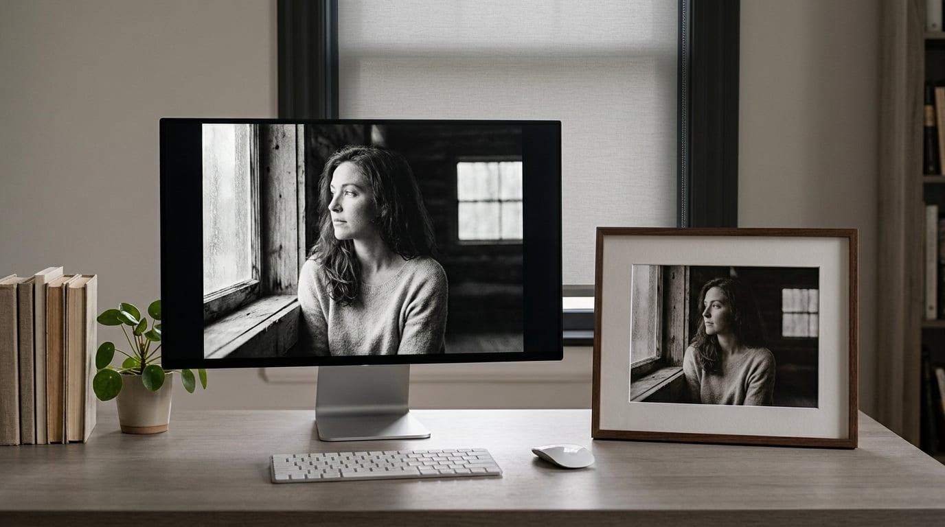
If you have ever printed a photo that looked great on your monitor and came out of the printer looking flat and heavy, the reason is physical, not a fault in your file. A display makes its own light; paper can only bounce light back. A correctly exposed print viewed in a normal room will always read a little darker than the same image on a bright screen, and that gap grows the brighter your monitor is set.
The good news is that most of the difference is fixable, and most of it comes down to three things: how bright your display is, whether colour management is doing its job once instead of twice, and whether you’re judging the print under light that resembles the light it will hang in.
The short version, before we get into detail:
- Your monitor is too bright. A factory monitor commonly runs at 250-350 cd/m2, while a print under ordinary room light sits nearer 80-120 cd/m2, so the screen always wins the brightness comparison.
- You edited the image to suit that bright screen and then the printer faithfully reproduced your darker version of the picture.
- Colour management is either missing or applied twice by the editing app and the printer driver, which usually darkens shadows and mutes colour.
- The wrong paper type is selected in the printer, so the driver lays down the wrong ink coverage for the surface you are actually using.
- You are viewing the print under the wrong light or from the wrong distance, and judging it against a screen that was never under those conditions.
Table of Contents
- Why Do Photos Look Brighter on a Screen?
- How Do Screen Brightness and Room Lighting Change the Match?
- Why Prints Look Darker Than the Screen on Different Devices
- Does Paper Type Make Prints Look Darker?
- How Can You Tell Whether the Screen or Print Is Wrong?
- How Do You Fix a Print That Looks Too Dark?
- Frequently Asked Questions
- What Should You Do First?
Why Do Photos Look Brighter on a Screen?
Your prints look darker than your screen because computer monitors emit light while printed paper only reflects the light in the room. Once the file is exposed for the brightness of an emissive display, the paper version has no way to compete with it.
That is the whole mechanism, and it explains most of what you are seeing. A monitor is an emissive surface: every pixel generates its own colour, and a pixel set to 300 cd/m2 genuinely puts 300 cd/m2 of light at your eye. Paper is a reflective surface. Its brightest possible pixel, the paper white, is just a bright white sheet bouncing back some fraction of whatever lamp is in the room. Multiply that by an average ink density of maybe 30-40 percent and you get a print peak of a few hundred lux rather than hundreds of nits.
The consequences ripple into the edit itself. On a very bright screen, shadows and midtones look washed and open, so most people reach for the exposure slider and take the image down. The histogram on that screen then looks tidy. The print, which is already thousands of times dimmer in absolute terms, faithfully delivers those reduced shadow values and looks underexposed.
So the mismatch is usually a viewing-environment error that gets baked into the file, not a printing error. Which is good news, because a viewing-environment error is a one-time fix that improves every image you edit afterwards.
How Do Screen Brightness and Room Lighting Change the Match?
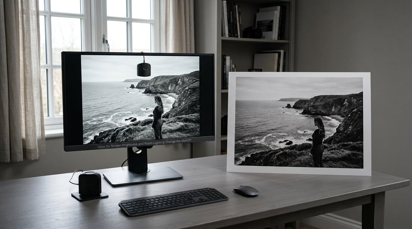
Display brightness is the biggest single lever, and it is worth being precise about the numbers. Professional work aimed at print has a recommended luminance target of 80-120 cd/m2, and a starting point of 120 cd/m2 is a reasonable place to begin before stepping down. Consumer monitors usually arrive at 250-350 cd/m2, which means the image you approved was being viewed roughly three times brighter than the paper version you will hold.
| Viewing condition | Typical screen luminance | What it does to the match |
|---|---|---|
| Factory monitor setting, bright room | 250-350 cd/m2 | Print looks several stops too dark. Worst case for judging a file. |
| Print-work target, neutral room | 80-120 cd/m2 | The band most print workflows aim for. Start at 120, then step down. |
| Step-down ladder | 120 / 100 / 90 / 80 cd/m2 | Move down one rung per test print rather than guessing. |
| Graphic-arts soft-proofing standard | 160 cd/m2 | A professional reference point, not a sensible home desk default. |
| Reflective print under room light | Roughly 80-120 cd/m2 equivalent | The real target. This is what you are trying to reproduce on screen. |
Room light matters just as much as the display, and it gets less attention. Ambient light raises the perceived black level of the room, which makes everything on the screen look flatter, but it also raises the brightness of the print in front of you. A print judged under a dim bedside lamp at night will look much darker than the same print at a desk under daylight. Judge a print under roughly neutral, 5000K room lighting, and closer to a reference level of 500 lux if you want your judgement to transfer to someone else’s wall.
Gloss adds a subtler trap. A glossy or lustrous print throws a specular reflection back at you; tilt it toward a window and a washed-out veil appears that is not in the file at all. Matte and fibre-based papers scatter that light instead, so they hold their blacks much better under a changing angle. Many people conclude a glossy print “printed too dark” when they have simply tilted it into a reflection.
Distance works on perception rather than physics. Hold a print at arm’s length and then look at the same image on a monitor from the same distance, and the paper shows you the lighting of the room while the screen shows you the lighting of the panel. Push the print to the same distance you edit at and the difference shrinks noticeably.
Why Prints Look Darker Than the Screen on Different Devices
Two people can open the identical file and see it at wildly different brightnesses, which is why “it looks right on my screen” tells you very little until you know which screen. The root cause is the same on every device; only the controls differ.
Desktop monitors
Usually the best-behaved of the lot. They have a real brightness control, an on-screen menu, and often a sensor to trim brightness as ambient light changes. The failure here is nearly always the brightness slider sitting near maximum, sometimes with a contrast or “dynamic contrast” enhancement that crushes the shadows further.
Laptops
A laptop panel is usually calibrated to the far brighter world of digital-first use, and its brightness slider often runs from 100 percent down only to about 30 percent of the display’s capability. Pushing the slider all the way down usually still leaves you well above 120 cd/m2, so a laptop screen is a poor judge of a print even when it is dimmed as far as it will go. Many colourists keep a desktop display for print decisions for exactly this reason.
Tablets and phones
Phones are the worst offender and the most common way people judge a photo before sending it to a lab. Modern phone displays peak well above 600 nits, and auto-brightness routinely pins them there in a bright room. Phones and tablets also apply their own image adjustments: True Tone, Night Shift, Night Shift on Mac screens, and adaptive tone mapping on OLED panels. The file may look vivid and punchy on a phone and neutral and softer on a monitor, and the phone is the one that’s wrong about paper.
Televisions
A TV in a living room is an entertainment display first. Picture modes like vivid, cinema and dynamic contrast all push saturation and crush blacks, and OLED panels are far brighter than any monitor. Judging a print against a television is close to meaningless.
HDR
HDR content expands the range well beyond what ink on paper can produce, and it is a frequent reason people conclude their photo looks dull once printed. Export a print master as SDR unless your lab explicitly asks otherwise, and check what your phone or laptop does to your file before you assume the file itself is the problem.
One clarification worth having, since search results for this query are full of it: printing onto dark fabric with screen-printing inks is a different problem entirely. There the white base of the garment, not your display, sets the darkest value you can reach, and no amount of screen calibration touches it.
Does Paper Type Make Prints Look Darker?
Paper changes the look, but the image file usually controls the tones. Swapping a matte sheet for a glossy one in the same printer and driver will shift contrast and black density noticeably, but if a print is genuinely a full stop under, the paper is rarely the whole story. Driver and profile errors outweigh surface finish.
| Surface | How it behaves | Effect on perceived density |
|---|---|---|
| Matte | Scatters light in all directions, no glare | Lower peak contrast but blacks hold steady from any angle; often reads slightly flatter |
| Satin or lustre | Small semi-gloss surface | A middle ground, with a hint of sheen and shadow detail that holds up well |
| Glossy | High specular reflection | Highest contrast and deepest blacks, but vulnerable to veiling reflections at some angles |
| Metallic or pearlescent | Reflective coating with a colour cast | Lifts overall brightness and shifts the white point; midtones can read lighter than intended |
| Textured or fine art | Raised surface, often cotton rag | Shadow detail is broken up by the texture, which reads as added grain or muddiness |
Paper white is the ceiling that nobody notices. A bright white inkjet paper reflects far more light than a warm-toned cotton rag, so the same file printed on both will produce noticeably different paper whites, and the rag version will look “darker” overall even when nothing is wrong. Match the paper choice to the lighting where the print will live: glossy for controlled indoor light where you can control the angle, matte or rag for anything you cannot control.
The rule of thumb most working photographers use: decide the paper first, load it, and tell the printer driver exactly what is in the tray. Everything else downstream depends on that one being right.
How Can You Tell Whether the Screen or Print Is Wrong?
Before you change anything, work out which side of the equation is broken. When prints look darker than the screen, the answer is often that the print is fine and the viewing conditions are not. This is the triage that most guides skip, and it is the part that saves you money.
A workable sequence, in order:
- Judge the print first, on its own. Look at it in neutral light with nothing else on the desk, before you open the file. Decide whether it is too dark as an object.
- Check the shadows and highlights separately. Blocked shadows with no detail, or clipped highlights that have gone flat white, mean a real problem. A print that is uniformly a little dimmer than you remember is a viewing issue, not a tone curve issue.
- View the file with a hardcopy reference next to it. Put the print beside the screen, turn the display down, and compare paper white to screen white rather than comparing midtones first. Paper white is the fastest diagnostic in the whole process.
- Check the room. Kill the overhead light, close the window blinds, and let your eyes adjust for a couple of minutes. Judge again.
- Check the file, not just the screen. Clip the histogram, check for crushed blacks, and confirm the export was made in the space you think it was.
- Only then touch the printer settings and run one test print with a single variable changed.
If the print is too dark across the board, the mismatch table below will point at the cause quickly.
| What you see | Most likely cause | What to do first |
|---|---|---|
| Everything too dark, blacks muddy | Monitor far too bright, or exposure dropped while editing | Lower display brightness to 120 cd/m2, then step down |
| Print too warm, paper white yellowish | Wrong white point for the paper, or a colour-managed/driver-managed conflict | Check paper profile and rendering intent |
| Print too cool, whites bluish | D65 profile applied to a D50-oriented print workflow | Confirm the paper profile the driver expects |
| Colours shift, saturated hues block up | Rendering intent set to something other than perceptual for the target | Set relative colorimetric for accurate colour match |
| Preview more vivid than print, and still is | Phone or laptop display, uncalibrated and over-bright | Stop judging on that device; calibrate or use a better display |
| Print too light or washed out | Overcorrected file, paper too glossy in bright light, or a low-ink black setting | Check the driver’s ink density and brightness controls |
That last row is the mirror-image failure and it confuses people just as much. A washed-out print usually means someone brightened the file to fight an over-bright screen, or the driver’s brightness and contrast controls were pushed up to compensate for a dark image. Fix the source before adjusting either.
How Do You Fix a Print That Looks Too Dark?
Here is the order I would work in. Change one variable per test print, because a print costs money and a two-variable test teaches you nothing.
- Set the display to 120 cd/m2 if you have any way to measure it. A colorimeter will do it; a phone app gets you close enough to find the setting, not close enough to trust it.
- Disable every automatic adjustment on the display before you calibrate: auto-brightness, True Tone, Night Shift, dynamic contrast, vivid picture modes, and any adaptive tone mapping.
- Warm the display up and calibrate to a display profile appropriate to the room. For print-oriented work a D50 (5000K) target at gamma 2.2 is the reference; for general screen delivery, D65 (6500K) is standard. Whichever you choose, be consistent, because switching between them is itself a source of confusion.
- Let the room settle. Consistent, neutral lighting, no direct sun, a monitor hood or at least a wall behind you rather than a bright window.
- Soft proof against the real output profile for the printer and paper you will actually use. A soft proof is only as good as the profile behind it, and a generic “printer” profile does nothing useful.
- Decide who handles colour. Either the application does it or the driver does it. If the application manages colour, set the driver to no colour adjustment or driver-managed off. Running both is double conversion and is one of the most reliable ways to get a heavy, dark, flat print.
- Set the correct paper type in the printer driver to match what is physically in the tray, and let the driver use its own profile for that combination.
- Print one test. Then step the display down through 100, 90 and 80 cd/m2, one test at a time, and stop where the match looks right to you in the room you care about.
Setting brightness on your device
On Windows 11, open Settings, go to System, then Display, and adjust the brightness slider while your display profile is active. On Windows 10 it is Settings, System, Display and monitor, then the brightness slider under the brightness and colour section. On macOS, System Settings, Displays, then the brightness slider. On iPhone and iPad, swipe down from the top right, or use Control Centre, and turn off True Tone and Night Shift before you judge anything. Laptop panels are the awkward case: the slider may not go low enough, and on many machines a third-party utility or an external calibration tool is the only way to reach a lower luminance.
Soft proofing in your editing app
In Lightroom Classic and the Lightroom Develop module, open the Print module, then the colour management area, set the profile to your printer and paper, and tick soft proofing. In Photoshop, the route is View, Proof Setup, then Proof Colours, and the behaviour is toggled from View, Proof Setup, Proof Colours again. In Capture One, it is the proofing icon in the tool bar, with a target profile and proofing intent. In darktable, the print module has its own colour-managed output path, and users on Linux and elsewhere report that turning the output through that path resolves most dark-print complaints at once.
Colour space is worth getting right here too. sRGB is what consumer labs and online print shops expect for most jobs. Adobe RGB covers more gamut but only converts cleanly if the receiving end handles it. ProPhoto RGB is an editing space, not a delivery space, and sending it to a lab that does not understand it is a reliable route to surprising colour.
One warning before you reach for the brightness slider in your editor. Do not brighten every file to compensate for a display that is set far too high. That bakes the error into the file permanently, it will look wrong on every other screen and every other printer, and it will look wrong on the next printer you buy. Lower the display, fix the print workflow, and only consider a small deliberate tone adjustment in a copy once the workflow itself is producing matches you can repeat.
Frequently Asked Questions
Are prints supposed to look darker than the monitor?
Somewhat, yes. A monitor emits its own light while paper only reflects room light, so a well-exposed print viewed in ordinary lighting will read slightly darker and less punchy than the same image on a bright display. If the difference is small and consistent, that is normal. If the print looks a full stop or more under, the gap is a setup problem worth fixing.
Should I make my monitor brighter to match a print?
No, brighten your print, not your monitor. Making the display brighter to match a dim room makes the mismatch worse and pushes you into over-brightening every image you edit. The useful direction is the other one: bring the display down into the 80-120 cd/m2 band and view the print under neutral light near 5000K.
Do matte prints look darker than glossy prints?
Not darker in the sense of printed too dark, but lower in contrast. Matte surfaces scatter light and hold their blacks steadily from any angle, which reads as flatter overall. Gloss shows deeper blacks and more contrast but throws reflections at you if you tilt it. The file usually sets the tone, so switching paper shifts the look more than it shifts the exposure.
Do I need a calibrated monitor to match print colors?
You need a controlled one, and calibration is the most reliable way to get there. Without it you are guessing, and a factory display at 250-350 cd/m2 is almost always far too bright for judging print work. A colorimeter plus an ICC display profile and a fixed room gets you most of the way there, and the software back in the box handles the profile for you.
Should I fix a dark print in Photoshop or on the monitor?
Fix it on the monitor and in the print workflow. Turn the display down to 80-120 cd/m2, remove automatic brightness and True Tone adjustments, confirm the paper profile in the printer driver, and make sure only the app or the driver is converting colour. Once those produce a repeatable match, adjust the tone in a copy if you still want a specific look.
What Should You Do First?
Look at the print on its own, under neutral light, before you open the file. If the blacks have detail and the print simply reads quieter than the screen, the print is fine and your display is the problem.
Then set that display to 120 cd/m2 with every automatic adjustment switched off, and work your way down to 80 if needed. Once the screen is where the paper should be, check the paper type in the printer driver and confirm that only one of the app or the driver is converting colour. Only after those two boxes are ticked is a tone adjustment in the photograph a reasonable move.
If you are still stuck after that, the remaining difference is a paper-and-profile question, and one more test print on the exact surface you plan to use will usually tell you which way to go. Last reviewed for 2026.