
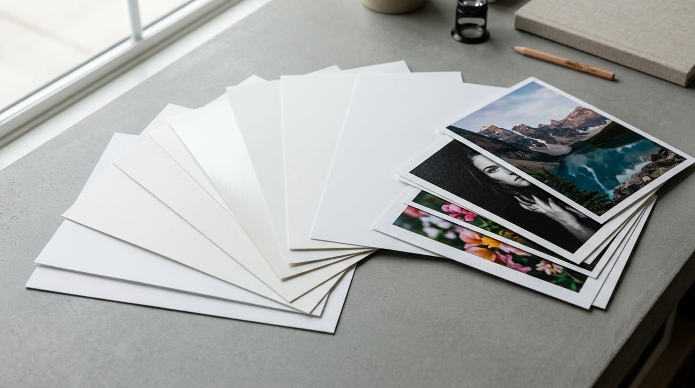
Fine art paper types explained in one line: every paper you can buy is a combination of four independent properties — substrate, weight, texture, and finish. Get those four right and you can read any product page in the 2026 print market and know exactly what you are ordering.
That matters because two prints of the same file, on the same printer, can look like two different artworks. One reads bright and crisp under glass; the other goes grey and soft. Nothing about the file changed. The sheet changed.
Below is how each of those four properties behaves, what a spec sheet is actually telling you, and which combinations suit which artwork. No brand gets a pass here — a name on the label tells you far less than the fibre and the surface.
Table of Contents
- What Is Fine Art Paper?
- Fine Art Paper Types Explained: Cotton, Rag, and Alpha Cellulose
- How Paper Surface and Finish Change a Print
- How Paper Brightness, Whiteness, and Tone Affect Color
- How Paper Weight and Thickness Affect Handling
- How to Choose Paper for Different Kinds of Art
- How to Choose Paper for Inkjet, Dye-Sublimation, and Traditional Printing
- Archival Quality, Durability, and Storage
- How to Choose the Right Fine Art Paper: A Simple Checklist
- Frequently Asked Questions
- What is the best fine art paper for black-and-white photography?
- Is cotton rag paper better than alpha cellulose paper?
- Should fine art prints be matte, satin, or glossy?
- What does paper weight mean when buying fine art paper?
- Does fine art paper guarantee archival permanence?
- How should fine art prints be framed and stored?
What Is Fine Art Paper?
Fine art paper is a heavyweight, acid-free printing stock made from cotton rag or refined alpha cellulose, designed for pigment-based inkjet (giclée) or dye sublimation printing so the image outlasts ordinary photo paper by decades rather than years. It is heavier, more stable, and far less prone to fading than standard office or glossy photo stock.
That difference comes from chemistry, not marketing. Wood pulp contains lignin, a natural polymer that breaks down into yellowing acids over time. Refined alpha cellulose papers wash most of that out; cotton rag has none of it to begin with, because cotton is a seed fibre rather than wood.
Giclée is a process, not a paper
People ask for “a giclée print” as if it names a material. It does not. Giclée describes an inkjet process that uses pigment-based inks with no dye, applied to fine art stock. You can print giclée on cotton rag, on alpha cellulose, or on a resin-coated sheet, and the results differ considerably.
What the words on a spec sheet mean
- gsm — grams per square metre, the weight unit used almost everywhere outside North America.
- mil — thousandths of an inch of thickness, the North American habit.
- Base white — the colour of the paper before ink, measured against a standard.
- Optical brightness — how much light the sheet scatters back, and why two papers with identical base white can still look different side by side.
- D-Max — maximum density, which is simply how black the blacks can get.
- Acid-free / lignin-free — the two properties that actually determine whether a print ages well.
Fine Art Paper Types Explained: Cotton, Rag, and Alpha Cellulose
There are three substrate families, and almost every fine art paper on sale is one of them or a blend. Substrate sets the tone of the white, how ink sits on the surface, and how the print ages.
| Property | Cotton rag | Alpha cellulose | Resin coated |
|---|---|---|---|
| Composition | Cotton rag, linters, or a blend | Refined wood pulp, lignin largely removed | Paper base with a polyethylene or microporous ink receptive layer |
| Tone | Warm to neutral, never truly white | Bright white to natural white | Bright white, very consistent |
| Surface feel | Crisp, fibrous, slightly spongy | Smooth, closer to office stock | Cool and slick, closer to photo paper |
| Colour response | Deep blacks, softer saturation, visible tonal steps | Clean whites, punchy colour, strong contrast | Highest sharpness and widest colour gamut |
| Ageing | Slowest yellowing; the archival benchmark | Good, with older lignin-reduced stocks fading more | Varies; the coating itself is the weak point |
| Typical cost | Highest | Middle | Low to middle |
| Best for | Limited editions, exhibition work, monochrome, watercolour | Everyday art printing, colour digital art, home studios | Large colour prints, fast turnaround, proofs |
Hybrid papers — a cotton/alpha cellulose blend — have become the default in the middle of the market. They give up a little of the rag’s warmth and tooth in exchange for a lower cost, which is a reasonable trade for most prints.
One caution worth stating plainly: optical brightening agents (OBAs) are fluorescent additives added to many bright-white papers so they look extra white under daylight. They look superb at first and then drift yellow, and the drift affects the whites of the image along with the paper. Cotton rag made without OBAs avoids the problem entirely.
How Paper Surface and Finish Change a Print
Surface and finish are two different things that get described with overlapping vocabulary. Surface is the physical texture — smooth, hot press, cold press, velvet. Finish is the optical layer — matte, semi-gloss, glossy, metallic.
Surface: smooth through textured
A smooth surface gives you fine detail and clean gradients, because there is no tooth to swallow the smallest information. Hot press is smooth but keeps a faint texture, and the name comes from watercolour paper manufacturing: the sheet is pressed hot against a smooth plate during forming. Cold press is pressed cold against a mould with a texture, which leaves a visible tooth — the name is a manufacturing term, not a quality grade. Velvet sits between cold press and smooth, with a soft low-contrast feel.
The trade is always the same: texture adds physical depth and a hand-made feel, and takes a little edge off the finest detail. A photographer who was disappointed by a heavily textured cotton rag moved to a smooth hot press natural with no OBAs and never went back. Texture can read as craft in one image and as blurriness in the next.
Finish: what changes and what it costs
- Matte — no glare, fingerprints barely show, and colour looks slightly calmer than reality. The safest choice under glass and in mixed lighting.
- Satin / semi-gloss / lustre / pearl — the middle. More colour pop than matte, far less reflection than glossy.
- Glossy — maximum contrast and sharpness, and a mirror at any angle. Fingerprints and smudges show immediately.
- Metallic / pearlescent — a tinted reflective layer that shifts with viewing angle. Effective for abstracts, unpredictable for skin tones and text.
Practitioners tend to rank glossy at the bottom for fine work. In an art forum thread someone put it plainly: glossy reflects too badly, while matte mutes the colours — and then immediately qualified it, because it depends on the artwork. That conditional is the honest answer. What matters is where the print will live.
Viewing distance is part of it too. Textured paper rewards being seen up close and holds up from across a room. Smooth stock flatters a large print viewed from two metres.
How Paper Brightness, Whiteness, and Tone Affect Color
Brightness and whiteness are related but separate. Base white is the actual colour of the blank sheet, measured against a reference. Optical brightness measures how strongly the sheet scatters light, and that number can be inflated by OBAs without the paper being any whiter in neutral terms.
A bright white base makes the whites in your image read as clean and open, and it lets colour look saturated. A natural or warm white base shifts everything slightly toward cream, which many people find easier to live with on a wall and which suits warm-toned subjects, skin, and autumn colour.
For monochrome, this is where paper choice does the most work. A bright white sheet with deep blacks gives you the classic high-contrast look. A natural base gives you softer greys and a longer, more continuous tonal scale — often described as more like a traditional fibre print. Bright whites can also clip, and once a highlight hits pure white, the detail behind it is gone.
Watch for the reverse effect in colour: a bright white sheet under warm domestic lighting can make skin look slightly cold, while a warm base pulls everything a touch warmer. Print a small test of your most skin-heavy image on both before committing to a full sheet.
How Paper Weight and Thickness Affect Handling
Weight is not a quality score. It tells you how the sheet behaves in your hands, in a frame, and on a wall — which is why it matters for large work and much less for a small one.
| Band | Typical gsm | Thickness | How it behaves |
|---|---|---|---|
| Light | 150-200 | 6-8 mil (0.15-0.2 mm) | Fine for small prints, mattings, and study work. Wants a mount. |
| Standard | 210-300 | 9-12 mil (0.23-0.3 mm) | The everyday fine art range. Frames and hangs without support. |
| Medium-heavy | 310-340 | 13-14 mil (0.33-0.35 mm) | Hangs flat on a wall, resists curl, feels substantial in the hand. |
| Heavy | 350-400+ | 15 mil+ (0.38 mm+) | Rag-weight and museum boards. Built for large formats and traditional mounting. |
Two other terms from the spec sheet affect handling. Grain direction is the alignment of fibres, and it decides how the sheet bends. Print long-grain so the finished piece hangs flat. Opacity is how much light passes through; low-opacity sheets need a mount or a backing, or the wall will show through.
Stiffness matters more than weight in practice. A slightly lighter sheet with a stiffer body frames better than a heavier floppy one, which is why thickness in mil is often the more useful number.
How to Choose Paper for Different Kinds of Art
Match the substrate and finish to the subject and the room. Here is the short version.
- Monochrome photography — matte or lustre on cotton rag. Matte keeps the tonal steps visible and glare out of the picture.
- Colour nature and outdoor work — smooth matte or light lustre. Texture competes with fine foliage detail.
- Portraits — semi-gloss or lustre on bright white. Enough surface to hold skin tone, not so much that highlights flare.
- Minimalist and graphic compositions — anything smooth, at any weight. Large empty areas show every flaw in the surface.
- Photomontage and surreal work — high weight and neutral tone. You want the seams to disappear, so pick a paper that adds no character of its own.
- Traditional drawing and printmaking — cold press or velvet rag. The tooth matches the medium it reproduces.
- Watercolour and gouache reproduction — cold press cotton rag. Reproductions of watercolour originals look wrong on a smooth sheet.
- Limited editions for sale — cotton rag, 300 gsm or above, with a stated archival standard on the certificate.
One extra factor applies when you are selling prints rather than printing for yourself. Buyers read weight and substrate as a quality signal before they read anything else. In forum threads about what sells better, the recurring preference was for heavier satin or rag stock, and the honest conclusion is that once a print is framed under glass, the finish matters less to a buyer than the substrate and the weight it feels like.
How to Choose Paper for Inkjet, Dye-Sublimation, and Traditional Printing
The output method constrains your choices more than most people expect.
Pigment inkjet works on almost anything designed for it. Because pigment sits on the surface rather than soaking in, matte papers give you a genuinely matte surface, and textured papers give real tooth. Check that the sheet is rated for your printhead type — some stocks carry a coating that fights certain pigment formulations.
Dye sublimation needs a specific coated polyester substrate. It will not run on cotton rag or plain cellulose at all; the dye has nothing to bind to. If you own a dye-sub machine, the paper choice was made for you.
Silver halide (C-type) printing uses conventional photo paper and is largely a commercial lab process. Its strength is the widest colour gamut of the three; its weakness is fading under light, which is why it is rarely used for fine art editions.
Platinum and palladium printing is a darkroom process, and here the paper’s own whiteness is the entire point. The image is formed by the density of the deposited metal against the brightness of the plate, so a warm, bright cotton rag produces something closer to the historical original than any inkjet stock.
Archival Quality, Durability, and Storage
Archival is not a single number. It is a set of properties, and a good manufacturer lists them. When you read a spec sheet, look for pH neutrality, lignin content, the presence of OBAs, ISO 9706 conformance for permanence, and ISO 10502 for lightfastness of the print under filtered light.
Longevity figures printed on packaging are laboratory conditions — sealed boxes, controlled temperature, no daylight. They are useful as a ranking and misleading as a promise. A pigment print displayed under gallery conditions should be expected to look stable for decades; the same print in a south-facing window degrades in a fraction of that time.
- Framing — use UV-filtering glazing or interleave acrylic rather than standard glass, and add acid-free matting and backing board around the print.
- Light — no fine art print, on any paper, survives direct sunlight. Keep prints off walls that get a full day of sun.
- Humidity — swings in relative humidity cause cockling and mould. Avoid bathrooms, kitchens, and unheated rooms.
- Handling — clean dry hands, or gloves if the surface is glossy or freshly printed. Ink needs a week or two to cure fully on resin-coated stocks.
- Storage — flat, in a dark archival sleeve, inside a room with stable humidity. Never roll a textured or matte rag print for long-term storage.
How to Choose the Right Fine Art Paper: A Simple Checklist
Run these in order and the decision takes about five minutes.
- Decide where the print lives. Under glass, in mixed light, or in a dim controlled room. This alone settles matte versus glossy.
- Look at the subject. Fine detail and monochrome favour smooth matte. Bold colour and large flat areas take lustre or semi-gloss better.
- Check the output method to confirm which papers are physically usable.
- Pick the substrate — cotton rag if this is a limited edition or long-term piece, alpha cellulose for regular printing.
- Set the weight from the print size: under A3, 200-250 gsm works; A2 and above, start at 300 gsm.
- Decide the framing style — a float mount suits heavy sheets, a standard frame suits anything.
- Order a sample pack and view it in the room it will hang in, at the time of day you usually look at it.
If you want one default to start from: a matte, smooth, 300 gsm alpha cellulose sheet for most digital art, moving to cotton rag when the print is an edition or a keepsake. Do not skip the last step.
Frequently Asked Questions
What is the best fine art paper for black-and-white photography?
A matte or lustre cotton rag sheet gives monochrome the most room to work. The matte surface kills glare under glass and lets the full tonal scale stay visible, while rag adds depth to the blacks without clipping. For high-contrast work, choose a bright white base; for softer, longer greys, choose a natural or warm white and check a test print before a full sheet.
Is cotton rag paper better than alpha cellulose paper?
Cotton rag is better for longevity, not for every print. Cotton contains no lignin, so it yellows far more slowly, and rag sheets are usually made without optical brightening agents. Alpha cellulose is refined to remove most lignin and prints brighter whites and punchier colour at lower cost. For a limited edition or a print you want to keep for decades, choose rag; for regular work, refined cellulose is perfectly sound.
Should fine art prints be matte, satin, or glossy?
Matte for anything under glass or in mixed lighting, satin or lustre as the balanced middle, glossy only for controlled, dim, unframed display. Matte slightly mutes colour and glossy reflects at every angle and shows fingerprints. Practitioners on art forums consistently rank glossy last for fine work and satin first, while agreeing that the artwork and the room decide it.
What does paper weight mean when buying fine art paper?
Weight is the mass of one square metre of sheet, in grams per square metre, and it tells you how the paper handles rather than how good it is. Roughly 150-200 gsm suits small prints and needs a mount, 210-300 gsm is the standard fine art range, and 310 gsm and above hangs flat on a wall and suits large formats. Stiffness matters more in practice than the weight figure itself.
Does fine art paper guarantee archival permanence?
No. Archival describes a set of properties, not a lifetime, and the figures on packaging come from laboratory storage in sealed boxes. Check for pH neutrality, lignin content, the absence of optical brightening agents, and conformance to ISO 9706 for permanence and ISO 10502 for lightfastness. Display conditions decide the outcome: keep prints out of direct sunlight and away from humidity swings.
How should fine art prints be framed and stored?
Frame with UV-filtering glazing or interleave acrylic, matting and backing in acid-free board, and a mat wider than the print so it never touches the glazing. Leave roughly a centimetre of air on every side so humidity changes cannot press the sheet against glass. Store unused paper flat in its original sleeve in a dark room with stable humidity, and let freshly printed ink cure for a week or two before glazing.
Start with the four properties: substrate for longevity, weight for handling, texture for detail, finish for glare and colour punch. Most people who feel lost in the terminology are actually holding two of them steady and have only been choosing between finishes.
Pick a matte, smooth, 300 gsm sheet as your default, print one small test of your most demanding image, and judge it in the room it will hang in. That single sheet will answer the questions no comparison table can.