
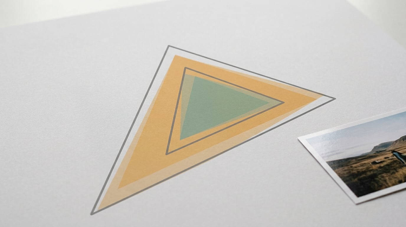
sRGB is the right answer for almost every finished photograph, because it is the color space every browser, phone, social platform and office printer already assumes. Adobe RGB reaches further into greens and cyans, which matters if your final output is CMYK print and your display can actually show that extra range.
Neither one is more accurate by default. Accuracy comes from a calibrated screen, the right ICC profile attached to the file and a delivery destination you chose on purpose, not from picking the wider space.
Here is the short version I give friends who ask: shoot RAW, edit in sRGB, export in sRGB, and only consider Adobe RGB when a printer or client asks for it in writing and you can proof your work on a wide-gamut monitor. Everything below explains why that advice holds up.
Table of Contents
sRGB vs Adobe RGB at a Glance
The table below compares the two spaces criterion by criterion. Read it as a map of where each one is strong, not as a scorecard.
| Criterion | sRGB | Adobe RGB |
|---|---|---|
| Primary intent | Web, screens, general image sharing | Commercial print, photography, graphic design |
| Introduced | 1996, by HP and Microsoft | 1998, by Adobe |
| Gamut size | The smaller baseline | Roughly a third more color area on the CIE diagram |
| Where the extra colors sit | Reference for the whole set | Mostly deeper greens and cyans |
| Color values available | 8 bits per channel, 16,777,216 combinations | 8 bits per channel, 16,777,216 combinations |
| White point and viewing curve | D65 white point, roughly gamma 2.2 | D65 white point, roughly gamma 2.2 |
| Device support | Assumed by default almost everywhere | Needs a wide-gamut display and conversion on export |
| Best for | Web, social, email, mixed-device sharing, beginners | CMYK print delivery, saturated product and foliage work |
| Common drawbacks | Clips colors the hardware could have shown | Looks dull online when exported without conversion |
One thing to keep in mind while reading it: a wider gamut on paper means nothing unless the rest of your chain can reproduce it. An Adobe RGB file that reaches a phone without conversion loses its extra colors anyway, and it usually loses something else too.
How Should You Read the sRGB vs Adobe RGB Comparison?
A color space is a map that says which visible color each set of numeric values represents. RGB on its own is only a counting system, three numbers per pixel between zero and 255. sRGB and Adobe RGB are two different maps built on top of that same counting system.
A color profile is the machine-readable file that carries the map. When a camera or editor writes an image, it also writes an ICC profile telling software how to interpret the numbers. The color gamut is simply the set of colors a given space can express.
So two files can both be “RGB,” both look perfectly normal in a hex code, and still describe different ranges of color. That is why sRGB vs Adobe RGB is never really a question about which format is better. It is a question about where the picture is going to be seen.
What Is the Difference in Color Gamut?
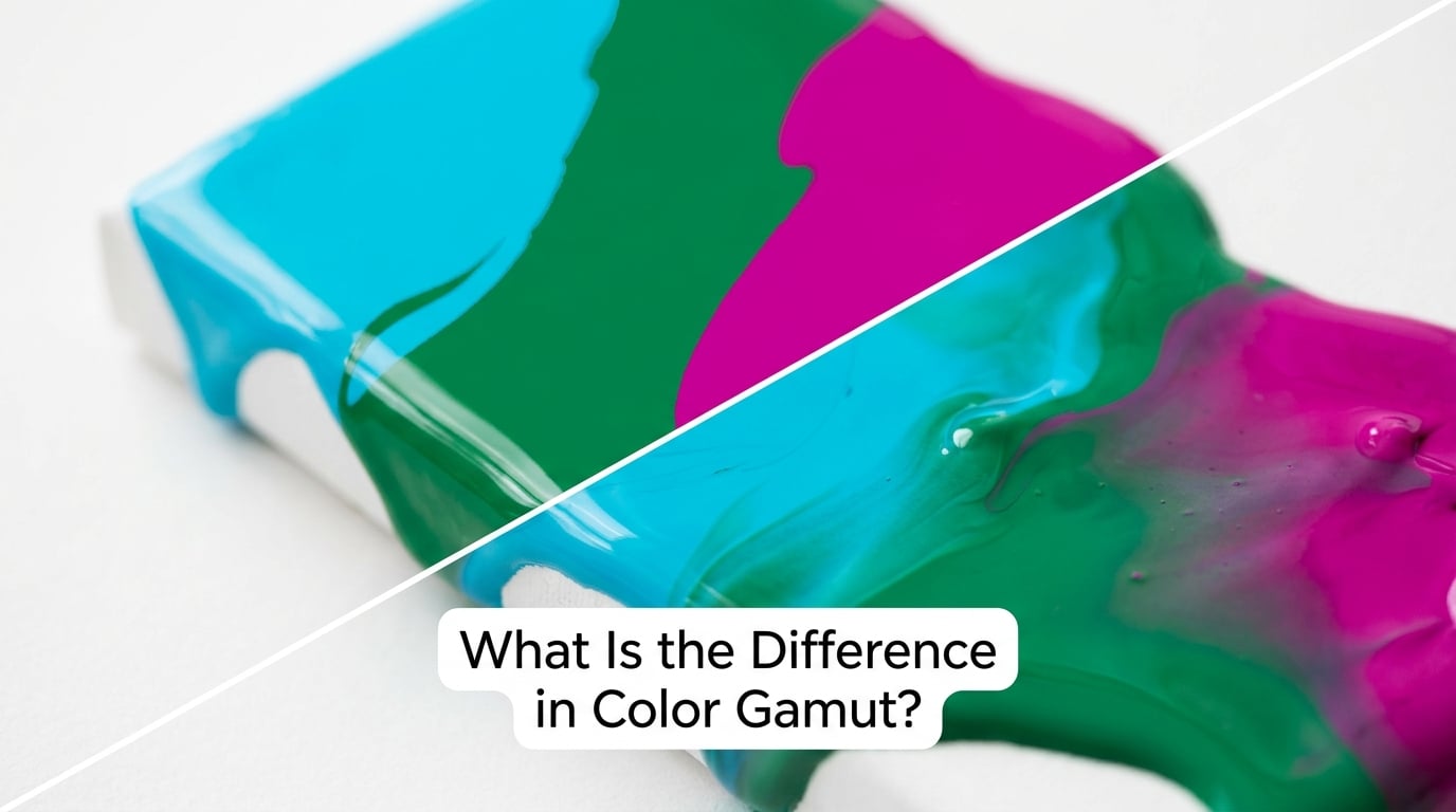
Adobe RGB covers noticeably more color area than sRGB, and almost all of that extra range sits in two directions: deeper, greener greens and cooler cyans.
Reds and blues are nearly identical between the two. That detail matters more than it sounds, because skin tones, sunsets, red paint and deep blue skies are exactly where people expect to see a wide gamut make a difference, and it barely does there.
Where you genuinely notice the difference is in highly saturated subjects: bright green leaves, neon and LED signage, colored stage lighting, turquoise water, product packaging in vivid brand colors. Those are the pixels sRGB has to clip, and clipping is what causes flat, posterized bands in skies and gradients.
Both spaces hold 8 bits per channel, so both offer the same 16,777,216 combinations. Nothing about Adobe RGB adds more numbers. It simply assigns those numbers to a wider set of real colors, which means the steps between neighbors are spread across more of what you can see.
Which Color Space Is Better for Editing?
For most people, sRGB is the better editing space, because sRGB is what your screen can actually show you.
The argument for Adobe RGB during editing is about headroom. Work in a wider space and those saturated greens and cyans survive until you decide what to do with them, instead of being flattened at the moment you open the file.
The argument against is harder to get around. If your display only covers sRGB, you are editing the extra range blind. Adjustments you make to colors you cannot see are adjustments you cannot judge, and that is how images end up looking wrong in ways that are hard to name.
Soft-proofing closes some of that gap. If your editing software can simulate your printer’s gamut through a soft proof, you at least know where the out-of-gamut areas sit before ink ever touches paper.
My rule: edit in Adobe RGB only if all three of these are true. You own or rent a display that covers most of the Adobe RGB gamut, that display is calibrated on a schedule, and your final deliverable is print. Miss any one and sRGB is the calmer choice.
How Do Color Profiles Change the Workflow?
Color management is just the habit of attaching the correct profile at every step and converting deliberately instead of letting software guess.
In practice, that means your camera writes a profile, your editing software reads it, and your export writes the profile that matches the destination. A file aimed at the web carries an sRGB profile; a file aimed at a prepress operator carries the Adobe RGB profile they asked for.
Two commands cause most of the damage people report on photography forums, and the difference between them is worth knowing by heart. Convert to Profile translates the colors so they look the same in the new space, which is almost always what you want. Assign Profile just relabels the file, claiming the existing numbers meant something else, which permanently shifts every color in the image. If you only remember one thing from this section, remember that one.
Embedding versus converting is a different question. Embedding keeps the profile inside the file so the recipient’s software can handle it. Converting rewrites the pixel values so the file no longer needs a profile to look right.
For screen delivery, convert. For handing a file to a printer who asked for a specific space, deliver that space with the profile embedded and state the intent you used. For email, chat apps and social platforms, assume the recipient’s software will ignore the profile entirely and hand them sRGB.
Which Is Better for Printing and Web Images?
For web images, sRGB is not just better, it is the only safe answer. Browsers assume sRGB, so an Adobe RGB file with an embedded profile gets its values reinterpreted as sRGB and comes out looking dull and shifted.
For print, the question is murkier because no printer reproduces the full range of either space. Ink gamut is limited by the printer driver, the paper, the ink set and the press conditions, and all four are fixed before your file arrives.
Most professional printers accept RGB files and handle the CMYK conversion themselves, often with a proofing step you should ask to see. That is the route I prefer, because it keeps more of your original color data than converting to a fixed CMYK profile at home.
Black-and-white is its own discipline. Converting a color image straight to a monochrome profile usually shifts skin tones, because a neutral conversion treats every hue with equal weight. A dedicated black-and-white conversion built around a tone curve tuned to your subject gives you real control over how tones separate.
Which Should You Choose?
Choose sRGB when your destination is a screen, when the destination is uncertain, or when you are still learning. That covers web pages, social media, email, chat apps, phone screens, mixed client devices, in-person sharing, and basically any workflow where someone else opens the file on hardware you do not control.
Choose Adobe RGB when the file is going to a CMYK destination that asks for it, when the subject contains genuinely saturated color that sRGB would clip, and when your hardware and habits are already in order.
A few narrower cases worth naming. For video, work in Rec.709, which matches sRGB closely enough to be the working standard for screen delivery. For product and packaging work on print, Adobe RGB earns its keep. For logo design, sRGB, because brand assets travel to code, screens and print in unpredictable order.
If you are not sure, stay with sRGB. Widening the space is easy to add later. Going back down after shipping files in the wrong space is not, and that asymmetry is the whole reason most professionals default to sRGB.
Frequently Asked Questions
Is Adobe RGB more accurate than sRGB?
No. Accuracy describes whether a device reproduces colors that match a reference, not how many colors it can reach. Adobe RGB reaches further into greens and cyans, but on an uncalibrated display those extra colors may arrive shifted or clipped. A calibrated sRGB monitor can be far more accurate than a wide-gamut screen left on its factory settings.
Can my monitor display the full Adobe RGB gamut?
Most cannot. Screens marketed as covering a high percentage of Adobe RGB vary wildly in real accuracy, and many wide-gamut panels oversaturate the colors they do show. Check the manufacturer gamut coverage figure, then calibrate the panel rather than trusting it. If you cannot verify coverage and accuracy, treat your editing space as sRGB.
Should I edit my existing photos in Adobe RGB?
Usually not. Switching the working space on files you already shot does not recover any color that was clipped in sRGB, and it introduces conversion errors in every image where the numbers fall outside the new space. Convert at export for a specific print job instead, and keep your working space consistent so your existing edits stay predictable.
Does converting a photo from sRGB to Adobe RGB restore clipped colors?
It cannot. Clipping happened at the moment the values were written, so the information no longer exists in the file. Converting only re-maps colors that are still present, spreading them across the wider gamut. To keep colors unclipped in the first place, work from RAW capture or choose a wider working space at the editing stage.
What color space should I use for black-and-white photography?
Convert to black and white from a wide RGB working space using a monochrome profile tuned to your subject, usually starting from RAW. A straight conversion from sRGB through a generic grayscale profile treats every hue with equal weight and can wreck skin tones. Working from RAW lets the conversion tool use full color data before it collapses to a single channel.
Conclusion: Start with sRGB for Most Photo Workflows
sRGB wins for the overwhelming majority of finished photographs, and Adobe RGB is a specialist tool for print-focused work rather than a general upgrade.
Start with three things: calibrate the monitor you actually edit on, decide the destination before you open the file, and make sure the correct profile stays attached from export onward. Add Adobe RGB when a printer asks for it, not before.