
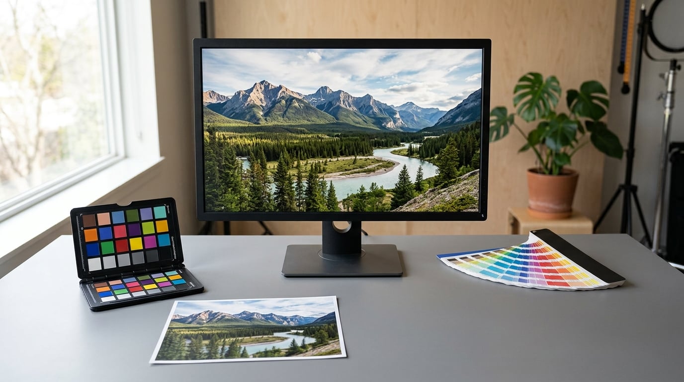
Color management is the system that keeps the colors in your photographs consistent from the camera to the screen to the print. Every device renders color slightly differently, and color management uses color profiles to translate between them so the same image looks like the same picture everywhere.
That sounds tidier than it is. Most color problems in photography trace back to one of three things: an uncalibrated display, an image converted into the wrong color space, or a print sent without the right profile attached. Get the system right once and those problems mostly stop appearing.
This guide walks through what color management actually does, which color spaces matter for photo work, when you need a colorimeter, and how to build a workflow that holds up whether your image ends up in an album, a gallery wall, or a client’s Instagram feed.
Table of Contents
- What Is Color Management in Photography?
- Why Accurate Color Matters in Photography
- How Color Management Works in Photography
- What Are Color Profiles and Color Spaces?
- How to Choose a Working Color Space
- How Do Camera Captures, Monitors, and Printers Differ?
- What Is Monitor Calibration, and Does Your Photography Setup Need It?
- How to Build a Consistent Photography Color Workflow
- Common Color Management Mistakes and How to Fix Them
- Frequently Asked Questions
- Conclusion: Start With a Consistent Workflow
What Is Color Management in Photography?
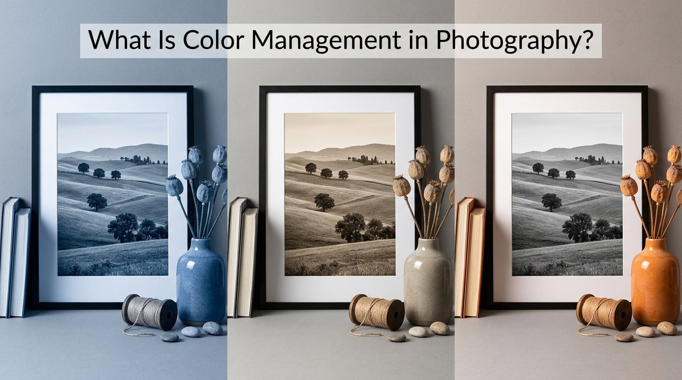
Color management in photography is the process of keeping colors consistent across your camera, monitor, editing software, printer, and the devices your viewers use. It describes colors in a device-independent way using ICC profiles, then translates them so each device reproduces the same tones.
Put differently: your camera does not record color, it records numbers describing color relative to a known reference. Color management is the set of rules and profiles that turn those numbers into the right color on a specific screen or press.
The core terms, defined once so the rest of this guide makes sense:
- Color space — a numerical definition of a range of colors, such as sRGB or Adobe RGB. It is a standard, not a device.
- Gamut — the slice of visible color a device or space can actually produce. No space covers everything.
- ICC profile — a small file that tells software exactly what colors a specific device produces and how to translate them. It is the link between a device and a color space.
- Embedded profile — the ICC profile carried inside the image file, so other software knows how to read the colors.
- White point — the color, defined by temperature, that a device treats as pure white. Photography typically uses D65, print uses D50.
- Gamma — how light values are encoded between darkness and brightness. A gamma of 2.2 is common for photography displays.
- Delta E — a single number describing how different two colors are. Lower is closer. Under 2 is usually called indistinguishable.
- Rendering intent — the rule set deciding what happens when a color in the source does not exist in the destination. Perceptual and relative colorimetric are the two you will meet most.
If you only take one idea away, make it this: an image file without an embedded profile is an image nobody else can interpret correctly, and a display without a profile is a display nobody can trust.
Why Accurate Color Matters in Photography
Two identical files, opened on two uncalibrated screens, will not look identical. That is not a defect. It is what happens when each screen has drifted differently over the years it has been switched on, and nobody has written down how it currently behaves.
The failures photographers actually hit are boring and specific. A print arrives with greenish skin tones because the file was converted to CMYK using a generic profile rather than the lab’s. A client opens an sRGB export on a wide-gamut phone and complains the colors look flat. A sky series looks consistent on your laptop and then jumps in saturation from image to image on a different monitor, because half the files were saved with a profile and half were not.
Accuracy also matters commercially. If the shirt a client ordered is a different red on the print than the sample they approved, that is a return and a lost trust. For wedding and event work, the album is a physical object that must match a set of proofs. For e-commerce work, the image is the product.
There is an important distinction to hold onto. Color management is device-independent plumbing: it keeps the same color the same. Correcting a white balance, matching a shot to a reference, or grading a sequence for mood are creative decisions. Mixing the two up is one of the most common sources of confusion, and worth separating clearly.
Color management vs color correction vs color grading
Color management is the transport layer. It does not decide what your image should look like; it makes sure every device shows the look you chose.
Color correction is the physical truth pass: fixing a white balance set under mixed light, pulling a channel back after overexposing, choosing which white object in the frame is actually white. It is a decision about the scene.
Color grading is the stylistic layer: shifting shadows toward teal, warming the highlights, matching shot three to shot four in a sequence. It is a decision about mood. Grading is where presets and LUTs live, and it only works properly if the underlying color management already works.
The practical rule: correct first, grade second, and let color management handle the rest so neither step has to compensate for a broken display.
How Color Management Works in Photography
The system is a chain, and a break anywhere in it shows up as a color shift somewhere else.
- Each device gets a profile. A monitor, a printer, a camera, and a scanner each ship with, or receive, an ICC profile describing the colors they produce and the conditions under which they produce them.
- The image carries its own profile. The file states what space or device its numbers refer to, so software does not have to guess.
- A color-managed application reads both. It converts the image’s colors from the source profile into the destination profile mathematically, rather than moving raw numbers around.
- A rendering intent decides the compromises. When the destination cannot produce a source color, the intent governs whether it clips, shifts, or maps smoothly.
- The viewing environment affects the result. A calibrated display in a sunlit room still looks different from the same display in a neutral one.
Convert to Profile, the function most software labels clearly, actually changes the pixel values so the image looks the same on two different devices. That is a real conversion, and it is lossy. Assign Profile, the other function, relabels the numbers without touching them, which is a fast way to make an image look wrong.
The three C’s of color management
The phrase photographers use most, and the one almost no explainer defines:
- Common — a shared, documented set of rules, so a profile written on a Mac means the same thing on a Windows machine in a lab in another country.
- Consistent — the same input produces the same output every time, on any properly configured device in the system.
- Controlled — devices are measured and adjusted so their actual behavior matches their stated profile, rather than being assumed.
Of the three, controlled is the one people skip, and it is the one that decides whether the rest is worth anything.
What Are Color Profiles and Color Spaces?
These two get used interchangeably and they are not the same thing. A color space is an abstract numerical container, like a coordinate system with no map yet drawn on it. A color profile is a measurement of one specific device, describing how that device’s actual colors line up with a space.
sRGB is a color space. Your laptop’s screen is a device, and the profile generated for it is a color profile. You work in the space and you calibrate the device.
| Color space | Gamut | Typical use | Workflow fit |
|---|---|---|---|
| sRGB | Narrow, standard for web | Website images, social platforms, client delivery | Safe default. Every browser, phone, and app renders it predictably. |
| Adobe RGB | Wider than sRGB, especially in cyan and green | Commercial print work, images with saturated foliage or product color | Good choice when a lab prints from your file and you know the target. Not for the web. |
| ProPhoto RGB | Very wide, based on a large-gamut film space | High-bit-depth editing, archival masters | Requires real wide-gamut hardware to judge. Heavy files, and out-of-gamut colors are easy to create by accident. |
| Display P3 | Wide, aligned to modern phone and laptop panels | Apple ecosystem delivery, some brand work | Looks better on those devices, shifts hue on older sRGB-only screens. Fine for digital-first work. |
| CMYK | Narrower and different in character, subtractive | Offset and inkjet printing workflows | Not a sensible editing space. Convert at export, using the printer’s own profile. |
The nesting matters: sRGB sits inside Adobe RGB, and Adobe RGB sits inside ProPhoto RGB. A color that exists in sRGB always exists in Adobe RGB. The reverse is not true, which is why converting a saturated Adobe RGB green down to sRGB gives you a duller, flatter green rather than an error message.
That is also why a wide-gamut monitor does not help you if you only ever work in sRGB. The extra gamut sits unused, and you have paid for a screen you cannot judge.
How to Choose a Working Color Space
For most photographers, the decision is far simpler than the forums make it sound.
Web only, clients on social platforms: work in sRGB. It is the only space where you can predict what a stranger’s phone will show. Vivid greens and blues get clipped, but nothing looks broken.
Mixed screen and print delivery: sRGB for anything digital, and let the lab handle CMYK conversion from a tagged sRGB file using their own profile. If you control the print yourself, Adobe RGB is a reasonable second option and gives the press more room for saturated color.
High-bit-depth editing or archival work: ProPhoto RGB with a wide-gamut display, if you have one. If you do not, editing in ProPhoto RGB means you are making color decisions you cannot see, which is worse than the smaller space.
Two things to avoid. Do not convert to a small space early, because every conversion throws away color information and you cannot get it back. And do not use a working space wider than your display unless you have a reason, since anything outside the display’s gamut is being judged blind.
One more thing worth knowing: if you shoot RAW, the in-camera color space setting mostly does not matter. It only affects the JPEG preview and the histogram you judge exposure against. That trips up a lot of new shooters who switch it and then wonder why nothing changed.
How Do Camera Captures, Monitors, and Printers Differ?
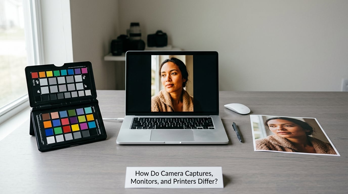
A camera captures with three additive channels. Red, green, and blue light in varying amounts make up every color the sensor records, and adding light can only move a color toward white. Displays work the same way, which is why screen colors get brighter as they get more vivid and why a display can reproduce colors a print physically cannot.
Print reverses the model. Cyan, magenta, yellow, and black ink absorb light, so more ink means darker. A color that is a bright saturated green on screen may need a dense mix of cyan and magenta that the press simply cannot lay down without dulling.
That difference is why no photograph looks identical on every medium. It is a physical limit, not a setting you forgot. What color management does is make the differences predictable and intentional rather than random.
Monitors also have their own hierarchy. A cheap general-purpose laptop panel is usually narrow-gamut with a shiny coating that adds reflections and lifts blacks. A dedicated photo display is matte, covers a larger gamut, and can be calibrated to a known white point and brightness. The image is identical; the rendering is not.
Printers bring one more wrinkle. Ink is nearly never as pure as light, paper reflects a portion of everything, and the same file on the same printer on a matte versus a glossy paper can shift noticeably. That is why the printer’s specific profile matters rather than a generic one.
What Is Monitor Calibration, and Does Your Photography Setup Need It?
Calibration is how a device’s profile comes to describe the device as it actually is right now. A factory profile describes how the display was on a specific bench on a specific day. Screens age, backlights dim, and rooms change. A measured profile closes that gap.
Two things are often confused under this one heading. Hardware calibration adjusts the display’s own internal settings so it matches a target white point, gamma, and brightness. Profiling then measures the result and writes the ICC profile describing it. Visual calibration, by contrast, involves a human adjusting brightness and contrast until images look right, which is subjective and does not produce a profile.
So does your setup need a colorimeter? A reasonable guide:
- You sell color-critical work — product, e-commerce, food, cosmetics, anything where the image is the sales argument. Yes, and calibrate monthly, since displays drift.
- You print your own work — yes, and a matte panel matters more than the colorimeter. A glossy screen always has reflections.
- You deliver to clients and care about your reputation — a colorimeter is a modest cost against the alternative of discovering a bad color shift after delivery.
- You post to Instagram and nothing else — sRGB in, sRGB out, with the display roughly neutral, covers most of the value. A colorimeter changes little here, and a badly bright display matters more.
Two habits do more for most people than the hardware does. Set your display to sRGB mode rather than a wide-gamut mode when working in sRGB. And look at work in a room with neutral surroundings, because a bright red wall next to your monitor shifts your perception of everything on it.
That last effect has a name, simultaneous contrast, and it is why photographers who work seriously tend to sit in front of neutral gray walls. It is the cheapest improvement available to you.
How to Build a Consistent Photography Color Workflow
This is the sequence. Follow it in order and the stages check themselves.
- Start in RAW. Your camera’s color space setting affects the JPEG preview only, so leave it wherever you like and stop thinking about it.
- Set your working space once. sRGB for most work, Adobe RGB for print-controlled workflows, ProPhoto RGB only with wide-gamut hardware. Then verify your editing application’s working RGB setting matches, and reset it to defaults if you are unsure what someone changed.
- Calibrate and profile the display you judge on. Set brightness to roughly 100 to 120 cd/m2 for print work, keep ambient light neutral, and recalibrate on a schedule rather than when something looks wrong.
- Judge inside the space you are editing. A soft proof or comparison view that shows the actual target profile catches out-of-gamut colors before export, which is far cheaper than a rejected print.
- Convert at export, not before. Use Convert to Profile, never Assign Profile. Assigning is the fastest way to make a correct image look wrong.
- Embed the profile. Every exported file should carry its profile. An untagged JPEG is interpreted differently by every application that opens it.
- Let the print lab convert. For most print orders, hand over a tagged sRGB or Adobe RGB file and let the lab convert to their CMYK profile. If you must do the conversion yourself, use the specific profile supplied for that printer and paper.
- Sanity check the delivery. Open the exported file on a second device, ideally one you did not create it on. If the color jumps, something upstream is untagged or double-converted.
That last step catches more problems than people expect, and it costs about a minute.
Common Color Management Mistakes and How to Fix Them
Working on an uncalibrated display. Every color decision you make inherits the display’s error. The fix is a colorimeter for color-critical work, or at minimum a neutral display in sRGB mode at a moderate brightness with controlled ambient light.
Assign Profile instead of Convert to Profile. Assigning relabels an image without changing its pixels, so the picture shifts to whatever the new label implies. A photographer who changes their color settings and then finds every file looking wrong has usually relabelled the workspace rather than converting it; reset color settings to defaults, confirm the working RGB profile matches your intended space, and re-convert.
Mixed working spaces in one project. Files from one folder in sRGB and another in Adobe RGB will not match, and you cannot fix it reliably after the fact. Pick one space at the start of the project.
Exporting without embedding the profile. The image looks right on your machine and wrong everywhere else. Embed the profile on export and this disappears.
Using a generic printer profile. If the lab gives you a specific profile, use it. If you are printing yourself and using the driver’s default, the color will be approximately, not accurately, reproduced.
Judging color outside a managed viewing environment. A screen by a window, next to a colored wall, or in a bright room cannot be judged. Tame the environment before you trust your eyes.
Ignoring gamut warnings. A color outside your output space will be clipped or shifted, and often both. Look at the out-of-gamut display before delivery rather than after the complaint.
Converting too early. Converting RAW to sRGB during the edit, then correcting, then converting again for a second deliverable, loses information at every step. Convert once, at the end.
Frequently Asked Questions
Is color management necessary for photography?
It is what keeps your colors predictable once your photographs are seen on devices you do not control, which is nearly every image you deliver. Without it, every screen interprets the same file differently and prints drift from what you approved. For someone who only posts to Instagram, a correct sRGB workflow and a neutral display covers most of the value with far less effort. For print, commercial, or client work, it is not optional.
Should I use sRGB or Adobe RGB for photography?
Use sRGB for anything delivered on a screen, because every browser, phone, and social platform assumes it and will render it predictably. Choose Adobe RGB when a lab prints from your file and you want more room for saturated greens, cyans, and product color. The common complaint that Adobe RGB looks better on a wide-gamut monitor is real, but the same file will shift on any sRGB-only screen your client owns.
Does monitor calibration make my photos more accurate?
It makes your decisions more accurate, not the file. Calibration measures how your display actually behaves and writes a profile describing it, so what you see is closer to what a correctly configured device will show. The photograph itself does not change. If you only work in sRGB and view on a neutral, moderately bright screen in a controlled room, the visible benefit of a colorimeter is small.
When should I convert a photo to CMYK?
As late as possible, and preferably not at all unless you control the printing. Most labs prefer a tagged sRGB or Adobe RGB file and convert to CMYK themselves using a profile measured for their own ink and paper. Convert on your side only when you need to preview the result, and then use the specific profile supplied for that printer and stock rather than a generic CMYK space.
Can I trust color on my phone or laptop screen?
For sending and receiving, yes. For judging, mostly no. Phones and laptops ship with uncalibrated, often wide-gamut panels that no manufacturer guarantees for color work, and screen brightness varies constantly. A laptop panel is fine for checking exposure and focus, and a phone is fine for delivering images. Neither is a surface on which to make final decisions about saturation or color cast.
Conclusion: Start With a Consistent Workflow
Color management in photography coordinates four things: a profile for each device, a shared color space to work in, a conversion that translates between them, and viewing conditions good enough to judge the result. Miss any one and the color shifts somewhere you did not expect.
Start with two steps this week. Pick a working space based on where your images actually go, sRGB for screen delivery, and set it once in your editing software. Then create a profile for the display you judge on, and spend twenty minutes taming the room around it. Everything else in the chain gets easier from there.