
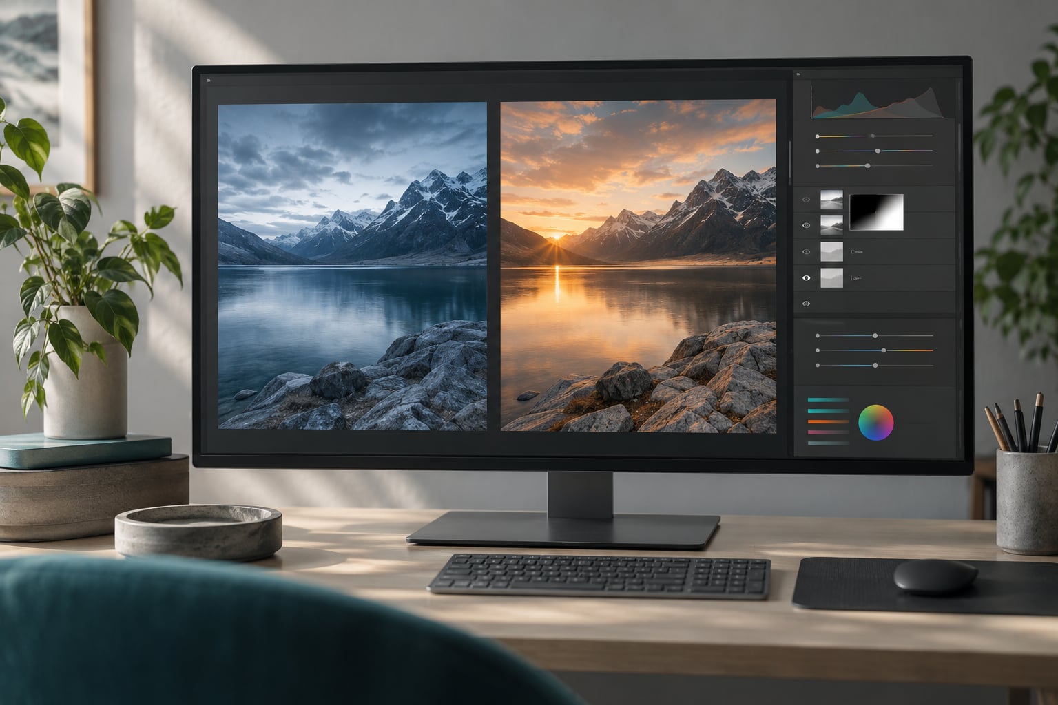
Matching colors between two photos in Photoshop comes down to one habit: correct the photo that looks wrong and keep the photo that already looks right untouched. Once that habit is set, the rest is a repeatable loop of sampling a shared reference, nudging broad color on an adjustment layer, then refining it with curves and a mask.
The whole workflow takes about ten minutes on a simple composite. The fiddly part is not the clicking. It is knowing which image should absorb the changes, and knowing when to stop pushing the sliders because a match that is technically perfect can look worse than a slightly looser one.
Menus and panel names here follow current desktop versions of Photoshop on Windows and macOS. Older releases and Photoshop Elements label a few of these differently, and I note the differences where they matter.
Table of Contents
- What You Need
- Step-by-Step: How to Match Colors Between Two Photos in Photoshop
- Common Mistakes
- Frequently Asked Questions
- What part of two photos should I use as the color reference?
- How do I use the eyedropper to compare colors in Photoshop?
- Will the colors match exactly after using these steps?
- Which adjustment layers work best when the lighting is very different?
- How do I keep my color matching edits non-destructive?
- Why will Photoshop not let me use Match Color?
- Conclusion
What You Need
You need the two source photos, a working document rather than a flattened export, and a plan to stay non-destructive so you can back up a correction that overshoots.
- Two source photos. The frame you trust and the frame you plan to change.
- A working Photoshop document. Duplicate your target image first and correct the duplicate, so your original pixels survive.
- A non-destructive approach. Adjustment layers and Smart Objects rather than merged pixels.
- The tools used below: Eyedropper, Color Sampler, Hue/Saturation, Color Balance, Curves, Levels, Selective Color, layer masks, and the Info panel.
One prerequisite deserves its own line before you start, because it causes more failed matches than any slider does. Check that both files share the same color profile. Open each one and look at the profile name in the title bar or in Image > Mode. An sRGB file and an Adobe RGB file describe the same numbers as completely different colors, so every correction you make after that point fights the conversion underneath it. If the profiles differ, convert one to match the other first, then start matching.
Step-by-Step: How to Match Colors Between Two Photos in Photoshop
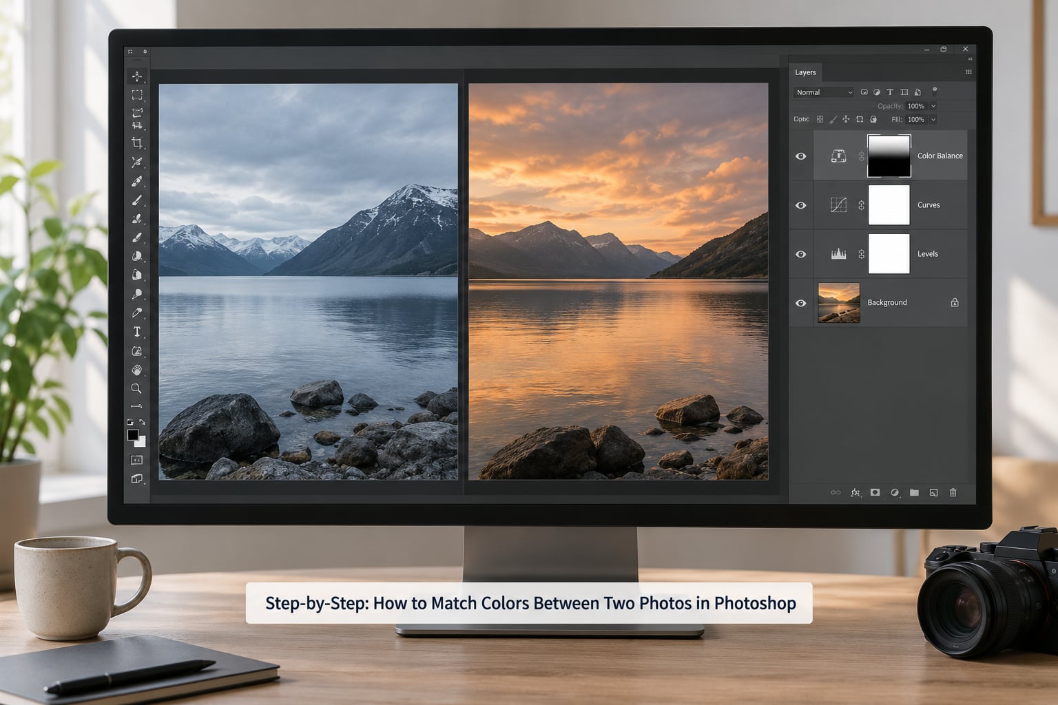
Work in this order: prepare both images, find a shared neutral, sample it, correct broadly, refine tone, control the correction locally, then check the result at normal size. Skipping ahead to the broad color step is what produces the washed-out composites people complain about.
Step 1: Prepare the Two Images
Open both photos. Duplicate the one you intend to correct with Image > Duplicate Image, rename the layers so you remember which is which, and work only on the duplicate.
Then make the two frames agree on size. If you are compositing, drag the subject onto the background document tab and let Photoshop place it at the same document dimensions and aspect ratio. Convert the layer to a Smart Object if you plan to scale it more than once, because every later transform re-samples from the original data instead of compounding the resampling.
Do not flatten at any point. A flattened layer cannot take adjustment layers, and you will end up rebuilding the correction from scratch.
Step 2: Choose a Neutral Reference
Find something that should look the same color in both frames: a white wall, a gray piece of clothing, a sheet of paper, a concrete floor. That region becomes your anchor for the entire correction.
The reference has to be evenly lit and free of strong colored bounce. A wall in shade beside a wall in direct sun is two different colors no matter how identical the paint is, and matching them will drag the whole image somewhere muddy. If you cannot find a neutral, pick the region your two photos have in common and treat it as the compromise point instead.
Step 3: Sample and Compare the Colors
Set a Color Sampler point on the reference region in your corrected photo, and a second sampler point on the same kind of region in the photo you trust. Open the Info panel and read both values as you toggle between layers.
This step is diagnostic, not corrective. You are looking for the direction of the gap: is the target too warm, meaning red and green are higher than blue? Is it too dark overall, meaning every channel sits lower?
Feeding a sampled value straight into the foreground color of a layer is the classic mistake here. It flattens texture, kills the natural variation inside a surface, and leaves you with a flat patch that reads as paint rather than as an object. Sample to measure. Adjust with a tonal tool.
Step 4: Make Broad Color Corrections
Add a Hue/Saturation adjustment layer or a Color Balance adjustment layer above your corrected photo. Hue/Saturation moves the color family, and Color Balance shifts shadows, midtones, and highlights independently, which is useful when the mismatch is mostly in the shadows.
Move toward the reference gradually. Drop the layer opacity to around 50 percent while you work, then raise it at the end. If you are working on the whole frame, keep opacity high; if you are correcting a single object, leave the layer at low opacity and mask it, which is what Step 6 covers.
One warning about the built-in Match Color command, since most searchers meet it first. It is fast, but it is also a destructive raster operation, it pulls your colors toward the average of the reference, and its default Fadedness setting desaturates the result noticeably. You cannot dial Fadedness back up after the fact.
Step 5: Refine the Match With Curves
Add a Curves adjustment layer above the color layer and match brightness separately from hue. You want the shadows, midtones, and highlights of the corrected photo to sit in the same tonal range as the reference, not just the same hue.
Work on one channel at a time. If the target is too blue in the shadows, pull the red and green points up slightly in the lower half of the curve while leaving the highlights alone. Small moves of two or three counts in RGB, and five in a single channel, are usually plenty. My Curves walkthrough goes deeper on the channel math if you need it.
Step 6: Control Color Locally
Mask the adjustment layers so the correction touches only the subject or region that was off. Alt-click the mask thumbnail to select it, then paint with a soft round brush at low flow.
Three settings decide whether a mask looks convincing: feathering, mask opacity, and edge handling. Feather the edge of the mask so the transition falls outside the silhouette, keep mask opacity somewhere around 60 to 80 percent so a hint of the original color survives, and zoom in to 100 percent at the boundary to hunt for halos. A hard mask edge is the second most common reason a good match looks pasted on.
Step 7: Match Contrast and Finish the Composite
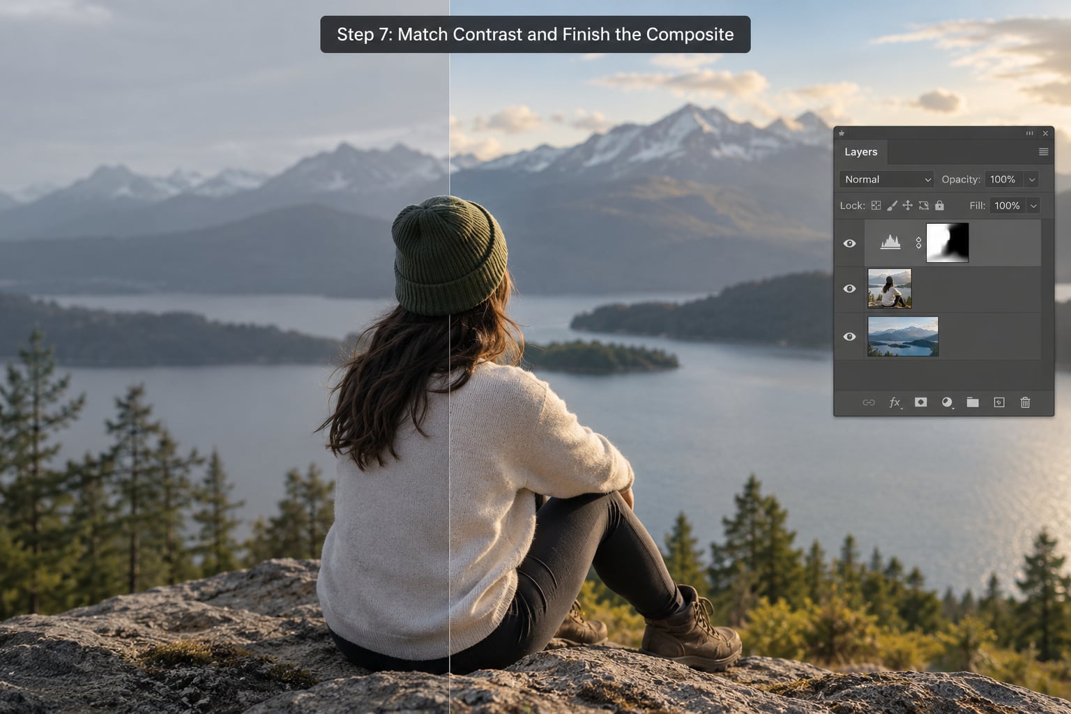
Add a Levels or Curves adjustment in small increments to align contrast and apparent sharpness. Two frames shot at different apertures will differ in micro-contrast, and matching overall brightness alone leaves that difference visible.
Then check the work honestly. Zoom out to 100 percent and look at both originals side by side, not at the layers panel. Open the Info panel and compare your sampler points again, numbers closer than about three counts in any channel is a good result. Temporarily desaturate the whole document to see if any brightness mismatch survives when hue stops distracting you, and reverse that check by hiding each layer in turn.
Once color is behaving, finish the composite. Unify the light direction, add one shared color grade over the top of everything, and match grain so the corrected region does not read as cleaner than its surroundings. If you need the blending itself rather than just the color, my guide to blend two photos together in Photoshop covers the edge work.
Common Mistakes
Correcting the wrong photo. Decide which image already carries the look you want, and treat it as fixed for the whole session. Most wasted corrections come from dragging the reference around instead of the target.
Matching one bright highlight too literally. A specular highlight is supposed to clip. Pulling it into line with a midtone in the other frame flattens it and drags the surrounding tones with it. Sample from a midtone or a neutral surface instead.
Using the color picker as a paint bucket. Flooding an object with a single sampled value erases texture and gradients. Use the sample as a target value, then build the correction with adjustment layers that preserve variation.
Adjusting the whole frame when only one object is off. Add the adjustment layer, then mask it. This is the difference between a composite and a color-graded duplicate of the background.
Ignoring the lighting difference. No amount of color correction fixes a subject lit from the left sitting in a scene lit from the right. Match color, then paint in directional light and a contact shadow to sell the direction.
Sharp masks and no zoom check. Every mask needs a soft transition and a 100 percent inspection along the boundary. Halos are obvious to a viewer and invisible on a zoomed-out canvas.
Judging at the wrong size. Toggle between your layer stack and the two originals at 100 percent. A match that survives inspection at arm’s length rarely falls apart when you view it at full size, but the reverse happens constantly.
Four habits cover most of this: fix the profile before touching a slider, sample from a neutral rather than a highlight, work on adjustment layers at low opacity, and correct the image that looks wrong.
Frequently Asked Questions
What part of two photos should I use as the color reference?
Pick a neutral surface that should look the same in both frames, such as a white wall, gray clothing, or a sheet of paper. It needs even lighting and no strong colored reflections nearby. Sample that region first, then use a midtone from the same material as your secondary check.
How do I use the eyedropper to compare colors in Photoshop?
Use the Color Sampler tool rather than the regular Eyedropper when you want to compare. Place one point on the reference region and one on the matching region in your corrected photo, then open the Info panel and toggle layers to read both sets of RGB values at once. The Eyedropper fills a color; the sampler measures.
Will the colors match exactly after using these steps?
No, and a perfect numerical match is not the goal. Two frames shot under different lighting will not resolve to identical pixels, because highlights, shadows, and light direction still differ. Aim for values within a few counts of each other in your sampled regions, then judge the composite at 100 percent. If it reads as natural to the eye, stop.
Which adjustment layers work best when the lighting is very different?
Start with Color Balance, since it shifts shadows, midtones, and highlights separately and handles mismatched light temperature well. Follow with Curves to align the tonal range per channel. Add Selective Color last for stubborn casts in one color family. Keep every layer masked to the subject so the background stays where it was.
How do I keep my color matching edits non-destructive?
Work on a duplicated layer and build the correction from adjustment layers instead of painted pixels. Duplicate your source, add Hue/Saturation, Color Balance, and Curves layers above it, and mask each one to the region it should affect. You can then lower opacity, hide layers, or reset any of them without touching the original image data.
Why will Photoshop not let me use Match Color?
The Layer dropdown is grayed out when your background or base layer is selected, because that layer cannot be changed independently. Select a normal layer above the background, or unlock the background first. The command also needs both images in the same RGB working space, so convert a Grayscale or CMYK document before opening the dialog.
Conclusion
Matching colors between two photos in Photoshop is one decision followed by a short loop: pick the frame that already looks right, sample a shared neutral in both, then correct the other with low-opacity adjustment layers until the sampled values sit within a few counts of each other.
Start with three things. Duplicate the image you plan to change and confirm both files carry the same color profile. Find a neutral surface that is lit evenly in both frames. Then add a single Hue/Saturation or Color Balance layer at around 50 percent opacity, and only reach for Curves and a layer mask once the broad color is close.
Updated for October 2026.