
To edit portraits in Lightroom, work in two passes: first fix white balance, exposure and tone across the whole frame, then use masks for the skin, eyes and mouth. That order is the whole trick, because global corrections set the baseline and local adjustments only refine what is already balanced.
A solid portrait edit takes about 15 minutes once you have done it a few dozen times. The tools are not complicated. What trips most people up is the sequence: pushing a slider before checking the histogram, or reaching for the Spot Removal brush before the exposure is right.
Everything below happens in the Develop module, and nothing you do destroys the original file. If you dislike a result, Ctrl+Z puts it back.
Table of Contents
- What You Need
- Step-by-Step: How to Edit Portraits in Lightroom
- 1. Import and Set the White Balance
- 2. Correct Exposure and the Basic Tone
- 3. Shape the Light with Tone Curve and Color Mixer
- 4. Create a Natural Skin Texture Edit
- 5. Dodge, Burn, and Correct Blemishes
- 6. Enhance the Eyes Without Fake Look
- 7. Color-Grade the Portrait Cohesively
- 8. Sharpen, Add Final Contrast, and Export
- Common Mistakes
- Frequently Asked Questions
- Conclusion
What You Need
You need the original file, which for portraits should be a RAW capture if your camera made one. RAW keeps the colour data the sensor recorded, so you can move white balance and exposure much further before quality breaks down. A high-quality JPEG works too, just with far less room to move.
You also need Adobe Lightroom Classic. These steps name the Classic panels because that is where the Develop module lives, and the slider names have been stable for years. Lightroom for mobile and the web app cover most of the same functions, but panel names and a few tools differ. If you are on a phone or tablet, the Masking panel replaces Adjustment Brush and Spot Removal.
A calibrated monitor is optional but worth it. Portrait work means judging skin colour by eye, and an uncalibrated screen will quietly shift every judgement you make.
One more thing helps more than any preset: a folder to save your own presets in. Once you settle on a look you like, store it and reuse it so the next shoot starts closer to finished.
Step-by-Step: How to Edit Portraits in Lightroom
The eight stages below run in a fixed order. Broad corrections first, selective finishing second. Every stage is non-destructive and lives in the same edit, so you can return to any of it.
1. Import and Set the White Balance
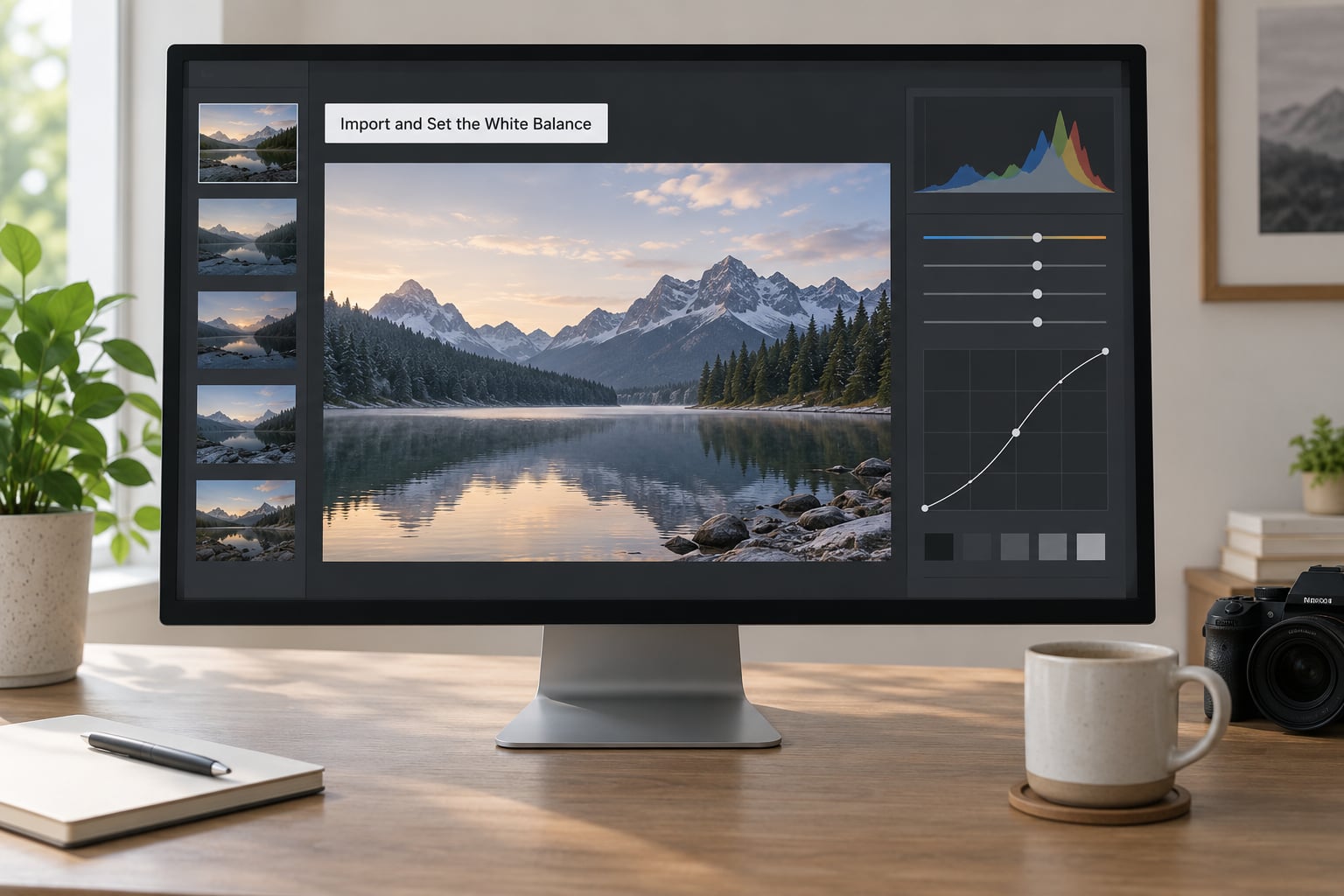
Start in the Color panel of the Basic group and switch the WB selector to As Shot so you can see what the camera recorded. Then set the Temp and Tint sliders until skin looks neutral rather than warm or green.
Click the eyedropper and choose White Balance Eyedropper, then click a patch of neutral grey or white in the frame. On a portrait that usually means clothing, a wall behind the subject, or a white collar. Click something you know was actually neutral in the scene, not something that merely looks grey.
Watch the Tint Shift and Tint controls afterwards. Older cameras and mixed indoor lighting often need a small Tint Shift to pull magenta out of the skin, and that single nudge fixes a lot of portraits that otherwise look dull.
Check the result twice: zoom in on the face for neutrality, then zoom back out for the rest of the scene. A neutral face next to a deliberately warm background is correct. A face that has gone grey because you neutralised the whole room is not.
2. Correct Exposure and the Basic Tone
With colour settled, work through the top of the Basic panel in order: Profile, Exposure, Contrast, Highlights, Shadows, Whites and Blacks. The Profile sets the tone and colour baseline for the whole file, so decide it first and live with it.
Set Exposure so the face sits in the upper-middle part of the histogram without touching the right edge. Pull Highlights down until bright skin and forehead detail holds, then lift Shadows enough to open the eye sockets and the shadow side of the face. Most portraits live somewhere around Highlights in the minus 30 to minus 70 range and Shadows in the plus 20 to plus 40 range, but the histogram decides, not the number.
Set Whites to the brightest tone you want to read as white, which on skin is usually the lit cheek or forehead highlight rather than a background highlight. Set Blacks so the darkest areas are dark but still show detail, not crushed to solid.
A quick checklist before you move on:
- The histogram has no hard pile-up against either edge.
- The face is clearly brighter than the background, or the background is brighter on purpose.
- Highlight detail survives in the skin, not just in the sky.
- Shadow detail is visible in the eyes and under the jaw.
- The black point is deep without going flat.
Hit the Backslash key to compare against the unedited version. That single shortcut catches more problems than anything else on this list.
3. Shape the Light with Tone Curve and Color Mixer
The Tone Curve is where you shape rather than correct. Click the point where the image sits in the midtones and pull it down slightly, then lift the shadows a touch, and you get contrast without the harsher look that the Contrast slider produces.
Use the Region tool to hold Alt and sample the face, then pull the region exposure down a few hundredths if the skin is reading brighter than the rest of the frame. Release Alt to stop sampling. This is the cleanest way to handle a face lit from the side.
In the Color Mixer, work one colour range at a time. Yellows usually needs a small luminance lift to keep skin from going muddy; Reds and Oranges hold skin, so treat them gently. Greens and Cyans can come down when a face sits against foliage or a blue wall, since removing that colour pulls attention back to the subject.
The limit to respect: do not push a colour range past what the original capture could plausibly have looked like. Skin that has gone grey or orange because a slider went too far will not survive any amount of careful work afterwards.
4. Create a Natural Skin Texture Edit
Over-smoothed skin is the single most common giveaway of an amateur portrait edit. The fix is not less editing. It is editing texture selectively instead of blurring it globally.
Open the Masking panel and choose Select Subject, then click the person. Lightroom builds a skin, hair, eye and clothes mask for you. To see what you are working on, hold O to show the mask overlay.
With the skin mask selected, add Texture back in small increments, usually between 10 and 25. Where skin looks soft rather than plastic, a small negative Clarity does more than Texture, but push it in increments of five and watch closely. Clarity at minus 40 on a face looks like fine skin. Clarity at minus 60 looks like wax.
Dehaze is the most dangerous of the three. A small amount, under 10, can lift a dull face. Much more than that and the pores turn to leather. Most portraits need none at all.
Shift and O lets you subtract from a mask so you can pull the effect away from eyes, lips and hair edges, which is where brush-based edits usually bleed. Finally, zoom to 100 percent and confirm you can still see pores and fine lines. Catchlights in the eyes should still be sharp points of light, not smudges.
Dark skin deserves its own note. Deep skin tones carry most of their visible detail in the midtones and shadows, so lowering Texture or Clarity at all will flatten the face. Lift Texture instead and work on the midtones, and check the edit on a properly calibrated screen where you can trust what you see.
5. Dodge, Burn, and Correct Blemishes
Spot Removal in the Develop module works in two modes. Heal samples the surrounding skin and blends it in, which suits blemishes, spots and stray hairs. Clone copies from a source point you place, which suits removing larger distractions where the heal would produce a smeared patch.
Set Size slightly larger than the blemish, raise Smoothness to around 60 for skin, and set Luminance to around 25 to 40. That combination replaces the defect while keeping a hint of the original texture. Turn on Proximity and Lightroom limits sampling to skin tones near the brush, which stops it borrowing colour from a high-contrast edge. Position the sample point on clean skin a short distance away, never on another blemish.
Click and it disappears instantly, non-destructively. Ctrl-click and drags a copy if you need to test placement first.
For shape rather than defects, dodge and burn. Select the Spot Removal brush, set the brush to Dodge, and paint a soft pass under the brow bone, along the cheekbone and down the centre of the nose. Switch to Burn and do the same under the cheekbone, in the eye sockets and under the jaw.
This changes the apparent shape of a face without touching a single pixel of real skin texture. It is slower than a slider and far harder to undo badly.
6. Enhance the Eyes Without Fake Look
Eyes sell a portrait, and they are the easiest place to overdo it. Work on one eye, zoom to 100 percent, and check the result before repeating.
Use a small Radial Mask placed over each eye. Set Feather high, around 60, so there is no visible edge. Inside the mask, lower Exposure slightly to deepen the socket, then raise the Whites just enough to lift the sclera without turning it pure white.
For the iris, use Color Range with the eyedropper on the eye colour and pull Saturation up modestly, around 15. Going higher turns brown eyes into something no person owns. A small Texture lift keeps the radial fibre detail in the iris visible instead of plastic.
If the eyes read as dull, check the catchlights before touching brightness. A catchlight that is a clean point of light does more for a face than any amount of exposure. Select Subject is the fastest route to eyes, lashes and brows, and you can then subtract with Shift and O where you need the effect to stop.
Be careful with sharpening later. Excess sharpening on lashes and iris edges creates a hard, crawling look that is much worse than a soft eye.
7. Color-Grade the Portrait Cohesively
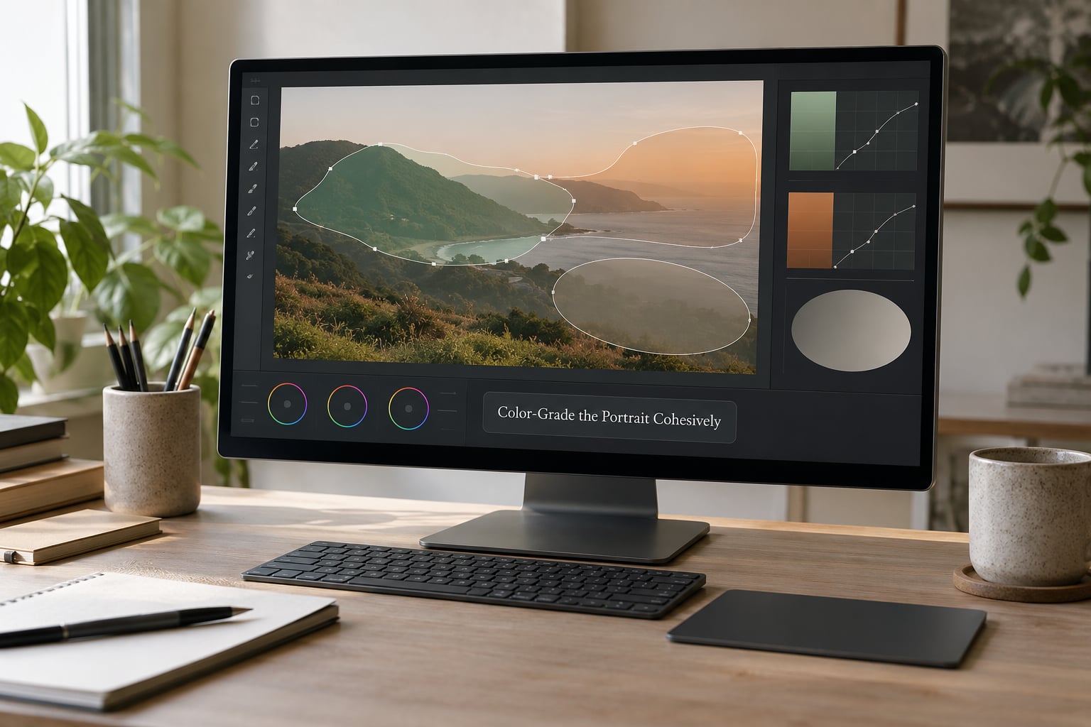
Once the portrait looks right on its own, grade it. Open the Color Grading panel and keep the changes small, because a portrait is judged on skin and skin is unforgiving.
A restrained approach is to add a touch of warmth in the midtones and a very light cool tint in the shadows, then check the face again. Most portraits need less than you think. If the grader asks you to work hard to see the change, you have probably got it right.
Calibration underneath the Color Grading panel is useful for correcting a colour cast across a whole set from one camera. Moving the Red Primary Hue shifts every skin tone in the file at once, which is why it beats pushing the Temp slider when you have 200 frames from the same shoot.
Camera matching in the profile browser can bring a JPEG in line with how you saw the scene on the back of the camera. It is worth knowing about, but treat it as a starting point rather than an answer.
For anything local, stay in HSL rather than a strong global preset. It is our guide to colour grading in Lightroom for the longer version of that process. If you want to see how a finished grade behaves on a monochrome image, the black and white editing guide covers the same panel logic from the other direction.
8. Sharpen, Add Final Contrast, and Export
Head to the Detail panel. Set Amount low, around 30 to 40, leave Radius and Detail near their defaults, and choose Sharpen Luminance in the dropdown. High sharpening on skin creates texture that looks like noise, so check the face at 100 percent before you increase anything.
Add any final contrast in the Basic panel or the Tone Curve, then view the image at fit and at full size. Full size reveals halos around the eyes and brush edges that the loupe view hides completely. Check the corners too, since sharpening always does the most work near the frame edge.
If you are not happy, Ctrl+Z is safe and instant. If you are happy, copy the settings from the adjustment panel and paste them onto the rest of the set. That is how a series of portraits stays consistent: identical values, applied once, rather than 200 individual judgements made at 2am.
For export, a sRGB JPEG at quality 90 or above works for web, social and email. For anything headed to a printer, export as a 16-bit TIFF. If you plan to composite or dodge in Photoshop, export a lossless 16-bit TIFF rather than a JPEG, since JPEG compression will start chewing on the gradients in a smooth skin tone. If you are still deciding between the two programs, our Photoshop versus Lightroom comparison covers where each one takes over.
Common Mistakes
Skin looks plastic. Clarity or Texture was pushed too far, usually globally. Reset that slider, then apply a negative Texture inside a skin mask instead of across the whole frame.
Whites are not actually white. The Whites slider is set too low or the profile is flat. Put a clipping warning on with J, and set Whites so the brightest skin hits but does not clip.
Blacks look muddy. Shadows and Blacks are both lifted. Bring Blacks down until the image has weight, then recover detail in the darkest areas with a masked Shadows adjustment rather than a global one.
Halos around eyes, lips or hair. The mask edge is too hard or the brush bled past the boundary. Add feathering, or subtract from the mask with Shift and O and paint the excess away.
The face looks over-sharpened. The Detail Amount is too high for skin. Drop it and check the face at 100 percent rather than at fit.
Skin tone went orange or grey. Colour ranges were pushed beyond the capture. Reset the Color Mixer entry for that range and use a small, masked correction instead.
Global edits where a local one was needed. Lifting Shadows globally brightens the background too. Mask the subject, work inside the mask, and keep the background where you want it.
Brush pins out of control. Too many small pins make an edit impossible to revisit. Group related pins, name them, and reset what no longer earns its place.
Two habits prevent most of this. Work non-destructively, which Lightroom does by default, and compare against the original with the Backslash key every few minutes rather than at the end. Judges on photography forums consistently describe the same failure: edits that look fine on the editing screen and fall apart on a second monitor. Step back before you commit.
Frequently Asked Questions
Should I edit portraits in Lightroom as RAW files?
Yes, whenever your camera produced a RAW file. RAW keeps the colour and tonal data the sensor recorded, which gives you far more room to move white balance and exposure before the image breaks down. That matters most on skin, where a JPEG can start showing compression artefacts and blotchy tones as you push it. Edit RAW, then export to sRGB JPEG for delivery so everyone else can open the file.
How do I make skin look natural in a Lightroom portrait edit?
Use a smaller amount of correction inside a mask than you think you need. Select the person, work on the skin mask with Texture set between 10 and 25, and keep Clarity negative but modest. The test is to zoom to 100 percent and confirm pores and fine lines are still visible. If skin reads as smooth to the point of plastic, you have gone too far and need to reset the slider rather than reduce it.
What is the best way to brighten eyes in Lightroom?
Place a soft Radial Mask over each eye with Feather high, then lower Exposure slightly to open the socket and lift Whites just enough to brighten the sclera. Add a small Texture lift to keep iris detail and a modest Saturation increase through Color Range. Keep the Whites adjustment short of pure white, and check the eyes again after sharpening in the Detail panel.
How can I make edited portraits in a series look consistent?
Finish one portrait completely, then copy the settings from the adjustment panel and paste them onto the rest of the set. Identical values applied in one action beat 200 individual judgements made late at night. Save the result as your own preset so the next shoot starts closer to finished. If your frames have different colour casts, correct those in the profile with Calibration rather than per image.
Do I need Lightroom Classic to follow this portrait workflow?
No. Lightroom for mobile and the web app cover white balance, the Basic panel, masking and export. What changes is vocabulary: Adjustment Brush became the Masking panel, Spot Removal is limited on mobile, and a few slider names differ. The order of the workflow is identical, so follow the same sequence and just look for the equivalent tool in your version. If you need dodge and burn at full strength, that is a Classic or Photoshop job.
Conclusion
Learning how to edit portraits in Lightroom is mostly a matter of refusing to skip ahead. White balance, exposure and light shaping come first because everything after them is built on top. Skin, eyes and colour come last, when the image is already balanced and a small adjustment goes a long way.
Start with those first three stages on your next portrait and stop there for one session. Most people find that the image already looks finished, and the retouching steps become a short list of small corrections rather than a rescue operation.