
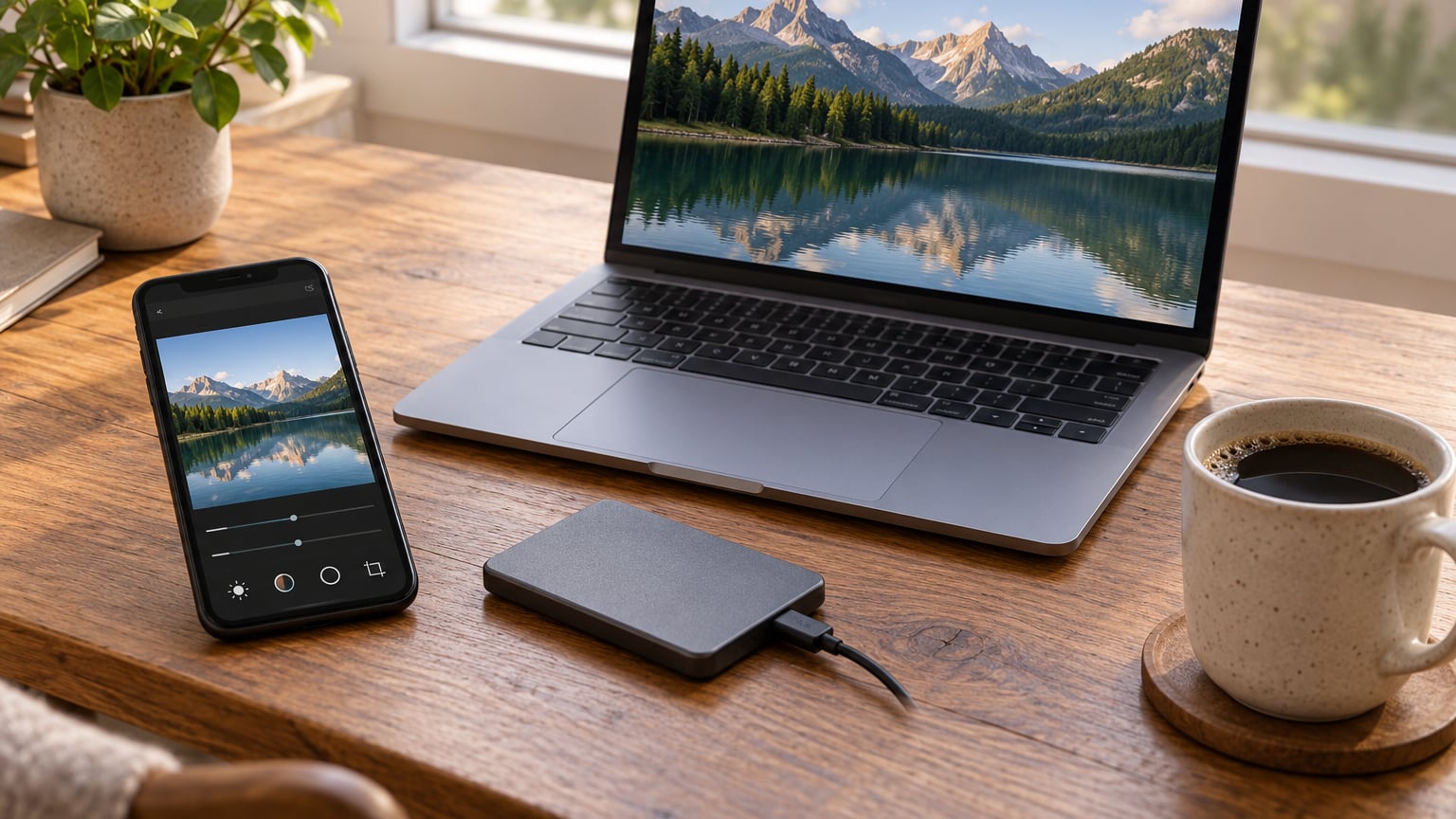
Editing photos on iPhone like a pro is mostly discipline, not gear: crop and straighten first, fix white balance, then exposure, then color, then detail, and leave the filter for last. Every edit in the Photos app is non-destructive, so the original file is never touched. Give me nine steps and about two minutes per photo, and most amateur-looking shots start to look deliberate.
What separates a good iPhone edit from a filtered one is restraint. Saturation pulled to +40, contrast cranked, sharpening added on top of noise, a horizon left three degrees crooked. That is what makes a photo look like it came out of a five-year-old phone. Professional-looking photos usually mean neutral color, straight lines and controlled contrast.
Here is the order I use every time, and the exact starting numbers to put on the sliders so you are not guessing. Adjustments are stated for the current iOS and the current version of the Photos app, since Apple moves these controls around now and then.
Table of Contents
- What You Need
- Step-by-Step
- 1. How to Edit Photos on iPhone Like a Pro Without Losing the Original
- 2. Set a Correct White Balance and Exposure
- 3. Refine Color, Contrast, and Texture
- 4. Crop and Correct Perspective
- 5. Retouch Small Distractions
- 6. Add Selective Color and Detail
- 7. Create a Consistent Creative Finish
- 8. Review the Edit at Multiple Sizes
- 9. Compare, Save, and Export the Right File
- Common Mistakes
- Frequently Asked Questions
- Conclusion
What You Need
You need very little. An iPhone on a recent iOS release with the stock Photos app handles every step below, including RAW capture, healing, selective edits and batch copy-paste. That alone covers roughly ninety percent of what people expect a paid editor to do.
Before you start, check that you have free storage on the phone. Editing a 48-megapixel ProRAW file creates several working copies, and running out of space mid-edit is the most common reason an edit gets lost.
Then decide where the work happens. The Photos editor is free, fast and non-destructive, and it is genuinely good for quick jobs. Snapseed is free, has no ads, and gives you control points, a healing brush and curves that the Photos app does not. Lightroom Mobile is the pick when you want a preset you can reuse across a whole shoot.
One honest caveat: the Photos app cannot composite layers, swap backgrounds, or add text over a photo with real typography control. When you hit one of those walls, that is the moment to move the file, not before. Details on the tradeoff are in how to batch edit photos.
Step-by-Step
1. How to Edit Photos on iPhone Like a Pro Without Losing the Original
Open the photo, tap Edit in the top right, and you are in a live preview. Nothing is written to the file until you tap Done. If you want a safety copy first, long-press the photo in the album and choose Duplicate, then edit the duplicate.
Before you touch a slider, turn off any capture format that will fight you. In Camera, Settings, Camera, Formats, set ProRAW to None if you want the smallest files and fastest editing, or keep ProRAW on if you plan heavy shadow recovery. HEIF Max captures a 48-megapixel image that gives you room to crop later.
Confirm the source is safe before moving on: reopen the photo, tap the info button, and check that the original is still there. If you ever want to go back mid-session, Revert to Original sits in the Edit menu and restores the untouched file.
2. Set a Correct White Balance and Exposure
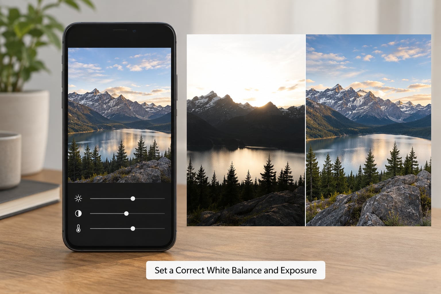
Tap the circular dial icon, which is Adjust, and swipe between the five adjustment wheels: Light, Color, Selective, Geometry and Other. Start with Light, then tap the Auto button at the top.
Auto gets you a fast baseline, then you fix what it got wrong. Watch the clipping indicators at the sides of the image: when the histogram bars turn light gray you are losing highlight detail, and when they turn dark gray you are crushing shadows. Pull Exposure back until the light gray shrinks, then raise Shadows to recover the dark gray.
Warmth and Tint live on the Color wheel, but you can correct a colour cast faster by holding two fingers on the image and dragging up or down, which moves temperature, then left or right for tint. Release and check the histogram.
Working numbers for an outdoor shot in daylight: Highlights -20, Shadows +18, Brightness +4, Black Point +4. If the sky is glowing, you shot too bright and the fix costs you detail. Next time stop the sky down with exposure compensation on the viewfinder.
3. Refine Color, Contrast, and Texture
Colour comes after light, never before, because no amount of Vibrance rescues an uneven exposure. Saturation pushes every colour equally, including skin tones, so most photos need Saturation at zero or below. Vibrance lifts the dull colours and protects the ones already strong, which makes it the safer slider. Brilliance adds midtone contrast and a little texture.
Sharpness adds local contrast edge by edge, Definition does a heavier job on hard edges, and Noise Reduction smooths grain. Order matters: reduce noise before you sharpen, or you are amplifying the very grain you are trying to remove. On a night shot, set Sharpness to 0 and Noise Reduction up. Vignette darkens the corners to pull the eye to the middle, and it should be almost invisible at full screen.
| Slider | What it does | Starting value |
|---|---|---|
| Highlights | Recovers detail in bright areas | -20 |
| Shadows | Opens up dark areas | +18 |
| Brightness | Overall lightness, midtone weighted | +4 |
| Contrast | Separates midtones | -5 |
| Black Point | Sets the deepest black | +4 |
| Saturation | All colours equally | -5 |
| Vibrance | Dull colours up, skin protected | +12 |
| Brilliance | Midtone contrast and texture | +10 |
| Warmth | Warmer or cooler | +5 |
| Tint | Green or magenta | -3 |
| Sharpness | Edge contrast | +10 |
| Noise Reduction | Smooths grain | 20 to 40 on night shots |
Different subjects need different numbers, so use these as a starting recipe rather than a rule.
| Subject | Highlights | Shadows | Brilliance | Vibrance | Sharpness |
|---|---|---|---|---|---|
| Outdoor wide scene | -20 | +18 | +10 | +12 | +15 |
| Portrait in open shade | -8 | +25 | +6 | +5 | 0 |
| Food | -12 | +15 | +8 | +15 | +8 |
| Night and low light | -10 | +35 | -5 | +8 | 0 |
Toggle between the edited view and the original with the small photo icon in the top left. That comparison is the only honest way to catch a slider you have pushed too far.
4. Crop and Correct Perspective
Crop and straighten before any tonal work, because your final frame decides where the eye lands. Tap the crop icon in the top left of the toolbar, drag a corner to reframe, then use the grid to keep verticals vertical.
The Auto straighten toggle near the bottom of the crop screen finds a level horizon by itself, which handles most scenery shots. For buildings shot upward, tap the perspective tool at the bottom of the crop screen and drag the vertical and horizontal controls until the walls run straight. Automatic perspective correction does not exist on iPhone, so this is a manual nudge of one or two degrees.
Check the crop twice: once full screen, once as a thumbnail in the Edit menu. A crop that looks balanced large often reads as badly framed small. Try to keep your crops consistent across a series, and if you want a particular film-like finish, how to make digital photos look like film covers the framing choices that suit it.
5. Retouch Small Distractions
Small fixes come last, after tone and colour, so you are not healing a sensor spot that was really a shadow problem. On supported models, tap Tools inside Edit to reach Clean Up, then tap the circle you want gone. Apple fills the gap with surrounding texture, and you can choose Fast or High Quality processing when the result matters for print.
In Snapseed the equivalent is the Healing brush: paint over the spot, keep the brush size about twice the size of the mark, and pan the image to pick clean source texture from nearby. Both tools fail the same way, which is by using them on things with recognisable structure. A healed power line through a face reads as a mistake, while a healed dust spot on a wall reads as nothing at all.
Three or four removals per photo is the ceiling for a natural look. More than that and the background stops having texture.
6. Add Selective Color and Detail
Selective edits let you change one region without touching the rest. Tap the Selective button on the Adjust screen, add a control point by tapping the image, then swipe up for Light, down for Saturation, left for Colour temperature, right for Tint. A second finger on the image moves the point, and pinching outward resizes the effect area.
A concrete case: a portrait under an awning. Add one point on the face, raise Shadows to +25 and Brilliance to +5, then add a second point on the wall behind and drop its Brightness slightly. The whole frame reads as evenly exposed because only the two zones that needed work were touched.
The same technique works for a sky. Add a point to the sky, raise Saturation to +15 and drop Brightness to -10, and the clouds separate from the foreground without touching skin tones. Two or three points is a normal working number. Past five, you are masking rather than editing, and a real masking tool in Lightroom Mobile is the cleaner route.
7. Create a Consistent Creative Finish
A creative finish is where most amateur edits go wrong, because the effect gets added because it is available rather than because the photo needs it. Black and white conversion works when the subject is defined by shape, texture or gesture. It flattens any scene where colour carries the meaning, such as food, autumn foliage or a sunset.
Split toning pushes shadows toward one colour and highlights toward another. A cool shadow and warm highlight split looks natural and cinematic; a stronger version looks like a film stock. Faded grading lifts Black Point and drops Contrast slightly, vivid grading does the opposite. Vignette belongs on portraits and street scenes where it directs attention to the centre, and rarely belongs on wide outdoor shots.
Grain is the most overused finish. Add it only when the image is being shot on a modern phone that renders perfectly clean, and add less than you want. If you are working in black and white, how to edit black and white photos in Lightroom goes deeper into tonal control.
8. Review the Edit at Multiple Sizes
Run a quick quality check before you save. Zoom to 100 percent and confirm focus, look for halos around high-contrast edges, and check that the healing tool has not left a smudge behind. Verify that no channel is clipped in the histogram and that skin or surface texture still looks like skin or a surface rather than plastic.
Look for colour casts in the shadows, especially on shots shot with third-party lenses where auto white balance has already fought back. Check the edges of the frame for distractions that a tighter crop or one heal could remove.
Then view the image at three sizes: full screen on the phone, as a small grid tile, and at print scale. Edits that hold at full screen often fall apart in a grid, where a heavy contrast boost makes a whole set look patchy. Consistency across a set matters more than any single frame being perfect.
9. Compare, Save, and Export the Right File
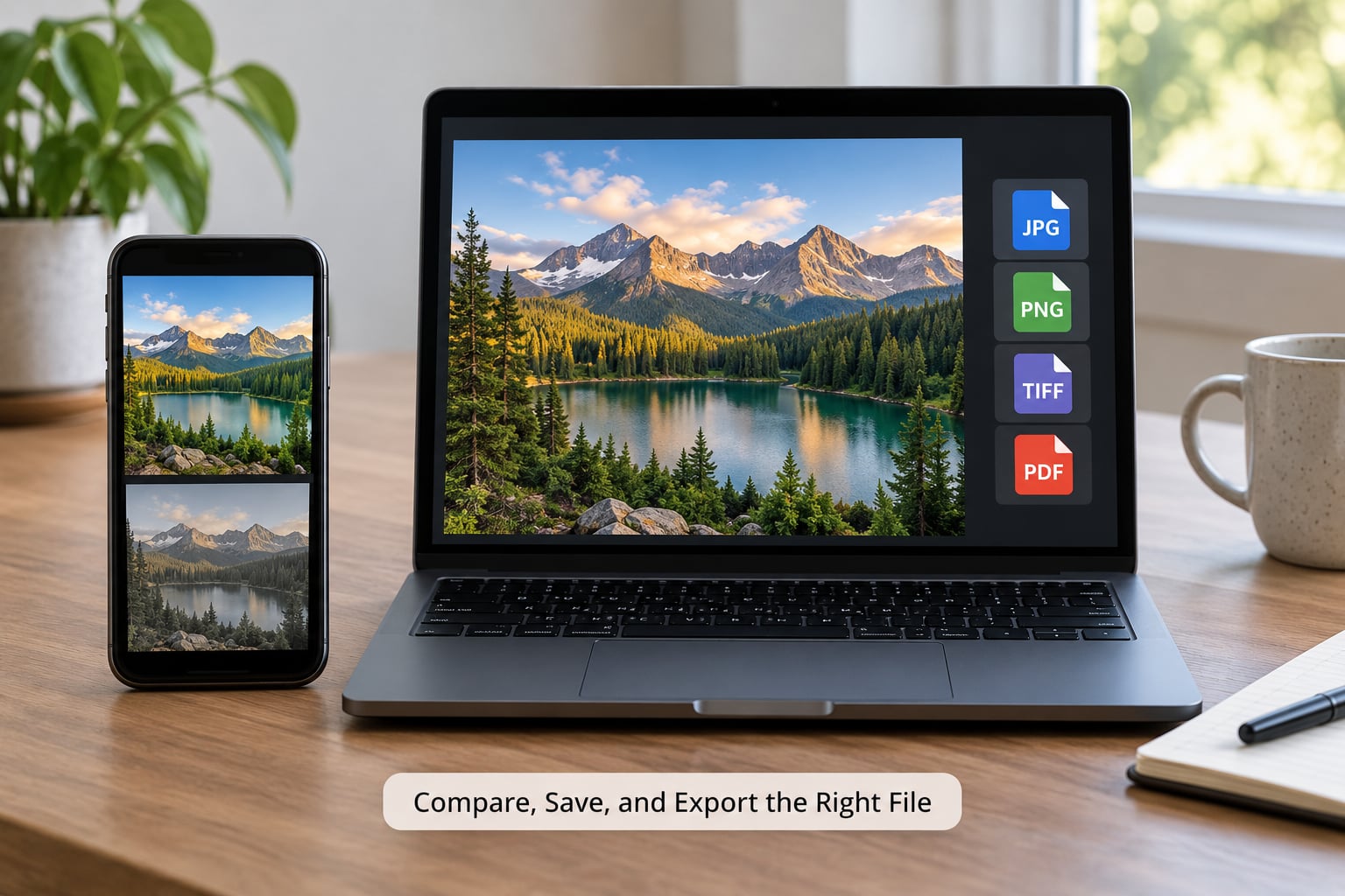
Use the original-versus-edited toggle one last time before you commit. If the difference feels larger than expected, something is overdone. Tap Done to save, and remember the edit is stored as instructions in the Photos database rather than baked into the file.
To apply the same look to other photos from the same shoot, open the finished photo, tap the three-dot menu and choose Copy Edits, then select the next photo and choose Paste Edits. It will not match perfectly across scenes with different light, so treat it as a head start rather than an answer.
For sharing, use Share, Save a Copy or Export. High Efficiency produces HEIF files that take less space and open on most modern phones and social apps. Most Compatible converts to JPEG and is the safer choice when the file is going to older software, email or a print shop.
Match the file to the destination: JPEG for social platforms and websites, HEIC as the everyday iPhone format, ProRAW when you intend to edit further and need the extra latitude, and TIFF when a lab asks for a flattened master file. See how to batch edit photos for keeping a consistent look across a full shoot.
Common Mistakes
Most of what makes an iPhone edit look cheap comes down to six habits. Each has a specific fix.
| Mistake | Why it looks bad | The fix |
|---|---|---|
| Skipping white balance | Every later colour decision inherits the cast | Fix temperature and tint before any other slider |
| Saturation above +20 | Skin goes orange and greens go electric | Saturation to zero or below, use Vibrance instead |
| Sharpening before noise reduction | Amplifies grain you were trying to remove | Noise Reduction first, then a small amount of Sharpness |
| Overhealing | Background texture turns smooth and plastic | Three or four removals maximum, small brush size |
| Inconsistent crops | A series reads as stitched together | Use the same aspect ratio and margins across a set |
| Judging at full screen only | The edit collapses in a grid or at print size | Review small, large and at 100 percent |
Two habits cover the rest. Keep the filter as the last step, because everything after a filter is fighting it. And export rather than overwrite whenever a file is going somewhere important, so the source stays recoverable.
Frequently Asked Questions
Can I edit RAW photos on an iPhone?
Yes. Turn on ProRAW in Settings, Camera, Formats, and Photos will open those files in the same editor as everything else. RAW gives you much more room to lift shadows and recover highlights than a standard capture. Open the Tools menu while editing and switch between the raw and preview versions to see how much is really being recovered.
Should I use Apple Photos, Snapseed, Lightroom Mobile, or Photomator?
Use Photos for quick work on the phone and for batch copy-paste across a shoot. Snapseed is free and ad-free, with control points, a healing brush and curves that Photos lacks. Lightroom Mobile earns its place when you want a preset you can reuse, or masking and local adjustments. Photomator suits layered, non-destructive projects on a larger screen.
Does editing an iPhone photo reduce its quality?
No. Every edit in the Photos app is stored as instructions rather than baked into the image, so the original data is preserved and the adjustments can be changed or removed at any point. Quality is only lost when you export repeatedly from an already flattened file, so export a copy instead of overwriting your source.
What is the best iPhone photo format for printing?
For prints, export a full-resolution file rather than sending the compressed version from Messages. ProRAW converted to TIFF gives a lab the most latitude for large prints, while JPEG at maximum quality works for smaller prints. Set Most Compatible in the export options, and check the shop wants sRGB before you upload.
How do I stop my edited photos from looking overprocessed?
Compare against the original after every two or three sliders and stop as soon as the difference stops improving the image. Most overprocessed shots have the same causes: Saturation far above zero, heavy Contrast or Brilliance, sharpening applied on a noisy night photo, and a filter added before the tonal work was finished.
Conclusion
Start by protecting the original, then correct white balance and exposure before anything else, and save a restrained first version at that point. Only then add detail, selective work and any creative finish. Two disciplined minutes beat twenty minutes of slider hunting.