
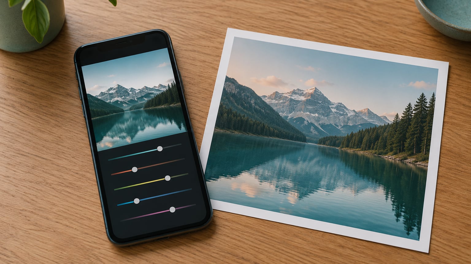
Lightroom Mobile is Adobe’s free editor for iPhone and Android, and knowing how to edit photos in Lightroom Mobile takes about five minutes once you know the order. Open a photo from your library, tap Edit in the bottom toolbar, crop first, then fix light, then color, then detail, and export when you are done. The same panel names and slider logic carry straight over to desktop Lightroom, so nothing you learn here is wasted.
What makes the app worth the effort is that editing is non-destructive. Your adjustments sit on top of the original file rather than baked into it, so you can dial a value up, hate it, and reverse it as many times as you want. The trick most beginners miss is order: you end up fighting yourself if you crank clarity before you have balanced the exposure, or if you crop after you have already tuned the colors for a frame that is about to change.
I keep coming back to a single habit that costs nothing. Before you touch a single slider, hold your finger on the photo and pull the exposure to each end. That trick shows you exactly where the highlights blow out and where the blacks crush, and it takes five seconds. Almost every bad edit I have seen started because nobody checked those two edges first.
Table of Contents
- What You Need
- Step-by-Step: How to Edit Photos in Lightroom Mobile
- 1. Import and Select the Photo You Want to Edit
- 2. Crop and Straighten the Image
- 3. Set the Overall Tone and White Balance
- 4. Refine Color and Detail
- 5. Add Selective Adjustments for Creative Effects
- 6. Apply Presets or Make a Consistent Look
- 7. Use Healing, Clone, or Other Detail Tools
- 8. Save or Export Your Edited Photo in Lightroom Mobile
- Common Mistakes and How to Fix Them
- Frequently Asked Questions
- Conclusion
What You Need
You need a reasonably recent iPhone or Android phone, the Lightroom Mobile app, and a photo already in your camera roll or in the Lightroom library. That is genuinely the whole list. If you have edited in any other app before, you will pick this up faster, but there is no prerequisite skill.
Two things vary and confuse people more than anything else in this guide. First, menu names shift between app versions and between iOS and Android, so if a panel is not where I say it is, look for the tool name rather than the exact label. Second, several tools are subscription-gated and simply are not visible on the free tier: masking and selective adjustments, the healing brush, the color mixer, tone curve, and RAW editing.
Being upfront about that matters. I would rather you know which tools need a plan before you spend twenty minutes hunting for a brush that was never there.
Step-by-Step: How to Edit Photos in Lightroom Mobile
Here is the whole workflow in one paragraph: open the photo, crop and straighten, set white balance and exposure, refine color and detail, add selective adjustments where the image needs them, apply a preset if you want a consistent look, clean up distractions, then export a copy to your device. Every step below explains what to tap and how to tell it worked.
1. Import and Select the Photo You Want to Edit
Open Lightroom Mobile and you land in the library, where imported photos sit. If your photo is still only in the device gallery, tap the plus button at the top and pick it from there, which copies it into the Lightroom library so the app can edit it.
Tap the thumbnail to open it, then tap Edit in the bottom toolbar. That single tap is the answer to the most common beginner question, and it is worth saying plainly: there is no separate editor to launch. If you cannot find Edit, the photo is probably still syncing or is a format the app has not finished importing.
Pinch to zoom in on the preview if you want to judge detail on a larger view. Keep the original untouched somewhere safe. Lightroom never writes over it, but exporting repeatedly to the same filename on your phone can quietly replace earlier versions, so I export with a date suffix in the filename.
2. Crop and Straighten the Image
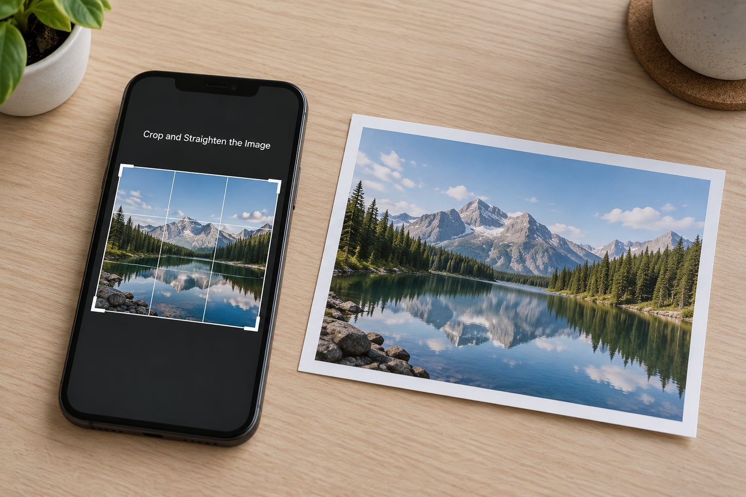
Tap the Crop and Straighten icon at the bottom of the edit toolbar, then choose an aspect ratio or leave it on Free. Drag the edges to frame the shot, and use the straighten grid to level a horizon that is off by a degree or two.
Crop first for a practical reason. Every extra slice of frame means the software is working with less data, and it also forces you to decide what the photo is about before you start making it look nice.
The ratios you will actually use:
| Ratio | Where it fits | Note |
|---|---|---|
| 4:5 | Instagram feed | Tallest portrait that survives the feed uncropped |
| 1:1 | Square posts, profile grids | Safe when the subject is centered |
| 16:9 | Stories, Reels, landscape screens | Wide crops, mind the edges |
| Original | Archive prints, desktop viewing | No framing decisions to regret later |
Check the corners of the frame before you hit apply. Cut a foot off someone’s boot and no amount of good color work will save the shot. On a beach shot I once cropped a friend’s hand halfway out of frame and did not notice until they mentioned it three days later.
3. Set the Overall Tone and White Balance
Open the Light panel. This is where the histogram lives, and it is the panel you will use longest.
Start with white balance, because everything you judge afterward depends on it. Warmth shifts the image from blue to orange, and Tint pushes it from green to magenta. The eyedropper picks a reference straight from the photo, which on a portrait means tapping a patch of neutral skin. Most indoor shots need warmth up and tint down a touch, and most overcast outdoor shots need the opposite.
Then Exposure. Move it until the image feels right rather than until it feels bright. Pull the Highlights slider down to recover bright windows and skies, push Shadows up to open the areas the sun never reached, and use Blacks and Whites to set how deep the darks go and how hot the brightest points burn.
Here are the starting values I use, before any judgment call:
| Slider | Starting point | What it fixes |
|---|---|---|
| Exposure | +0.3 to +0.5 | Slightly dull files from a phone camera |
| Highlights | -30 to -40 | Blown windows, bright skies, hot skin |
| Shadows | +20 to +35 | Blocked faces and dark foregrounds |
| Contrast | +10 to +20 | Flat, hazy-looking frames |
| Whites | -10 to +10 | Muddy or chalky brightness |
| Blacks | -10 to -20 | Gray, lifted shadows |
| Warmth | Match the scene | Blue cast indoors, yellow cast outdoors |
| Vibrance | +15 to +25 | Colors that read as lifeless |
| Sharpening | +15 to +25 | Softness after a crop |
Contrast is the slider people push too far. It deepens shadows and brightens highlights at once, so pushing it before you have set Exposure usually just makes a flat photo look harsh. Set exposure, then contrast.
4. Refine Color and Detail
Stay in the Light panel for the white balance sliders, then move to Color. Vibrance is the one to reach for first. It lifts colors that are already muted and leaves the ones that are already strong alone, so skin tones survive. Saturation pushes every color at once, and that is how beginners end up with orange skin and neon grass.
My rule: vibrance up, saturation almost never. If a single color is off, the color mixer on a paid plan is the right tool rather than more saturation. When the picture still looks tired after that, the problem is usually light, not color, so go back and check exposure before adding any more.
For structure, the Effects panel holds Texture, Clarity, and Dehaze. Texture adds local contrast and holds up under heavy resizing. Clarity is global midtone contrast and it is the one that goes crunchy fast, so think fifteen, not fifty. Dehaze is for atmosphere: it strips haze from a distant landscape and does nothing useful to a close-up portrait.
The Detail panel is where you give the file back the crispness a crop took. Add a little sharpening, then add matching noise reduction, because sharpening amplifies the grain along with the edges. The rule I use: sharpening first, noise reduction second, and if grain appears, you went too far on the first.
Not sure whether an edit improved the photo? Tap the Edit icon again to flip between before and after. If you cannot tell the difference, you have probably done enough.
5. Add Selective Adjustments for Creative Effects

Global sliders treat every pixel the same. When a backlit portrait leaves a face dark and a sky bright, no amount of global work fixes both, which is where masking comes in. Tap the Masking or Selective tool, choose a pin, radial gradient, or brush, and the adjustment affects only the area you select.
A concrete example: place a pin on your subject’s face, drop exposure to -0.4 and warmth to -6, and the face warms up while the landscape stays cool. That warm subject against cool background is the single most useful trick in this app for a creative look.
Placing a pin is fiddly at first. Drag up or down on the pin to resize the circle, use the handles to feather the edge, and slide the whole pin to move it. Tap it to reopen the adjustment, use the eraser to remove part of a gradient, or duplicate it to build a second variation without starting over.
One warning that has saved me more than once: when you are zoomed in, a one-finger swipe draws an adjustment instead of panning the image. Use two fingers to move around while zoomed.
6. Apply Presets or Make a Consistent Look
Tap Presets to browse looks, tap one to apply it, then pull the intensity slider down until it sits under the image rather than on top of it. A preset applied at full strength usually needs a serious global correction afterward, and at that point you might as well not have used it.
Presets and profiles are not the same thing, and the confusion is worth one sentence. A preset replaces your slider values. A profile layers a look on top of whatever you have already done, which is why profiles are safer when you want a consistent style across a whole shoot.
For a fine-art or black and white treatment, tap the color icon under Presets and pick a black and white option, then work from there. Check skin tones right after. A conversion that clips a channel turns light skin grey and blotchy, and no vibrance slider will bring it back. For a deeper look at monochrome, read how to edit black and white photos in Lightroom.
If you want a consistent color treatment rather than a stock look, the tone curve and the color grading workflow in how to color grade photos in Lightroom are the next step up from sliders.
7. Use Healing, Clone, or Other Detail Tools
Healing and clone live under the More or detail tools menu. Heal samples the surrounding area and blends it in, which is what you want for small distractions: a bright spot on a wall, a sensor mark, a thin power line. Clone copies pixels from the point you tap, which handles larger texture, but it can smear if you use it alone.
For a big distraction, the order matters. Run Heal first to remove most of the object, then Clone over the leftover edge to blend the texture. Users who try Clone first usually end up with a visible smudge, and I have made that mistake more than once.
Keep the brush small, drop the opacity and softness so the strokes blend, and zoom in to check the result. These tools are on a paid plan. And they are the wrong tool for anything meaningful: once a person, a landmark, or evidence of what you saw is removed, the photo is no longer a record of it.
8. Save or Export Your Edited Photo in Lightroom Mobile
Last is the finishing pass, kept deliberately small. A touch of grain can hide banding in a flat sky, and a slight vignette pushes the eye toward the center. Blur belongs on backgrounds behind a subject, applied through a mask, not across the whole frame.
Then compare with the original, and export. Tap the share icon in the top corner, choose Export or Save a Copy, pick your target size, and choose the maximum available quality if you want to keep the full detail. Exporting to your camera roll creates a separate JPEG that lives in your Photos gallery. Your Lightroom edit stays in the Lightroom library with all its reversibility, and nothing in the app overwrites your camera roll original.
To carry a finished look across a whole shoot, edit one photo properly, long-press its thumbnail, tap the copy settings icon, then select the other photos and paste settings. That is how you apply one correction to twenty frames without touching twenty sliders, and it is the single biggest time saver in the app.
If an export seems to fail, with a spinner that never resolves and no file in your gallery, do these in order: check that your device storage is not full, confirm the app is updated, force the photo to finish syncing by opening it in the editor, and try exporting to a different folder. A full phone is the cause more often than anything else, and it is also the easiest to fix.
Common Mistakes and How to Fix Them
Over-editing everything at once. The fix is to make one change, look at the before, then make the next. If you cannot tell what a slider did, it was too small to matter or too large to keep.
Skipping the crop. A tighter frame fixes more than three sliders combined, and doing it last means you tuned colors for a composition you already abandoned.
Pushing clarity to 60 or more. That is what makes a photo look cheap. Keep it under 20 and let Texture carry local detail instead.
Using saturation for a dull image. Switch to vibrance. If a single color is wrong, the color mixer fixes that one color instead of wrecking the rest.
Trying to fix a local problem globally. Backlit faces, dark corners, and bright skies need a mask, not more exposure. Global edits on those photos flatten everything else.
Living inside presets. Apply a preset at reduced intensity, then adjust it. Accepting one unchanged usually leaves you with a look that belongs to someone else’s photo.
Exporting too small. A heavily compressed or resized export cannot be sharpened back into shape later. Export at the largest sensible size, and resize after.
Editing on a bright screen in a bright room. Turn brightness down to about half and work in neutral light if you can. A dim room with a bright screen is the worst combination for judging color, and it is why the same edit looks flat in the morning and punchy at night.
Two finishing touches that help more than any single slider: fix your phone habits before you edit, because no amount of processing rescues a soft or badly exposed frame. And keep your catalog tidy, because finding the right frame is half the work. I use the workflow in how to organize photos in Lightroom to keep shoots separated from the day they were shot.
Frequently Asked Questions
Is Lightroom Mobile free to use?
Yes for the core editor. The free tier includes crop and straighten, the full Light panel, the Color panel with temperature, tint, vibrance and saturation, basic Effects and Detail sliders, and a set of built-in presets. The tools people ask about most, including masking and selective adjustments, the healing brush, the color mixer, tone curve, RAW editing, and the full preset library, sit behind an active Adobe Photography plan. Check the app for current plan details, since Adobe changes what is included.
Does Lightroom Mobile save edits to the original photo?
No, and that is the point. Lightroom stores every adjustment as a non-destructive set of instructions layered on top of your file, so nothing is written into the original. You can reverse or delete any single change at any time, and the source file stays exactly as your camera produced it. To get a shareable flattened version, you export a copy to your camera roll, which creates a separate JPEG and leaves the layered edit untouched in the library.
How do I export an edited photo from Lightroom Mobile?
Tap the share icon in the top corner of the editor, choose Export or Save a Copy, then select your format, size and quality. Pick the maximum available quality if you want to preserve detail, especially after a crop. If the export seems to stall, check that device storage is not full, make sure the app is up to date, and wait until the photo has finished syncing before trying again. Saving inside Lightroom and exporting a copy are two different things and you will want both at different times.
Can I use presets in Lightroom Mobile?
Yes, though the free tier includes a smaller built-in set. A preset applies a whole look in one tap, and the intensity slider lets you dial it back so it sits under your image instead of on top of it. Presets and profiles behave differently: a preset replaces your slider values, while a profile layers a look on top of an edit you already made. For a consistent style across a whole shoot, profile-style layering is the safer choice.
How do I edit photos in Lightroom Mobile without losing quality?
Work non-destructively, which is Lightroom’s default, and export at the largest sensible size. Most of the loss people notice comes from exporting small, heavy compression, or sharpening hard enough to ring edges. Add a little sharpening, then a matching amount of noise reduction so you are not amplifying grain. If you need several sizes, export from the layered edit each time rather than re-editing an already compressed file.
How do I undo changes in Lightroom Mobile?
Use the undo arrow in the bottom toolbar to step backward through your edits one at a time, and redo to step forward again. The Edit toggle in the same toolbar flips between the original and the current version so you can compare at any moment. One thing to know: once you confirm an adjustment by tapping the checkmark, an erased piece of a gradient cannot be brought back individually, so undo is your only route. That is the one place the app gives you no second chances.
Conclusion
Getting comfortable with how to edit photos in Lightroom Mobile comes down to order. Start with the crop, then set white balance and exposure, then color and detail, and only then reach for masks, presets, or healing. Most photos are finished before you touch anything in that last group, and the ones that need it will tell you so plainly once the light is right.