
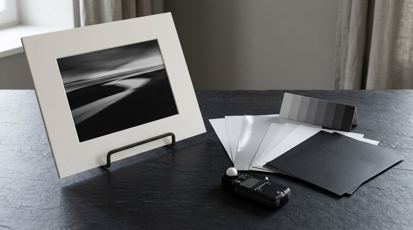
If you want one honest answer: a 300gsm baryta paper such as Hahnemuhle FineArt Baryta, or a 310gsm cotton rag such as Canson Platine Fibre Rag, gives you the deepest blacks and the smoothest shadow gradation a modern printer can produce. Matte rag wins when you want softness and zero glare. Gloss and lustre sit in between.
The reason there is no single winner is that paper does two jobs at once. Its coating and fibre decide how much ink the surface can hold, which is what sets how dark your blacks go. Its surface finish and base tone decide how light bounces back at you, which is what you read as contrast, sharpness and mood. Get either one wrong and a good file prints flat.
This guide compares the four families of monochrome paper, how brightness and weight change the result, and how to match a sheet to your printer. I have printed the same frame on gloss, lustre and matte for years, and the difference is easier to see than most guides make it sound.
Table of Contents
- What Paper Is Best for Black and White Prints?
- What Are the Main Types of Black and White Photo Paper?
- Glossy vs. Matte Paper for Black and White Prints
- How Paper Brightness, Whiteness, and Contrast Affect the Image
- Baryta vs. Cotton Rag Paper: Which Is Better?
- How to Choose Paper for Your Printer and Print Workflow
- How to Prepare a File for the Best Black and White Paper Choice
- Frequently Asked Questions
- Is glossy paper best for black and white photography?
- Should black and white prints be printed on warm or cool paper?
- Is baryta paper better than glossy paper?
- What paper is best for black and white portraits?
- Do I need an ICC profile to print black and white photos?
- How much does good black and white photo paper cost?
- Conclusion
What Paper Is Best for Black and White Prints?
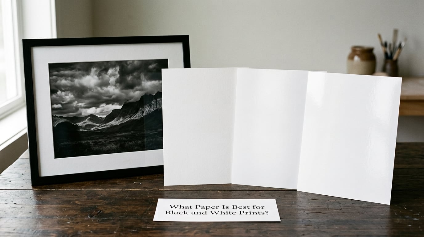
Three answers, depending on what you are making. For exhibition-grade monochrome with dramatic blacks, use a baryta-coated fine art sheet at 300gsm or heavier. For a soft, museum-like look that reads as traditional darkroom output, use a matte cotton rag. For maximum microcontrast, snap and vibrancy on a large or punchy image, use a glossy or lustrous resin-coated sheet.
Beyond finish, the practical variables are paper weight, base tone, fibre content and printer support. A 300gsm sheet at 24 inches wide needs a different handling plan than a 190gsm A4 sheet, and a rag paper will only reach full black density if your profile and driver setting match it.
Quick rules if you don’t want the whole picture
Deep blacks and low-key drama, go baryta or gloss. Portraits and skin tones, go matte or a smooth satin rag. Framing under glass, avoid gloss because reflections will fight the image. Large prints, start at 310gsm so the sheet hangs and handles properly. Test prints, order a sample pack rather than guessing from a screen.
What Are the Main Types of Black and White Photo Paper?
Four families cover almost everything you will print on. They differ in the base (fibre or resin), the coating that receives the ink, and the surface you end up looking at.
| Paper type | Surface | Tonal character | Contrast | Permanence | Best for |
|---|---|---|---|---|---|
| Resin-coated gloss | High gloss, smooth | Very deep blacks, hard highlight separation | High, slightly punchy | Good with pigment ink, less with dye | Small sharp prints, high-contrast work, prints not framed under glass |
| Resin-coated lustre or satin | Satin sheen | Deep blacks with softer highlights | High but forgiving | Good with pigment ink | General display prints, portraits, anything going behind glass |
| Baryta fine art | Smooth, gloss-like, no paper fibre | Highest maximum density, wide tonal range | Very high, adjustable | Excellent, rated for exhibition prints | Large exhibition monochrome, low-key and dramatic images |
| Matte or satin inkjet | Matte, micro-texture | Open shadows, gentler blacks | Medium, can look flat if pushed | Excellent, no optical brighteners on good stock | Portraits, high-key images, framed and gallery display |
| Cotton rag fine art | Matte, sometimes textured | Soft gradations, slight fibre sparkle | Medium to high, controllable | Excellent, acid- and lignin-free | Portfolios, archival work, tactile fine art presentation |
Resin-coated papers are plastic film with a pigment-receiving layer, which is why they are cheap, fast-drying and glossy. Baryta papers are a resin layer over a fibre base, so they behave like photographic paper but print digitally. Cotton rag is pure fibre with a matte coating, usually 100 percent cotton or a cotton-alpha-cellulose blend.
One more category worth knowing exists for people printing at home: papers formulated to look like traditional darkroom stock, such as the Ilford MG FB and Kentmere ranges. They carry a visible base tone and a deliberately soft tonal curve. Print a correct digital conversion on them and it will look over-inked, because their own contrast is already built in.
Glossy vs. Matte Paper for Black and White Prints
Neither wins outright. Gloss raises microcontrast and reflects specular light back at the viewer, which makes the image look punchier. Matte scatters that light, which lowers glare, softens the surface and gives a more traditional tonal feel. Photographers on photography forums overwhelmingly describe matte or fine art rag as the most reliable darkroom-like look, and that is the consensus worth trusting for portraits and everyday framing.
Gloss: maximum contrast, maximum glare
Gloss holds the most ink in one place, so D-max, or maximum density, is high and blacks read as genuinely black. Fine detail and edge contrast look excellent because the surface is optically flat. The trade-off is reflection. Under museum glass or a picture light, a gloss print can end up with a bright window reflection sitting across the midtones, which is the single most common reason people move off gloss.
Lustre and satin: the practical middle
Lustre, satin and pearl are the same idea at different gloss levels. They keep a high maximum density while cutting the reflection to something you can photograph or hang without trouble. For most people printing a portfolio of work that will be framed and looked at in mixed lighting, lustre is the safest choice on the photographic side of the range.
Matte: soft, quiet and glare-free
Matte spreads ink across a textured microporous layer, so highlights stay open and shadows stay visible even in flat light. The cost is peak black: the darkest tone a matte sheet can reach is usually less deep than baryta, so a very low-key image can look washed out or grey rather than dramatic. Forum reports of low-key work going flat on matte match exactly what the coating does. If your image is mostly shadow, either use gloss or baryta, or raise contrast and lift the black point on the matte surface specifically.
Textured rag is a different question again. A pronounced texture masks dust spotting, which matters if you retouch, but it also breaks up fine detail and can make smooth skin tones look blotchy. For portraits, choose a smooth or fine-textured rag rather than a heavily textured one.
How Paper Brightness, Whiteness, and Contrast Affect the Image
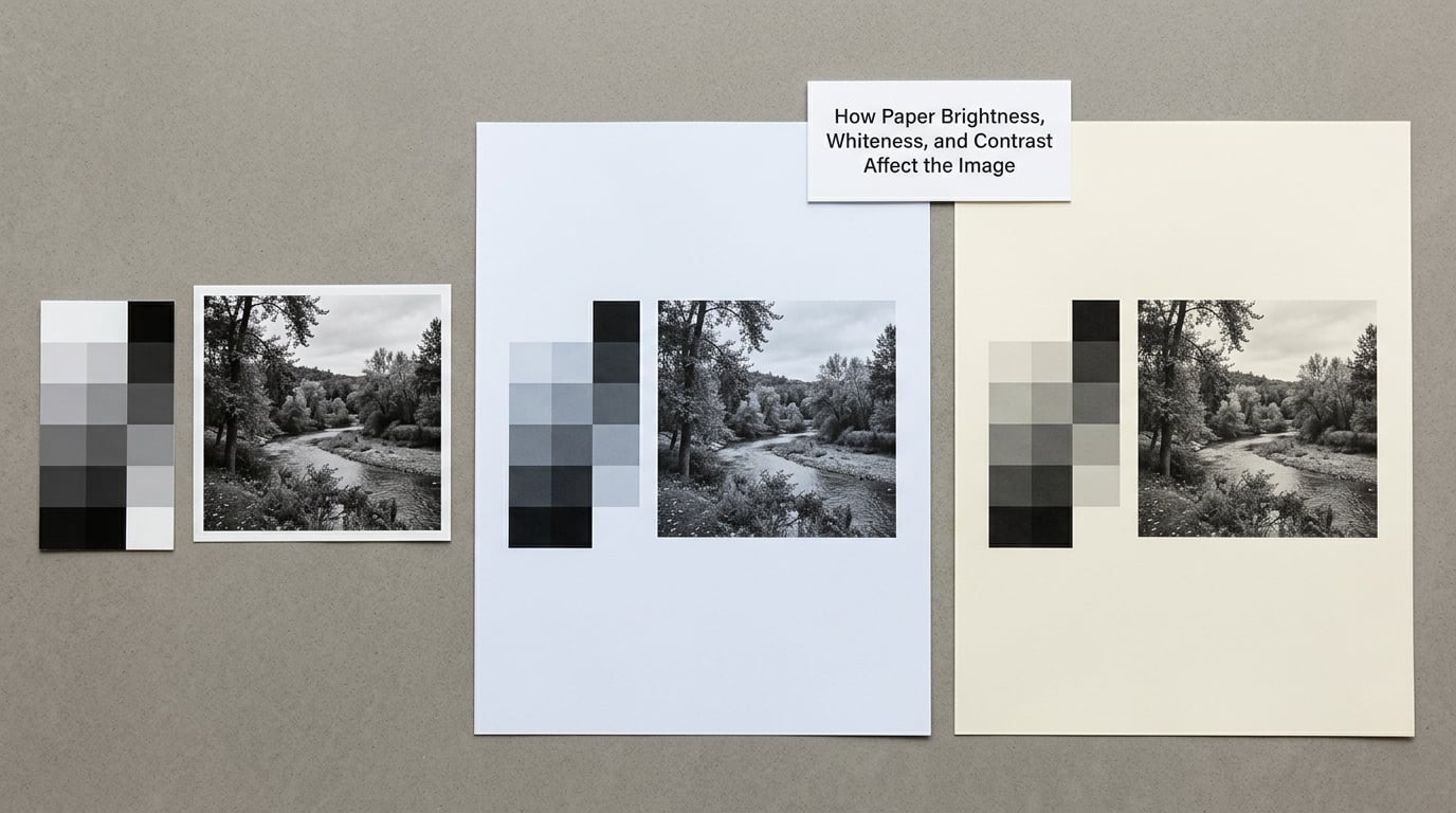
Paper brightness is not the same thing as monitor or scanner brightness, and mixing them up causes most of the disappointment people report. Paper brightness describes how white the blank sheet is. Optical brighteners, chemical additives that fluoresce blue under daylight, push that whiteness higher. A brightener-treated sheet looks crisper in daylight and can drift warm in daylight-balanced tungsten light, and that warm shift reads as a paper tone, not a printing error. Good fine art papers are made without optical brighteners for exactly this reason.
Paper tone is the underlying colour of the base, usually described as neutral, warm or cool. Neutral keeps grey objects grey. Warm paper pushes neutral greys toward cream and adds a pleasant warmth to skin. Cool paper pushes greys toward blue and, in a monochrome print, a cool base can look like a colour cast that is impossible to remove later because the ink has already settled into the paper.
Contrast in a print is really three things working together: your file, the ink density the paper can hold, and the whiteness of the base where the paper has taken no ink at all. Raise the base white and the image looks more luminous. Raise maximum density and it looks heavier. Most guides talk about a dynamic range, which simply means the number of distinguishable tones between the brightest white and the darkest black the combination can hold.
Paper weight (gsm) and print size
Weight matters less for tone than people expect and more for handling, framing and longevity. A heavier sheet hangs flat, resists curling in a dry room, takes a mount or dibond backing without flexing, and is far less likely to crease when handled. The rule of thumb most print labs use: heavier as the print gets bigger.
| Print size | Minimum gsm to consider | Typical handling | Framing approach |
|---|---|---|---|
| A4 / 8 by 10 inch | 180-250gsm | Standard sheet handling | Standard mat and frame, glazing optional |
| A3 / 11 by 17 inch | 250-310gsm | Two hands, flat surface | Float mount on 310gsm rag or baryta |
| A2 / 16 by 20 inch | 310gsm | Support both edges when moving | Float mount or dibond; avoid full glazing glare with gloss |
| 24 inch and larger | 310gsm, museum-grade | Two people, flat storage only | Dibond or face-mount; full framer, acid-free backing |
Above about 24 inches, consider a rigid or semi-rigid mounting rather than a hanging sheet. A 310gsm rag at 40 inches will droop in a frame over time, and the top edge takes the most weight. This is a handling fact, not a quality one, but it decides how long the print looks good on a wall.
Baryta vs. Cotton Rag Paper: Which Is Better?
Baryta is the better choice for smooth photographic realism, cotton rag is the better choice for tactile fine art presentation. Neither is a downgrade from the other, and printers differ in how far they can push each one.
Baryta gives you the highest maximum density of the common fine art surfaces, so blacks stay black and a wide tonal range comes through with very little brushwork or grain. The surface is optically smooth with no visible fibre, which makes it look like a traditional black and white photograph rather than a piece of paper. It is also less forgiving: dust on the surface is visible, and any sharpening you apply is rewarded with crisp edges. The trade-offs are cost per sheet, a surface that shows fingerprints, and a need for a matching profile that assumes a smooth surface.
Cotton rag gives you a matte surface with visible or semi-visible fibre, and the ink settles into that texture rather than sitting on top of it. Tonally it is a touch softer, and you will work slightly harder to reach the same perceived density, which many people prefer because the result looks less clinical. Rag sheets are the standard choice for portfolios and archival work, and the fibre is usually 100 percent cotton or a cotton and alpha-cellulose blend, acid-free and lignin-free. A widely referenced specification is 100 percent cotton at 308gsm, as on Hahnemuhle Photo Rag.
Printer compatibility matters more than most comparisons admit. Some consumer printers cannot lay enough ink on a heavy rag to reach the density you calibrated for, and the result looks milky. Baryta is generally easier to drive hard because the coating is more uniform. A dull image is far more often a wrong driver setting than a bad sheet.
What Paper Is Best for Deep Blacks: Baryta or Rag?
Baryta, without much argument. Its coating holds a higher density per unit area, so the same file and the same ink load lands you deeper blacks with a cleaner falloff into the shadows. Choose cotton rag anyway if you want the matte look, if you are producing editions where the tactile surface is part of the piece, or if your printer handles rag better than it handles baryta. Most working printers keep both on the shelf and decide per image.
How to Choose Paper for Your Printer and Print Workflow
Start with the supported media list, not with the paper catalogue. Every printer has a menu of paper types and a maximum sheet size, and a sheet outside that list will print soft, banded or dull no matter how good it is. Check the maximum sheet size before you fall in love with a 24 inch roll; plenty of capable printers stop at 13 by 19 inches, and a 13 by 19 is still a serious print size.
Then check the ink. Dye-sublimation printers are a different world: they transfer dye to a coated surface and can produce beautiful, stable colour and monochrome, but they are not a general-purpose fine art workflow. Pigment inkjet is the standard for fine art, and pigment on baryta or rag is the combination with the best archival record. Print life figures attached to fine art papers typically run from 85 years up, while ordinary photo paper is usually quoted far lower, so permanence is one of the strongest arguments for moving up a tier.
Driver paper type matters more than most people expect. If you select a glossy setting while printing a matte rag sheet, the printer under-inks the surface to avoid gloss artefacts, and your blacks come out light and lifeless. That single mismatch is the usual cause of the pale, flat monochrome prints people complain about. Select the paper setting that matches the surface you actually loaded, even if the driver label is a generic word like Matte Photo Paper or Premium Luster.
Beyond that, profiles do the real work. A manufacturer profile for the specific paper is a decent starting point, but a custom profile built from your own test chart on your own printer, in your own lighting, is what gets you a neutral black. Once you have it, calibrate for the paper rather than for brightness. If a blue or grey cast shows up in neutral areas, the fix is in the profile or the driver setting, not in the paper you chose.
How to Prepare a File for the Best Black and White Paper Choice
Prepare the file, not the paper. The sheet decides the surface, the file decides the tone, and a tone set for gloss will be wrong on matte. Six steps, in order.
1. Calibrate the monitor first. Every judgement you make before this point is a guess. A decent hardware calibrator and a short warm-up is the cheapest quality step in the whole process.
2. Work in a space with room for a neutral conversion. A wide-gamut RGB working space, such as ProPhoto RGB or Adobe RGB, gives you more separation to work with than sRGB. If your editing software only offers sRGB, that is workable, just plan for a narrower tonal range in the highlights.
3. Convert with a black-and-white tool that lets you control channel mixing. Auto-contrast is a starting point, not an answer. Set the black point and white point deliberately, and check that neutral greys stay neutral.
4. Apply output sharpening, and not much of it. Output sharpening compensates for the spread of the ink into the coating. Use a small radius, a modest amount, and check the result on the actual surface, because baryta and matte rag respond differently to the same setting.
5. Make a test print at small size. Print the same image on gloss, lustre and matte if you can afford it, then look at all three under neutral daylight rather than the light in your room. Many hobbyists keep exactly this habit, and it is the fastest way to find out what your own eye prefers.
6. Evaluate the surface, not the screen. Judge shadow separation, whether the whites are clean, whether the surface texture fights the detail, and whether the deepest tones look dense. Only then adjust, and adjust for that paper. Sample packs and swatch books are worth more than any spec sheet, because a paper’s real character is in the surface.
Frequently Asked Questions
Is glossy paper best for black and white photography?
For maximum microcontrast and the deepest blacks, yes. Gloss and baryta surfaces hold more ink in one place, so a correctly converted file looks punchier and more three dimensional. Gloss also reflects, so a framed print can catch window glare across the midtones. For a low-key portrait or a dramatic outdoor frame, glossy is usually the right pick.
Should black and white prints be printed on warm or cool paper?
Neutral is safest if you want grey objects to read as grey. Warm paper adds a gentle cream cast that flatters skin tones and works well for portraits and archival fine art work. Cool paper sharpens the sense of contrast but can introduce a blue cast that reads as a printing error. Avoid optical brighteners, which shift colour as the lighting changes.
Is baryta paper better than glossy paper?
Baryta is usually better if your printer can drive it. It reaches a higher maximum density, holds a wider tonal range and gives you a smooth surface with no paper fibre, so it looks more like a photographic print than a sheet of art paper. Glossy resin-coated paper is cheaper, more widely available and easier to print on a desktop printer, and it delivers punchy blacks in a lighter frame.
What paper is best for black and white portraits?
Matte or a smooth satin cotton rag at 300gsm or heavier. It gives you a glare-free surface under glass and a soft, natural tonal feel in skin. Avoid heavily textured rag, which can make smooth complexions look blotchy, and avoid a high-gloss finish that will show fingerprints and window reflections. Print a small test on two finishes before committing to a large sheet.
Do I need an ICC profile to print black and white photos?
You need something that tells the printer how this ink on this paper behaves. A manufacturer profile for the exact paper is a workable start. A custom profile built from a test chart, on your printer, viewed under controlled light, is what gives you truly neutral blacks. Many printers also offer monochrome or black-and-white printing modes, which are worth testing before building a full profile.
How much does good black and white photo paper cost?
The spread is wide, so judge it by tier rather than by sheet. Standard resin-coated photo paper sits at the bottom, matte inkjet in the middle, and baryta and 310gsm cotton rag at the top. For a 13 by 19 inch sheet, the step from entry paper to premium rag is several times the cost. Do the math on your own print sizes and workflow, because a test print is cheaper than one wasted large sheet.
Conclusion
Buy a small sample pack of baryta, a matte rag and a lustre sheet, and print one image on all three. Judge them side by side in neutral daylight, check your printer’s supported media list against the sheet sizes you actually want, and set the driver paper type to match the surface in the tray. That single afternoon will tell you more than any specification table, and it is the fastest way to find the answer to what paper is best for black and white prints on your own printer.