
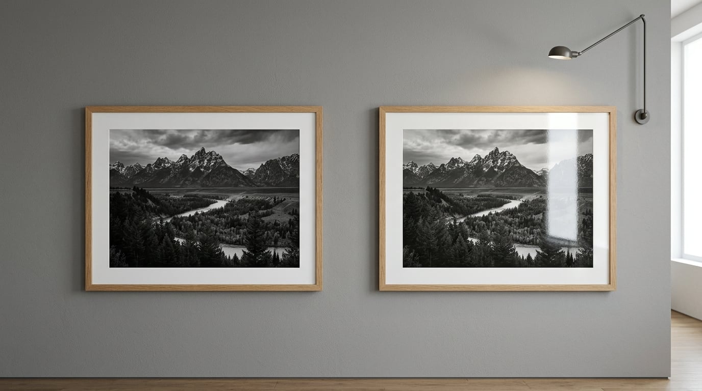
Matte photo paper scatters light and stays readable in a bright room; glossy photo paper reflects light and gives colors more punch. Neither one is better in general — the right matte vs glossy photo paper choice depends on where the print lives, what light hits it, and whether anyone will handle it. There is a third option too: luster and satin sit between the two.
The finish is a coating on top of the paper, not the paper itself. Most modern photo paper is resin-coated, meaning a smooth plastic layer seals the fibers so ink can sit on the surface rather than soak in. That base layer is identical across finishes; what changes is how the top surface is textured and how it treats light. Change the top surface and the same photograph can look like two different pictures.
That is why the question keeps coming up. The choice decides whether your print is shouty or quiet, whether it hides in a bright living room or fights a window, and whether a fingerprint ruins the image. Here is how each finish behaves, where each one wins, and how to test before you commit to a whole box of paper.
Table of Contents
- Matte vs Glossy Photo Paper at a Glance
- How Do Matte and Glossy Photo Paper Look?
- How Do the Finishes Affect Color and Tonal Range?
- Which Finish Shows Less Glare?
- Which Finish Is More Durable and Easier to Handle?
- Which Finish Works Best With Frames and Albums?
- Do Printers and Inks Treat the Finishes Differently?
- Which Should You Choose?
- Frequently Asked Questions
- Is matte photo paper best for black-and-white photography?
- Does glossy photo paper make a photo look sharper?
- What is the best paper finish for colorful digital art?
- Can glossy photo prints be displayed behind glass?
- Does matte or glossy paper show fingerprints more?
- Should I choose a textured or smooth photo paper finish?
- Choose Your Finish by Viewing Conditions
Matte vs Glossy Photo Paper at a Glance
| Criterion | Matte Photo Paper | Glossy Photo Paper |
|---|---|---|
| Surface | Micro-textured, absorbs light, no mirror finish | Smooth resin surface, specular reflection |
| Tonal range | Even, slightly softened, strong shadow detail retained | Deep blacks and bright whites, higher perceived contrast |
| Color saturation | Natural, restrained, good for soft palettes | Vivid and punchy, greens and blues pop |
| Perceived sharpness | Reads flat at a distance, crisp up close | Looks more detailed, subject to reflection |
| Glare | None from the paper itself | Bright reflected patches from lamps, windows, sun |
| Fingerprints | Handled marks show but stay subtle | Shows oils and smudges immediately |
| Durability | Resists scuffing, hard to scratch | Scratches show as white lines in raking light |
| Writability | Accepts pen, pencil and ink for signatures | Beads ink; needs a wet pen or laminate |
| Printing behavior | Wants more ink density to avoid a washed look | Wants lower black density to avoid pooling |
| Display conditions | Bright rooms, mixed angles, gallery walls | Controlled light, albums, close viewing |
| Best for | Framed wall art, portraits, black-and-white, galleries | Color prints, photo albums, crafts, sales photos |
| Watch out for | Flat color if under-inked with dye inks | Glare that hides detail behind glass |
A third column belongs in this conversation: luster, also sold as satin or semi-gloss. It reflects less than glossy and holds a little more color depth than matte, which makes it the safe middle choice when a print has to work in an album and on a wall at the same time.
How Do Matte and Glossy Photo Paper Look?
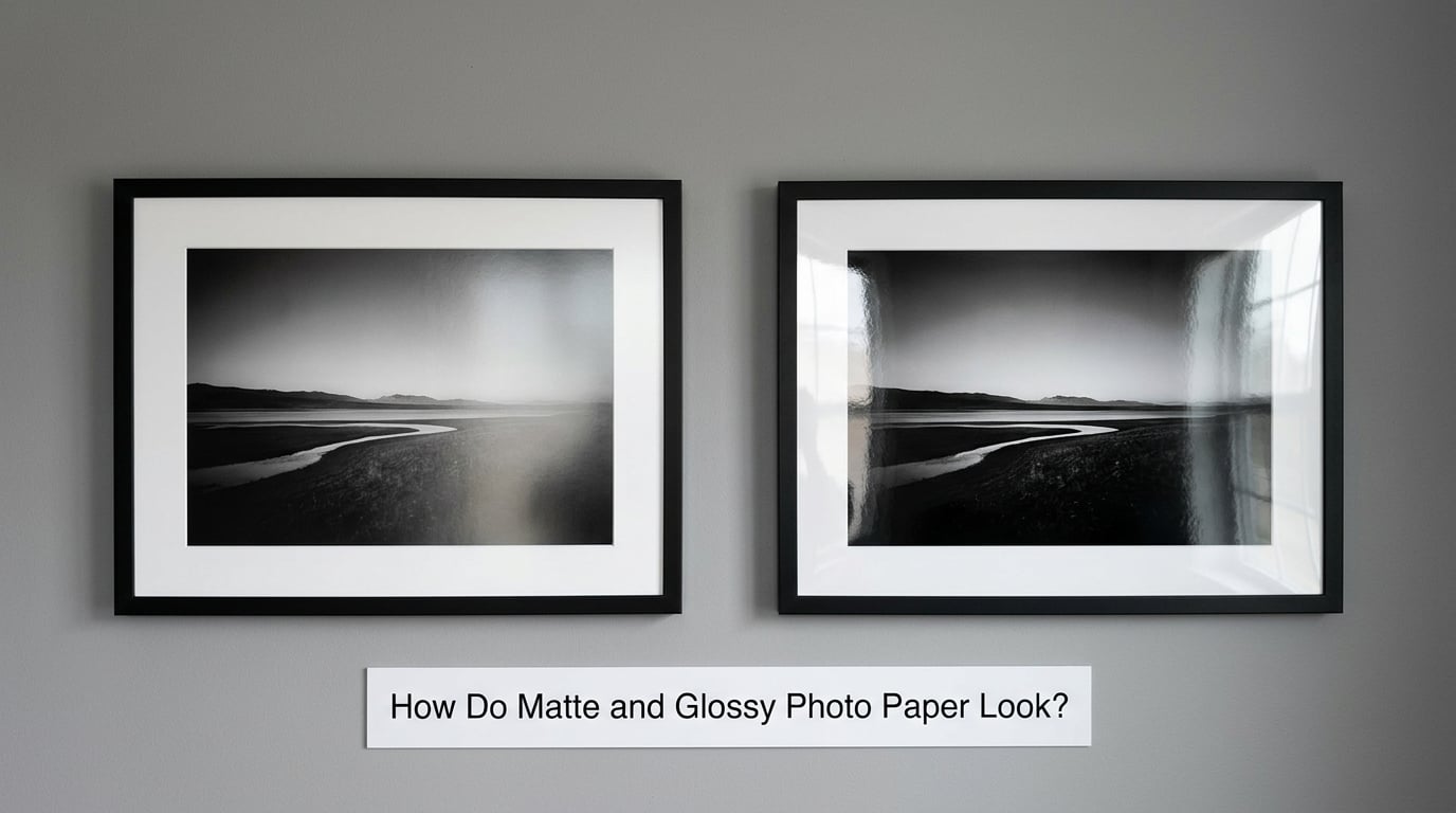
Matte photo paper looks like the photograph rather than the surface. Light hits it and scatters in a thousand directions, so the image reads the same from across a room and from six inches away. The trade-off is a slight softening of contrast, most visible in saturated scenes where you wanted deep, dark color.
Glossy photo paper puts the surface in the conversation. A smooth resin layer throws light back at you, which makes blacks look denser and colors look more saturated. Ask two people in the same room to stand at an angle and they will often disagree about whether the print looks better, because one of them is looking at a reflection.
Fine-art matte is usually smooth to the touch even though it is not optically flat. Textured matte, sometimes called velvet or lusterless, has a visible grain that catches light at raking angles and hides dust. The grain is attractive on a large wall piece and annoying if you like the print to disappear completely behind the image.
For color work, think of matte as the natural rendering and glossy as the enhanced one. In my experience the difference matters most on greenery, autumn foliage and deep blues, where glossy pulls the color forward and matte keeps it honest. It matters least on muted scenes like fog, stone or winter trees, where the two surfaces land in the same place.
How Do the Finishes Affect Color and Tonal Range?
Both finishes can hold a wide tonal range. The difference is in how that range is distributed and how much of it your eye can access at a given moment. Matte spreads a smooth gradient from shadow to highlight with very little break in it, and holds detail in the deepest shadows. Glossy extends the range further at both ends, but a reflection can swallow a whole tonal band in one go.
Blacks are where the two split most clearly. Glossy gives the deepest black on paper and a bright, crisp white, which makes a high-contrast scene pop. Matte gives a slightly lighter black and a softer white, and that softness is exactly why it looks natural on a wall rather than like a screen.
Skies, skin tones and smooth gradients behave differently. A cloud-heavy sky with no hard edges can look flat on matte if the print is not inked densely enough, because nothing gives the eye a hard reference. Skin tones, on the other hand, usually sit more naturally on matte because the surface doesn’t add its own brightness.
How Matte vs Glossy Photo Paper Changes Perceived Sharpness
Paper finish does not add detail your image never had. A glossy sheet cannot make a soft photograph sharp, and a matte sheet will not lose resolution just because it scatters light. What changes is perceived sharpness — how quickly your eye resolves fine texture like hair, eyelashes, gravel or foliage.
Glossy usually wins that perception test. The higher apparent contrast and the smooth surface let edges look crisp, and fine detail in a landscape print seems to jump forward. The catch is that this effect depends on the viewing angle. Move to where the lamp reflects and the print looks blurry and washed, which reads as lost sharpness even though nothing is wrong.
Matte looks softer from a distance and holds up under close inspection. Held in the hand at reading distance, detail in a portrait or a product shot stays legible without glare. If your images are judged at arm’s length in a bright studio, matte is the more forgiving choice.
Which Finish Shows Less Glare?
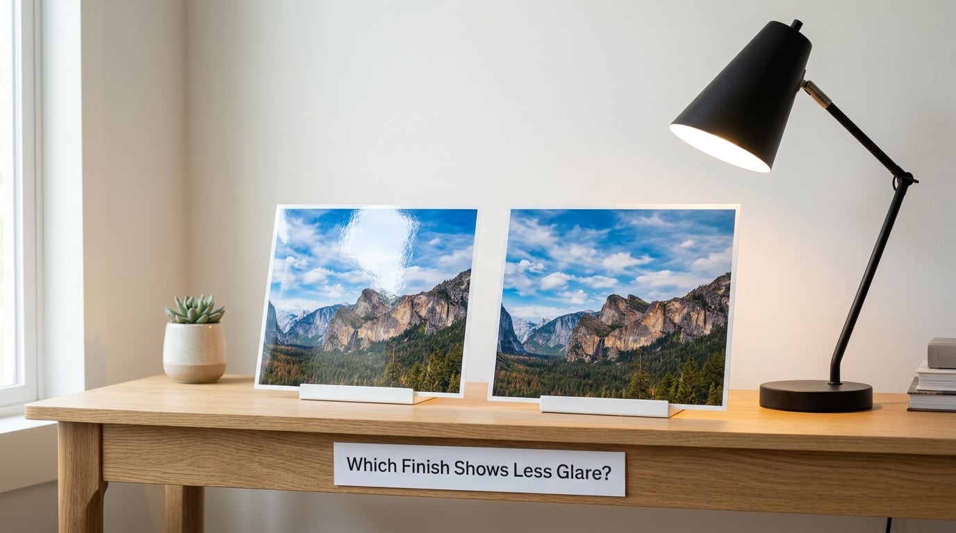
Matte shows less glare because it has no mirror surface to reflect one. Diffuse reflection sends light in every direction, so a lamp, a window or a phone screen never lands on the image as a bright patch. You can walk around a matte print, point a light at it from anywhere, and the picture stays readable.
Glossy produces specular reflection: light bouncing off the surface in one predictable direction. That means glare is not everywhere at once, it is a moving bright area. Tilt the frame slightly and it moves. In a room with a strong window on one side, a glossy print can look perfect in the morning and unreadable in the afternoon.
Overhead lighting is the hardest case for glossy. A ceiling fixture reflects straight into the glass or the coating, washing out the center of the image. Matte under the same fixture looks even from every seat in the room, which is a large part of why galleries and offices lean toward matte or luster for wall pieces.
Direct sunlight is the worst case for both finishes and for the frame’s glass regardless. No coating saves a print that sits in a sunlit window. Rotate the wall, use UV-filtering glazing, or move the frame, and you get more out of your paper than any finish swap will give you.
Which Finish Is More Durable and Easier to Handle?
Matte is the more forgiving surface to live with. A scuff on matte shows as a slight change in sheen, if it shows at all, while the same scuff on glossy appears as a pale line where the resin has been disturbed. In a gallery or a busy household, scratches on glossy accumulate into visible damage over time.
Glossy is the harder surface but the more demanding one to touch. Bare skin leaves oils that catch the reflection and are immediately obvious. Clean it by wiping with a soft microfiber cloth in one direction, and even then a haze can build. Handling prints straight from a dryer is where glossy takes the worst beating.
Smudging is a printing-time issue with both. Fresh ink on any resin-coated sheet needs a short drying period before you stack, sleeve or bind it, otherwise ink can rub off. Matte is more forgiving here because the ink sits within a textured layer. Give both a few minutes on a rack, and set glossy prints face to face only with an interleaf.
If the print gets passed around, signed, or used in a craft project, matte wins outright. You can write on it with a felt-tip or fine liner pen. Glossy beads the ink, so a signature sits on the surface and smears unless you laminate the whole sheet.
Which Finish Works Best With Frames and Albums?
Framing under glass changes the equation. Glass has its own reflection, and when the print beneath it is glossy you get two reflective layers, which is the double-glare problem that makes fine detail disappear. Matte under the same glass gives you one reflection instead of two, so the image stays legible in a bright room.
Anti-reflective glazing helps a glossy print, but it adds haze and a slight color shift, and it is the more expensive part of the frame. If you have already invested in good glazing, a matte print lets it do its job without competing for attention.
Backing board and mounting matter too. A matte print sits flat and does not bounce light back into its own frame, so a standard backing board and acid-free mat window are enough. A glossy print in a deep frame can pick up a faint haze on the glazing as ink cures, so leave the frame open to air for a day before glazing.
For albums and photo books, most people land on matte or luster. Albums get handled, tilted and stacked, and glossy pages build up fingerprints fast. The exception is a high-gloss fine-art book with sealed pages, which is essentially a laminated surface and behaves differently from an open glossy print.
One warning about mixing. A gallery wall or album that combines finishes looks inconsistent, because the same photograph appears punchier on the glossy page and calmer on the matte one. Pick one finish per project and stick to it, then re-ink the printer when you switch. The deeper issue is color consistency, not shine, and that is the subject of the next section.
Do Printers and Inks Treat the Finishes Differently?
Yes, and this is where most disappointing prints come from. Matte paper has a textured, porous top layer that scatters the ink droplet instead of letting it sit glossy, so it needs more ink to reach the same density. Print it with the settings meant for glossy and colors come out pale and lifeless. That flat look is usually an ink density problem, not a finish problem.
Glossy works the other way. The smooth surface holds ink on top where it can pool in the dye, and heavy coverage can produce mottling or a grainy texture in shadows. Lowering the black density slightly is a common fix. Between the two, glossy is the more forgiving surface for a stock profile and matte is the one that rewards a custom profile.
Change the media type in the printer driver when you change paper, and re-run any color calibration you have. Do not expect one profile to serve both surfaces well. A paper-specific profile built by your printer manufacturer usually gets you close; a custom profile generated from a color target gets you the rest of the way.
Dye inks and pigment inks behave differently too. Dye inks are more transparent, so they are easier to lighten on glossy and easier to over-ink on matte, where they can bleed into the texture. Pigment inks sit more solidly, so matte prints made with pigment ink look denser without a density bump. If your matte color still looks washed out and you have already raised ink density, check whether your printer is loading dye ink.
Not every printer handles every surface equally. Dye-sublimation and some photo printers are built around a specific glossy or luster stock, and feeding them matte sheets can produce banded or flat output. Check the printer’s supported media list before you buy a different finish in bulk.
Which Should You Choose?
Choose matte for black-and-white photography. It holds a long, unbroken tonal range, keeps detail in deep shadows, and shows no reflections that compete with fine texture like gravel, fur or fabric.
Choose glossy for vivid color art, food, travel and event photos displayed at close range in a room with controlled light. It is the finish that shows off the saturation already in your file.
Choose matte for large wall pieces, especially in rooms with windows, overhead fixtures or a glare-prone wall. It is also the right pick for portraits, headshots and anything a client will judge as fine art rather than as a snapshot.
Choose glossy or luster for photo albums, craft projects, decoupage, greeting cards and sales prints you hand to people. Luster is the sensible compromise when a print has to work in a book and on a wall, and it is the finish I would pick if a client would not look at two test prints and decide.
Choose matte for any print that will be signed, written on, handled by children, or kept in a bag. Glossy for prints that stay behind glass in a controlled room, or that will be scanned, where the smooth surface keeps scanners and camera glass from adding their own reflections.
And consider pearl, metallic and fine-art cotton rag finishes if your image suits them. They sit outside this two-way comparison, but a textured or cotton surface often solves the “which of these two” problem because it is neither.
Frequently Asked Questions
Is matte photo paper best for black-and-white photography?
Most photographers lean matte for black-and-white work because it keeps a long, even tonal range and holds detail in the deepest shadows without reflections competing with fine texture. Glossy gives deeper blacks and a crisper look, but a lamp or window reflecting off the surface can hide exactly the shadow detail a monochrome print is meant to show. Test a crop of your own image on both and decide in the room where the print will hang.
Does glossy photo paper make a photo look sharper?
It often looks sharper, but the finish does not add detail your file never had. A glossy resin surface raises apparent contrast and gives edges a crisp outline, so fine texture reads faster at a distance. The catch is that the effect depends on viewing angle. Where the surface reflects a light source, the same print looks washed out and can read as blurry. Matte holds up better under mixed lighting and close inspection.
What is the best paper finish for colorful digital art?
For saturated digital art, glossy delivers the strongest color because the smooth surface reflects light back through the ink, deepening greens, blues and magentas. Matte suits illustration with softer palettes, line work and pastel tones, where the extra punch of gloss can overwhelm the design. If your art contains large smooth gradients, test both: gloss separates the colors, matte keeps the transitions calm. Luster is a reasonable middle option.
Can glossy photo prints be displayed behind glass?
Yes, and plenty of framed prints are glossy. The issue is that glass has its own reflection, so a glossy print underneath creates two reflective layers and can lose detail in a bright room. Anti-reflective glazing reduces this, though it costs more and adds a slight haze. A matte print under ordinary glass usually shows one reflection instead of two, which is why it stays readable in rooms with windows or overhead lighting.
Does matte or glossy paper show fingerprints more?
Glossy shows fingerprints more, because bare skin leaves oils that catch the reflection right where you can see them. Matte marks are real but far less obvious, since the surface scatters light instead of mirroring it. Matte is still not fingerprint-proof, and a hard drag across a textured sheet can raise a visible line. If prints get passed around or signed, matte takes handling noticeably better than glossy.
Should I choose a textured or smooth photo paper finish?
Choose textured matte for large fine-art pieces, especially where you want the paper itself to register under raking light; the grain also hides dust and small scuffs. Choose smooth when the image should dominate, for close-up work, product shots and anything that will be scanned. Satin and luster are the middle path between smooth matte and full gloss, and many people settle on them because the result is forgiving in almost any room.
Choose Your Finish by Viewing Conditions
The finish decision comes down to light and handling, not to which surface is objectively better. Matte wins in bright rooms, on walls, on black-and-white work, and anywhere prints get signed or passed around. Glossy wins for saturated color seen at close range in controlled light, and luster covers most of the ground in between.
Print the same crop on both finishes before you buy a box. Take the two sheets to the room where the print will actually live, at the time of day with the worst light, and stand at the distance you will view from. Choose the surface that keeps the detail you care about without reflections pulling the eye away from the image. That test takes twenty minutes and settles the question faster than any spec sheet.