
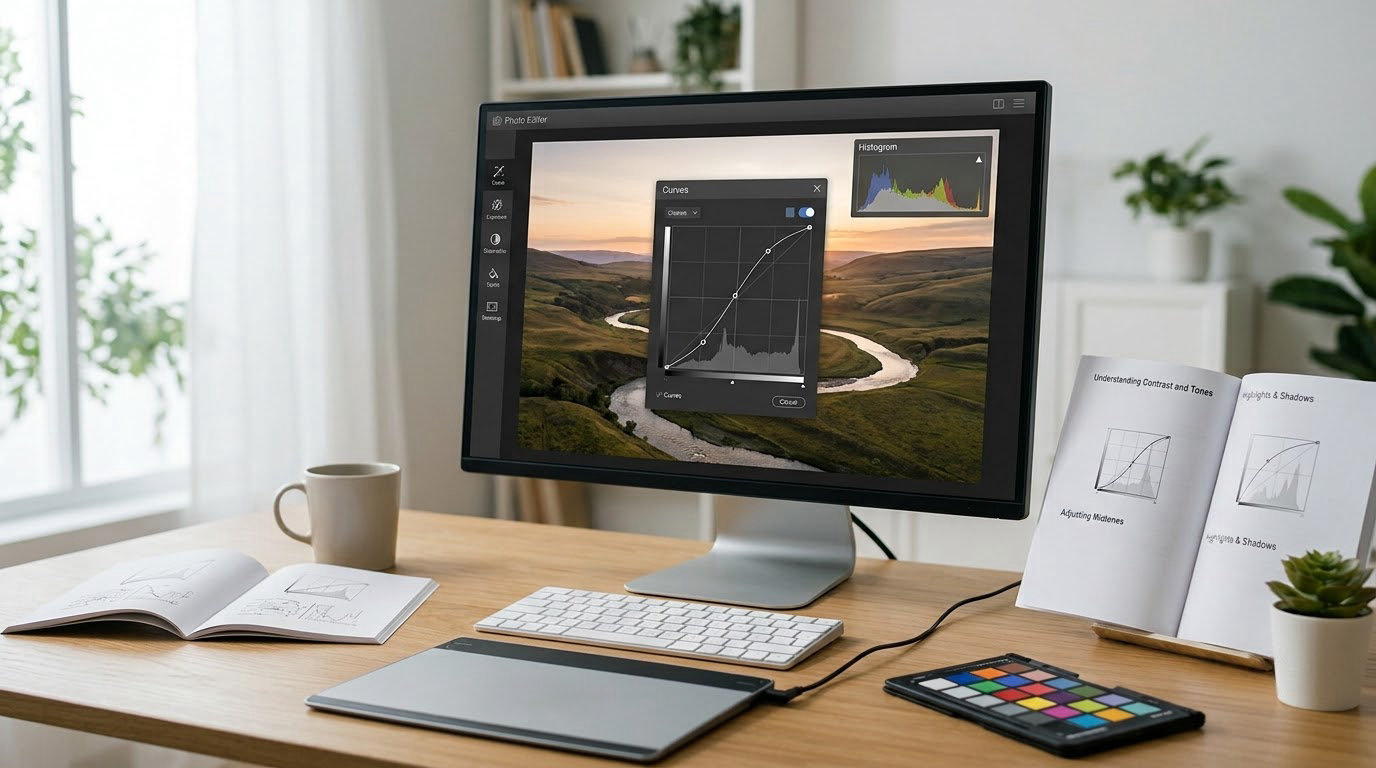
Learning how to use curves in Photoshop takes about ten minutes and one adjustment layer. Curves is a graph that maps the tonal values coming into an adjustment (input) to the values leaving it (output), and moving that line is how you open shadows, protect highlights and place contrast exactly where you want it rather than everywhere at once.
The reason it feels intimidating the first time is that most tutorials hand you a curve before explaining what the axes mean. Once input 128 and output 128 make sense to you, the tool stops being a mystery and starts being the most predictable control in Photoshop.
This guide is written for the current desktop version of Photoshop, released in 2026, and the paths are the same in older versions. Menu names differ slightly in Photoshop Elements, where Curves lives under Enhance rather than Layer.
Table of Contents
What You Need
You need Photoshop with any photograph open, and about fifteen focused minutes. That is genuinely the whole list. A tablet with a stylus helps but is not required, and there is no plugin involved.
The one piece of background worth having is a feel for tonal values. Every pixel in a grayscale image is a number between 0 and 255, where 0 is pure black and 255 is pure white. Color photographs carry three such numbers per pixel, one each for red, green and blue. Curves is a lookup table between those numbers.
It helps to know which adjustment tool to reach for, because three of them overlap and beginners tend to use the wrong one:
| Tool | What it changes | Reach for it when |
|---|---|---|
| Brightness/Contrast | Overall lightness and contrast with a single slider | You want a fast global nudge and nothing more |
| Levels | Black point, white point, gamma, and a single midtone slider | You need to set the tonal endpoints fast |
| Curves | Any mapping of input to output, per channel | You want contrast placed in specific tones, or per-channel color work |
If your photo is simply flat, Levels will get you there in five seconds. If you want the shadows lifted but the skin tones left alone, you need a curve.
Step-by-Step: How to Use Curves in Photoshop
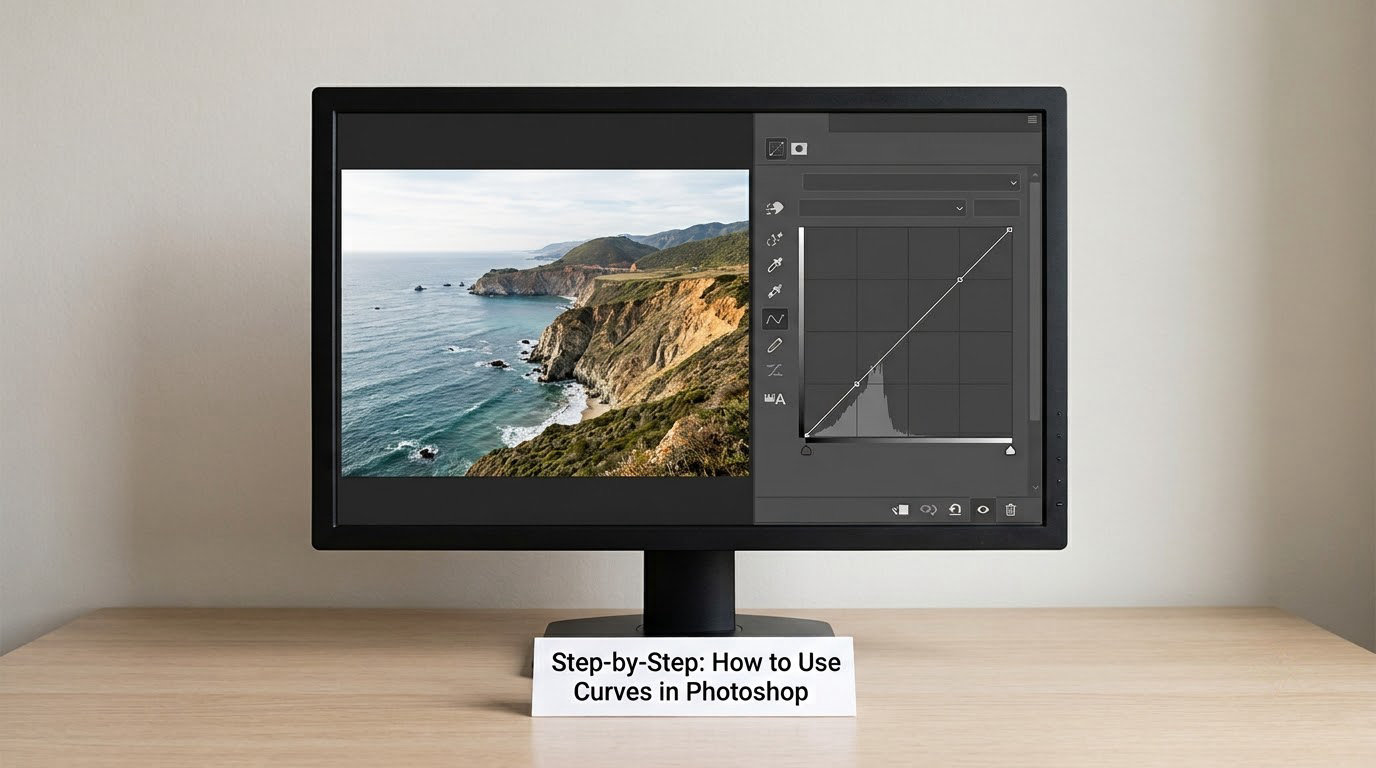
Here is the workflow I use on nearly every file. Follow it in order and the result is repeatable, which matters more than any single recipe.
1. Open the Curves panel. Press Alt and J on Windows, or Option and J on Mac, to bring up the Adjustments panel. Click the half-black, half-white circle icon, which is Curves. The panel shows a histogram with a diagonal line across it.
2. Create an adjustment layer rather than a direct edit. In the Layers panel, click the half-filled circle at the bottom, or use the menu path Layer > New Adjustment Layer > Curves. Press M on Windows or U on Mac to toggle the adjustment layer visibility, which makes before-and-after checking instant.
3. Work out where your tones are before you move anything. Look at the histogram. A spike shoved against the left wall means crushed shadows, and a pile-up on the right means blown highlights. If the whole thing sits in the middle third, the photo was shot flat and needs exposure before it needs curve work.
4. Add a control point. Click once on the diagonal line. That creates a point. Now select the point’s input and output values in the two boxes below the graph and type exact numbers rather than dragging by eye. Setting input 128 to output 150 lifts the midtones and brightens the photo without touching either end.
5. Place contrast where the subject lives. Add a second point low on the curve, at input 64, and drag it down slightly, then a third at input 192 and drag it up slightly. That is a gentle S shape, and it is where most of your work will happen.
6. Judge at full size, not in the panel. The Curves panel is small and the change looks bigger than it is. Fit on screen (Ctrl and 0 on Windows, Cmd and 0 on Mac), look at the image, then look at the histogram again. If you cannot name what improved, you have gone too far.
7. Mask it if the effect is too broad. If the curve is doing exactly what you want but applying it everywhere, select the mask thumbnail on the Curves layer and paint black over the areas that should stay untouched. Curves is an adjustment layer, so the correction stays non-destructive and fully reversible.
Two things to know about housekeeping. Click the menu icon at the bottom of the panel and choose Reset to return the curve to its diagonal starting point, and choose Delete Curves to remove the layer entirely. Also, the shortcut for a new adjustment layer of any kind is Alt and Ctrl and J on Windows, Option and Command and J on Mac, then pick Curves from the list.
How to Use Curves in Photoshop Without Losing Shadow or Highlight Detail
Move points in small increments and check the ends of the tonal range before you call it done. The default diagonal maps every input to itself, so lifting the bottom-left corner away from zero is what destroys shadow detail, and pushing the top-right corner past 255 is what blows highlights.
Keep the curve attached to both ends unless you deliberately want clipping. If a point at input 20 sits at output 0, every pixel darker than 20 in the original collapses to solid black, and no amount of sharpening brings that back.
Zoom in to 100 percent and open the shadows with the eyedropper set to Sample in Screen or Sample All Layers. The moment you see no separation between the darkest parts of the subject and the background, lift the black point to input 0 and output around 8 to 12 instead of steepening the whole lower curve.
If you are working from a raw file converted through Camera Raw, remember that the tone curve there is a different object from the Curves adjustment layer. Adjust the raw tone first, then decide whether Photoshop still needs a curve on top.
Adjusting Shadows, Midtones, and Highlights
The bottom quarter of the graph controls shadows, the middle controls midtones, and the top quarter controls highlights, which in practice is everything above roughly input 192. Each region moves independently, which is the whole point of using a curve instead of a brightness slider.
To open shadows without touching highlights, add a point at input 40 and set output to 55. The value at input 40 and everything darker shifts, while the top of the curve stays pinned. To recover a hot sky, add a point at input 230 and set output to 210, and the brightest areas come down while the midtones keep their brightness.
Midtone changes move the overall exposure impression without changing the endpoints. Input 128 to output 150 brightens; input 128 to output 105 darkens. Small numbers matter here. A ten-step change is visible, a forty-step change usually looks like you messed up the exposure.
Here are the values I return to most often, all in 8-bit terms where white is 255:
- Neutral starting point: every point sits on the diagonal, input equals output.
- Slight midtone lift: input 128, output 145.
- Gentle S-curve: point at input 64, output 52, and a point at input 192, output 200.
- Faded matte look: raise the black point to output 18 and lower the white point to output 238.
- Deeper blacks for a punchy frame: black point output 0, white point output 255, with the midtones untouched.
Using the Curves Histogram to Check Your Edits
The histogram behind the curve shows how the tones are distributed, and it is the fastest way to spot damage you cannot see at a glance. Set the channel dropdown to RGB for overall tone, then switch to Red, Green and Blue separately to check for channel clipping, which is what produces color fringing in skies and skin.
With a channel selected, Photoshop paints the clipped areas black at the far left and far right of the histogram. Any black bar appearing there means pixels have hit 0 or 255 and are now unrecoverable. When you see it, back the point off by five and look again.
Setting the black point and white point is a two-value operation rather than a dragging exercise. Click the eyedropper under the black point box, hold Alt on Windows or Option on Mac, and click the darkest area you want to stay black; the numbers fill in for you. Do the same with the white point eyedropper on the brightest area you want to stay white.
The dropdown at the top right of the panel also holds Luminance, plus individual RGB channels, plus red, yellow, green, cyan, blue and magenta in Lab mode and CMYK colors in CMYK documents. That last group is what makes Curves a color grading tool and not just a tone tool.
How to Use Curves in Photoshop for Common Creative Effects
For contrast, build the S-curve: one point at the bottom third pulled down, one at the top third pulled up, midtones left near the diagonal. It reads as stronger blacks and brighter whites without the flatness you get from dragging the contrast slider all the way right.
For a matte look, lift the black point to around output 20 and drop the white point to around output 235. This washes the endpoints and leaves midtone contrast intact, which is why it suits hazy outdoor scenes and film-style edits.
For color work, select the Red channel and lift or drop a point at the top of the curve, then do the same for Blue. A point at input 255 in Red set to output 245 shifts highlights toward cyan; the same move in Blue pushes them warm. Do not touch all three channels aggressively at once, or the image drifts into a cast you will not enjoy in print.
For matching a reference image, put both files side by side, then use the black point eyedropper and the Target Adjustment tool. Choose the point sampler in the Options bar, set the sample to the Image, then click the reference window; Photoshop builds a curve for you from the measured values. It is a starting shape, not a finished grade, and you still refine it by eye.
For black and white conversion, the dedicated adjustment gives you richer control than a Curves layer, and how to use the Black and White adjustment layer in Photoshop walks through the channel sliders in detail. Curves still helps afterward for the tone once the color is gone. If you would rather keep the work reversible, how to use blend modes in Photoshop covers the modes that pair with a curve.
For dodge and burn, add a Curves layer clipped to another layer, set the layer blend mode to Soft Light, drag a point near the bottom of the curve up to lighten and one near the top down to darken, then paint on the mask where you need it. This is a real workflow rather than a gimmick, and it holds up on large prints.
Common Mistakes
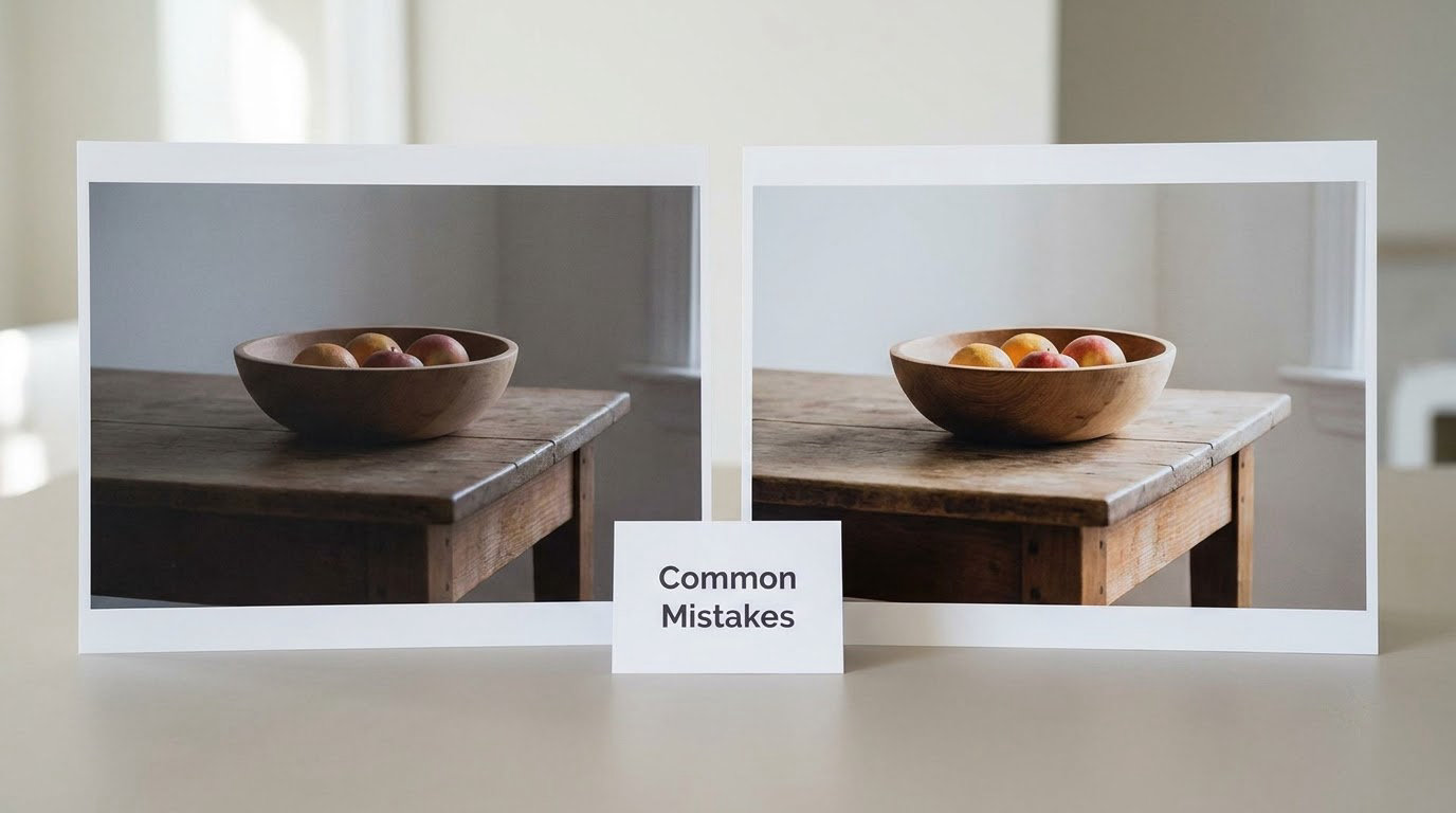
Most bad Curves edits come from one of a handful of habits. Each has a quick fix.
Adding too many control points. More points do not mean more control, they mean less. Beyond three or four, a small nudge reshapes a huge stretch of the tonal range and the image starts to look unpredictable. The fix is to delete the extra points and make fewer, larger, more deliberate moves.
Using Curves as a brightness slider. Dragging the middle point far up or far down to fix exposure flattens the rest of the range. Exposure belongs to Camera Raw, Brightness/Contrast or Levels. Use the curve for contrast placement after the exposure is right.
Leaving the ends of the curve loose. If the curve no longer meets the bottom-left and top-right corners, you have changed the black or white point, and you have probably clipped something. Pin the endpoints back unless you meant to set the tonal range.
Never comparing before and after. Your eyes adapt to the edited version within seconds, so the improvement vanishes. Toggle the layer with M or Alt and J repeatedly, and check the histogram for black clipping bars before you judge with your eyes.
Stacking five Curves layers. Six separate tone layers make the file hard to reverse and impossible to reason about. Consolidate. If you find yourself stacking, you usually want a luminosity mask or a blending mode working on a single adjustment layer instead.
Expecting Curves to fix a color cast that white balance already handles. Experienced editors reach for Camera Raw or Lightroom first for white balance, then open Curves in Photoshop only for the tone and the color tweaks that remain. Curves is not obsolete in that workflow, but it is not the first tool either.
One bug worth knowing about: when a Curves layer is set as a clipping mask, some Photoshop versions appear to stop updating the layer correctly. Un-clip it, apply the curve, then clip it back and confirm the result on the layer below.
A last habit that speeds everything up: keep a grayscale step wedge next to the histogram while you work. Readers who use one say it makes over-cooked curves obvious immediately, because the neutral steps start separating into blobs. You can add a similar texture treatment with how to add texture to a photo in Photoshop, though the wedge is the more useful one for tone.
Frequently Asked Questions
How do I use the Curves tool in Photoshop?
Open the Adjustments panel with Alt and J on Windows or Option and J on Mac, then click the half-black, half-white circle icon. A histogram with a diagonal line appears. Click the line to add a control point, then set exact input and output values in the two boxes underneath. Move points gently and toggle the layer with M to check the result.
How do I add curves to an image in Photoshop?
Use the menu path Layer u0026gt; New Adjustment Layer u0026gt; Curves, or press Alt, Ctrl and J on Windows and Option, Command and J on Mac, then choose Curves. Adding it as an adjustment layer keeps the edit non-destructive, so you can toggle its visibility, mask it, reset it, or delete it without touching the original pixels.
Why use curves in Photoshop instead of sliders?
Sliders move broad ranges of the image at once. A curve lets you change shadows, midtones and highlights separately, and lets you shape the contrast between them with a shape rather than a single number. You can also adjust red, green and blue independently for color work, and reuse the exact same curve as a preset.
What is a black point in Photoshop?
The black point is the shadow end of your tonal range, the value that becomes pure black. Setting a curve point at input 40 and output 0 crushes everything below 40 into solid black with no detail left. If you want clean shadows instead, set input 40 to output 10 and keep the curve attached to the bottom-left corner.
What does an S curve look like?
An S curve is a tone curve that bows above the diagonal in the midtones and below it at both ends, which deepens shadows and brightens highlights for contrast. Build it with two points: one near input 64 pulled slightly down, one near input 192 pulled slightly up. Keep the moves small, since a steep S posterizes skin tones.
How can I understand RGB curves?
Each color channel has its own curve, selected from the dropdown above the graph. Select Red, drag a point at the top of the curve, and only the red highlights move. That means you can warm or cool an image, recover a color cast, or match a reference by moving the same tonal range in different channels.
Conclusion
Start with one adjustment layer, one control point, and one small move: set input 128 to output 145, toggle it off and on with M, and see whether the midtones actually improved. Once that single number makes sense to you, adding shadows, highlights and an S-curve is just more of the same thinking.