
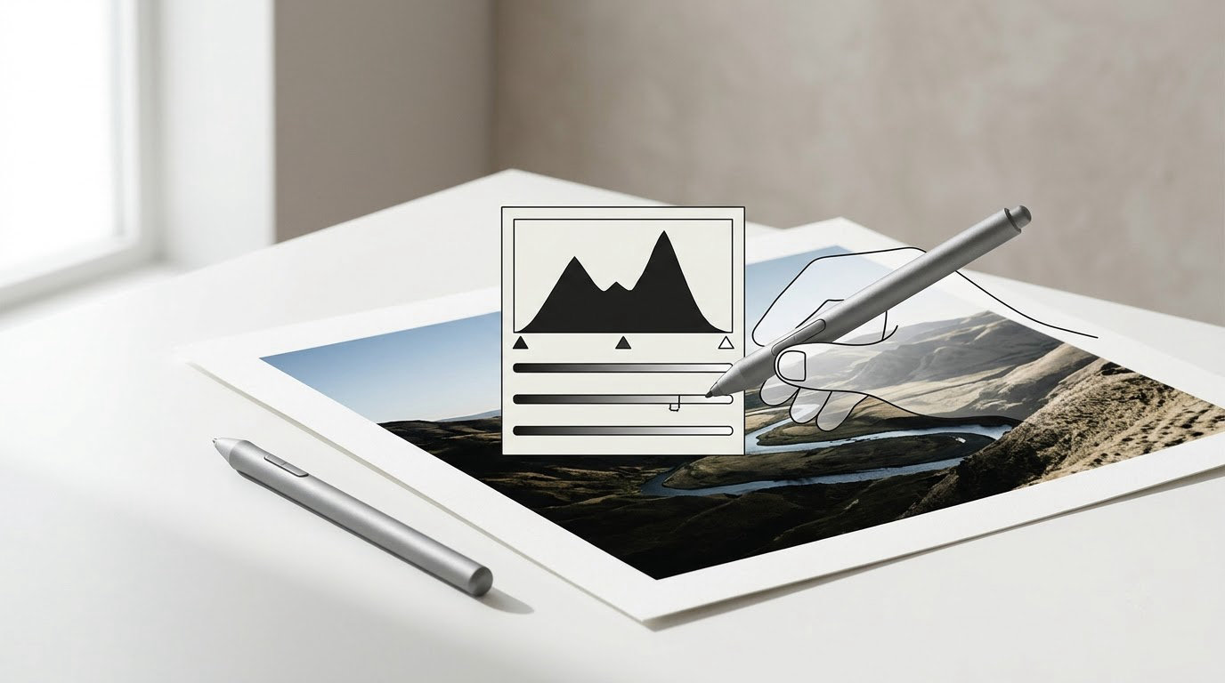
How to use Levels in Photoshop: open the adjustment from Image > Adjustments > Levels, press Ctrl+L on Windows or Cmd+L on Mac, or click the half-filled circle at the bottom of the Layers panel and choose Levels. Then set the black point, the midtone gamma, and the white point against the histogram, and watch the clipping indicators so you do not destroy detail.
That is the whole tool, and it is genuinely powerful once you stop treating the middle slider like a mystery. Levels remaps every pixel in an image across a brightness scale from 0 (pure black) to 255 (pure white), so you are really just deciding which values count as black, middle grey, and white. Everything in between gets stretched to fit.
This guide covers the full workflow: where Levels lives, what each of the three input sliders does, why output levels matter, and how to keep every change reversible on an adjustment layer. Budget about ten minutes for your first pass, and no more than that after practice.
Table of Contents
What You Need
Any current version of Adobe Photoshop, including the Creative Cloud and 2020-and-later releases, ships with Levels and adjustment layers. The steps here assume the modern Layers panel rather than the old palette layout, though the menu path is identical across versions.
Pick a practice image that is genuinely flat: an underexposed RAW file, an overcast landscape, or a shot where everything sits in a narrow band of grey. A grayscale or black and white practice photo is even better for learning, because you can see tone changes without color confusing you.
Three parts of the interface matter here. The Histogram sits in the Histogram panel (Window > Histogram) or lives inside the Properties panel when a Levels layer is selected. The Properties panel is where the Levels controls appear, and it is the reason you can reopen and tweak a later edit. Layer masks are the third piece, and they are what make a tonal correction non-destructive.
If masks are still unfamiliar, the practical guide to blend modes covers the same layering habits, since both features depend on how layers interact.
Step-by-Step: The Non-Destructive Levels Workflow
Success here means three things at once: the tones look balanced on screen, the contrast feels deliberate rather than extreme, and you still have recoverable detail in both the darkest and brightest areas. You can confirm the last point with the clipping indicators and the histogram panel at any time.
How to Use Levels in Photoshop to Set the Starting Points
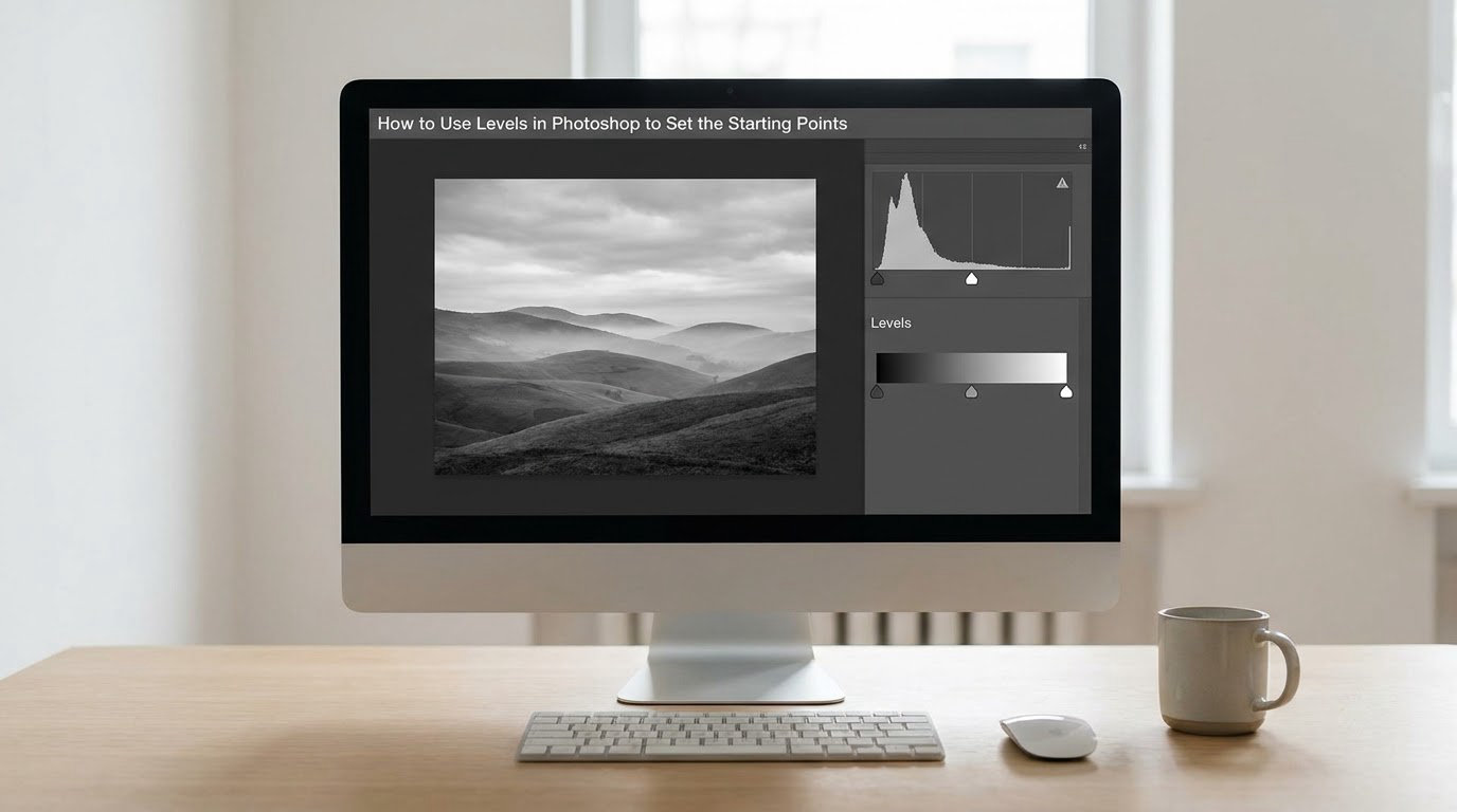
The safest route is an adjustment layer rather than a direct adjustment. Click the adjustment icon at the bottom of the Layers panel, pick Levels, and you get a layer you can rename, mask, and delete at any point. A direct adjustment through the Image menu applies instantly to the pixels underneath and needs a History step to undo.
Three input sliders sit under the histogram. The left one sets the black point: drag it right and everything darker than that value becomes pure black, deepening shadows and adding contrast. The center one sets midtones. The right one sets the white point: drag it left and brighter pixels turn pure white, brightening highlights and strengthening the contrast from the other side.
Now watch the small triangles above the histogram. The left triangle reports pixels being clipped to black, the right triangle reports pixels clipped to white. Turn on clipping by clicking each triangle, and as you drag you will see those areas flash where detail is being destroyed. Back off one hair whenever the indicator lights up across a meaningful area of the image.
Move the black point until the darkest shadow reads as dark without large areas flashing, then move the white point until the brightest area reads as bright with the same restraint. On a typical underexposed frame, small inward moves on both ends do more for apparent contrast than any amount of work in the middle slider.
Correct Midtone Contrast with the Gamma Slider
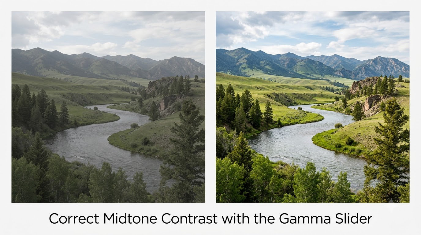
The gamma slider is the one that confuses beginners, so here is the plain version: it changes how bright the midtones look without moving your black or white points. Dragging it left darkens everything in the middle of the scale. Dragging it right brightens it. Endpoints stay exactly where you put them.
Because the effect is non-linear, a small move changes a lot. Slide the gamma to around 0.80 on a flat overcast scene and the midtones lift noticeably while the highlights hold their shape. Push it to 0.40 and the same image goes murky and heavy, and the histogram develops visible banding in the shadows.
Two habits keep this under control. Watch the histogram as you drag, since banding appears well before the result looks obviously wrong. And stay inside roughly 0.70 to 1.30 unless you are deliberately matching a very specific look. If you need a bigger tonal shift than gamma can give, you probably want Exposure or Curves instead.
Use Output Levels to Refine the Final Tones
Output levels work the opposite way from input levels. The input sliders decide what counts as black and white in your data. The output sliders decide how black and white the finished image actually looks.
Raise the left output slider from 0 to something like 8, and your deepest blacks lift into a soft matte grey. This is the classic way to avoid the harsh, ink-heavy look on a print and it mimics how film printed. Lower the right output slider toward 245 instead, and the brightest highlights fade gently, giving a softer, slightly vintage feel.
Numbers are shown as percentages under the sliders, so you type the value directly into the box rather than dragging by eye. Keep the effect subtle. Raising blacks by more than about 5 percent starts to look hazy, and pulling whites down by more than 10 percent reads as washed out rather than refined.
Fine-Tune Levels with a Curves Preview
Sometimes the result is close but the tone curve feels slightly wrong, and Curves gives you a second opinion. Add a temporary Curves adjustment layer above your Levels layer and compare. If Curves needs a long, wiggly path to fix what Levels could not, you have your answer: keep Levels, delete the Curves layer, and live with the simpler control.
| What you need | Tool to reach for | Why |
|---|---|---|
| Quick overall contrast and tone | Levels | Three sliders, fast, easy to explain later |
| One specific tonal range to bend | Curves | Full control over shadows, midtones, or highlights |
| A shift that needs to move shadows and highlights opposite ways | Curves | Two independent control points |
| A neutral point for a color cast | Levels | The set gray point eyedropper lives here |
| A clean black and white conversion | Black and White adjustment | Channel-by-channel control of each color |
The honest truth, which you will hear from most working photographers, is that Curves handles more tonal situations than Levels does. Levels stays worth learning because it is quicker for broad corrections, and because understanding it makes Curves stop looking mysterious.
Protect Color and Correct Errors Non-Destructively
Masks give you control over where the correction lands. Paint black on a layer mask to exclude an area, or lower the mask opacity to dial the effect back. If a sky brightened too much but your subject looks right, mask the sky instead of undoing the whole layer. Hold Alt while clicking between two layers in the Layers panel to clip one adjustment to the layer beneath it, which is how you apply a tonal change to a single element rather than the whole frame.
For color casts, switch the channel dropdown at the top of the Properties panel from RGB to Red, Green, and Blue. Each channel has its own histogram, and nudging individual channel sliders changes that color only. The set gray point eyedropper under the sliders is faster for stubborn casts: click it, then click a patch that should be neutral grey. Open the Info panel first (F8) so you can hunt for a spot where the red, green, and blue readings sit close together rather than guessing.
When you need to correct a separate Levels file, convert it to a Smart Object first (Layer > Smart Objects > Convert to Smart Object). The adjustment then stays fully re-editable even after you scale or transform the layer. For monochrome results, adding a Black and White adjustment layer above Levels gives you channel sliders per color, which is far better than converting to grayscale and hoping. My walkthrough of that adjustment layer covers the channel setup.
Correcting order also matters. If an image has both a color cast and a tonal problem, fix white balance first, then tone. Adjusting tone on a color-shifted image means you will chase the shift again after you fix the color.
Common Mistakes
Crushed shadows. You dragged the black point too far and a whole region went solid black. Watch the left clipping triangle, and pull the slider back until it stops lighting up. Detail that reads as very dark can still be recoverable; detail at pure 0 cannot.
Blown highlights. The same problem at the other end, usually from dragging the white point left on a frame that already had bright sky. Move it right instead of brightening midtones, and check the right clipping triangle.
Muddy blacks. Shadows look grey and lifeless. That is usually output levels left at zero when the image needs a matte look, or midtones pulled too far up with gamma. Raise the left output slider a few points, or nudge gamma back toward 1.00.
Overdone midtones. An overcorrection where the image looks like it has a filter over it. Reset the adjustment with the panel menu, then work in smaller steps and compare against the unedited layer using Alt and click for a before-and-after blink.
Leaning on the Auto button. Auto gives you a technically balanced histogram and often an unnatural result, with dark midtones that make the whole frame feel underexposed. Use it as a starting point, then correct by hand.
Grayscale conversion too early. Turning a layer to grayscale and then leveling removes your ability to bring color back or fine-tune each channel. Handle tone first, convert last. If you want a proper monochrome, our guide to converting a photo to black and white in Photoshop covers the desaturate shortcut properly.
Destructive edits. Applying Levels from the Image menu with no adjustment layer. Everything above it can no longer be re-opened, and any fix becomes a History hunt. Make the adjustment layer a reflex.
Confusing input and output levels. Sliders that feel ineffective are usually output sliders being moved with an input-level goal in mind, or the reverse. Input levels decide what your data means; output levels decide what the picture looks like.
A few habits will speed up your learning. Keep the Info panel open and watch the numbers while you drag. Practice on five frames from the same shoot and apply identical values to each, which is the fastest way to build instinct for what a number like 240 looks like. And learn to read the shape of the histogram: data bunched at the left is an underexposed frame, data spread wide with a gap in the middle means contrast is fine but midtones are missing.
Frequently Asked Questions
Should I use Levels or Curves in Photoshop?
Use Levels for broad, fast corrections: setting black and white points, opening up an underexposed image, or correcting white balance with the gray eyedropper. Use Curves when you need to bend a specific tonal range or move shadows and highlights in opposite directions. Most working photographers reach for Curves by default, but Levels is faster and easier to reverse.
Why are my highlights or shadows disappearing in Levels?
You have clipped them. Anything darker than the black point or brighter than the white point is pushed to pure 0 or pure 255, and that data cannot come back. Click the small triangles above the histogram to turn on clipping indicators, then drag the affected slider back until the flashing stops.
What does the gamma slider do in Photoshop Levels?
The gamma slider, the middle one under the histogram, changes midtone brightness without moving your black or white points. Dragging left darkens the midtones, dragging right brightens them. The effect is non-linear, so small moves change a lot. Staying between roughly 0.70 and 1.30 keeps results natural.
Should I convert an image to black and white before using Levels?
No. Convert last. Working in color while you set tonal corrections means you can still correct a color cast and fine-tune individual channels. Desaturating first removes that flexibility and often leaves you compensating for a cast you can no longer see. If you want a rich monochrome, add a Black and White adjustment layer after Levels is finished.
Can I use Levels on a layer mask?
Yes, and it is a powerful way to build a selection. Choose Select u0026gt; Color Range, sample the color you want to keep, confirm the preview, then add a Levels adjustment layer with a black layer mask so only the highlighted areas are visible. Drag the sliders to push the unwanted tone to pure black and the result reads as a clean selection.
How do I make a photo black and white with Levels?
Add a Black and White adjustment layer above your Levels layer, then use the six channel sliders to control how each original color converts to grey. Levels alone can desaturate a layer, but it collapses all channels to one value and gives you no control over individual colors. For a deeper walkthrough of both methods, see our black and white conversion guide.
Conclusion
Levels is fast when you treat it as what it is: three decisions about where black, middle grey, and white live, plus two optional sliders that control how finished the tone looks. Master that and every flat frame becomes workable in under a minute.
Open your next photo, add a Levels adjustment layer, and start with the ends. Set the black point until the shadows read as dark without the left clipping triangle flashing, set the white point until the highlights read as bright without the right triangle lighting up, then make one modest gamma move in the direction you want. Check the result with clipping on, refine with output levels if the blacks feel harsh, and mask any area that moved further than you wanted.
Do that ten times and the tool stops being intimidating. From there, Curves is a short step away whenever you need finer control.