
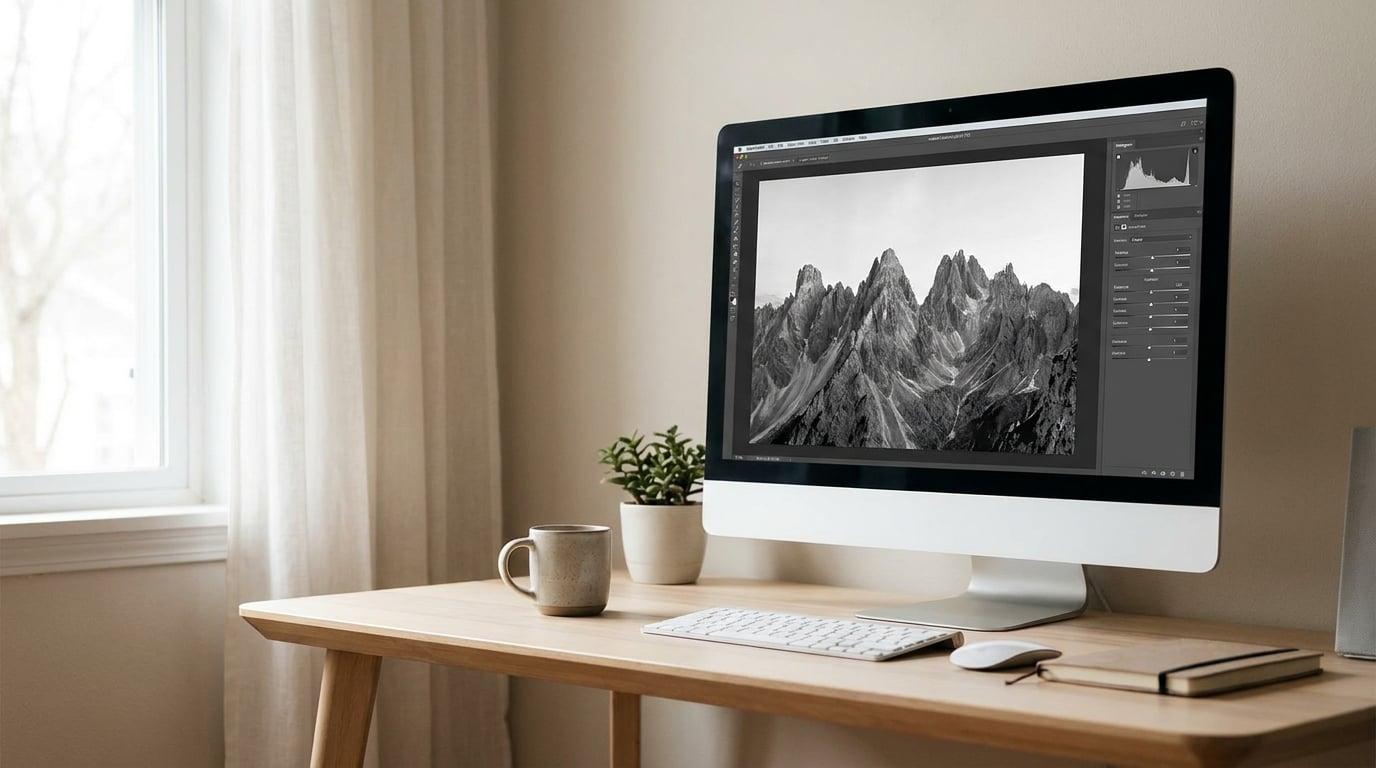
To edit black and white photos in Lightroom, open the image in the Develop module, set Treatment to Black & White in the Basic panel (or press V), then use the B&W panel sliders to decide how bright each colour becomes. Shape the result with the tone curve, add local adjustments and grain, and export. Nothing is baked in, so the colour original survives.
That last point is what makes this workflow repeatable. Lightroom writes your decisions to its own catalog database rather than to the file, so you can go back to a colour version of the same frame at any time and re-convert it.
The mistake almost everyone makes first is dragging Saturation to zero. That removes hue and leaves whatever brightness the colour happened to be, so a blue sky and a grey wall can land on the same tone and your subject merges into the background. The B&W treatment is different: it hands you one slider per colour range so you decide the mapping yourself.
This guide is written for Lightroom Classic, and I call out the cloud version wherever the controls differ, because most of the confusion on the forums comes from following a tutorial for the other app.
Table of Contents
- What You Need
- Step-by-Step: How to Edit Black and White Photos in Lightroom
- 1. Start With a Strong Image and a Clear Goal
- 2. Correct the White Balance Before Converting
- 3. Adjust Exposure, Highlights, Shadows, Whites, and Blacks
- 4. Convert the Image to Black and White
- B&W mix sliders at a glance
- 5. Shape Contrast With Tone Curve and Contrast
- 6. Add Texture, Clarity, Dehaze, and Color Grading Carefully
- 7. Crop, Retouch, Sharpen, and Prepare the Export
- Common Mistakes
- Frequently Asked Questions
- Should I use a black-and-white preset when editing in Lightroom?
- How do I convert a color photo to black and white in Lightroom?
- Which Lightroom sliders help create a high-contrast black-and-white photo?
- Does Lightroom Classic change the original image when I make a black-and-white edit?
- Why does my black-and-white photo look flat after conversion?
- Should I add grain before or after sharpening a monochrome image?
- Conclusion
What You Need
You need Lightroom Classic (or the Lightroom app), one RAW or JPEG file, and about twenty minutes of uninterrupted time. No external plug-in, no extra software. A calibrated monitor helps, but consistency matters more than perfection: if the same screen is what you judge every edit on, your eyes will learn its bias within a session.
Before importing, turn on the settings you will want. In the Develop module, click the panel icon at the bottom right (or press Shift+Tab to cycle the panel sets) and show Histogram, and make sure the Profile line at the top of the Basic panel is visible. You will read the histogram constantly, and you will want to switch profiles without hunting for the menu.
Keyboard shortcuts worth memorising
| Key | Action | Notes |
|---|---|---|
| V | Toggle Treatment between Color and Black & White | Develop module; the shortcut acts on the image you are editing, not on the panel you clicked last |
| W | White Balance Selector | Click a neutral area of the frame to neutralise colour |
| J | Targeted Adjustment Tool in the B&W panel | Then click and drag the colour you want to sample |
| B | Show or hide the B&W panel | Classic only; the cloud app has no equivalent panel to toggle |
| Y | View the color version of a monochrome image | Hold while Treatment is set to Black & White, then release to return |
| Z | View before and after | Show the Before view, and press it again to get back to your edit |
| Backslash () | Toggle Treatment between Color and Black & White | A second way to reach the same toggle as V |
| Alt (Windows) or Option (Mac) | Fine-tune any slider you are dragging | Halves the movement rate for precision |
| Shift+Tab | Cycle the Develop panel sets | Handy when a panel is covering the part of the frame you need to see |
Two version notes before you start. Lightroom Classic keeps the dedicated eight-slider B&W panel plus a colour mixer that switches into its own B&W mode with hue, saturation and luminance. In the cloud Lightroom app and the mobile app, Treatment lives in the same place, but the fine colour controls are more limited, so a heavily mixed conversion is easier to build on a desktop and harder on a phone. Everything below works in both; the extra colour sliders are Classic-only.
Step-by-Step: How to Edit Black and White Photos in Lightroom
1. Start With a Strong Image and a Clear Goal
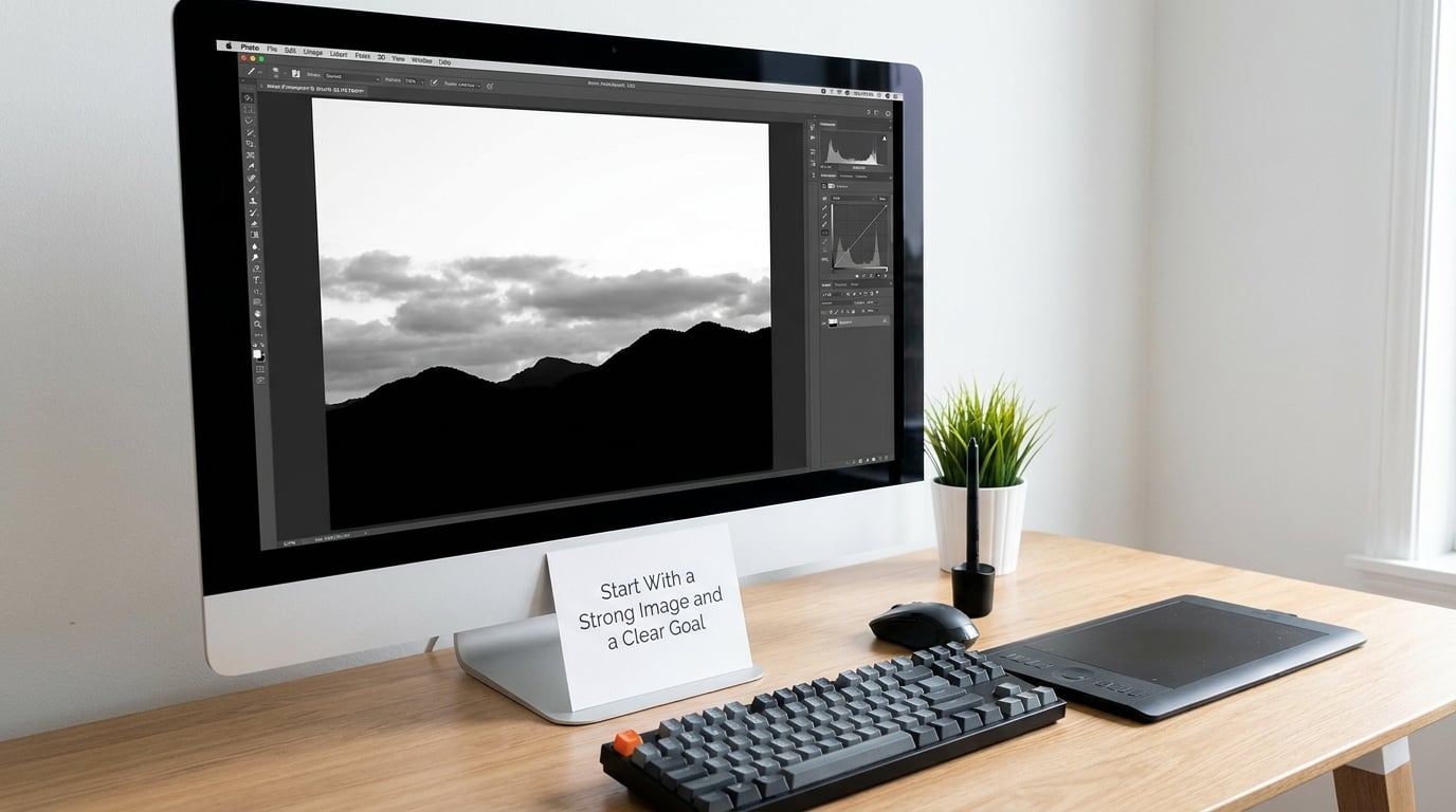
Decide what the picture is before you touch a slider. Documentary, fine-art print, high-contrast, or soft and quiet, each one points at a different histogram. Knowing which one you are after is what stops you mid-way through an edit wondering whether the shadows are too heavy.
Look at the frame in colour and check for tonal separation, because that is all a monochrome conversion has to work with. A cloudless sky above a dark hillside is in trouble. A face with shadow across one cheek usually works well, and so does architecture with hard light raking across it.
Press J, then drag the Baseline Exposure slider down until the histogram shows a small gap at the left edge. That gap is your black point: a few pixels of true black with real data in them. Stop before the data runs into the edge, and you have a picture with breathing room rather than a picture with holes in it.
2. Correct the White Balance Before Converting
Lightroom derives its black and white rendering from the colour profile, so a cast left in the file will bias every colour’s brightness. Fix the white balance first. Press W and click a surface you know was neutral (a white wall, grey asphalt, shade), or set Temp and Tint by eye until skin and stone look right.
Then re-judge the contrast in colour. A strong cyan cast flatters the sky and exaggerates the separation between it and the rock. Neutralise that and the separation narrows, which is exactly the problem the B&W mix sliders exist to solve. Correct the colour first, then re-separate the tones in monochrome. Doing it in the other order means chasing a moving target.
3. Adjust Exposure, Highlights, Shadows, Whites, and Blacks
Work in the Basic panel in this order: Exposure, then Highlights, then Shadows, then Whites and Blacks, then Contrast. Exposure sets the overall level. Highlights and Shadows recover the detail that the conversion will amplify, Whites and Blacks set where pure white and pure black sit, and Contrast is the last global move because it changes everything underneath it.
Watch the clipping indicators. The small triangles beside the sliders light up when a channel clips, and the histogram shows where your detail is being lost. Pull highlights down until the sky holds tone; lift shadows only until the subject reads, since every step up in shadows costs contrast somewhere else.
Where a face, a snowfield or a window is still stuck after a global move, reach for a local adjustment rather than a stronger global one. A radial filter with a soft outer edge over the sky, or a brush over the subject, lets you fix that one region and leave the rest of the frame alone. Set the range first and the effect second, so the feather stays clean.
Do not judge each adjustment by the slider alone. Toggle before and after with Z after every couple of moves. The most common disappointment in a fresh monochrome edit is that the picture looks worse than the colour original, and it usually turns out to be an overdone highlights or clarity setting rather than a bad conversion.
4. Convert the Image to Black and White
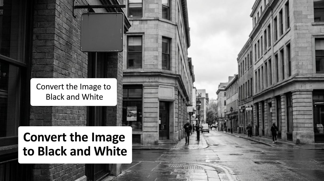
Now convert. In the Basic panel, set Treatment to Black & White, or press V. The HSL colour mixer switches to B&W mode, and in Classic the separate B&W panel opens with its eight colour sliders, its Auto button and the Targeted Adjustment Tool (J). Set Profile to Adobe Monochrome if you want a firmer, more contrasty rendering than the neutral default; you can always back it out.
Here is the priority order that panel implies but never states. Orange and red first, because skin, wood and warm stone carry most images. Then blue, usually lowered, because it controls sky and shadow depth. Yellow and green next for foliage. Aqua, purple and magenta last and rarely, since they appear in small quantities. Raise a slider and that colour renders lighter; lower it and it renders darker. Every slider also has a range setting, and the range decides which pixels it is allowed to touch, so a narrow range with a large mix change gives a blocky patch instead of a smooth shift.
If you push one colour too far, the affected areas break into visible blobs. The fix is to widen the range before you back the slider off, or to bring a neighbouring slider up a little to cover the seam.
B&W mix sliders at a glance
| Slider | What it usually represents | Typical move | Starting value |
|---|---|---|---|
| Red | Lips, warm skin, red clothing | Raise to lift skin or a red dress | +10 |
| Orange | Skin tones, wood, warm stone | Raise, the most-used slider | +15 |
| Yellow | Foliage, sand, sunlit leaves | Raise to separate leaves from sky | 0 |
| Green | Grass, trees | Lower slightly for depth | -10 |
| Aqua | Shade, water, reflections | Lower to darken open shade | -5 |
| Blue | Sky, deep shadow, water | Lower to calm a blown-out sky | -25 |
| Purple | Clothing, mixed lights | Small moves only | 0 |
| Magenta | Flowers, signage, colour casts | Small moves only | 0 |
Those starting values are a floor, not a formula. Copy them into a preset, push one slider, and you have a repeatable baseline instead of a blank panel.
One extra tool, the Targeted Adjustment Tool, shifts your cursor from grey to a coloured cursor when you hover over the image. Click the colour you want to isolate and the matching slider jumps up in value while the rest stay put. It is the fastest way to pick out a roof from the sky behind it.
How to keep one colour in a black and white photo
To leave a single colour alive in an otherwise monochrome frame:
- Finish and save the full monochrome edit first, all sliders and the curve as you want them.
- Add a masking tool: a radial filter if the colour sits in one compact area, a brush if it is scattered.
- Inside the mask, set Treatment back to Color and re-open the original colour profile.
- Use the masking panel’s Temp, Tint and Exposure to blend the patch into the grey around it.
- Keep the mask feathered wide so the edge disappears, then reduce the mask’s flow until the colour reads as a hint rather than a sticker.
The same masking approach works in reverse: keep the frame monochrome and desaturate only the one colour, which usually blends better because the surroundings stay untouched.
5. Shape Contrast With Tone Curve and Contrast
With the mix set, the Tone Curve panel controls how the greys relate to each other. Drag the black point up slightly and the picture gains a matte, faded quality. Drag it down and the shadows go dense. Both are legitimate; pick one and stay with it.
A gentle S-curve is the safest starting move. Lower the shadow end, raise the highlight end, and keep the transition between them smooth. A hard curve with a sharp knee gives you a punchy high-contrast look but costs you midtone separation, which is where faces live. If the subject is a person, back off the curve.
Use the Parametric curve when you want the three-region sliders and a predictable result, and the Point curve when you want to control a single transition precisely. The Region curve is useful when you need a flat block of midtone without touching the ends.
High key and low key are the two recipes people ask for most. For high key, lift exposure by a stop, raise whites, keep blacks just off zero and pull the curve up at both ends so nothing sits at true black. For low key, drop exposure until the histogram is close to the left edge without touching it, hold the highlights, and deepen the curve’s shadow end. Save each as your own preset after it works once.
6. Add Texture, Clarity, Dehaze, and Color Grading Carefully
Texture adds midtone micro-contrast; Clarity works on the edges between tones and is much stronger. Use Texture as a broad finishing pass, usually under 15, and treat Clarity as a local tool on a masked subject. Dehaze pulls haze out of the frame and will happily chew through a soft sky, so on monochrome work keep it small.
Split Toning is your black-and-white colour grading. Move the Shadows and Highlights hue wheels a short way from neutral and the frame stops being grey and starts having a cast, cool shadows against warm highlights being the usual choice. Keep the saturation low; a split-toned image that reads as tinted grey is elegant, one that reads as beige is a mistake.
Grain in the Effects panel is the finishing layer, and it hides digital noise more effectively than it adds character. A useful starting point is Amount around 25 with Size near 50, then raise Roughness only if you want the coarse, film-stock look. For a fine-art print, keep the grain invisible at arm’s length. If it is the first thing you notice, it is too strong.
7. Crop, Retouch, Sharpen, and Prepare the Export
Crop and straighten before the final sharpening pass, because a tight crop changes what needs to be sharp. Use the Crop Overlay’s straighten tool for horizons, then decide between a full-frame and a slightly tighter frame with the monochrome version on screen, since the edges no longer distract you with colour.
Retouch with a healing brush on the Detail panel, or a spot removal pass, and keep it minimal. Removing a distracting bright spot from a dark background is worth doing; smoothing a face in a documentary frame is a different decision entirely.
Sharpen last, in the Detail panel. Hold Alt and drag the Sharpening Amount slider to see the halo threshold, then set it around 40% of that value so edges stay clean. In the export dialog, use Output Sharpening for print (Normal for matte paper, High for glossy) and leave it at the default or off for web delivery.
For files: export a 16-bit TIFF for anything you intend to print or archive, and a JPEG in sRGB at quality 80 to 90 for the web. If you plan to move the look across a whole shoot, copy the Develop settings with the copy icon in the panel header, name it, and paste it onto the rest of the frames, then repeat the conversion on each. The mix sliders are per-image values and do not travel inside a preset, so a series built on the B&W panel needs the same panel repeated on every frame. After exporting, put the file side by side with the colour original. If the monochrome version is not at least as strong, go back to step 3.
Common Mistakes
Setting Saturation to zero instead of Treatment to Black & White. The image loses all colour control and lands on whatever brightness the colours happened to have. Fix: press V, then work the B&W panel. Leave Saturation alone; it has no effect in monochrome.
Converting first and correcting tones afterwards. You cannot judge exposure and contrast properly in a half-finished conversion. Fix: settle the Basic panel in colour, then convert.
Applying a downloaded preset and stopping. A preset encodes somebody else’s white balance and exposure for a scene you do not have. Fix: use a preset as a starting value, then set exposure, tone and mix for your frame.
Crushing the blacks. Pulling the black point to the edge of the histogram removes detail permanently and leaves the image harsh. Fix: stop at a few percent of data and let the curve handle drama instead.
Pushing a single mix slider hard. Wide areas break into blocky patches, most visibly across skies. Fix: widen the range, or raise an adjacent slider to soften the seam.
Adding clarity and grain everywhere. Both are edge effects; applied globally they make skin, foliage and water look chewed. Fix: mask them to a subject and keep values modest.
Converting a scene with no tonal separation. A colourful scene with no light difference in it turns into one flat grey. Fix: work the shot in colour first, and if there is genuinely no range, shoot it differently or leave it in colour.
Sharpening before the final crop. The amount you need changes when the frame does, and halos are easier to avoid when you set the sharpening last. Fix: crop, then sharpen, then export.
Exporting an over-processed file. A picture that looks punchy on a bright screen can look crushed on paper. Fix: export a test print-sized TIFF, and pull back the curve if the shadows have gone solid.
Frequently Asked Questions
Should I use a black-and-white preset when editing in Lightroom?
Use one as a starting point, not as the edit. A downloaded preset carries the exposure, contrast and white balance of the photograph it was built on, so it rarely fits your frame. The better move is to build your own: set the treatment to black and white, choose your Adobe Monochrome profile, work the mix sliders, then copy the Develop settings and name the preset. You will reuse it on every frame from the same scene.
How do I convert a color photo to black and white in Lightroom?
Open the photo in the Develop module, set Treatment to Black u0026amp; White in the Basic panel, or press V with the mouse over the image. The Bu0026amp;W panel then appears with eight colour sliders that control how bright each colour range becomes. Do not drag Saturation to zero, because that removes the control you need to separate a subject from its background. Fix your exposure and white balance first, then convert.
Which Lightroom sliders help create a high-contrast black-and-white photo?
Contrast and the tone curve do most of the work, in that order. Set Contrast in the Basic panel, then shape the result with a steeper S-curve on the Tone Curve panel. Pull Highlights down and hold Shadows rather than pushing Clarity, which creates harsh halos around edges. If blacks start merging, raise the black point slightly on the curve for a harder but better-controlled contrast.
Does Lightroom Classic change the original image when I make a black-and-white edit?
No. Every adjustment in the Develop module is stored in Lightroom’s catalog, and your original file is never rewritten. Reverting with Ctrl+Z or the reset button returns to the imported state, and you can switch the treatment back to colour at any time. Only Export writes a new file, and even then it creates a separate copy while leaving the source image untouched on your drive.
Why does my black-and-white photo look flat after conversion?
Flat usually means the colour ranges were never separated. Every colour landed on a similar grey, so nothing separates the subject from its background. Open the Bu0026amp;W panel, raise Orange and Red for skin and warm tones, and lower Blue for the sky, moving one slider at a time. If your result also differs from a tutorial, check whether auto tone mix was applied on first conversion in Preferences.
Should I add grain before or after sharpening a monochrome image?
After. Sharpening exaggerates fine edges, and grain applied first gets sharpened along with them, which looks noisy rather than filmic. Set the crop, sharpen in the Detail panel, then add grain in the Effects panel as the last step. If the grain is the first thing you notice at arm’s length, lower the Amount until it disappears at normal viewing size.
Conclusion
Start with the picture in colour. Correct the white balance, then the exposure, highlights, shadows, whites and blacks, and only then set Treatment to Black & White and work the mix sliders in priority order, warm tones first and blue second. Shape the result with a gentle tone curve, fix whatever the global moves could not with a masked local adjustment, and keep texture, clarity and grain to a deliberate dose. Crop, sharpen, grain, export, and compare the monochrome version against the colour original. If the monochrome version is not the stronger of the two, the problem is almost always in the tonal correction you did before converting.