
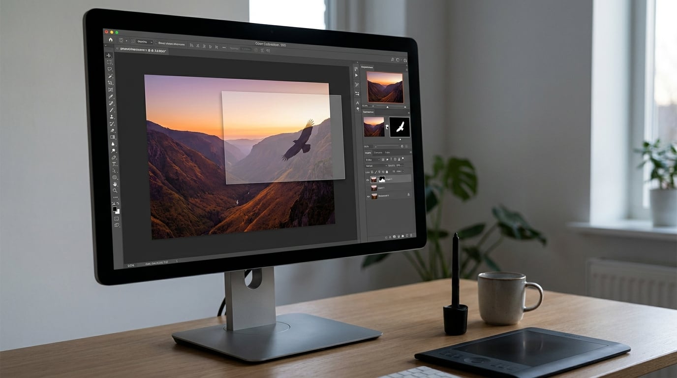
To make a photo composite in Photoshop, open your photos as layers in one document, isolate the subject with a selection, hide the rest with a layer mask, then match the light, color and shadows so the result reads as one photograph. There is no single “composite” button. The whole job is four tools used in the right order.
The hardest part is rarely the cut-out. Anyone can trace an edge in thirty seconds, but a clean edge pasted into badly matched lighting is the thing that gives the whole game away. On r/photoshop, the same complaint shows up over and over: shadows first, edges second, color third.
A beginner’s first believable composite takes about 30 to 60 minutes, and most of that time goes on matching, not cutting. Once you’ve done two or three, the sequence becomes muscle memory.
Table of Contents
- What You Need
- Step-by-Step: How to Make a Photo Composite in Photoshop
- Common Mistakes
- Frequently Asked Questions
- Do I need a paid Photoshop subscription to composite photos?
- What is the difference between a photo composite and a collage?
- Which cut-out method should a beginner use in Photoshop?
- How do I make shadows look realistic under a composited subject?
- How do I match the lighting and color of two photos taken at different times?
- What resolution and file format should I export a composite in?
- Conclusion
What You Need
Software
Any current version of Adobe Photoshop for desktop works, and the iPad app handles the same core tools. Select Subject arrived back in Photoshop CC 2018, so anything you’re renting or buying today has it, along with layer masks, blend modes and the Camera Raw filter.
If Photoshop is not an option, Photopea runs in a browser with the same layer and mask model, and GIMP is a free desktop alternative. Both can do this workflow, though the menu names differ.
Source images
You need two or three photographs. Pick them for compatibility, not for how good they look alone, and check four things before you open Photoshop:
- Light direction. If the sun is behind the subject in one shot and to the side in the other, no amount of color matching will save it.
- Color temperature. A warm late-afternoon frame and a cool shade frame will fight each other for the whole session.
- Camera and lens. Frames from the same camera and focal length match perspective and depth of field for free.
- Resolution and grain. Match them as closely as you can. A 24-megapixel frame dropped onto a 12-megapixel base gives you soft edges you cannot fix later.
A note on direction: many beginners shoot composites as separate exposures and stack them later, which is how the sunset look on r/postprocessing is usually built. That works well for skies and light trails, but it does not solve a subject that needs different lighting.
Tools to have ready inside Photoshop
Select Subject or Object Selection for the cut-out, the Pen tool for hair and hard edges, a layer mask for hiding, blend modes for light and shadow, Camera Raw filter or Curves for color matching, and a soft brush for shadows. That is the whole toolkit.
These are the shortcuts you will use constantly. Learn these first and the workflow stops feeling fiddly.
| Shortcut (Windows / Mac) | Action | Where it is used |
|---|---|---|
| V | Move Tool | Positioning layers and elements |
| Ctrl+T / Cmd+T | Free Transform | Scale, rotate and reposition an element |
| Ctrl+J / Cmd+J | Duplicate Layer | Copying masks and shadow layers |
| B | Brush Tool | Painting on layer masks and shadows |
| Ctrl+I / Cmd+I | Invert | Turning a background reveal into a hide |
| Ctrl+E / Cmd+E | Merge Down | Baking light and shadow layers into one layer |
| Ctrl+Shift+E / Cmd+Shift+E | Merge Visible | Baking a group of finishing layers |
| Alt-click the mask icon / Option-click | Delete layer mask | Recovering from a wrong selection |
| Alt+drag a Smart Filter | Duplicate a Smart Filter | Applying the same look to several layers at once |
For the cut-out itself, pick your method before you start.
| Method | Speed | Precision | Use it for |
|---|---|---|---|
| Select Subject | Seconds | Good on clean contrast | Animals, objects, portraits on plain backgrounds |
| Quick Selection / Object Selection | Fast | Medium | Textured backgrounds like grass or foliage |
| Color Range | Fast | Medium | Flat single-color backgrounds |
| Pen tool with paths | Slow | Highest | Hair, fur, glass, clean architecture |
Start with Select Subject, then correct by hand. Reach for the Pen tool only when the edge is genuinely hard to get right with a brush.
Step-by-Step: How to Make a Photo Composite in Photoshop
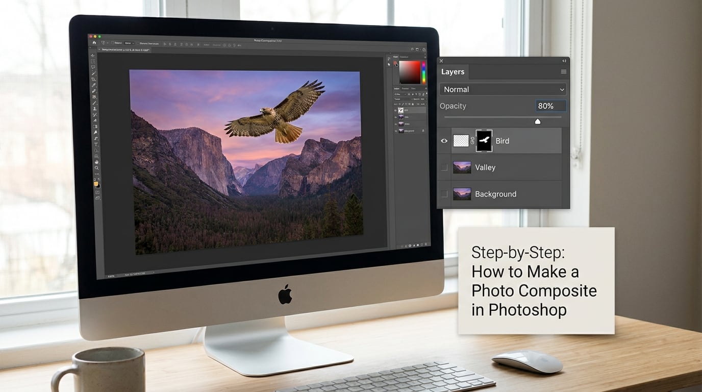
The workflow has four stages, and the order matters: combine, isolate, blend, unify. Combine your images into one document and position them roughly. Isolate the subject. Blend edges, light and shadows so the elements interact. Unify the whole thing with a single finishing pass at the end, never one pass per layer.
1. Choose and Prepare the Base Image
Open your background photo and get it right before anything else. The base sets the light direction, the color palette and the scale for everything that goes on top, so fixing it later means re-matching everything you have already placed.
Straighten it with Camera Raw filter if the horizon is off, crop out distractions, and remove anything that will fight the subject. Generative Fill works well for clearing small intrusions. Save the file now as a layered PSD, so you always have a clean base to return to.
How to tell the base is ready: squint at it. You should see one clear light source, one color temperature and enough open space where you want the subject to sit. If any area of the frame is going to be hidden by the subject, it does not need perfecting.
2. Prepare the Composite Elements
Bring each element in as a new layer. Use Place Embedded from the File menu, or drag the file onto the canvas, then right-click the layer and choose Convert to Smart Object. Smart Objects keep the original pixels, so scaling and warping never soften them.
Run Select Subject on the layer, then click the Add Layer Mask icon at the bottom of the Layers panel. The layer mask hides what you do not need without deleting a single pixel, so you can always paint it back in.
Check the edge at 100 percent zoom with the panel set to outline mode. Look for two things: a bright fringe of background pixels left around the edge, and strands of hair or fur that look chopped. Select and Mask (Select and Mask in newer versions) with a small Smooth and a Shift Edge of about minus 5 percent cleans most of it up.
Now scale the layer with Ctrl+T or Cmd+T. Hold Shift for a proportional scale, and hold Alt or Option while dragging a corner to scale around the anchor point. Make the element sit on the ground plane of your base image, not floating above it.
For anything at an angle, Edit > Transform > Warp is the safe option. Perspective Warp exists, but it moves corner handles and can look wrong on a subject’s face or body, so use it on buildings, roads and boxes only.
How to tell it is scaled right: compare a known object. A door, a car or a person next to the subject should be the size it would be in the base image if they were standing there.
3. Match Lighting, Color, and Perspective
This is the stage that separates a composite from a collage. Two photos shot at different times will have different color temperature, different contrast and different shadow density, and your eye spots the mismatch long before it can name it.
Work one layer at a time, non-destructively. Select the element layer, then Edit > Apply Image on a duplicate, or more simply add a Curves or Levels adjustment layer clipped to it with Alt-click between layers. Push the element toward the background’s white point, black point and midtone contrast.
For a finer match, open the adjustment layer’s Properties panel and use the Blend If sliders. Drag the black slider right and the white slider left until the element’s tones fall inside the background’s tonal range. You can split a slider with Alt or Option-click to keep the top of the range while easing in the bottom, which is how you fade a shadow without losing the highlight.
Shadows are the give-away. If the base image has long soft shadows and your element has short hard ones, repaint the element’s shadow: set a layer mask, pick a soft brush, drop the opacity to 40 or 50 percent, use a dark brown or neutral gray rather than pure black, and stretch it in the direction the light is coming from.
How to tell the match is close: turn every layer’s visibility off and on one at a time. If an element looks obviously brighter or warmer than the rest of the frame, it needs another pass. Zoom to 200 percent and check edges, which is where mismatched sharpening usually shows first.
4. Blend Elements and Create Shadows
Blending is what makes the composite look photographed rather than assembled. It comes down to a layer mask to control where each element appears, a blend mode to control how its tones interact, and a shadow layer to anchor it to the ground.
Add a Contact Shadow first. Duplicate the subject layer with Ctrl+J or Cmd+J, press Ctrl+Backspace or Cmd+Backspace to fill it with the background color, then apply a heavy Gaussian Blur under Filter > Blur. Move the result downward slightly, keep it tight and dark, and mask it so it stays under the subject.
Then add a Cast Shadow for light coming from one side. Take the subject’s layer mask, link a new layer beneath it, fill with the shadow color, blur it generously, and stretch it away from the light source. Soft it with a mask brush at low opacity, since a hard edge here is the classic pasted-on look.
Blend modes do the rest. Keep the shadow layers on Multiply so they darken and never blow out, and use this short list for the rest:
| Blend mode | What it does | Use it for |
|---|---|---|
| Multiply | Darkens, keeps blacks | Shadows, darkening a subject to match a dim scene |
| Screen | Lightens, keeps whites | Light streaks, glows, haze and fog over a dark base |
| Overlay | Boost or crush both ends | Adding contrast and texture to a flat base |
| Soft Light | Gentle contrast shift | Toning an element to match the scene without drama |
| Color | Takes color from one layer | Matching hue while keeping original luminance |
Screen hides black, which is why light-streak composites work so quickly: paint the streak layer black where you do not want it, set the blend mode to Screen, and the black disappears. If you see a visible rectangle where the black should have vanished, the source black is not black enough. Add a Levels adjustment clipped to that layer and drag the black input slider right until the rectangle is gone.
How to tell the blend is working: zoom out to fit on screen and squint. Any element that reads as a separate sticker needs more mask softening or a lower opacity, not a different blend mode.
5. Add Atmosphere and Final Color Grading
Once the elements sit correctly, unify the whole frame with one treatment. Duplicate the merged layers into a Smart Object, then open Camera Raw filter. Set white balance, contrast, curve and a single color mix, apply it once, and everything in the frame moves together.
For a dreamscape feel, let atmosphere pass in front of the subject as well as behind it. Add a soft haze layer at low opacity across the lower third, mask it so it thins near the subject’s face, and let a foreground element overlap the bottom edge. Depth is the fastest way to make a flat composite read as space.
Add matching grain last, at the same amount across every layer, because clean digital edges next to grainy ones look pasted on. A small amount of sharpening after the grain keeps edges crisp without halos.
How to tell the grading is finished: check the histogram for crushed blacks or blown highlights, and look at the image in grayscale. If one area jumps out as pure black or pure white, tone it back before you export.
6. Inspect, Refine, and Export the Composite
View the composite at 100 percent and work around the frame. Most composites fail in two or three specific spots: the cut-out edge, the contact shadow and the horizon line behind the subject.
Fix them small. Use the History Brush or Spot Healing Brush on tonal errors, and a low-opacity mask brush on edge errors. Resist sharpening, which will make every remaining halo more obvious.
Save a layered PSD for future edits, and export a flattened copy for web use. For JPEG, 8-bit RGB at quality 80 to 90 gives a file most sites handle without visible artifacts. Use PNG or TIFF if you need transparency or 16-bit depth for print, and match the export resolution to the base image rather than upscaling.
How to tell you are done: show the composite to someone who has not seen the source images. If they ask which parts were photographed separately, that is a compliment. If they say “that looks cut out”, there is one more pass to do.
Common Mistakes
Hard, obvious edges. Select and Mask with a small radius, then zoom to 200 percent along the edge and paint the mask with a 20 to 30 percent opacity brush. Feather by hand beats feathering automatically.
Bright halos around the subject. The background pixels came along in the selection. Use Select and Mask with Decontaminate Colors set to a low amount, or zoom in, hold Alt, and click the offending edge pixels with the edge blend mode.
Mismatched lighting and color. The number one complaint from people posting their composites for feedback. Clip a Curves or Levels layer to the element and match it to the base before you blend anything.
The subject looks pasted on. It has no shadow. Add a tight contact shadow plus a longer cast shadow on its own layer, Multiply blend mode, soft brush edges.
Visible rectangle from a blend mode. Your source blacks are not fully black. Clip a Levels adjustment to the layer and pull the black input slider right.
Inconsistent scale and perspective. The element is too large or sits at the wrong height. Use Free Transform with Shift held, and check the ground line against an object of known size in the base image.
Over-blurring and over-processing. A heavy sharpening pass at the end creates halos around everything you carefully masked. Sharpen once, lightly, before grain.
Flattening too early. Pressing Ctrl+E repeatedly bakes your masks and blend modes into pixels you cannot get back. Ctrl+E merges down only when you deliberately want that.
Grading every layer separately. If each element has its own final look, the composite will read as a set. Grade the whole frame once, at the end, through the Camera Raw filter.
Too many elements. Three is usually plenty. Every extra element is another lighting match to get wrong, and the eye goes straight to the weakest join.
Frequently Asked Questions
Do I need a paid Photoshop subscription to composite photos?
No. Photopea runs in any browser and uses the same layers, masks and blend modes, so the whole workflow described here works there. GIMP is a free desktop option, though blend mode names differ slightly. Photoshop gives you Select Subject, Select and Mask and the Camera Raw filter, which make the cut-out and final color match faster, but none of them are strictly required.
What is the difference between a photo composite and a collage?
A collage places images side by side with visible edges, so the viewer sees separate pictures. A composite merges elements into one scene, hiding the original backgrounds with layer masks and matching light, color and shadows so the result reads as a single photograph. If you can point at the seams, you have made a collage.
Which cut-out method should a beginner use in Photoshop?
Start with Select Subject, then add a layer mask and fix the edges by hand. It handles objects, animals and clean portraits in seconds. Move to the Quick Selection or Object Selection tool for textured backgrounds such as grass and foliage, and to the Pen tool only when hair or fine detail will not hold up. Color Range works well when the background is one flat color.
How do I make shadows look realistic under a composited subject?
Duplicate the subject layer, fill it with the background color, apply a heavy Gaussian Blur and mask it so it stays under the subject for a contact shadow. Add a second, longer and softer layer stretched away from your light source for a cast shadow. Use Multiply blend mode and a dark neutral tone rather than pure black.
How do I match the lighting and color of two photos taken at different times?
Clip a Curves or Levels adjustment layer to the element and match its black point, white point and midtone contrast to the base image. Fine-tune with the Blend If sliders in the adjustment layer’s Properties panel. Then check the shadows: repaint the element’s shadow with a soft brush at low opacity, pointing away from the light source.
What resolution and file format should I export a composite in?
Match your export resolution to your base image rather than upscaling, and use 8-bit RGB for screen use. Save a layered PSD so you can reopen and keep editing, then export a flattened JPEG at quality 80 to 90 for the web. Use PNG when you need transparency, or 16-bit TIFF for print and heavy retouching.
Conclusion
Start with the base image and give it one clear light source. Cut the subject out with Select Subject, place it on a Smart Object, and match it to the background with a clipped Curves or Levels layer before you blend anything.
Add a contact shadow and a cast shadow, grade the whole frame once through the Camera Raw filter, and save a layered PSD beside your flattened export. That four-stage sequence, combine, isolate, blend, unify, is the whole job, and it stays current as this guide is updated for 2026.