
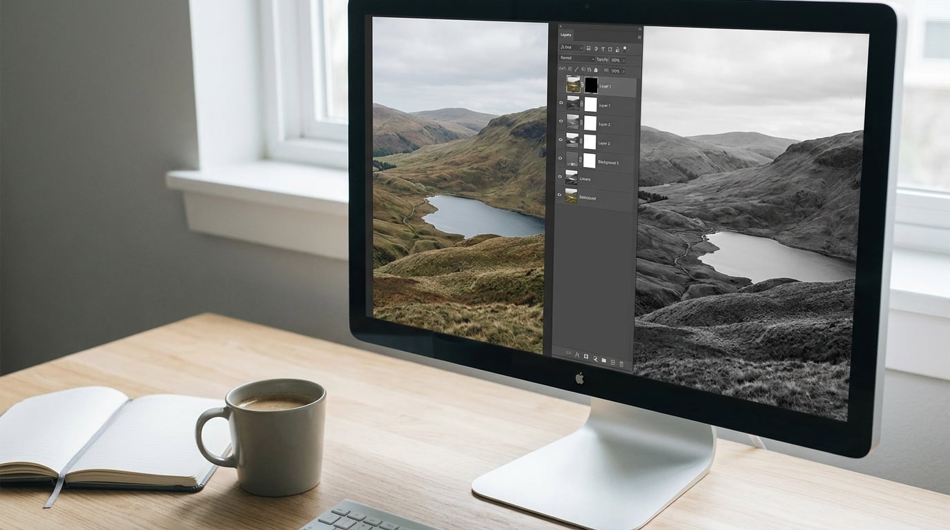
The fastest way to convert a photo to black and white in Photoshop is to add a Black & White adjustment layer from Layer > New Adjustment Layer > Black & White. Photoshop converts the image instantly, the color data stays in the file, and you can dial in six sliders until the tones look right.
Desaturating works too, but it applies one fixed brightness formula to every color, which is why so many quick conversions look flat and muddy. The adjustment layer lets you decide how each color family turns into grey, so a blue sky can stay bright while a red shirt goes dark.
These steps use the panels and menus in the current desktop Photoshop releases, and the same menu names still apply in the recent subscription versions. Paths are written the way Adobe writes them, with the greater-than sign separating each level.
Table of Contents
- What You Need
- Step-by-Step: How to Convert a Photo to Black and White in Photoshop
- Step 1: Duplicate the Photo on a New Layer
- Step 2: Add a Black & White Adjustment Layer
- Step 3: Adjust the Color Channels for Contrast
- Step 4: Refine the Image With Levels or Curves
- Step 5: Use Selective Adjustments for Important Areas
- Step 6: Check Contrast, Grain, and Image Detail
- Step 7: Save or Export the Final Black-and-White Image
- Common Mistakes
- Frequently Asked Questions
- Why are my Black u0026amp; White adjustment options greyed out in Photoshop?
- What is the difference between a black and white image and a grayscale image?
- Are adjustment layers destructive in Photoshop?
- Why does my black and white conversion look flat or washed out?
- How do I get out of Grayscale mode in Photoshop?
- Can you convert a black and white photo back to color in Photoshop?
What You Need
You need Photoshop open with a full-color RGB document. An adjustment layer only works on RGB data, and a file that has already been flattened to Grayscale or Bitmap cannot take one.
- Photoshop with the image already open as an RGB Color document. Check the mode name in the top of the Layers panel or under Image > Mode.
- A layered file, ideally a PSD, a TIFF, or a RAW file you have opened as a Smart Object. A flattened JPEG works, but you have less room to recover later.
- The Properties panel, where the six color sliders and the tint and target options live. If you cannot see it, use Window > Properties.
- The on-image adjustment tool, the small hand icon at the top of the Properties panel. It lets you drag directly on the picture instead of guessing which slider to move.
- Selection tools such as the Quick Selection or Object Selection tool, for the optional selective adjustments later on.
You do not need any plug-in for this. Everything below runs on a standard Photoshop install, and the whole thing takes a couple of minutes once you have done it a few times.
One piece of terminology worth sorting out before you start, because tutorials use these words interchangeably. A grayscale image is made of many tones of grey, from pure black to pure white, and that is what you get from a Black & White adjustment layer. True black and white, which Photoshop calls Bitmap mode, holds only two values with no grey in between. Most of what people want when they ask how to convert a photo to black and white in Photoshop is the first of those, so keep your document in Grayscale-compatible RGB and ignore Bitmap unless you are working with line art.
Step-by-Step: How to Convert a Photo to Black and White in Photoshop
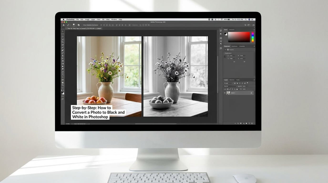
Go to the first step to add the layer, then work down through the tone and detail steps. Check the result after each one rather than waiting for the end.
Step 1: Duplicate the Photo on a New Layer
Select the Background layer in the Layers panel, then press Ctrl+J (Cmd+J on Mac) to duplicate it. Name the copy something like Photo BW so you can tell it apart later.
If the layer is not called Background, or it is a Smart Object from a RAW file, the same shortcut still works. Smart Objects are worth a mention here: open a RAW file as a Smart Object rather than a normal layer and you get an embedded original inside the document, so re-processing the camera raw settings later does not degrade the pixels you already adjusted.
You might ask why bother, when the adjustment layer is already non-destructive. The duplicate is your safety net for the steps that follow, especially the Levels and Curves work. If you decide mid-way that you want the original framing back, you can switch it off and nothing is lost.
It also matters if you are working on a JPEG you pulled from a card. Once you flatten and save, the color is re-compressed every time, and repeated save cycles soften the very detail that a monochrome conversion depends on. Working on a duplicate from the start keeps one untouched color version in the file.
How to tell it worked: the Layers panel now shows two layers, the top one highlighted and named Photo BW.
Step 2: Add a Black & White Adjustment Layer
Go to Layer > New Adjustment Layer > Black & White. Photoshop changes the image to grayscale right away. Name the layer, call it Black & White, and leave the mask set to white so it applies to the whole frame. There is a keyboard shortcut for it too, Ctrl+Alt+Shift+B on Windows and Cmd+Opt+Shift+B on Mac, which adds the layer without touching the menu.
The Properties panel now shows six sliders: reds, yellows, greens, cyans, blues, and magentas. Every color in your photo belongs to one of those six families, and each slider decides how bright or dark that family becomes in the monochrome result. Underneath the sliders sit a Tint checkbox, which adds a flat color cast, and the on-image adjustment tool, the small hand icon in the corner of the panel. The hand is the fastest way to work, because you click a spot on the picture and drag up or down to lighten or darken whatever color is under your cursor.
How to tell it worked: a new layer appears above your photo with a layer mask thumbnail, and the whole canvas is now grey.
Step 3: Adjust the Color Channels for Contrast
Drag each slider to shape the tone. Dragging left darkens that color family, dragging right lightens it, and small movements of five to fifteen points usually make the biggest difference.
A few things I check every time:
- Skin should sit between roughly 20 and 70 percent grey. If faces turn chalk white or nearly black, pull the reds and yellows back toward the middle.
- Skies come mostly from cyans and blues. Lightening blues keeps a sky bright without blowing out the clouds, while darkening them makes stormier weather.
- Foliage lives in the greens slider, and it is the easiest way to separate leaves from the sky behind them.
- Clothing and props often read as one flat shape. Nudging yellows or magentas pulls a shirt away from the wall behind it.
Two habits keep this under control. First, work at the level of a single color family rather than jumping between all six, and second, keep the on-image adjustment tool active so your changes land on the part of the frame you are actually looking at. Sliders alone are fine for a broad, even shift, such as lightening every sky in the frame, but for anything local the hand tool is more honest about what you changed.
If the image looks muddy no matter where you put the sliders, the problem is usually upstream. A flat, low-contrast conversion often starts with a photo that was shot in flat light or exported with a compressed curve, and no amount of channel work fixes that. Fixing exposure and white balance before you convert gives you far more to work with than pushing the sliders harder afterwards.
There is one alternative tool worth knowing. A Channel Mixer adjustment layer lets you output any color channel into any grayscale channel, which means you can add contrast between colors that already have similar luminance. It is older and clumsier than the Black & White layer, and it is still the one to reach for when you need to pull detail out of a single channel, such as separating a dark sky from dark hair. Most people never need it, but it is the answer when a conversion has one stubborn area that the six sliders cannot separate.
How to tell it worked: the image has visible separation between areas that looked the same shade of grey when you started.
Step 4: Refine the Image With Levels or Curves
Add a Levels or Curves adjustment layer above the Black & White layer. Curves gives you more control, so that is my default, but Levels is faster for a first pass.
Set the black point so the darkest shadows have detail rather than turning into solid black, and set the white point just below clipping so highlights keep texture. A quick way to place them is to hold Alt (Option on Mac) and drag on the histogram.
Do this on an adjustment layer rather than with Image > Adjustments, so the change stays reversible. Watch the histogram in the Properties panel as you drag. If the whole range piles up against the right edge, you have clipped highlights and no amount of sharpening will bring them back.
For a conversion that still lacks punch, look at the midtones before you touch the ends. A gentle S-curve through the middle of the histogram adds contrast while keeping the deepest shadows and brightest highlights where they are. A straight diagonal, which is what an untouched Levels layer gives you, changes nothing, and beginners often conclude the layer is broken when in fact it is simply doing nothing.
How to tell it worked: the image has deeper blacks and cleaner whites, and nothing important is sitting as a flat block.
Do this after the Black & White layer rather than before it. Curving a color image and then converting produces a different result from converting first and then curving, because the channel sliders react to whatever tone values they are given. In practice, conversion first gives you a predictable grey scale to shape, and it is much easier to judge what a curve is doing when you can see the actual output.
Step 5: Use Selective Adjustments for Important Areas
Sometimes the tone is right everywhere except one spot. Paint a black mask on the adjustment layer to hide it, or use the on-image adjustment tool to drag just the sky lighter while leaving the foreground alone.
There is a trick here that catches people out. The Black & White adjustment layer only affects pixels that are still full color, so if part of your image was desaturated earlier, that part stays grey no matter what you do with the sliders. That also means you can keep part of a photo in color: paint the mask of the Black & White layer to black over the area you want to leave alone, and the original color shows through again.
How to tell it worked: a local change with a soft edge, no hard line where the mask starts.
Mask edges are where this goes wrong. Paint at a low flow and a large soft brush, or use the Quick Selection tool and then Select and Mask to feather the selection by a pixel or two. A hard edge on a face reads as an editing mistake, because the eye finds the boundary long before it notices the tone shift. Where you need a much larger tonal difference than a mask can blend, add a second adjustment layer clipped to a specific layer using the Create Clipping Mask button at the bottom of the Layers panel.
Step 6: Check Contrast, Grain, and Image Detail
Zoom to 100 percent with Ctrl+ (Cmd+ +) and look at the areas that break first: eyes, hair edges, and bright skies against dark buildings. If you see white fringes or halos, the sharpening from your original capture is being exaggerated by the conversion.
Add a small amount of grain when the tones feel too clean and clinical. A grain layer with a soft light or overlay blend at low opacity is usually more convincing than heavy sharpening, and it hides the sensor noise that monochrome work tends to reveal. Load black and white noise through Filter > Noise > Add Noise at around three to five percent, keep the option to monochromatic noise ticked, and drop the layer opacity until it sits under the surface.
Step back and look at the frame as a whole rather than at the zoomed view. At 100 percent you see halos, clipping, and noise; at fit-on-screen you see the tonal balance, which is what a viewer actually registers. If the image reads well small, it will read well large, and the reverse is rarely true.
How to tell it worked: no clipped shadow blocks, no halo edges, and detail still visible in the brightest area of the frame.
Step 7: Save or Export the Final Black-and-White Image
Keep your working file. Choose File > Save As and save a layered PSD or TIFF so the adjustment layers, masks, and original color are all still there later. For print, a flattened TIFF at 16 bits avoids the banding you can get from pushing a low-bit file into deep shadows, and it keeps Photoshop’s RGB numbers intact for a print house that will convert the file itself.
If the picture is headed somewhere that only accepts greyscale, converting the mode at this last moment is reasonable, and by then you have already made every decision the mode would have prevented you from making.
For a flat version for the web, flatten a copy with Ctrl+Shift+Alt+E (Cmd+Shift+Opt+E) and save it as a JPEG. Keep the PSD untouched, because the flattened copy is the one you cannot undo.
One more case worth knowing: if you need true black and white with only two values and no grey at all, save a duplicate under Image > Mode > Bitmap. That gives you a one-bit image, which is a different thing from grayscale and is only worth it for line art, stencils, or very small file sizes.
Common Mistakes
Almost every complaint I see about this workflow comes down to one of a handful of things.
- Flattening first. Merging layers before you add the adjustment layer removes the option to change your mind. Duplicate the layer or work on a PSD instead.
- Trusting Desaturate on its own. Image > Adjustments > Desaturate simply drops all color and keeps the same fixed brightness formula for every hue, which is why the result looks flat. Follow it with a Black & White adjustment layer, or skip it entirely.
- Switching to Image > Mode > Grayscale too early. It is a destructive conversion. The color data is gone the moment you confirm the dialog, and you are back to a fixed recipe with no sliders.
- Pushing contrast too far. Huge slider moves on all six channels flatten faces and blow out skies. Small moves, checked one at a time, look better almost every time.
- Ignoring skin tones. Reds and yellows are where faces live. Judge every conversion against skin, not against the background.
- Over-sharpening after converting. A monochrome image reads as sharper than it is, so a sharpening pass on top often looks harsh and creates halos. Sharpen before you convert, or barely at all after.
- Confusing the words. Black and white, grayscale, greyscale, and desaturated all get used loosely in tutorials. A Black & White adjustment layer still produces a grayscale image, with many tones of grey, until you deliberately change the mode to Bitmap.
If a menu item is greyed out, check the document mode first. Under Image > Mode, if your file is already Grayscale or Bitmap, switch it back to RGB Color and the Black & White layer becomes available again. It also stays unavailable when the layer is locked, when the layer mask is being targeted with a selection active, or when a layer mask is being edited with Quick Mask mode switched on.
A few people try three or four different methods on the same file and get a different result from each, with no idea why. That is not a mistake on their part. Desaturate, Grayscale mode, a Hue/Saturation layer with saturation at zero, and a Black & White adjustment layer each use a slightly different brightness recipe, so of course the results differ. For accuracy, the adjustment layer wins on control. If you want brightness that matches how your eye reads a color, a solid Color Fill layer set to hue zero and saturation zero in Color blend mode is the method some trainers prefer, though it gives you no fine control afterward.
Two more things come up regularly enough to be worth a short note. If you want grey that is not actually grey, leave the Tint checkbox on in the Black & White Properties panel and pick a color. A sepia or burgundy tint reads as an intentional choice, which is not true of a flat desaturation, and it suits vintage portrait and document work. If you have a folder of shots to convert, build the layer stack once on the first image, then open the Actions panel, record a set, and run the same action across the batch so every frame keeps the same tonal treatment.
The last piece of advice is the one people resist most. Do the conversion as late as possible in your workflow, and keep the color original underneath the whole way through. The moment you commit to a flattened grayscale file, the six sliders, the curves, and the ability to put color back are all gone, and you are editing a photograph rather than a picture of a photograph.
Frequently Asked Questions
Why are my Black u0026amp; White adjustment options greyed out in Photoshop?
It is almost always the document mode. A Black u0026amp; White adjustment layer only works on RGB data, so if you have already used Image u0026gt; Mode u0026gt; Grayscale or Bitmap, switch back to RGB Color and the option returns. It is also greyed out when the layer is locked, when Quick Mask mode is active, or when you have a selection on an empty area. Check the mode name at the top of the Layers panel first, since that is the cause in most cases.
What is the difference between a black and white image and a grayscale image?
Grayscale means an image made of many tones of grey, from pure black to pure white, and that is what the Black u0026amp; White adjustment layer produces. True black and white, called Bitmap mode in Photoshop, contains only two values, pure black and pure white, with no grey in between. Bitmap gives tiny file sizes and hard edges, so it suits line art and stencils rather than photographs. A photograph converted to Bitmap usually looks harsh and posterized.
Are adjustment layers destructive in Photoshop?
No. An adjustment layer stores its settings separately and applies them to the layers below, so hiding it, changing the sliders, or deleting it leaves your original pixels untouched. Destructive edits are the ones that rewrite pixels, such as Image u0026gt; Adjustments u0026gt; Desaturate or Image u0026gt; Mode u0026gt; Grayscale, because those bake the change into the file. As long as you keep your adjustment layers, you can switch back to color at any time.
Why does my black and white conversion look flat or washed out?
A flat result usually means the image was desaturated and nothing was done afterward, so it inherited one fixed brightness formula and lost the separation that color was providing. Add or go back to the Black u0026amp; White adjustment layer and move the sliders so tones separate, then follow it with a Curves or Levels adjustment layer to set your black and white points. Watch the histogram as you drag so you do not clip either end.
How do I get out of Grayscale mode in Photoshop?
Go to Image u0026gt; Mode and choose RGB Color. Any color information that was discarded when you converted to Grayscale cannot be brought back, so if you need the color, close without saving and reopen the original file. Once you are back in RGB you can add a Black u0026amp; White adjustment layer and keep the color data in the file, which is the reason to avoid Grayscale mode in the first place.
Can you convert a black and white photo back to color in Photoshop?
You can add color, but the information is gone, so Photoshop has to invent it. Start with a Curves adjustment layer split into separate channels to tint the skin, hair, and background differently, then use a Hue/Saturation adjustment layer with its colorize option to give the midtones a single base color. Refine with a Selective Color or Paint Bucket layer on a soft light blend. Small, plausible color shifts look convincing, and an obviously tinted image does not.
Start with the adjustment layer, not Desaturate, and leave the file in RGB so you can keep changing your mind. That habit is the whole answer to how to convert a photo to black and white in Photoshop without giving up the color data. If you only do one extra thing, fine-tune the reds and yellows against the skin in the frame, because that is usually the difference between a snapshot in grey and a photograph people want to look at.