
When a composite looks fake, the shadow is usually the reason, not the edges or the colors. Learning how to make shadows look real in photo composites comes down to matching four things to the background: the direction the light comes from, where the shadow falls, how soft its edge is, and how dark and what color it goes. Most of the work is diagnosis rather than painting, and a clean fix on a simple composite takes 15 to 30 minutes once you know what to look for.
You do not need to be a lighting expert. You need a layer-based editor, about half an hour, and the discipline to change one thing at a time. I have rebuilt the same kind of shadow on enough composites to know that the third pass almost always looks worse than the first.
Table of Contents
- What You Need
- Step-by-Step: Make Shadows Look Real in Photo Composites
- Common Mistakes
- Frequently Asked Questions
- Should shadows in photo composites be sharp or blurry?
- How do I fix shadows that point in different directions?
- What is the best blend mode for a realistic cast shadow?
- How do I make a shadow look softer without losing its shape?
- How do I choose the right shadow color and darkness?
- Why does my composite still look fake even when the shadow is dark?
- Conclusion
What You Need
At minimum you need a layer-based editor. Photoshop, Affinity Photo and GIMP all handle the workflow described here, because the workflow depends on separate layers and masks rather than on any single feature. Everything I describe below is available in the free options too, just under a different menu name.
Beyond the editor, these are the tools you will actually reach for:
- A subject silhouette on its own transparent layer, so you can reuse its shape for the cast shadow.
- Selection and masking tools for clean edges. The Pen Tool and Quick Selection both work; the Pen Tool is more accurate on hard geometry.
- Adjustment layers such as Curves, Hue/Saturation and Color Balance, so density and color changes stay reversible.
- Transform controls including Free Transform, Transform Warp and Perspective Distort, for fitting the shadow to the ground plane.
- A soft brush and a large soft eraser, which do most of the actual painting.
- Gaussian Blur and Path Blur for edge control on the cast shadow.
- Dodge and Burn tools, used sparingly, for the last density pass.
Before you start, run a short preflight on both source images. Check that they share enough resolution that your subject is not being enlarged past its original pixel dimensions. Look at the subject edges under 200 percent zoom and fix any leftover background fringe first, because a halo around the subject will read as a halo around its shadow. Compare the overall color temperature of the two frames, and note which direction every existing shadow in the background falls. If the subject and the background disagree wildly on camera height or focal length, the shadow work becomes an uphill fight, so fix the perspective before you paint anything.
Step-by-Step: Make Shadows Look Real in Photo Composites
Here is the working principle: a believable shadow is a photograph of the light that is already in your background plate, not a dark shape you invented. Light travels in straight lines, so the shadow always points directly away from the light source and stretches longer as that source drops lower toward the horizon. The closer the subject sits to the surface, the tighter and darker the contact shadow gets; the further light travels before it lands, the softer the cast shadow edge becomes.
Work non-destructively throughout. Keep the shadow on its own layer, keep your masks unclipped where you can, and compare at 100 percent zoom rather than at fit-to-screen. Make small corrections in a deliberate order: direction, then contact, then softness, then density, then color. Skipping ahead is what produces the muddy, over-blurred shadows that give the game away.
1. Establish the light direction
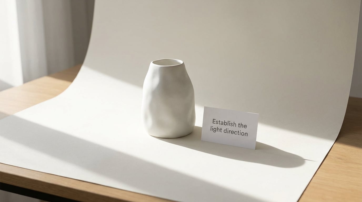
The light direction in your composite is set by the background, not by your subject. Open the background plate and trace every existing shadow you can find, then look at the highlight and shadow sides of every object in the frame. Those two clues together tell you where the key light is, and how high it sits.
Then do the same for your cut-out subject. Note which side is lit, which side falls into shade, and where its own original shadow pointed before you removed it. Most mismatches show up here: a subject lit from the left dropped into a scene lit from the right reads as fake no matter how good the shadow is, because the subject’s own shading still disagrees with the scene.
Pick one dominant direction and commit to it. If the background has a clear sun, the subject’s shading has to agree with that sun, and the shadow has to fall opposite the light. Where two subjects in the background cast clearly separate shadows, your inserted object can reasonably cast two as well, with the softer and less opaque one coming from the weaker source.
Quick test: blur the whole composite slightly with Filter > Blur > Gaussian Blur at around 6 pixels, or squint at it from across the room. Conflicting directions that are invisible at 100 percent become obvious at a glance, because the brain compares shadow angles instantly. If two shadows form a V, or nearly a Y, one of them is wrong. This is the fastest diagnostic in the whole process and it costs two seconds.
2. Match shadow softness to distance and light size
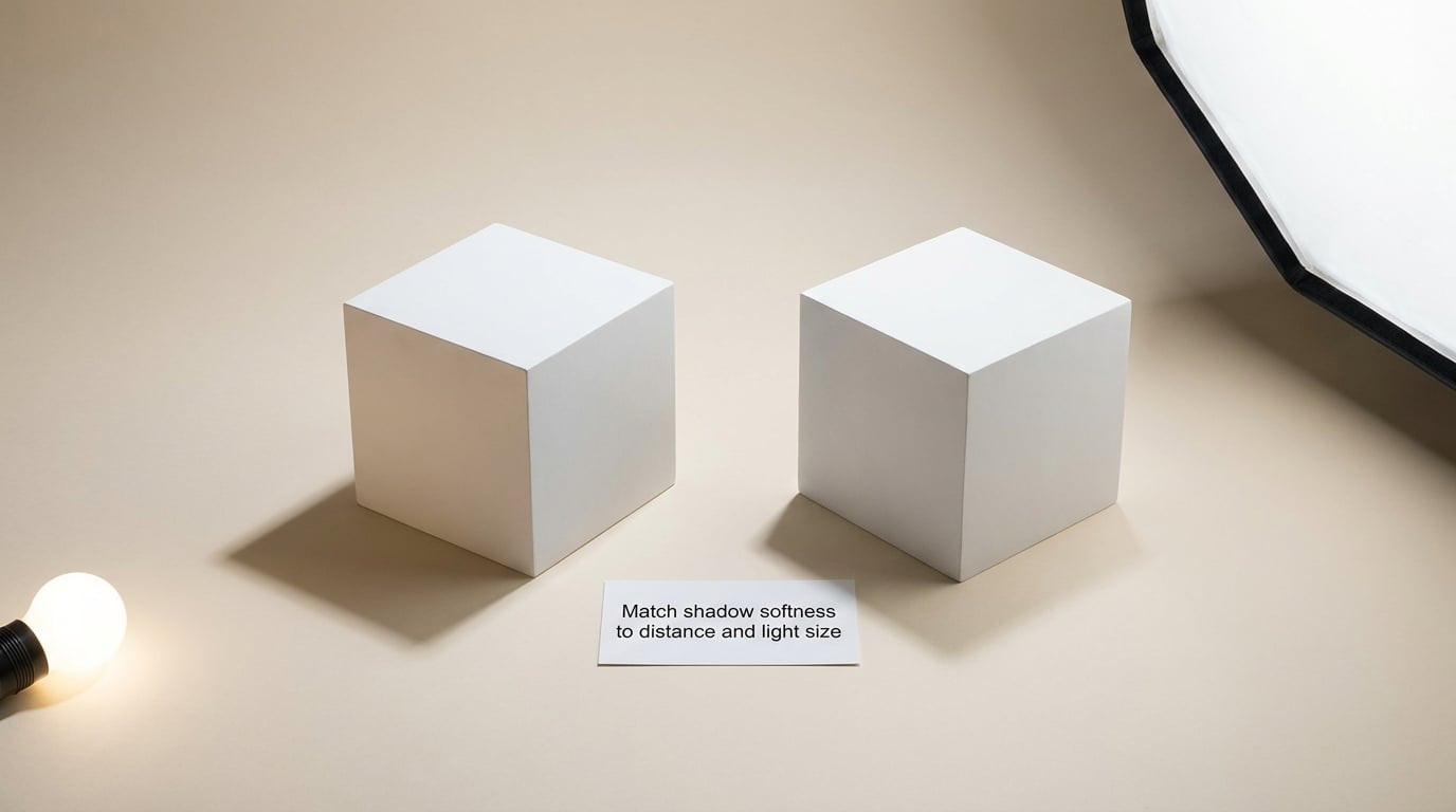
Shadow edge softness depends on the apparent size of the light source and on how far the subject is from the surface receiving the shadow. A point-sized source, like direct midday sun, gives a hard edge. A large soft source, like a window or a big diffuser, gives a soft edge. A small object close to a wall also gives a hard edge, because little light has room to spread before it reaches the surface.
This is why one identical blur across a whole shadow looks fake. Real shadow softness is graded: tight and dark where the object touches down, opening out as the shadow travels away from the contact point. A single Gaussian Blur applied to the entire shape gives every part of the shadow the same penumbra, and the eye reads that as wrong immediately.
To calibrate, zoom to 100 percent and compare your shadow’s edge transition against an existing shadow in the background. Sample two or three points along that existing edge and ask how many pixels it takes to go from full shadow to full background. That measurement, in pixels, is your blur radius. Compare a second edge that falls further from its object, and you should find it wider.
Keep the contact area noticeably sharper than the far end of the cast shadow. If your contact shadow is soft, the object looks like it is hovering a few millimetres above the surface no matter how dark it is.
3. Build the contact shadow first
Grounding the subject matters more than the dramatic cast shadow, and this is the step most people skip. A subject with a beautiful cast shadow but no tight dark edge underneath it floats. The contact shadow is the single strongest signal that an object has weight and is touching something.
On a new layer above the background, set the foreground to a dark neutral and paint with a soft round brush at roughly 15 to 25 percent opacity. Start directly beneath the subject, along the edge that actually meets the surface, and follow the real geometry of the base rather than a guess. Widen the stroke slightly under the heaviest part of the object, where the light is most blocked.
Drop to roughly 5 to 10 percent opacity for a second pass, and use it to taper the shadow out at the edges. Then select the shadow layer and run a light Gaussian Blur, about 1 to 2 pixels, to kill the brush texture. A copy of that blurred layer, blurred harder and set lower, gives you the wide soft ambient darkening that sits underneath everything and suggests shallow depth.
Two things to protect while you work. Surface texture should stay visible through the shadow, so keep the layer on Multiply or a soft brush at modest opacity rather than painting opaque black. And the darkest point is not pure black. Real contact shadows pick up bounce from the surface, so leave the deepest area a shade above black and tint it with the surface color you sampled earlier.
4. Add or refine the cast shadow
The cast shadow is the shadow the body of the object throws away from the light. Derive it from the subject silhouette you already have: duplicate the subject layer, fill it with a flat dark color, and that shape becomes your working shadow.
Now fit it to the ground. Use Free Transform to scale and rotate it away from the light, then Transform Warp to bend it across the floor if the surface recedes. If the background is shot at a strong angle, Perspective Distort is the tool that lets the far end of the shadow narrow correctly as it runs toward the horizon. This step is what answers the question that comes up constantly on forums, which is how to get a shadow to follow the background’s perspective lines rather than sitting flat on top of it.
Start the shadow a short distance out from the contact area so the two do not merge into one blob, then add a gradient mask so the far end fades out instead of stopping. Blur with Gaussian Blur for a general softness, or Path Blur if you want a controlled gradient along the length of the shape, which is closer to how real falloff behaves.
The pasted-on look almost always comes from one of four things: the opacity is too high, the direction is a few degrees off, the length does not match the light’s elevation angle, or the falloff is flat from end to end. Check those four before you touch anything else, and correct them one at a time.
5. Match density, color, and reflected light
Shadow color is set by the light that reaches it, which is rarely the key light. Open shadows on a sunny day are lit by the blue sky above them, which is why shadows in landscape photography skew cool even when the direct light is warm. That one cue does more for realism than most beginners expect, and almost nobody sets it on purpose.
Sample the existing shadows in your background with the eyedropper instead of picking a color from a swatch. Set your shadow layer to Soft Light for a gentler integration, or Multiply when you need it to darken a surface reliably; keep an eye on Linear Burn and Color Burn, which bite hard fast and are easy to overdo. Add a Hue/Saturation adjustment layer, clipped to the shadow, to push the hue and density separately so you can tune them without repainting.
Reduce the darkest areas rather than making everything black. In a real composite the range runs from a fairly dark contact core through to a barely-there cast shadow tip, and if every part of the shadow sits at the same density the whole shape reads as a cut-out sticker. Reduce opacity toward the far end and toward the side away from the light.
Then add the reflected light. A warm floor throws a subtle warm tint into the underside of a shadow, and a nearby object can bounce colored light into the edge of a shadow. Keep it faint. Reflected light describes what is already in the scene; if what you are adding implies a second light source that is not there, you have added an object that does not belong.
6. Check perspective, edges, and final integration
The final pass is a checklist, not a painting session. Confirm the camera angle and horizon match between subject and background, and that the shadow runs in the same vanishing direction as the floor lines. Check shadow length against the apparent elevation of the light, contact placement against the real base of the subject, and edge sharpness against the existing shadows. Then check grain, color temperature, and any pale fringe where your subject meets its new surroundings.
Use clipping masks and layer opacity for the last adjustments, plus dodge and burn on a separate low-opacity layer if a region still needs more or less density. Avoid raising contrast globally to hide an awkward shadow; it flattens the whole frame and the shadow still looks wrong.
Here is the specific test for detecting an artificial shadow. View the composite at thumbnail size, the size it appears in a search result or a social post. If the shadow is the first thing you notice, it is too dark, too long, or too sharply defined. Real shadows are almost never the focal point of an image, so shrink the view until the whole frame is smaller than your thumb, and if the shadow is what pops, that is your answer.
Finish with a side-by-side against the original source photography at full size, toggling the shadow layer on and off. A shadow that you are proud of at 30 percent opacity usually turns out to be too faint at 100 percent, and the toggle is the fastest way to find the honest value.
Common Mistakes
Almost every failed shadow comes down to one of the following. The fix is usually a smaller change than expected.
- One uniform blur on the whole shadow. A single blur radius cannot be right for both the contact edge and the far tip. Blur the base at 1 to 2 pixels and the tip at 8 to 15, or use Path Blur for a graded falloff.
- Shadow too dark. Almost always over-darkened with a strong blend mode or an opaque paint. Drop the layer opacity until the background texture is still faintly visible through the shadow.
- Shadow too long. Length follows the light’s elevation angle. Compare against a shadow in the background cast by something of similar height, and match that rather than guessing.
- Contact shadow in the wrong place. It should hug the real base of the subject, weighted toward the side facing away from the light. If it floats to one side, the subject’s own shading is fighting you; fix that first.
- No contact shadow at all. The classic beginner error, and the reason so many composites look like stickers. Add the dark, tight grounding edge before any cast shadow.
- Ignoring ambient color. A pure gray or pure black shadow ignores the skylight and bounce already present in the scene. Sample an existing shadow and match its hue and density.
- Rotating a flat shadow without correcting perspective. Rotating a horizontal shadow on a receding floor leaves the far end too wide. Warp or perspective-distort it so the far end narrows toward the vanishing point.
- Mismatched grain. A crisp digital shadow on a grainy film-like background is instantly detectable. Apply a light grain overlay clipped to the shadow layer at low opacity.
- One shadow for a scene with two light sources. Where the background clearly shows two shadows from one object, the honest fix is a second, weaker shadow from the secondary source rather than a single compromise shape.
A few habits keep the iteration fast. Save variations with names like v1-flat, v2-warped, v3-graded, because you will want to compare three opacity values side by side before deciding. Compare at 100 percent for edge work and at fit-to-screen for direction and density work; the two jobs need different zoom levels. And check the result in grayscale once, which removes color from the equation and makes an incorrect shadow angle much easier to see, then at thumbnail size, which is how most people will actually see it.
Frequently Asked Questions
Should shadows in photo composites be sharp or blurry?
Both, in the same shadow. The edge is tight and dark where the subject meets the surface, then opens out as the shadow travels away from it. That is penumbra: a small light source gives a sharp edge, a large diffused one gives a soft edge. If the whole shadow has one uniform blur, the eye reads it as a pasted shape. When you work out how to make shadows look real in photo composites, grade the softness from the contact point outward rather than picking a single radius.
How do I fix shadows that point in different directions?
Decide which light source the composite is built around, usually the one producing the strongest existing shadows in the background, and make your subject match it. That means correcting the subject’s own lit and shaded sides, not just rotating the cast shadow. If a second light is clearly visible in the scene, add a second weaker shadow from that direction instead of trying to average the two into one. Blur the whole composite by about 6 pixels and squint at it; conflicting directions pop out instantly that way.
What is the best blend mode for a realistic cast shadow?
Multiply is the safest default because it darkens while letting the background texture show through, so the surface still reads as the same material. Soft Light gives a gentler, more natural integration when the shadow is subtle or the background is already busy. Linear Burn and Color Burn darken too fast and usually force you into a lower layer opacity just to compensate. Whichever mode you pick, clip an adjustment layer to the shadow so you can change density and hue without repainting the shape.
How do I make a shadow look softer without losing its shape?
Soften the edges, not the body. Blur the shadow layer, then bring the core back with a darker, tighter duplicate underneath so the shadow keeps its density while its edge loses definition. A layer mask or a gradient mask lets you hold the soft shape in place near the contact area and let the far tip dissolve. Softness should increase with distance from the object, so a single uniform blur is what makes a shadow read as artificial.
How do I choose the right shadow color and darkness?
Sample an existing shadow in the background with the eyedropper and match its hue and density rather than choosing from a swatch. Shadows are usually lit by skylight and bounce, not by the key light, so they skew cooler and lighter than the object above them. The darkest contact area should still show surface texture and a hint of reflected color, never pure black. If the background holds no shadow to copy, err on the side of lighter and cooler.
Why does my composite still look fake even when the shadow is dark?
Darkness is not realism. A heavy black shadow with the wrong angle, a uniform blur, a missing tight contact edge, or a mismatch with the subject’s own lighting will all read as fake at any density. Work through direction, contact, softness, then density in that order, and test at thumbnail size. If the shadow is the first thing you notice when the image is small, it is too dark or too sharply defined, so pull the opacity down before adjusting anything else.
Conclusion
Start with the light, not the brush. Find the key light in the background, match your subject’s shaded side to it, and then paint a tight contact shadow so the object touches the surface. Only after that is grounded should you add the cast shadow, warp it into the background’s perspective, and grade its softness from the contact point outward.
Density and color come last. Sample the shadows already in the scene, lean cooler and lighter than you think you should, and add only the bounce light the scene actually justifies. Compare the result against your source photography at full size, and change one variable at a time so you can attribute every improvement to a specific change. That habit, more than any single blend mode or blur setting, is what makes shadows look real in photo composites. These principles have not changed since the early digital workflows, and they still hold in 2026.