
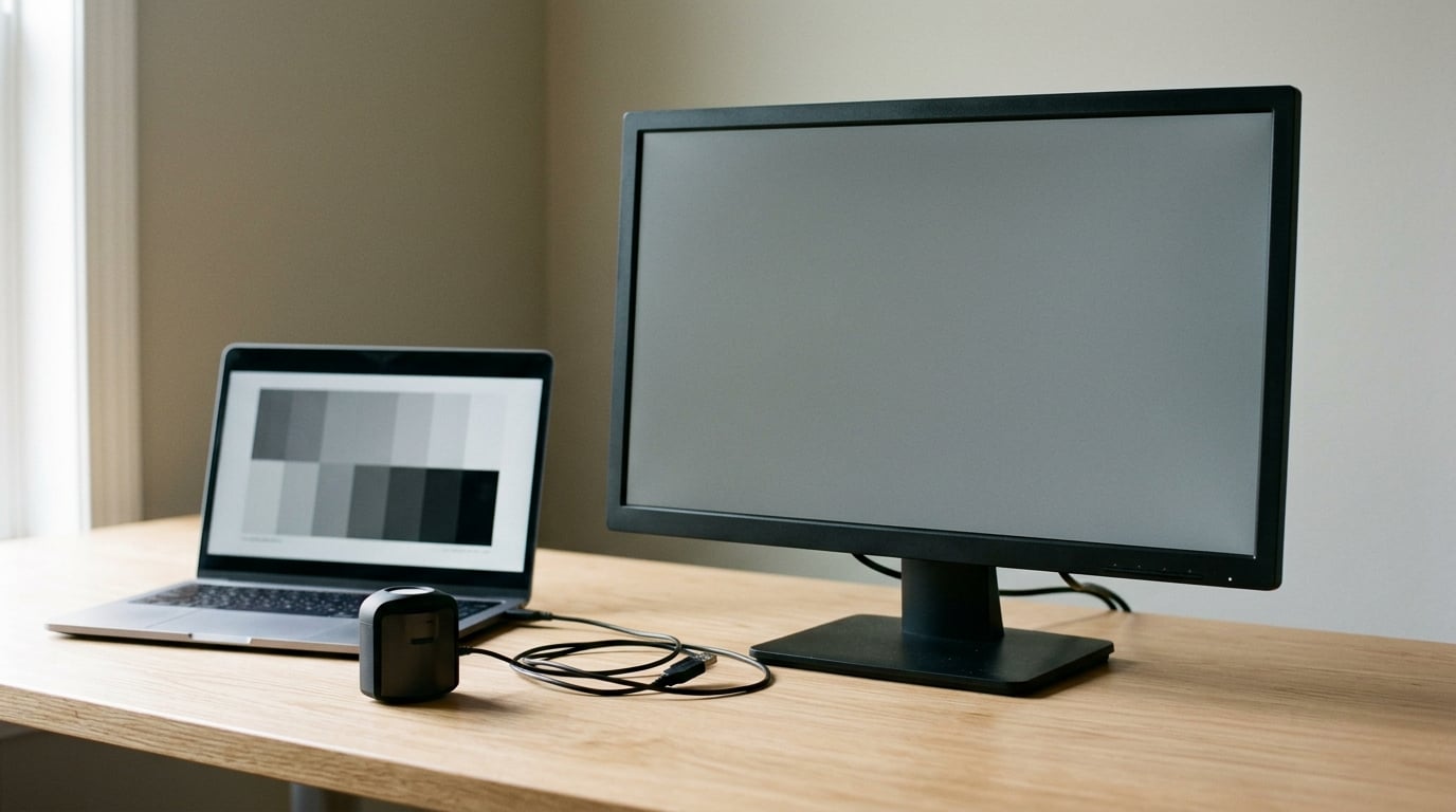
If your edits look good on screen and dull on paper, you learn to stop trusting the screen, and that is the real damage. Calibrating a monitor for printing means measuring the light your display actually emits, adjusting it to a known target, and saving that measurement as an ICC profile your editing software reads every time it opens a file. The accurate route runs through a hardware colorimeter pointed at a target of roughly 120 cd/m2 luminance, a D65 white point and gamma 2.2. The free route uses a visual calibrator built into Windows or macOS and gets you part of the way. Neither makes screen and print identical, because your monitor emits RGB light and your printer lays down CMYK ink, and those two color worlds only partly overlap.
The gap between those worlds is the reason so many people never bother calibrating. It looks like a settings problem and it is really a translation problem. Your screen adds light to a surface; your printer subtracts light with ink. Saturation behaves differently in each, dark tones get compressed on paper, and a vivid blue on screen can simply be outside what a pigment inkjet can produce at all.
So here is what to understand before you touch a single slider. Calibration describes what your display is doing right now, and adjusts it toward reference values. Profiling is the measuring and describing of that display, and the result is the ICC profile file. The monitor profile converts colors for viewing; a separate printer and paper profile converts them for output. Swap the two and everything turns muddy, which is one of the mistakes that trips up most people later in this guide.
Table of Contents
What You Need to Calibrate a Monitor for Printing
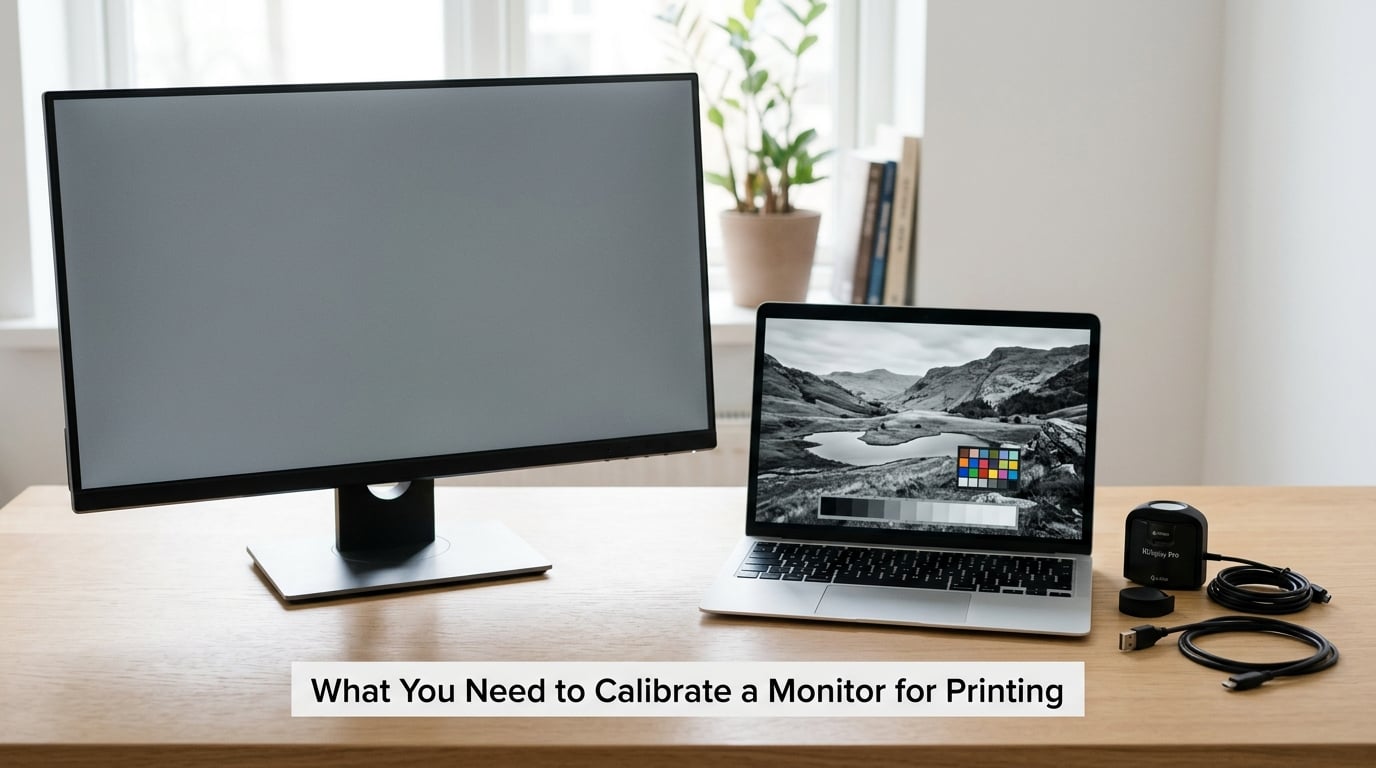
There are two routes, and the honest difference between them matters more than any brand recommendation. A hardware colorimeter is a small measuring device that sits on or over your screen and reads the actual light coming off each test patch. It is accurate, repeatable, and it is the only route that produces a profile your software can trust for serious work.
The second route is a visual calibration assistant built into your operating system or shipped with the monitor. It shows you test images and asks you to decide which one looks closer to a reference. It needs no purchase, and it is a reasonable first move for a laptop or a basic display with no manufacturer profile available. Its ceiling is lower, because a tired, biased human eye decides the outcome.
Beyond the method, you need a few things that are easy to forget:
- A monitor worth calibrating. Any decent panel benefits. A laptop screen can be calibrated, but brightness controls are usually coarse and glossy finishes add reflections that cap your accuracy.
- Software or device. A colorimeter comes with its own software, which is where the profile gets saved. The OS route uses the assistant already installed.
- Controlled lighting. Dimmable room, screen brightness turned down, no direct window light and no lamp behind you. Ambient light decides what your eye calls normal.
- A neutral test image. A grayscale ramp and a set of neutral patches for judging casts, usually generated by the calibration software.
- An ICC profile for your printer and paper. This is the piece most home printers skip, and skipping it is why a correct monitor still produces wrong prints.
- A physical print for verification. Calibration you never verify against paper is a guess with extra steps.
Step-by-Step
1. Prepare the Monitor and Printing Workspace
Leave the display switched on for 20 to 30 minutes before you start. Backlight brightness and color temperature drift as a panel warms, and calibrating a cold panel means your profile is wrong within the hour.
Set the screen to its native resolution and its native refresh rate, then let the graphics driver handle all scaling. A non-native resolution resamples the image and smears those fine gradients that reveal banding, which is exactly what you need to judge during calibration. Update your graphics drivers too, since a stale driver frequently resets color management without telling you.
Then switch off every automatic adjustment. On Windows, turn off Night Light and adaptive brightness. On macOS, turn off True Tone and set display scheduling to Never. In the monitor’s own on-screen menu, reset to factory defaults and leave the picture mode alone instead of picking Vivid, Cinema or a gaming preset. Those modes clip color on purpose.
Dim the room and, if you can, aim for about 64 lux of ambient light. People who calibrate in a bright room end up with a profile tuned to conditions they will not print under. You will know this step worked when your display settings panel names the monitor you actually want to calibrate, and the on-screen menu shows no brightness or picture-mode override.
2. Set the Monitor to Its Correct Factory Profile
Before measuring anything, make sure the operating system is using the right profile for the display. Windows and macOS bundle generic profiles that are close to nobody’s hardware.
- Windows 11: open Settings, then System, then Display, then Color profile, and select the profile named for your monitor’s make and model.
- Windows 10: open Settings, then System, then Display, then Advanced display settings, then Color profile, and again pick the profile named for your monitor’s make and model.
- macOS: open System Settings, then Displays, then Color Profile, and select the profile named for your display. sRGB IEC61966-2.1 is the generic fallback when no specific profile exists.
If your monitor manufacturer ships a custom ICC profile, install it and select it here. It is measurably closer to your hardware than the generic profile. Once your own calibration exists, it replaces the manufacturer profile in that same list, and applications pick it up immediately. Nothing needs re-launching in most cases, though closing and reopening the editing application is a cheap way to be sure.
One warning for wide-gamut displays: the Windows visual calibration assistant can flatten a wide-gamut profile down toward generic sRGB. That is one reason to calibrate with a colorimeter on that hardware, even if you have never spent money on one otherwise.
3. Choose Hardware or Visual Calibration
A colorimeter earns its cost when your work ends up on paper that clients see. It removes your eyes from the process, it gives you a measurable error figure afterwards, and it repeats the same way in December as in July. Most hobbyists get nearly all of the benefit from a basic four-channel unit, and the more advanced multi-channel devices mainly add speed and profiling for projectors and printers.
Using one takes about five minutes. Connect it by USB, launch the software, choose your display from the list, and set your targets before you start: D65 for photography and general work, 120 cd/m2 for printing, gamma 2.2. When the software asks you to place the device, rest it flat against the panel in the center of the screen, hinged closed like a phone against a book, with nothing covering the sensor. Screen dimming and privacy filters can confuse the reading, so close them.
The visual route is where you start if you want a free fix today. On Windows, open the Start menu, type calibrate, and choose Calibrate Display Color. The assistant walks through gamma, brightness, contrast and color balance, adjusting the on-screen display to your choices as you move sliders. On macOS, go to System Settings, then Displays, then Color Profile, then Advanced, which opens the Display Calibrator Assistant with the same sequence.
What it will not do is describe the display for your editing software, which is why a visual pass fixes the way your monitor behaves but cannot rescue colors in an unmanaged print path.
As for using your phone: no, it cannot do this. A phone camera has fixed exposure and white balance, no spectral sensitivity matching the eye, and its screen is calibrated to look good in its own backlight. Apps that claim otherwise read a test image and tell you what the hardware already knew.
You will know this step worked when you end up with a saved ICC profile, or a display adjusted to a set of targets you can repeat.
4. Adjust Gamma, Brightness, Contrast, and White Point
During a hardware calibration the software prints a series of patches on screen and asks you to nudge brightness, white point and RGB gains until its readings land on target. Change one control at a time and let each settle for a few seconds. Moving several at once makes it impossible to tell which adjustment helped and which one overshot.
- Luminance, target 120 cd/m2. Anything around 100 to 140 is workable. Go lower if your room is dim; push toward 160 cd/m2 when you judge prints under bright light-box conditions.
- White point, target D65 for photo and design work. D50 is the choice for print and prepress work, where papers and viewing conditions are standardized to that illuminant.
- Gamma, target 2.2. Rarely worth changing. Correct it only if the ramp still curves visibly after the profile is applied.
- Black point, between 0.5 and 1.5 nits. True black crushes shadow detail and makes soft proofs look worse than the print.
- Color space, sRGB for general and print work. Move to Adobe RGB only when every part of your pipeline supports it, including the printer, the paper and the driver.
Read the result rather than trusting the words. In the histogram view, the ramp should sit along the diagonal with no plateaus or steps in the shadows, which is banding. Neutral patches should read neutral, and if one is obviously green or magenta you are looking at a panel defect or a badly behaving factory profile rather than something calibration can fix.
That histogram view is also your earliest warning. If contrast is set too high, the middle of the ramp sits above the line and highlights clip, which is the classic reason edits look punchy on screen and flat on paper.
5. Validate the Profile and Printing Workflow
Run the software’s validation target when the calibration finishes. It measures the result again and reports average and maximum deviation, and for most panels on a decent display you are aiming for values under about 2. Save the profile with a name you will recognize six months from now, such as the panel name, the white point and the date.
Then assign it. In Photoshop, open Edit, then Color Settings, then Color Management, and confirm the working RGB space and the profile under each Convert to. In Lightroom Classic, the profile assignment lives in the Develop module’s Color Grading panel, and the soft proof happens under the same panel with the Proof Setup menu.
Load the profile that matches your exact printer and paper combination, then soft proof. This is where people expect an exact match and stop believing the workflow, but a soft proof is a simulation: it cannot account for dot gain, paper texture, gloss level or the lighting in your room. It tells you whether the printer will run out of gamut before you spend ink discovering it.
Finally, print one small image and judge it in neutral light, not under a warm lamp and not at midday by a window. If a print comes out consistently darker than your screen, that is normal, and the common fix is to stop comparing shadow-to-shadow and compare midtones instead. A print viewed under a bright, color-neutral light source looks lighter than the same file on a display at 120 cd/m2.
You will know this step worked when a small test print holds up against the proof under decent light, and when you can put the file away without second-guessing it.
Common Mistakes
Most disappointing results come from the environment, not the device. Here is what goes wrong, and what to do about it.
Calibrating in a bright or warm room. Daylight through a window, or a warm bulb behind you, both shift what your eye calls neutral. Calibration then bakes in a compromise. Close the curtains, kill the warm lamp, and if your room lighting changes through the day, expect to recalibrate when it does.
Running a non-native resolution. Everything gets resampled, so gradients look smooth while being wrong. Set the panel to its native resolution and correct refresh rate before you begin, and leave scaling to the graphics driver.
Judging images against white browser windows. A bright white surround makes the same image look darker and more contrasty by comparison, so you over-brighten and over-crush edits to compensate. Judge against a mid-gray or neutral surround, the same way you judge the print.
Confusing an sRGB display profile with a printer profile. The display profile tells Photoshop what your monitor can show. The printer profile tells it what the printer plus ink plus paper combination can reproduce. The printer profile comes from your printer manufacturer, and for a specific paper it usually comes from the paper company’s site. Loading a display profile where the printer profile belongs gives you colors that are worse than having no color management at all.
Leaving the printer on automatic color handling. In the driver, set the color handling option to let the application manage colors, turn off printer ink enhancement and vivid or saturated modes, and select your actual paper type by name rather than letting the driver guess. Pick matte, glossy or fine art correctly, since those surfaces reflect light very differently.
Changing brightness, contrast and gamma in one sitting. When the result is wrong you have no idea which control caused it. Change one, wait, evaluate, then move to the next.
Recalibrating too often, or not at all. Monthly suits a hobbyist who prints regularly. Professionals who work in a color-managed pipeline often recalibrate every two to four weeks. Recalibrate immediately after moving the monitor, changing rooms, changing ambient lighting, or a firmware update, since any of those shift the panel’s behavior.
Expecting an exact match. You are not getting one, and any guide that promises it is selling something. A calibrated monitor plus a color-managed printer gets you close enough that a stranger cannot spot the difference. That is the standard worth aiming for.
One last habit that saves more money than any of this: keep your calibration software and your printer profiles in one folder, and note the viewing light you judge prints under. Six months from now, when a client sends back a print you thought was perfect, those two details are what tell you whether the file or the room was at fault.
Frequently Asked Questions
Do I need a colorimeter to calibrate a monitor for printing?
No, but it is the only route that is measurable and repeatable. The Windows Calibrate Display Color assistant and the macOS Display Calibrator Assistant adjust your display to targets your eyes choose, which fixes brightness and contrast behavior without a purchase. A colorimeter removes your eyes from the process, produces a saved ICC profile, and lets you confirm the result afterwards. For casual home printing, try the free route first and upgrade only if prints still drift.
How often should I calibrate my monitor for photo printing?
Monthly is plenty if you print regularly and your setup has not changed. Professionals working in a color-managed pipeline often recalibrate every two to four weeks. Recalibrate immediately rather than waiting when you move the monitor, change rooms, alter your ambient lighting, or install a firmware update, because each of those shifts panel behavior. Rooms with lighting that changes through the day need attention more often than windowless studios.
Should I calibrate to sRGB or Adobe RGB?
Use sRGB unless every part of your output chain supports Adobe RGB. A wider working space only helps if your printer, paper and driver can actually reproduce those saturated colors, otherwise you are editing colors that will be clipped on output. If you shoot JPEG and print at home, sRGB is the safe and accurate choice. Set the target white point to D65 for general photo work, and consider D50 if you work to print industry standards.
Why does my monitor look accurate but my prints still look different?
Because two different things are being described. Your monitor emits RGB light; your printer lays down CMYK ink, and the two gamuts only partly overlap. Paper adds texture and gloss, ink darkens tones, and the light you view the print under changes everything. Check that you have loaded the profile for your exact printer and paper combination, that the driver is set to let the application manage colors, and that you are judging the print under bright neutral light.
Should I use the monitor profile or the printer profile in Photoshop?
Both, each in its own job. Photoshop uses your monitor profile when converting colors for display, and uses the printer profile when it converts them for output or for soft proofing. Never assign a monitor profile where a printer profile belongs, and never assign a printer profile as your working space, because colors will shift badly in both directions. Under Edit, Color Settings, Color Management, your working RGB space carries the monitor profile and the conversion target carries the printer profile.
Conclusion
Start with the boring part, because that is where the accuracy comes from. Leave the display on for half an hour, set its native resolution, switch off Night Light, True Tone and every automatic brightness setting, and dim the room. Install the correct manufacturer profile for your panel, or run your own calibration to 120 cd/m2 at D65 with gamma 2.2, then save and validate the ICC profile before you edit anything.
Next, load the printer and paper profile and soft proof once. Then print a single small image, view it under bright neutral light, and judge midtones rather than shadows. Get that habit in place and the daily frustration of wondering whether you can trust what you see goes away, which is the actual reason to calibrate a monitor for printing in the first place.