
A camera picture style is a built-in profile that tells your camera how to render the JPEG it writes: how contrast, saturation, colour tone and sharpening are pushed, or how the frame is converted to black and white with a colour filter and toning effect. Monochrome mode is simply the black-and-white member of that family. These settings shape the file before any editing software touches it, which is why the same scene looks different on two cameras set to different styles.
The short version for most people: leave the style on Standard or Neutral if you shoot RAW, pick Monochrome when you want to compose in black and white, and only customise once you know what each control does. This guide covers what each setting changes, which styles most cameras ship with, how monochrome conversion works, and the point that trips up nearly every beginner, namely that picture styles do not touch your RAW data. Menu names and available controls vary by model and by model year, so treat the paths below as a map and check your own manual for the exact wording. Everything here was checked against manufacturer documentation and photographer forums in 2026.
Table of Contents
- Camera Picture Styles and Monochrome Mode Explained
- What Does a Camera Picture Style Actually Change?
- Which Picture Styles Are Available on Most Cameras?
- How Does Monochrome Mode Create a Black-and-White Image?
- Do Picture Styles Change RAW Files?
- Are Camera Picture Styles the Same as Filters?
- How Do I Choose the Best Picture Style for My Photography?
- Why Do Picture Styles Look Different Across Camera Brands?
- Frequently Asked Questions
- Start With Neutral, Then Add Intentional Contrast
Camera Picture Styles and Monochrome Mode Explained
Picture styles are named rendering presets. Select one and the camera’s JPEG engine applies that profile as it builds the file, adding contrast, shifting hues, or dropping all colour on the way out. They are not a filter applied afterwards, and they are not a replacement for editing. They are one step in the pipeline between the sensor and the JPEG.
That is the whole concept, but three practical consequences follow from it. First, the style affects the JPEG, the video file, and the preview image embedded in your RAW file. Second, the RAW sensor data itself stays untouched. Third, the style only changes what you see and what you get if you never open editing software.
Every major brand ships the same idea under a different name, and hunting for the menu is the single most common source of forum confusion:
| Brand | Menu name for the feature | Typical preset names | Black-and-white option |
|---|---|---|---|
| Canon | Picture Style | Standard, Portrait, Landscape, Neutral, Faithful, Monochrome, User Defined | Monochrome, with filter effects and toning effects |
| Nikon | Picture Control | Standard, Neutral, Vivid, Portrait, Landscape, Monochrome, Flat Picture Control, custom slots | Monochrome and Monochrome M, plus filter effects |
| Fujifilm | Film Simulation | Pro Neg Std, Pro Neg Hi, Classic Neg, Neg, Astia, Velvia, Pro Neg Black, Eterna, Acros, Sepia, Monochrome | Acros and Monochrome, each with yellow, red or green filter simulation |
| Sony | Creative Style (stills) | Standard, Portrait, Landscape, Vivid, Neutral, Clear, Deept, Night, Autumn Leaves, Black & White | Black & White style, plus separate Picture Effects for JPEG |
| Olympus and OM System | Picture Mode | Natural, Vivid, Muted, Flat, i-Fine, Monotone, plus Art Filters | Monotone, and monochrome variants inside Art Filters |
| Panasonic Lumix | Photo Style | Standard, Vivid, Natural, Monochrome, L.Monochrome, Portrait, Custom | Monochrome and L.Monochrome, with filter effects |
| Pentax | Picture Style | Standard, Bright, Natural, Muted, Monochrome, Soft Film, plus Film Composite | Monochrome and Monochrome with filter and toning |
| Sigma | Color Tone (with Looks and Effects) | Standard, Vivid, Neutral, Soft, Faded, Dark, Sepia, monochrome Looks | Monochrome looks with red, green and blue filters |
| Leica | Picture Profile | Standard, Vivid, Natural, Classic, Conti., Monochrome | Monochrome profiles including high-contrast variants |
Camera Picture Styles and Monochrome Mode Explained in Practice
Shoot JPEG only with Standard selected and the file you hand to a client looks balanced and slightly conservative. Switch the same camera to Vivid or a saturated film simulation and blues, greens and skin tones all move further from neutral before you touch a slider.
Shoot RAW plus JPEG and the two files disagree on purpose. The RAW keeps the full colour data, the JPEG carries whatever the style did to it. That pairing is the standard way to get a ready-to-send black-and-white frame while keeping the colour original for later, and it is what most working photographers do.
Monochrome mode also changes what you see on the rear screen while you compose. On most bodies the live view image, the electronic viewfinder, and the quick menu display switch to greyscale, which means you can judge tone and luminance before pressing the shutter rather than guessing.
None of that applies to a RAW file opened in Lightroom. The picture style the camera recorded is stored as metadata, and the software reads that record, not your intent.
What Does a Camera Picture Style Actually Change?
Picture styles control the rendering properties of the JPEG, and the exact list of controls you can adjust depends on the camera model and which mode you are in. Across brands the common controls are these:
- Sharpness, often split into sharpening amount, radius and threshold, so you can control how much edge contrast is added and how large the affected area is.
- Contrast, usually with a tone curve for highlights, midtones and shadows on newer bodies.
- Saturation, the overall intensity of colour in the image.
- Colour tone or hue, which shifts reds toward orange or yellow, and greens toward cyan or yellow.
- Brightness on models that separate it from contrast.
- Noise reduction and, on some models, separate luminance and colour noise reduction.
- Filter effect and toning effect in black-and-white modes.
- Grain effect and Color Chrome Effect on Fujifilm bodies.
Sharpness deserves a warning. Raising it to fight a soft-looking JPEG is a common mistake, and the result is halos along rooflines and crunchy detail in shadow areas. The style is a starting point, not a fix for a photograph that was underexposed or shot at too high an ISO.
Note also that some controls only exist inside a particular style. Grain and Color Chrome on Fujifilm live under the film simulation settings, and Leica’s contrast and saturation behave differently in the high-contrast monochrome profiles than in Conti.
Which Picture Styles Are Available on Most Cameras?
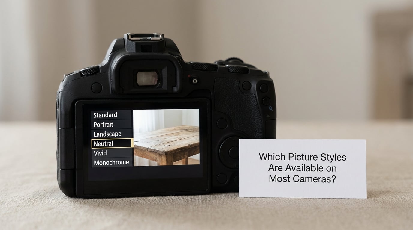
Almost every camera offers the same small set of families, whatever the brand calls them.
Standard is the everyday default. Contrast and saturation sit close to neutral, skin tones stay predictable, and it is the safest choice when you hand JPEGs to someone else to print or use online.
Portrait lowers saturation slightly and softens the overall rendering, which keeps skin from turning orange or red in warm light.
Landscape or Vivid style, often called Velvia on Fujifilm or Vivid on Nikon and Sony, pushes saturation and contrast hard. Skies and foliage look dramatic at midday and look garish in flat light or at a wedding.
Neutral or Faithful style renders close to the sensor data with minimal contrast added. Canon splits these into two: Neutral stays flat in a user-facing way, Faithful keeps colour values truer. On Fujifilm the equivalent is Pro Neg Std, and on Olympus it is Natural.
Monochrome or Monotone converts to greyscale and opens the filter and toning controls described below. Nikon splits it further into Monochrome and Monochrome M, and offers a separate Flat Picture Control that gives RAW shooters a deliberately dull rendering they can re-grade later.
Film simulation styles on Fujifilm are the deepest set of any manufacturer, with around eleven options plus filter and grain controls. Astia is a gentle skin-tone-friendly simulation, Classic Neg adds warm muted colour, Eterna is deliberately low in saturation, and Velvia is the vivid one.
User defined or custom slots exist on every brand. You adjust a style, save it to a numbered slot, and recall it with two dial clicks. The number of free slots varies, so check your camera before planning around several custom looks.
One caveat worth repeating because it comes up constantly in forum threads: these settings are highly subjective. There is no single correct style, and a look that is perfect for a street shooter can be wrong for a newborn shoot.
How Does Monochrome Mode Create a Black-and-White Image?
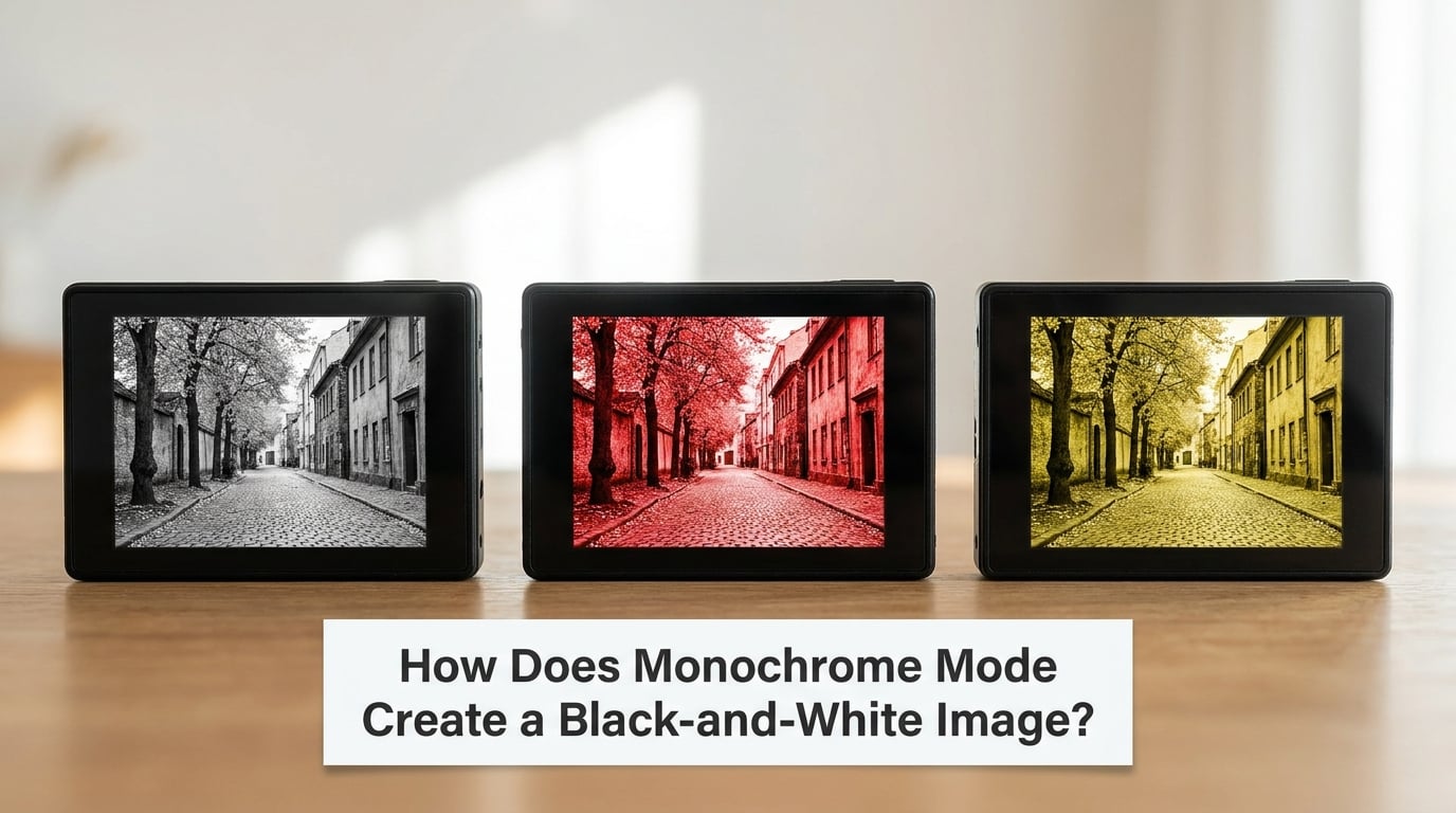
A camera cannot record light as colour, only as brightness per channel. Monochrome mode takes the red, green and blue channels from the sensor, converts them to luminance, and mixes them into tones of grey. The camera lets you bias that mix with a filter setting, which simulates the coloured filter a photographer would otherwise screw onto the front of a large-format lens.
The rule is short and counter-intuitive at first: the filter darkens the colours it is named after. A red filter darkens skin and foliage, so a face goes lighter against a dark background and leaves separate from a bright sky. A yellow filter darkens a blue sky more gently while keeping skin tones workable. A green filter reduces overall contrast and cuts through haze, which suits distant scenery, and it is the one to use cautiously on portraits.
Typical subjects and the filters that suit them:
- Portraits — none, or a red filter for separation. Blue eyes and blond hair gain contrast under red.
- Woodland and distant scenery — red for dramatic separation between leaves and sky, yellow for a gentler version.
- Architecture and streets — none for a neutral documentary result, yellow for a little extra punch.
- Haze and far landscapes — green, because it cuts atmospheric haze and lowers overall contrast.
- Low light and indoor — none. A coloured filter darkens the image further, and you are already working with limited light.
Toning sits on top of that. Sepia, blue, brown and green toning colour the whole frame, with red, blue and green filters listed separately as stronger tints. Fujifilm’s Acros and Monochrome simulations apply the same idea, with a filter simulation dropdown offering yellow, red and green, plus separate grain and colour-chrome controls that change the feel rather than the tones.
If your monochrome result looks dull, the cause is nearly always that the scene had little tonal separation to begin with, and no filter setting will rescue it. A pale sky against pale concrete stays pale. Move to a time of day with directional light, or look for genuine contrast between subject and background.
Do Picture Styles Change RAW Files?
No. Picture styles do not change the RAW data. The RAW file records the sensor’s colour data untouched, and the style you selected is stored in it as a metadata tag that tells editing software which style created the embedded preview JPEG.
So when you open a RAW file shot in Monochrome in Lightroom, you see colour. That is correct behaviour, not a fault. The RAW still holds the full colour information, and nothing was thrown away when you pressed the shutter.
There are two reasons a RAW file can still look monochrome in some software. Some applications honour the embedded preview and display the JPEG rendering. And in Adobe Camera Raw and Lightroom you can select a matching profile from the Camera Matching folder, which applies the camera and style of your choice to the RAW data, including monochrome options.
To reproduce your camera’s look on a RAW file:
- Open the RAW file in Adobe Camera Raw or Lightroom.
- Open the Profile browser, usually the icon in the image panel, and choose Camera Matching.
- Select your camera make and model, then the picture style you used, for example Monochrome with a red filter.
- Fine-tune with the tone curve, and check the B&W mixer panel, which mixes the red, green and blue channels just as the camera did.
- Copy the settings as a preset so you can reuse the look across a whole shoot.
The B&W mixer panel in that software is where the channel mix can be adjusted far beyond what any camera menu offers, which is the real reason many people shoot RAW even when they enjoy the in-camera monochrome look.
Are Camera Picture Styles the Same as Filters?
No, and the difference matters. A picture style is a full profile: it bundles contrast, saturation, tone, sharpening and, in black-and-white modes, filter and toning settings. A filter effect is one control inside monochrome mode. Picture Effects and Creative Filters on some brands are separate systems again, sitting alongside the full style rather than inside it.
Sony is the clearest example of why this distinction confuses people. Its three colour systems are not interchangeable. Creative Style applies to stills in both JPEG and RAW. Picture Effects apply only to the JPEG and can stop RAW capture entirely on some models. Picture Profiles apply to video, not to stills at all.
On Olympus and OM System, Art Filters and Picture Modes live in the same menu but behave differently, and bracketing across several art filters is a feature the brand supports. On Panasonic the equivalent separation is Photo Style against Filter Settings. Fujifilm’s grain and Color Chrome controls sit inside the film simulation rather than in a separate filter menu.
Practical advice: resist stacking a strong style, a filter effect, a heavy sharpening setting and a creative filter on top of each other. Each one pushes in the same direction, and the combination usually looks worse than any single setting. Pick one look, then adjust a single control until it does what you want.
How Do I Choose the Best Picture Style for My Photography?
Work through these questions in order. What are you outputting, JPEG only or RAW plus JPEG? What is the subject, and how is it lit? Does the style hold skin tones under the light you actually shoot in? And will you edit the file afterwards, or hand it over as it is?
Then start from the recommendation table below and adjust from there.
| Subject or use | Good starting point | Why |
|---|---|---|
| Portraits and skin | Neutral or Faithful, Pro Neg Std, or Portrait style | Holds natural skin tone under mixed light |
| Nature and scenery | Vivid or Velvia when the light is strong, Neutral in overcast conditions | Saturation helps in hard light and turns muddy in flat light |
| Street and documentary | Standard, Flat Picture Control with RAW, or Classic Neg | Subtle rendering does not fight the scene |
| Wedding and events | Neutral or Portrait for JPEGs delivered to clients, Standard with RAW for your own edit | You cannot correct a skin tone that is already red |
| Travel and mixed light | Standard, or Eterna for a subdued look | Handles the widest range of light without surprises |
| Black and white | Monochrome or Monotone, filter set for the subject, with RAW alongside | You keep the option to re-mix channels later |
| Video | The video profile system, usually a flat or log profile | Grading needs headroom, which picture styles do not provide |
Once a style works, save it. Every brand lets you adjust a style and store the result in a user defined or custom slot, so you stop re-dialing the same contrast and sharpness values at the start of every shoot. Canon’s slots are Picture Style User Def. 1 to 3, Nikon’s are custom Picture Controls loaded through a utility, and Fujifilm stores customised film simulations directly in the function buttons.
Brand software matters if you want to build a style on a computer instead of in the menu. Canon’s Picture Style Editor and EOS Utility handle uploading style files to the body, Nikon’s Picture Control Utility 2 and NX Studio do the same for Picture Controls, X Raw Studio works with Fujifilm and Olympus files, and NX Studio covers recent Nikon bodies. Each is free from the manufacturer’s site.
White balance interacts with everything above. A picture style adjusts the rendering of colours, not their measurement, so a warm auto white balance shift still happens underneath a Neutral style. Shoot RAW with auto white balance if you want the camera’s best guess recorded, or set a custom Kelvin value from a grey card if you need consistency across a whole wedding day. Canon users note the difference between auto white balance and its white-balance-shift variant, and the same choice exists under a different name on other brands.
Why Do Picture Styles Look Different Across Camera Brands?
Two cameras set to Neutral will not produce identical files, and that is expected. The differences come from colour science, the default contrast curve each maker applies, how many controls the menu exposes, and how far the film simulations lean from a true rendering.
Names are the least reliable guide. Neutral on one brand may sit closer to what another calls Standard, and Fujifilm’s Pro Neg Std is nothing like Canon’s Neutral. The names describe intent, not a shared formula.
Control depth also varies. Newer bodies and higher-end models expose tone curve, hue and colour space controls that entry-level models hide. The same menu label can cover three sliders on one camera and seven on another.
There is also a philosophical split. Some manufacturers prioritise accurate rendering so files match what a colour-managed display shows, others prioritise a look. The second group treats film simulation as a creative tool rather than an accuracy setting, and photo communities tend to notice the difference immediately when comparing files from different systems.
A method for comparing fairly, in five steps:
- Set both cameras to the same lens equivalent focal length and the same aperture.
- Use a manual white balance at the same Kelvin value on both, so white balance is not a variable.
- Select the closest equivalent style on each, choosing Neutral or Standard rather than a film simulation.
- Shoot the same static subject under identical light, and compare the JPEGs side by side on a calibrated display.
- Adjust one control at a time on the camera you prefer, and store the result in a user defined slot.
If you move between brands regularly, that last step is the one that pays off. The slot saves the look, and it moves with you in spirit even when the menu wording does not.
Frequently Asked Questions
What is the best picture style for general photography?
Standard on most cameras, or Neutral where one exists, is the best general-purpose choice. It keeps contrast and saturation close to neutral, holds skin tones predictably, and needs the least correction later. Choose Vivid or a saturated film simulation only when the light is strong enough to support it, and avoid both when you deliver JPEGs straight to clients.
Can I use picture styles when shooting in RAW?
Yes, and you should. The style renders the JPEG and the video, and it is recorded as metadata on the RAW file along with the embedded preview. The sensor data in the RAW is not altered, so the colour information survives whatever style you chose. Many photographers shoot RAW plus JPEG with a style set, getting a usable file immediately without giving up the editable original.
Why does my monochrome image look flat?
Most often the scene itself lacked tonal separation, and a grey conversion cannot invent contrast that was not in the frame. A pale sky against pale concrete will stay pale whatever settings you use. Other causes are a green filter, which deliberately lowers contrast, and over-softening of sharpening. Try red for a subject against a bright background, or shoot when the light is directional.
Should I use a red, yellow, or green filter in monochrome mode?
Use red for portraits, since it darkens skin and foliage and makes faces stand out, and for woodland where you want leaves to separate from sky. Use yellow as a gentler middle ground for streets and architecture. Use green for distant scenery and haze, where you want reduced contrast, but avoid it on close portraits. No filter is a perfectly good choice for neutral documentary work.
Can picture styles be used for video?
Stills picture styles are not the tool for video. Most brands separate the two: Sony uses Picture Profiles for footage, Panasonic offers film and picture style options, and Canon and Nikon use their own video colour menus. Video profiles are built for grading, with flat or log curves that leave headroom for colour work. Applying a stills style to a video file does not work because the controls are different.
Start With Neutral, Then Add Intentional Contrast
Here is the first thing to do. Check which style your camera is actually set to right now, then shoot the same scene twice: once on Standard or Neutral, once on Monochrome. Comparing the two frames from the same position tells you more in ten seconds than an hour of reading about the settings.
After that, change one control at a time. Raise contrast a step and look again, add a red filter and look again. If you adjust four things simultaneously you will not know which one helped, and you will end up with a look you cannot repeat on the next shoot.
When you land on something you like, save it to a user defined slot and use that from then on. That is how picture styles stop being a menu you scroll past and become part of how you shoot.