
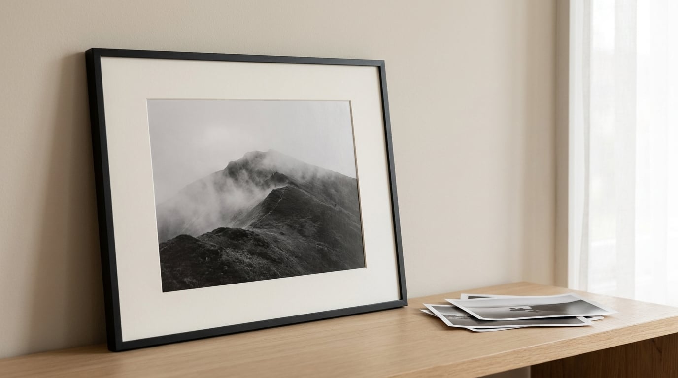
Knowing how to choose a frame for black and white photos comes down to tone and proportion, because there is no colour to match. Pick a slim moulding in black, charcoal or natural wood, then build the mat from the lightest tones in your print rather than from the wall paint. Keep the mat border at least twice as wide as the frame’s face, and let the image sit slightly high so it appears centred.
That is the whole decision in four moves. Everything below unpacks it: how to read your print’s tonal range, how to size a frame to it, which mat colour protects and flatters it, and how to check the finished piece before it goes on the wall.
Framing a black and white photo is easier in one respect and harder in another than framing a colour print. There is no hue clash to dodge, but there is also no colour to carry the composition, so every proportion decision becomes visible.
Table of Contents
- What You Need
- Step-by-Step: How to Choose a Frame for Black and White Photos
- Common Mistakes
- Frequently Asked Questions
- What color frame is best for a black and white photo?
- Should I use a white or black mat for a black-and-white photograph?
- What size frame should I choose for my print?
- Is glass or acrylic better for framing black-and-white photos?
- How wide should the mat be around a photograph?
- How do I prevent glare when displaying a framed photo?
What You Need
Most of the work happens before you touch a frame. Gather these first and the shopping takes an afternoon rather than a month of second-guessing.
- The print itself. Not a photo of it on your phone, the actual print, so you can judge tone under the light of the room.
- Exact measurements. Width by height in inches, including any deckled edge or white border the print already carries.
- Two or three frame options in different face widths, ideally in the same colour, so you can see how moulding width changes the apparent size.
- Conservation-grade mat board in a few neutral tones, so you can hold them against the print before committing.
- Glazing to test against. A sheet of clear glass and, if the frame is large, a sheet of acrylic. Tilt each one and watch for reflections.
- An opening tool, a knife and a ruler if you intend to cut your own window mount.
- Wall conditions. The wall colour, the furniture below the print, and whether anything is directly opposite that will bounce light back at it.
Most ready-made frames arrive with a wood-pulp mat included. Treat it as packaging, not as a mounting, and check the label for the words conservation grade or museum quality before you use it.
Step-by-Step: How to Choose a Frame for Black and White Photos
Assess the Photograph’s Tones and Composition
Start by reading the print’s tone range. A high-key photograph sits mostly light, with soft shadows and little pure black. A low-key photograph does the opposite, dropping most of the image into shadow with a few bright accents.
Look at the lightest area of the print and hold a piece of mat board against it. If the board is brighter than anything in the image, it will pull the eye away from the photograph. That single comparison settles most mat questions before you start shopping for frames.
Composition matters just as much. Note where the visual weight sits, and note where the negative space falls. A print with a dark mass in the lower third wants a mat weighted the same way, while a frame can sit anywhere on a busy wall.
Match the Frame Proportions to the Image
Work from the print’s aspect ratio rather than from a standard frame size, then adjust. A standard eight-by-ten inch print is a four-by-five ratio, so an eleven-by-fourteen inch frame with a two-inch mat on each side is a clean fit: the mat turns it into a roughly square nine-by-ten inch opening.
Landscape prints need wider side borders than tall ones to stay optically balanced, and panoramic prints usually want a deeper mat top and bottom so the frame does not become a letterbox slot. Square prints take a wider border all round, because a narrow mat makes them read as small.
Two placements work better than a perfectly centred one. Hanging the image slightly high, or weighting the bottom mat border an extra quarter inch, compensates for the fact that the eye reads an object as sitting high in its opening.
| Photograph | Frame colour that flatters it | Mat colour |
|---|---|---|
| High-key, soft shadows, few true blacks | Black or charcoal, to give the pale tones something to sit against | Warm white matched to the print’s lightest tone |
| Low-key, mostly shadow with bright accents | Slim matte black or dark metal, kept narrow so it does not add weight | Black mat for a graphic edge, warm white for a traditional look |
| Balanced mid-grey range | Charcoal, natural wood or a thin silver metal | Off-white, or a double mat with a warm white outer |
| Hard contrast, deep blacks and bright whites | Slim black or a very narrow moulding in any neutral tone | Off-white kept clearly brighter than the print’s whites |
| Faded or vintage, whites gone cream | Wood or bronze, which sit with warm paper | Cream or ivory that matches the faded paper exactly |
Choose Matting and Contrast for Black-and-White Images
Mat board does two jobs. It separates the print from the moulding, and it sets the brightness the eye reads as the edge of the photograph. A stark white mat next to a warm-toned vintage print will make that print look dingy, because the contrast reads as a fault in the print rather than in the mat.
Pull the colour instead. Take the lightest tone in the image, then step outward: ivory, warm white, then off-white. Black mats are the counter-consensus that many photographers prefer, because a black border lets the image edges dissolve and pushes attention inward. Black mats need a frame with enough contrast around them, which usually means wood or a light metal rather than black itself.
White mats and black mats can also combine as a double mat, with a wide black or charcoal band behind a narrower warm white one. It gives the print an extra ring of air and reads well in a small frame.
Width comes next, and there is a rule professional framers use: the mat border should be at least twice the width of the moulding’s face. A one-inch frame face wants a two-inch mat, a narrow quarter-inch metal profile can take a one-inch mat. Small prints need proportionally wider borders, roughly two inches all round, or they look lost on a wall.
Two terms worth knowing. Mat burn is the brown stain that appears where acidic board touches the print edge, and it comes from lignin in cheap wood-pulp mats, so conservation-grade board prevents it rather than hides it. A bevel cut opens a small white core inside the window, which draws a fine bright line around the image.
How to Choose a Frame Material and Finish
Wood mouldings range from thin flat profiles to deep sculptural ones, and the face width is what matters for how large your print looks. A wide face eats into the mat and makes an eight-by-ten print read like a five-by-seven. A slim profile lets the mat carry the size, which is why large-format prints almost always suit narrow mouldings.
Metal frames come as thin aluminium or steel profiles or wide box sections. They weigh little, hold a precise line, and their reflective finish picks up the room, which can be a problem opposite a window and a benefit in a dim hallway.
Plastic and composite mouldings are the budget option and are perfectly fine for a digital print on a wall you rent. They scratch more easily, they flex, and their colour is printed on rather than stained, so a deep black will eventually look grey. Vintage or heirloom prints deserve hardwood, a conservator-grade mat and UV-filtering glazing instead.
On finish, matte surfaces disappear and let the mat and image dominate. Gloss and metallic leaf both add a highlight of their own, which is why ornate gilt reads as a mismatch beside modern monochrome work unless the photograph is genuinely period. This is where people who work out how to choose a frame for black and white photos online tend to overreach, chasing a finish they have seen on a colour print and then finding it fights the monochrome.
Preview the Complete Frame Before You Buy
Before committing, mock the frame up. Set the print on the mat board, tape the moulding around it on the floor or a table, and look at the whole thing from across the room and then from a foot away. If the moulding reads as the loudest element, it is too wide or too dark.
Test glare by tilting. Put the glazing in place, stand at a normal viewing angle, then move your head left and right. Anything that flashes across the print at a comfortable standing position is a problem, and it gets worse as the day moves. Museum glass and UV-filtering acrylic reduce it; angling the frame slightly down helps more than any product.
Finally, hold the mock-up against the wall. Hang the centre of the frame about fifty-seven inches from the floor, or use the two-thirds rule: measure from the top of the sofa to the ceiling, land two-thirds of the way up, and hang the centre of the frame there. Check the hardware too, since a heavy moulding over a bed needs a proper anchor rather than a picture hook.
Common Mistakes
Buying the frame before the print. Almost every framing problem starts here. Measure the print first, then buy a frame that fits it, and buy a bigger mat rather than a bigger frame when you want more presence.
A mat narrower than the moulding face. The frame then crowds the image and the photograph looks small inside its own frame. Keep the mat at twice the face width, minimum.
A stark white mat on a warm or faded print. The mismatch makes the print look stained rather than the mat look bright. Fix it by matching the mat to the print’s lightest tone, even if that tone is cream.
Letting the image touch the glazing. In a humid room, ink can transfer onto the glass and the paper can stick to it. Use spacers or a mat window so the image floats about an eighth of an inch clear of the glazing.
Using the mat that came with the frame. Those are usually wood-pulp board, and mat burn shows up as a brown line a few years later. Swap in conservation-grade board while you still have the print out.
Hanging by the frame’s centre over a sofa. The frame is not the artwork; the image is. Hang by the centre of the image inside the mat, and the wall will look right instead of slightly off.
Frequently Asked Questions
What color frame is best for a black and white photo?
Black or charcoal is the safest answer, because a neutral dark moulding gives the eye somewhere to rest without adding a second focus. Natural wood suits warm rooms and older prints. Slim black metal works in modern interiors. The deciding factor is width: keep the face narrower than half your mat border so the photograph stays dominant.
Should I use a white or black mat for a black-and-white photograph?
Use the mat colour your print’s lightest tone calls for, not the one your wall suggests. A warm white or off-white mat flatters most prints and keeps a faded photograph from looking stained. A black mat suits low-key images and makes the frame edge disappear. The consensus of most framers is warm white, with black as a deliberate stylistic choice.
What size frame should I choose for my print?
Match the frame to the print’s aspect ratio, then add mat rather than size. An eight-by-ten inch print fits an eleven-by-fourteen inch frame with a two-inch mat all round. Give small prints a proportionally wide mat, around two inches, so they hold a wall. Landscape prints can take slightly wider side borders than top and bottom.
Is glass or acrylic better for framing black-and-white photos?
Glass is harder and more scratch-resistant, which suits prints in low-traffic rooms and anywhere UV filtering matters. Acrylic is lighter and safer for large frames, so it suits prints hung above a bed or a stairwell. UV-filtering acrylic slows fading, but a mat or spacers still keep the image clear of the glazing surface.
How wide should the mat be around a photograph?
At least twice the width of the frame’s face is the working rule, so a two-inch moulding wants a four-inch mat. Small prints need proportionally wider borders than large ones. Make the bottom border a quarter inch deeper than the others, or hang the image slightly high, because the eye reads a centred picture as sitting too low.
How do I prevent glare when displaying a framed photo?
Glare is a placement problem before it is a glass problem. Hang the frame on a wall perpendicular to windows rather than opposite them, and keep bright lamps outside the reflection angle. Museum glass or UV-filtering acrylic softens reflections. Tilting the top of the frame forward a few degrees also helps, and a dark mat hides stray reflections near the image.
Start with the print in your hand, not the frame catalogue. Measure it, hold a few mat tones against its lightest area, and pick the narrowest moulding that suits the room. That is how to choose a frame for black and white photos with confidence: everything after the measurement is proportion and lighting, and proportion is the part you can still fix at home.