
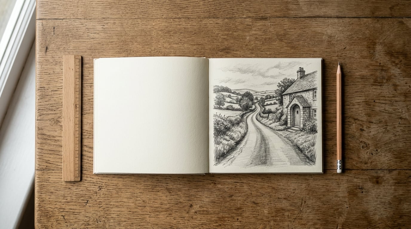
Learning how to use leading lines in composition is mostly a matter of deciding where you want the viewer to look, then arranging the scene so something already in it carries their eye there. A road, a fence, a shadow, a row of windows, a riverbank or the edge of a table will do the job if it enters the frame at an edge or a corner and finishes at your subject.
The honest part: there is no magic to it. The photographers who look good at this are not seeing lines other people cannot see, they are just noticing them faster and refusing to accept a frame where the line goes nowhere. The six steps below are the routine I use, and they work whether you are holding a camera or a pencil.
Table of Contents
- What You Need
- How to Use Leading Lines in Composition: Step-by-Step
- 1. Find the lines already present in the scene
- 2. Decide where you want attention to go
- 3. Choose the line that fits the story
- 4. Position the camera and the line deliberately
- 5. Check the frame and the visual path
- 6. Refine the composition and reinforce it in editing
- How the same rules work in drawing and painting
- Common Mistakes
- Frequently Asked Questions
- Conclusion: Start With One Clear Line
What You Need
Almost nothing, which is why this is the easiest composition idea to start with. You need a camera or a phone, a subject with some usable edges, and a clear idea of what the picture is about.
Turn on your camera’s grid or the viewfinder overlay. Lines are much easier to place deliberately when you can see thirds and diagonals instead of guessing at the middle. On a phone this is usually in the camera settings under grid or guide.
A tripod is optional rather than necessary. You will want one for the low angles in step four, since most cameras will not hold focus and exposure at ground level, but leaning on a wall or resting the lens on a kerb works fine. If you only ever use a phone, forget the tripod and just watch your slowest shutter speed instead.
How to Use Leading Lines in Composition: Step-by-Step
Here is the repeatable process. It runs from scouting the scene to the final crop, and each step has a thing you can check to know it worked.
1. Find the lines already present in the scene
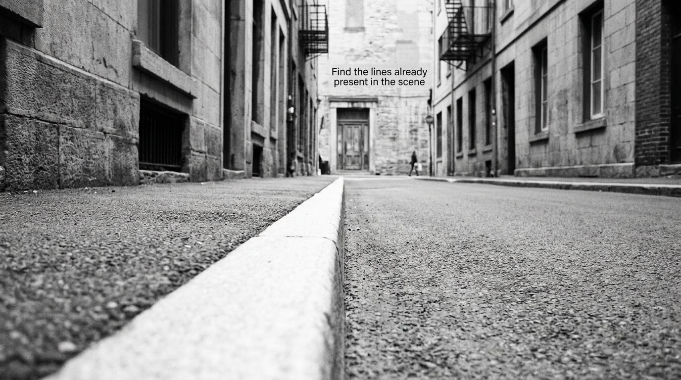
Scan the scene for edges before you look for a subject. Roads, kerbs, fences, hedges, rooflines, cracks in a pavement, a strip of light on a wall, the edge of a shadow, a person’s arm or shoulder, the sweep of a cloud bank. Almost every scene has four or five candidates and the strongest one is usually the one you could describe to someone else in three words.
Lines fall into two families. Natural lines come from the world itself: shorelines, branches, rock strata, rolling hedges, dune ridges, a track worn into grass. Man-made lines come from us: kerbs, railings, road markings, scaffolding, drainpipes, window frames, seams in paving. The man-made ones tend to be cleaner, so if you want an obviously readable frame, start there.
How do you know you found the right one? Photograph it, then look at the thumbnail. If your eye goes to the far end on its own, that is your line. If the picture reads as a flat jumble at thumbnail size, the line is buried and you need to move before you shoot.
2. Decide where you want attention to go
The subject comes first, always. Decide what the picture is about before you arrange anything, then pick a line whose far end lands on it. If a line ends in empty sky, it is a lead-in to nothing, and no amount of good positioning rescues it.
Forum photographers arrive at this point from different directions, and the advice is consistent: put a person, a dog or a single bright object at the point where the lines converge, and the frame wakes up. A staircase that leads nowhere becomes a photograph the moment someone stands on the third step.
One nuance worth knowing, because it comes up constantly on beginner boards. Placing the subject exactly on the vanishing point flattens the picture. Sit a little in front of the intersection, toward the near end of the line, and the depth comes forward instead of collapsing.
3. Choose the line that fits the story
Line type is a mood decision, and it is worth being deliberate about. Horizontal lines rest, they feel calm and stable, and they suit a still shoreline or an open plain. Vertical lines stand, they make a building feel tall and impose authority, so they work for architecture and for trees. Diagonals are unstable in the best way, they carry motion and tension, which is why a leaning fence or a staircase shot across the frame feels more alive than the same staircase shot straight on.
Curved lines invite, they feel softer and slower, so a bend in a river or a switchback road draws a viewer in rather than pushing them forward. Converging lines, where parallel edges meet at a vanishing point, do the heavy lifting on depth. A bare fence running away from you is a technical exercise. The same fence with a figure standing where the posts appear to close up is a photograph.
Implied lines do not exist physically. A row of people on a bench, a trail of glances, a gap between two dark buildings, the direction of wind in wet grass. Photographers argue about whether these count. They do, because the viewer’s brain completes them, and the same device works in drawing, where a row of brush marks or the edge of a draped cloth can carry the eye without a hard line anywhere.
| Line type | What it feels like | Suits | Effect on depth | Place the subject |
|---|---|---|---|---|
| Horizontal | Calm, restful | Water, fields, dune ridges | Shallow, layered | On or just above the line |
| Vertical | Tall, formal, still | Architecture, tree trunks, doorways | Strong if the camera tilts up | At the base, with headroom |
| Diagonal | Energy, tension, motion | Stairs, fences, shadows, crowds | Fast, three-dimensional | Near the upper end of the diagonal |
| Curved | Gentle, inviting | Rivers, roads, fabric, hair | Gradual, continuous | Where the curve straightens |
| Converging | Dramatic, spacious | Railways, halls, city streets | Strongest of all | Slightly before the intersection |
| Implied | Quiet, suggestive | Gazes, rows, wind, patterns | Subtle, inferred | At the head of the pattern |
| Intersecting | Structured, busy | Crossroads, grids, scaffolding | Layered, complex | On one line, off the other |
One practical note on the third type. Diagonals only read as diagonals if the frame is tilted or the line itself is angled. A level horizon with a slanted fence beside it looks like a mistake, because the eye reads the tilt as a mistake. Either commit to the tilt, or crop so the frame itself carries the angle.
4. Position the camera and the line deliberately
This is where most of the actual work happens, and it is physical rather than technical. Every step you take changes a line’s direction, width and apparent strength. Walking closer to the point where a path bends thickens the line and shortens the read. Walking back narrows it and gives the viewer more room to travel. Crouching to knee height turns a flat path into a strong wedge.
A wide lens exaggerates the near end and pulls the far end together, so a railway or a corridor gets more dramatic depth than it has in life. A long lens compresses the same scene, stacking the elements and making a short stretch of wall look dense. Neither is correct. Pick one and know what it does to your line.
For most starting compositions I would use a wide lens at f/8 or f/11, focus about a third of the way into the frame, and keep the horizon level unless the tilt is deliberate. Leave the edges of the frame open where the line enters, and check that no pole, sign or stray branch slices through the middle of your path. That single interruption is the most common reason a good line fails.
| Situation | Lens | Aperture | Camera height | Tripod |
|---|---|---|---|---|
| Low path or puddle reflection | 16 to 35mm | f/8 | 10 to 20 cm | Yes, or brace on something solid |
| Corridor or hall of columns | 24 to 35mm | f/11 | Standing | No |
| Compressed stack of planes | 70 to 200mm | f/5.6 | Standing | No |
| Phone, general scenes | Main camera, 1x | Auto | Standing or crouched | No |
| Phone, exaggerated depth | Ultra wide, 0.5x | Auto | As low as you can hold it | No |
Negative space is part of this. The area the line travels through is doing a job, so give it room rather than filling it. A strong line crossing a crowded frame gets lost, and the fix is usually to leave more empty space along its length, not to add more subject.
5. Check the frame and the visual path
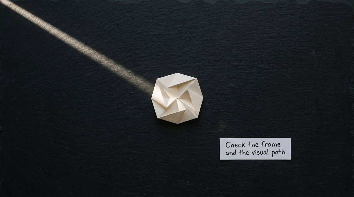
Preview the shot at full size and trace the line with your finger. Follow it from where it enters the frame and see where it deposits you. If it reaches your subject before it reaches the edge of the photograph, the path works. If the line runs out of the bottom or the right side before it gets there, the frame is wrong, not the subject.
If several lines compete, choose a dominant one and demote the rest. That means reducing their contrast, moving them away from the subject, or cropping them out. Two lines fighting for attention is the single most common complaint on photography forums, and the cure is subtraction rather than a better position.
Shoot three or four variations before you move on. Change one thing each time: a step sideways, a lower angle, a slightly different crop. Comparing them on the camera screen is faster than reasoning about it, and it is the only reliable way to find out which version actually reads the way you imagined.
6. Refine the composition and reinforce it in editing
Open the file and simplify. Crop out the distractions you noticed on the screen, and straighten anything the tilt made uncomfortable without destroying the diagonal on purpose. Then look at the visual path again, because a crop that trims the line at the wrong place undoes the whole frame.
On tone, lift local contrast along the line and at the subject, and pull it down a little on the competing shapes. Shadows that were soft in the file can be deepened so the line reads more cleanly. A touch of sharpening on the path and a small dose of local exposure on the subject are usually enough.
One habit separates editing that helps from editing that hurts: if you can see the adjustment, back it off. Edits should reinforce a composition you already built, not manufacture one that was not there. If the picture only works after an hour of masking, go back and reshoot from a different spot.
How the same rules work in drawing and painting
Photography is not the only medium where this applies. On paper or canvas, the line becomes structure first and mood second. Draw the orthogonals of a corner, a room or a street as light construction lines and let them run past your subject to a vanishing point, then use those guides as the path the finished linework follows. The path is what carries a viewer through a painting, and it is far easier to move a pencil than to re-plan a canvas.
Curved construction works the same way. Lay in a sweeping arc for a road, a river or a fold of cloth, place the subject where the arc turns, and keep the edges of the shape pointing back along that arc. In graphic design and typography the device becomes a grid, a baseline or an arrow between two blocks of text, and the test is the same one: does the arrangement tell the eye where to go next.
Common Mistakes
Here are the errors I see most often, each with the correction that fixes it.
- The line points away from the subject. It enters the frame and exits into empty space. Fix it by moving your position until the far end of the line lands on the subject, or by choosing a different line.
- The line starts in the middle of the frame. A line that begins in open space has no urgency. Walk forward or tilt the camera until it enters from an edge or corner.
- Something interrupts the path. A pole, a sign, a bright window or a branch crossing the line kills the movement. Reframe or wait for the person to move.
- The line is too dominant. A road filling 80 percent of the frame overwhelms the subject. Get lower on the far side of it, or crop so the line is present without dominating.
- The subject sits exactly on the convergence. It flattens the frame. Move the subject toward the near end of the line, a little in front of the intersection.
- Several lines compete equally. The eye cannot choose. Darken or crop the weaker ones until one path is clearly the strongest.
How to use leading lines in composition without making them obvious
When a line is too obvious, the frame looks engineered. Vary where it enters rather than always starting at the same corner, and let it begin as a narrow, low-contrast sliver that strengthens as it travels, so the eye discovers it rather than being shoved by it. Changes in tone or scale do more work here than hard symmetry, and letting the environment contribute a second, quieter line usually looks more natural than a single ruler-straight path.
Quick tips for stronger leading lines
Keep the viewfinder grid on and place lines along a third rather than the middle. Start with one dominant line and treat the rest as optional. Test a horizontal and a vertical crop of the same shot before you commit. Watch the edges, because that is where lines are born and where they most often get chopped. Leave breathing room in front of the subject so the path has somewhere to arrive. And compare several frames at full size on the camera screen, because a composition that works in the viewfinder can fall apart in the file.
Frequently Asked Questions
What are the best leading lines in photography?
The best leading lines are the ones already in the scene with a clear far end, which is usually a road, a path, a railing, a riverbank, a staircase, a strip of light or a shadow edge. Strong lines are straight or gently curved, have consistent width, and lead to something interesting. Avoid a line that ends in blank sky or gets interrupted by a pole, since both break the movement the eye depends on.
How do I make leading lines point toward my subject?
Decide the subject first, then choose a line whose far end lands on it. If no natural line reaches the subject, add something that does: a person, a dog, a bright object or a patch of light. Place it slightly in front of the point where lines converge rather than exactly on it, because a subject sitting dead on the intersection flattens the frame.
Should leading lines start at the edge of a photograph?
In most cases yes, and a corner works best because it gives the eye an obvious entry and a direction to travel. A line beginning in open space lacks urgency, so move forward or tilt the camera until the line reaches an edge. The exception is a line that starts elsewhere but grows wider and darker as it approaches, which the eye discovers on its own.
How do I fix distracting converging lines?
First check whether they actually converge. Keep the camera level and use a tilt-shift lens or shoot further back, since rising off the point makes parallel edges tilt inward. When several lines compete, pick a dominant one and reduce the others by lowering their contrast or cropping them out. Convergence itself is useful for depth, so keep it when it points at your subject.
What if my scene has no obvious road or path?
Look for lines made by light, shadow, texture and edges instead: a lit strip of wall, a dark diagonal of shadow, a row of windows, a seam in paving, a hedgerow, a wake on water, or a row of people on a bench. Implied lines made by gaze and pattern count too, because the viewer completes them. Lowering the camera usually turns a flat scene into one with a usable line.
Conclusion: Start With One Clear Line
The whole technique reduces to three things: know your subject, find the strongest line that reaches it, and remove anything that competes with that path. Do those three and most frames start to read on their own.
For your next outing, pick one line before you leave the house and walk until it lines up. Once you know how to use leading lines in composition, the same habit works in a drawing, a painting or a layout on screen.