
Split toning is a colour grading technique that tints the two ends of a photo’s tonal range separately: one colour for the shadows, a different colour for the highlights, with a balance control deciding where the two meet. Learning how to split tone a black and white photo takes a few minutes once your monochrome conversion is finished. The part that catches people out is not the tool, it is the order of operations. Every menu path below matches current desktop releases as of 2026; if your panel looks different, it is usually a collapsed group rather than a missing feature.
What split toning buys you is depth. A perfectly neutral monochrome image is tonally complete but emotionally flat, because the eye reads colour temperature cues as atmosphere. A cool cast in the shadows and a warm one in the highlights hand the eye those cues back without touching the contrast or the detail.
The workflow below is built around the version most people search for, an image that is already black and white, with the Lightroom and Photoshop routes side by side and a free-editor option for each.
Table of Contents
- What You Need
- Step-by-Step: How to Split Tone a Black and White Photo
- Common Mistakes
- Frequently Asked Questions
- Can you split tone a photo that is already black and white?
- How do I use split toning in Lightroom?
- How do I two tone an image in Photoshop?
- What is the difference between split toning and colour grading?
- Why does my split tone look muddy or blotchy on skin?
- Is a split-toned black and white image still black and white?
- Conclusion
What You Need
Start with a monochrome image whose tones you are happy with. If exposure or the black point is wrong, no amount of colour will rescue it, and toned images show tonal faults more plainly than neutral ones.
- A finished black and white image. Converted in the editor, not shot in a camera’s monochrome JPEG mode, because the camera throws away the colour data the original file still holds.
- The colour original. A RAW file or a colour TIFF, in case you decide later to tone the image a different way or go back to colour.
- An editor. Lightroom and Adobe Camera Raw have a built-in Split Toning panel. Photoshop works through adjustment layers. Capture One (version 12 and later) has Split Tone in its Color panel. For a free option, Photopea and GIMP both have a Color Balance adjustment and a Gradient Map.
- Layers and masks, for the Photoshop route. Split toning is a stack of separate adjustments, and the stack is what lets you dial one range back without losing the whole effect.
- Basic tonal understanding. Shadows, midtones and highlights. If you can look at a histogram and say which third of the range a problem lives in, the sliders stop being guesswork.
Working in 16-bit also helps. Eight-bit files band visibly in smooth gradients, and a gentle shadow tint makes that banding easier to see.
Step-by-Step: How to Split Tone a Black and White Photo
Step 1: Prepare the Black-and-White Image
Fix the exposure and set the black and white point before anything else. Pull the black point down until the deepest shadows read as true black, and the white point up until the brightest areas reach white without clipping.
Then check the conversion itself. In Lightroom, open the Black & White panel and work the mix slider, the individual Reds, Yellows, Greens, Cyans, Blues and Magentas sliders, or the eyedroppers. Brightening a red shirt or a sky with the Reds slider keeps texture in what would otherwise blow out to a flat white shape.
In Photoshop, use a Black & White adjustment layer rather than Image > Mode > Grayscale, which applies a fixed channel mix and gives you no control at all. Once you like the result, put a copy of the straight monochrome version on its own layer or take a Lightroom snapshot, so you always have a neutral version to compare against.
Step 2: Add Adjustment Layers for Shadows and Highlights
In Photoshop, stack the adjustments. A Black & White adjustment layer sits at the bottom of the stack, above it a Color Balance adjustment layer with its blend mode set to Color, and above that a Curves adjustment layer if you want to shape the falloff between the two tones.
On the Color Balance layer, set the Tone menu to Shadows. The three sliders are Cyan to Red, Magenta to Green and Yellow to Blue, and they tint whichever part of the image falls inside the selected range while leaving contrast and detail untouched.
In Lightroom the same idea is one panel. Open the Color panel and find Split Toning, where you get a Shadows row, a Midtones row and a Highlights row, each with a Hue slider, a Saturation slider and its own colour swatch. The eyedroppers on the swatches sample a colour straight out of the image, which is the fastest way to find a tone that belongs to the photograph.
Step 3: Colorize the Shadows
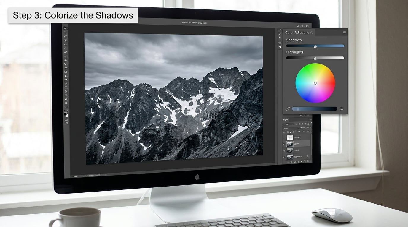
Pick one shadow colour and commit to it. Cool blues and teals read as cold, open and wintery; warm browns and violets read as nostalgic or dusty. Beginners often add a third colour instead of fixing a second one, and three tints on one image is a mess.
Then drop the saturation hard. A shadow saturation somewhere between 10 and 25 is usually plenty on a well-exposed image; the colour should register as a temperature rather than as a colour. Drop the layer opacity to around 60 to 80 percent as well. Two controls, both subtle, are more controllable than one pushed to maximum.
The Balance slider decides where the shadow tone stops. Push it toward the highlights and the tint creeps into your subject’s skin; pull it back and the colour stays in the deep corners, which is usually the more useful default for portraits.
If the tint seems to be missing, check the tone range first. A Shadows adjustment on an image that has been lifted and flattened may have very little to act on, in which case a Midtones range is the honest fix.
Step 4: Add a Complementary Highlight Tone
The highlight colour works best on the opposite side of the wheel from the shadow colour. Blue shadows with orange highlights, or brown shadows with cool blue highlights. The contrast between the two ends is what makes the effect read as photographic rather than as a filter.
Keep the highlight saturation lower than the shadow saturation, usually in the 8 to 20 range. Highlights occupy far more pixels than shadows, so a stronger tint up there covers the whole image and flattens the monochrome character you worked to build.
| Look | Shadows | Highlights | Balance |
|---|---|---|---|
| Classic sepia | Hue 40, Sat 18 | Hue 35, Sat 12 | 0 |
| Cinematic teal and orange | Hue 200, Sat 15 | Hue 35, Sat 10 | -25 to -40 |
| Cold winter | Hue 220, Sat 12 | Hue 50, Sat 6 | -15 |
| Silver gelatin warmth | Hue 30, Sat 10 | Hue 45, Sat 5 | 0 |
These are starting points rather than rules. Write down the numbers for any look you like, because recreating a good result from memory is the slowest part of the whole process.
Step 5: Blend the Tones Naturally
Real photographs do not have hard edges between their tonal ranges, so the transitions need softening. In Photoshop, a quick method is to hold Cmd+Ctrl+I (Ctrl+Shift+I elsewhere) to turn a luminosity selection into a layer mask, which confines the tint to the darker pixels.
For portraits, do the opposite. Select the skin range through a Select > Color Range pull, mask that selection into the layer, and mask the colour out of the faces with a soft brush set to a low flow, around 20 percent. Photographers who work in Photoshop regularly also use built-in face and skin luminosity masks for exactly this.
Keep an eye on the midtones. A midtone tint flatters almost nothing, and a saturated one gives you the blotchy, muddy result that makes people abandon split toning after one attempt.
Step 6: Check, Refine, and Export
Zoom out to fit the image on screen, then zoom back to 100 percent. At fit size you are judging the mood, at 100 percent you are judging the transitions, and the two views catch completely different problems.
Look at the file on a second screen or a phone if you can. A tint that reads as a gentle warmth on a wide-gamut laptop can look distinctly green on another display, and checking early is cheaper than re-editing later.
For print, push the effect further than feels right on screen. Paper reflects less light than a monitor, so a shadow tint that seems appropriately subtle on a display often needs another 20 to 30 percent more saturation to register on the print. Darkroom users have long recommended test prints before committing to a full run of a toned image, and the same logic applies to a digital file headed for a printer.
Export the toned result as a 16-bit TIFF and keep the monochrome version alongside it. In Lightroom, right-click the image and choose Save as Preset so you can apply the same look to a whole sequence later.
Common Mistakes
The tint is applied before the tones are fixed. A weak tonal foundation shows through the colour as blotchy patches and clipping. Close the split tone adjustments, fix exposure and the black and white point, then come back.
Saturation pushed too far. The most common failure. Halve the saturation, drop the layer opacity, and check again. If you notice the tint immediately at fit size, it is too strong.
The whole image is tinted rather than the tonal ends. With a midtone range selected, a tint spreads across skin, sky and subject alike. Check the range dropdown before you touch the sliders again.
Muddy blacks. Deep shadows have very little tonal information left, and colour in near-black areas looks like noise. Lighten the black point slightly, or move the Balance slider back so the tint stays out of the deepest pixels.
Visible mask edges. Masks on skin and around objects need feathering and low flow. A hard-edged mask is the giveaway that the effect was painted rather than graded.
The monochrome character is lost. Pure white and pure black should stay neutral. If the brightest highlights and deepest shadows both carry a colour, the image has become a duotone, which is a legitimate look but a different one.
Two habits help more than any single fix. Compare against the neutral version side by side, every time, rather than from memory. And remember that the effect should register when you feel it rather than when you see it.
Frequently Asked Questions
Can you split tone a photo that is already black and white?
Yes, and that is the normal way to use it. Split toning adds hue to the two ends of the tonal range while leaving contrast and detail alone, so it works on an image that has already been converted to monochrome. If the file was flattened to true grayscale, nothing is lost. If it was shot in a camera monochrome mode and saved as JPEG, work from the colour original instead, because the colour data is already gone.
How do I use split toning in Lightroom?
Open the Color panel in the Develop module and find Split Toning. Pick a colour with the Shadows swatch, set its Hue and Saturation sliders, then do the same for the Highlights row. Use the Balance slider to move the transition between the two tones, and the eyedroppers to sample colours from the photo itself. When you like it, right-click the image and save the settings as a preset.
How do I two tone an image in Photoshop?
Use two layers. Put a Black u0026amp; White adjustment layer at the bottom, add a Color Balance adjustment layer above it, set that layer’s blend mode to Color, and choose Shadows in the Tone menu. Push the Cyan to Red, Magenta to Green and Yellow to Blue sliders to taste. Switch the Tone menu to Highlights, work the same sliders again, and soften the boundaries with a luminosity-based layer mask.
What is the difference between split toning and colour grading?
Colour grading is the broad term for adjusting colour and tone across an image, and it can involve any number of ranges, wheels and curves. Split toning is one specific, restrained technique inside that larger field: two colours, applied to the two ends of the tonal range, leaving the midtones alone. A split tone is easier to keep repeatable because there are only two decisions to make.
Why does my split tone look muddy or blotchy on skin?
Almost always one of three things. The tint is set to the midtones range, which is where most skin sits, or the saturation is high enough that the colour visible in the shadow side of a face reads as a stain, or a hard-edged mask cuts across the face. Move the range to Shadows, lower the saturation, and mask the colour out of skin with a soft, low-flow brush on a luminosity-based mask.
Is a split-toned black and white image still black and white?
It is a monochrome image carrying a colour cast, not a colour photograph, and the distinction matters for portfolios and print sales. A restrained split tone keeps neutral whites and blacks and is widely accepted as part of the black and white tradition. A heavy duotone or tritone, where every pixel takes a colour from a gradient map, reads as a colour image. Keep the neutral version if a client needs true greyscale.
Conclusion
Start with a monochrome image you already rate, because split toning adds colour and not contrast. Add one restrained shadow tone at low opacity, choose a highlight colour from the opposite side of the wheel, then mask the colour out of skin and check the result at fit size rather than zoomed in.
Keep the neutral version, save the settings as a preset, and dial it back until the effect is something you feel rather than something you see. That is usually the difference between a tint that looks like a choice and one that looks like a filter.