
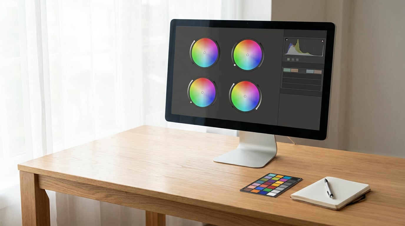
To color grade photos in Lightroom, open the Develop module, correct exposure and white balance first, then work in the Color Grading panel at the bottom of the right-hand panel stack. That panel holds four color wheels, Global plus Shadows, Midtones and Highlights, and each wheel gives you a hue, a saturation and a balance control. About 20 minutes per photo once you have the order down, and a few hours if you are learning it from scratch.
Most beginners open the panel, drag a point on the Global wheel far to one side, and end up with a photo that looks like a different camera made it. That is not color grading, that is a filter. A grade is a quiet, deliberate push in three separate tonal ranges that makes a photo feel intentional and keeps feeling intentional across a whole shoot.
Here is the workflow I use, and the order matters more than the numbers:
- Open the photo in the Develop module and decide the mood before touching a wheel.
- Fix exposure, white balance, highlights, shadows, whites and blacks.
- Shape tone with texture, clarity, vibrance and the Tone Curve.
- Grade the Shadows, Midtones and Highlights wheels, then soften the result with Blending.
- Protect skin and separate subject from background with masks.
- Compare, export in the right color space, and save the grade as a preset.
Everything below is the detail behind those six steps.
Table of Contents
- What You Need
- How to Color Grade Photos in Lightroom: Step-by-Step
- Common Mistakes
- Frequently Asked Questions
- What is the difference between color correction and color grading in Lightroom?
- Can I color grade a JPEG in Lightroom, or is RAW required?
- What order should I adjust colors in the Lightroom Develop module?
- Are Lightroom presets the same as color grading?
- How do I make a Lightroom edit look consistent across a photo set?
- What should I check before exporting a color-graded photo?
What You Need
A few things decide whether your grade survives contact with other photos and other screens.
Shoot RAW if you can. A RAW file has no baked-in white balance, so grading it is a real process. A JPEG has the camera’s interpretation baked in, which is why photos that were shot as JPEG tend to fight a grade instead of accepting one.
Know which Lightroom you are in. Nearly every free tutorial on the internet is written for Lightroom Classic, the catalog-based desktop app. If you are in Lightroom (the cloud version) or Lightroom Mobile, most of the same panels and sliders are there, but the layout is different and the Color Grading panel has fewer range controls. Read the panel names rather than the window positions, because the panel names are what stay consistent.
Work in Develop, not Library. The Library module is for sorting, culling and importing. Every adjustment described here happens in the Develop module, and grading is where it happens.
Use a monitor you trust. A cheap or uncalibrated screen will convince you that a flat, washed grade is correct. Brightness down to your screen’s real level is the cheapest fix there is, and it costs nothing.
Know your backouts. Grading is non-destructive, so you can always reset. Before you start, the eyedropper beside Temp lets you click a known neutral surface to set white balance, and holding Alt (Windows) or Option (macOS) while clicking a slider resets that one slider to zero.
How to Color Grade Photos in Lightroom: Step-by-Step
1. Set Up the Image and Choose a Grading Goal
Open the photo and look at it for a few seconds before you change anything. Decide what the picture should feel like: cool and clean, warm and nostalgic, heavy and cinematic, or bright and airy. Writing that sentence down is more useful than it sounds, because it is what stops you from pushing sliders just to see what happens.
Before you go further, open the before view with the backslash key and note two things: the strongest color already in the frame, and where the light is coming from. Your grade usually wants to reinforce one of those, not fight both.
Keep a copy of the untouched file. Press Ctrl (Windows) or Command (macOS) plus Z to reset, or simply duplicate the file in the grid. It gives you a reference to compare against at the end, and it costs nothing because nothing is baked in.
2. Correct Exposure, White Balance, and Contrast
Color correction comes before color grading, every time. If the image has a color cast or a blown highlight, a grade on top of it will only amplify the problem.
Start with the histogram at the top of the Develop panel. You want the tones spread across the range, with a small gap on the right edge so highlights are not clipping, and a black point that lands just shy of zero rather than far left.
Set white balance next. Use the Temp and Tint sliders, or click the eyedropper on a surface you know is neutral. Skies, snow and grey concrete are good references; anything tinted by clothing or reflected color is not.
Then set the black and white points with the Blacks and Whites sliders, and pull Highlights and Shadows until the histogram stops running off either end. Finish with contrast. If you need a big contrast move, the Tone Curve is smoother than the contrast slider, which clips before it does.
Apply Profile and Lens Corrections now too. A lens correction changes the edges of the frame, and doing it after grading means grading pixels you are about to distort.
3. Build the Overall Look with Lightroom Tone Controls
With the base image clean, shape the brightness and micro-contrast in a fixed order so each control reinforces the last one.
Texture first. It affects local contrast, so moderate amounts read as detail rather than crunch. Clarity comes next and is the same idea at a broader scale; a negative value is useful when you want haze or softness. Dehaze is the harshest of the three, and small numbers only.
Then vibrance, which lifts muted colors more than already-saturated ones, followed by saturation if you genuinely need a global push. Most grades end up with vibrance up a little and saturation down a little, which is why forum threads keep recommending lowering the overall saturation and adding color back in selected ranges.
Finish with the Tone Curve. Build a gentle S-curve by lifting the shadows and highlights ends and holding the midtones, which adds contrast without crushing anything. Only move the Parametric Curve sliders here, and save the Point Curve for a look you intend to reuse.
At this point the image should look finished but plain. That is exactly right. It is the right foundation for a grade.
4. Add a Deliberate Color Treatment
Scroll to the bottom of the Develop panel and open Color Grading. The panel used to be called Split Toning, which is why older tutorials and forum threads say split toning when they mean this panel.
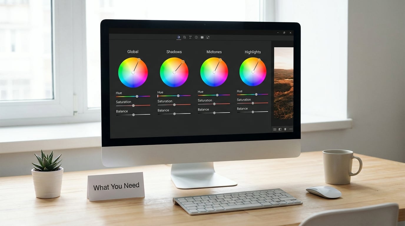
The panel has four wheels. Global applies one color across the whole tonal range. Shadows affects the dark end, Midtones the middle, Highlights the bright end. Beginners reach for Global by default and push the entire image toward one hue, which is why their skin turns green. Use the three range wheels for almost everything, and use Global only for a subtle overall cast.
Each wheel has the same three controls. Hue is the color you pick on the wheel itself. Saturation is how strong that color is, from 0 up to 100, and staying under about 25 is the range where a grade still looks like photography. Balance shifts the range of tones the wheel affects: negative values pull it toward the shadows, positive values push it toward the highlights.
Two sliders sit below the wheels. Blending controls how much of the grade mixes into the image, from 0 to 100, and 50 is the default. Balance (the second one, at the bottom of the panel) biases the entire grade toward shadows or highlights.
These are usable starting points, not rules. Lighting changes everything, and a grade that works on an overcast street scene will be far too strong on a sunlit one.
| Look | Shadows wheel | Midtones wheel | Highlights wheel | Global |
|---|---|---|---|---|
| Moody cinematic | Hue 210, Sat 15, Balance -15 | Hue 30, Sat 6, Balance 0 | Hue 45, Sat 10, Balance +20 | Sat 4, Blending 60 |
| Warm golden hour | Hue 230, Sat 10, Balance -10 | Hue 40, Sat 10, Balance 0 | Hue 50, Sat 18, Balance +25 | Temp +8, Blending 55 |
| Faded film | Hue 200, Sat 8, Balance -25 | Hue 35, Sat 8, Balance 0 | Hue 55, Sat 12, Balance +20 | Blending 45, Blacks lifted |
| Airy and cool | Hue 220, Sat 12, Balance -5 | Hue 190, Sat 8, Balance 0 | Hue 45, Sat 8, Balance +15 | Blending 50 |
| Teal and orange | Hue 195, Sat 22, Balance -20 | Hue 30, Sat 8, Balance 0 | Hue 35, Sat 16, Balance +25 | Blending 55 |
Type those numbers in, look at the result, then walk Blending down until the grade is something a viewer would not consciously notice. The test is simple: if you can see the color without being told to look for it, it is too strong.
Matching a reference photo. This is the most common question in photography forums, and it does have a method. Open the reference beside your file. Note which of the three ranges is most different from yours, start there, and match the mood rather than the pixel. Most references turn out to be warmer highlights plus cooler shadows, a very common pairing because it separates a subject from its background. Use the eyedropper in the Info panel, or the RGB histogram values, to check whether you are actually landing in the same ballpark on luminance.
5. Refine the Look with Masks and Local Adjustments
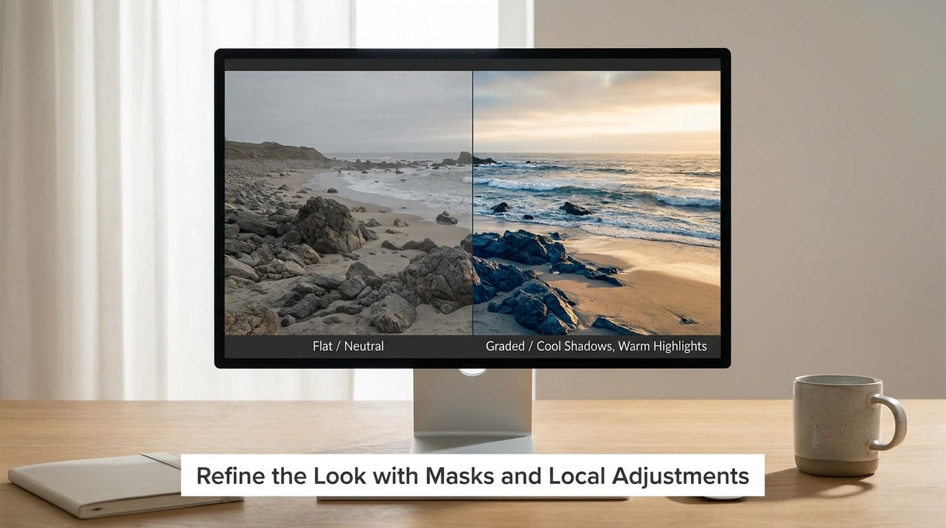
A global grade has no way of knowing which pixels are skin, which are sky and which are a painted wall. Masks fix that, and they are the difference between a grade that looks like a filter and one that looks intentional.
Click the masking icon above the histogram and choose Select Subject, Select Sky or Brush. The selection is created for you, and you can refine it with the Shift and Remove buttons.
The most valuable first mask is a skin-tone protection mask. Inside it, pull saturation down a few points and warm the Temp slightly. A strong global grade will otherwise push faces toward yellow or green, and this is the fastest way to keep a portrait looking like a person.
Second, mask the background and push it cooler or darker, or open it up if you want the subject to separate. On a subject mask, add a touch of exposure and clarity to sharpen the person against the background. On a sky mask, drop dehaze and pull the blue hue toward a cooler range, since a global grade usually flattens skies fastest.
Use the adjustment brush when masks are not enough. Hold Alt (Windows) or Option (macOS) to erase instead of paint, and set the brush feather high so edges do not show.
6. Compare, Export, and Save the Grade in Lightroom
Zoom in to 100 percent and check the areas a grade usually exposes: skin, bright sky, deep shadow corners. Then press the backslash key to flip between before and after, several times, quickly. That works on both Windows and macOS in the Develop module, and it is the fastest way to catch a grade that is heavier than you thought.
Look at the clipping indicators under the histogram while you do it. A grade that pushes a wheel’s saturation too far will show as clipped colors long before it shows as clipping luminance.
For export, the color space matters more than most people realize. Export to sRGB for anything on the web, on a phone or in a social app, because that is what those screens assume. AdobeRGB is wider, and a grade that looks rich in Develop can look dull or muddy on a phone when exported into it, which is the single most common complaint about exported grades looking washed out.
Keep sharpening for output at a modest amount, and turn off the options you do not need: Remove Location Data does not change appearance, but zeroing it costs nothing. If you are delivering large files for printing, check the paper profile your printer asked for before you export.
To reuse the grade, right-click the image in the Grid view and choose Create Preset. Name it after the look, not the photo, and decide which settings it includes. Leaving the Develop module options out gives you a preset that applies only the grade, which is the one you want for consistency across a shoot. Check the panel again in the Presets panel to confirm the boxes you ticked.
For a whole set, select the images in the Grid view and use Copy Settings on the first one, then Paste Settings onto the rest. Because the base exposure still differs between frames, paste onto a set that was shot under the same light, or the grade will land differently on each file.
Common Mistakes
Grading before fixing white balance. The grade spends its whole budget fighting a color cast and never settles. Fix Temp and Tint first, every time.
Using the Global wheel by default. One color pushed across every tonal range is a filter, not a grade. Use Shadows, Midtones and Highlights, and keep Global saturation under about 5.
Over-saturating the shadows. This is the most-called-out error in photography forums, and it is why amateur edits often have lurid blue or orange corners. Drop shadow saturation until the corners read as shadow, not as a color.
Tinting the skin. Any strong grade will drag skin toward the shadows color. Mask the subject, lower saturation inside the mask, and warm the Temp a few points.
Grading a broken tonal range. If highlights are clipped or the tone curve is doing something strange, a grade just amplifies it. Check the histogram before the panel.
Leaving Blending at 100. This is the slider that separates a natural grade from an obvious one. Halve it and see if you still like it.
Expecting the grade to survive a bad export. If it looks right in Develop and dull on a phone, it is a color space problem, not a grading problem. Export sRGB for screens.
Treating presets as the final result. Presets are a starting point. Pasting one across a shoot that was lit five different ways will produce five different results.
A few habits that make this repeatable. Grade at 100 percent on a trusted screen, keep a written note of your starting values per look, and always compare with the backslash key before you save. A few tips worth building in: press and hold Alt to reset any single slider, use the histogram clipping indicators as a live warning light, and give each look its own preset name so you can find it later.
Frequently Asked Questions
What is the difference between color correction and color grading in Lightroom?
Color correction makes an image accurate: right exposure, right white balance, no color cast. Color grading happens after that and is a creative choice about mood, deliberately pushing shadows, midtones and highlights toward particular colors. Correction fixes what is wrong, grading decides what the picture should feel like. Doing them in the other order means grading a broken image, which is why every workflow puts correction first.
Can I color grade a JPEG in Lightroom, or is RAW required?
You can grade a JPEG and the Color Grading panel works identically. The difference is how much room you have. A RAW file has no fixed white balance or rendering, so the wheels and the white balance controls have real latitude. A JPEG arrives with the camera’s decisions already applied, so the grade is working inside a narrower range and tends to need smaller numbers. RAW gives you options, not requirements.
What order should I adjust colors in the Lightroom Develop module?
Exposure and white balance first, then the tonal controls, then the grade. Inside the color work, the practical order is texture, clarity and dehaze for local contrast, then vibrance and saturation, then the Tone Curve, then the Color Grading panel, then masks. A common mistake is grading before the tone curve is settled, which means the grade has to be redone as soon as the curve changes.
Are Lightroom presets the same as color grading?
A preset is just a saved set of slider positions, so a preset can contain a color grade but is not one by itself. Professionals do use them, usually as a starting point that gets adjusted to the scene, because a single frame never matches a preset exactly. When you create a preset, untick the Develop module options if you want it to apply only your grade, which is what keeps a set consistent.
How do I make a Lightroom edit look consistent across a photo set?
Build the look on one representative frame, save it as a preset with the Develop module options unticked, then use Copy Settings and Paste Settings across the set. Paste only across frames shot under the same light, because the grade lands differently on frames with different base exposure. If a set is mixed, grade the hard ones individually and bring them together by matching the midtone luminance rather than the hues.
What should I check before exporting a color-graded photo?
Check three things. First, zoom to 100 percent on skin and bright areas, then press the backslash key several times to compare with the original, because a grade reads stronger than expected. Second, watch the clipping indicators under the histogram for blown channels. Third, pick the export color space deliberately: sRGB for web, phones and social, and whatever profile your printer specifies for print. Most dull-looking exports come from this last step.
Start with one photo. Fix the exposure and white balance, shape the tone, then push a single wheel at low saturation and walk Blending down until the color stops announcing itself. That is the whole craft, and it gets faster every time you repeat it.
Once it feels right, save it as a preset and paste it across a set. That is how a body of work starts to look like it was made by one person, which was the goal all along.