
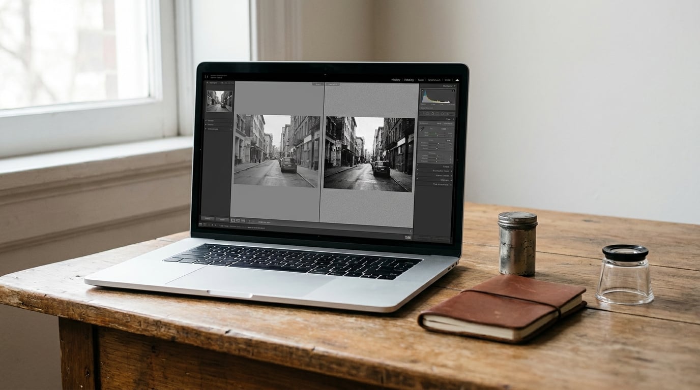
To learn how to make digital photos look like film, you copy the tonal response of an emulsion rather than dropping a filter on top. The core moves are always the same: lift the blacks so shadows turn milky instead of black, soften contrast and sharpening, then add grain last with a size and roughness that match your file size. Budget 20 to 30 minutes for a full frame when you’re doing it by hand in Lightroom or Photoshop.
The trick is restraint. Film doesn’t look like film because you crushed the contrast and dumped on heavy grain. It looks like film because the tonal response is soft, the color is muted, and the texture is uneven. Get those three in the right order and the rest follows.
Table of Contents
- What You Need
- How to Make Digital Photos Look Like Film Step by Step
- 1. Choose a Film Look and Work from a Reference
- 2. Correct Exposure, White Balance, and Color
- 3. Reduce Digital Color and Add Tonal Contrast
- 4. Add a Film Emulation Look
- 5. Add Realistic Grain Instead of Heavy Texture
- 6. Add Subtle Texture, Halation, and Optical Character
- 7. Match Sharpness to the Intended Format
- 8. Compare, Refine, and Export the Final Image
- Common Mistakes
- Frequently Asked Questions
- Do I need a film preset to make digital photos look like film?
- Can I make a color digital photo look like black-and-white film?
- How much grain should I add to a digital photo?
- Should I add film grain before or after resizing the image?
- Can I make photos look like film using Lightroom Classic or Photoshop?
- How do I make a film effect look realistic on a phone photo?
- Conclusion
What You Need
You need a photo editor and a starting file, and the editor matters less than you’d think. Lightroom Classic is the obvious pick because the Develop module has a tone curve, an HSL panel, split toning and a dedicated grain control in the Effects section. Photoshop’s Camera Raw filter is the same engine, so every setting below applies there too.
On a phone, Lightroom Mobile covers most of the workflow. Its controls sit in different places, and the tone curve lives behind the icon in the bottom toolbar, but nothing in this guide depends on the desktop layout. Snapseed or a comparable free editor works as well, just with more manual steps for grain.
Shoot RAW if you can. A RAW file gives you the exposure latitude to lift shadows without dragging noise up with them, and it keeps the white balance adjustable after the fact. JPEGs from a phone are workable, but you are correcting and masking rather than shaping, and the compression has already eaten some of the subtlety you are trying to recover.
One more thing worth having before you start: a reference. Pick a specific look you can name, like a warm muted portrait, a high-contrast black-and-white documentary frame, or the flat, slightly green color of a cheap consumer film. Write down three things about it, such as how dark the darkest shadow goes, how warm the highlights are, and how visible the grain is at full size. Without that, you are just sliding things around and hoping.
How to Make Digital Photos Look Like Film Step by Step
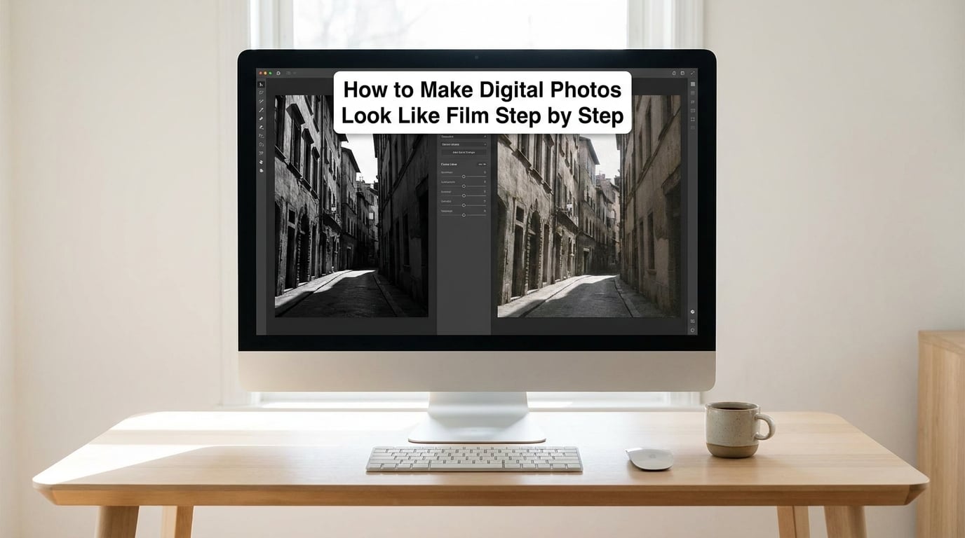
1. Choose a Film Look and Work from a Reference
Start by naming the target. Muted color portrait, high-contrast black-and-white, faded consumer snapshot, and slide-film color are four genuinely different jobs, and mixing their adjustments is why a lot of edits end up muddy. Decide which one you are making before you touch a slider.
Then record the reference characteristics instead of copying someone’s preset. A preset is a set of numbers built for one photograph, and applying it to a backlit portrait gives you the same failure the top forum complaint describes: warmth and shadows that look fine, highlights that look wrong. Once you have the three numbers written down, the preset becomes a useful cross-check rather than the edit itself.
2. Correct Exposure, White Balance, and Color
Fix the technical errors before any creative work. In Lightroom, the Basic panel comes first: set the Temp slider until neutral surfaces read neutral, around 5200 to 6000 Kelvin for daylight, then set Exposure, Highlights and Shadows so nothing is clipped and nothing is crushed. Film scans have a wide tonal range, so you want the histogram to reach roughly 5 to 95 percent rather than touching either end.
Next comes the Detail panel. Drop Sharpening Amount to around 30 to 40 with a Radius near 0.8, or turn it off entirely and sharpen at the end instead. Digital images arrive with heavy computational sharpening, and that crunchy micro-contrast is one of the loudest tells that an image was made on a modern sensor. Lower Clarity to somewhere between negative 10 and negative 30, and pull Texture down to around negative 10, which softens skin and foliage without going soft everywhere.
Check the histogram after each move. A hard clip on the right edge means highlights you cannot get back, so bring Highlights down before you do anything else.
3. Reduce Digital Color and Add Tonal Contrast
Digital color is too saturated and too evenly saturated. Drop Saturation to roughly minus 10 to minus 20, then use Vibrance instead to recover color selectively on skin, foliage and sky, leaving already-strong reds alone. In the HSL panel, pull down the orange and green saturation slightly, which is usually all it takes to stop a modern photo from looking radioactive.
Film also has less contrast in the middle than digital. Set Contrast to zero or even negative 10, and shape the tone curve instead. Drag the bottom-left point of the curve upward until the deepest shadow sits near 5 to 8 percent on the histogram, then add a control point in the lower midtones and lift it a touch more. That upward drag at the base is what produces faded, milky shadows, and it is the single most identifiable film signature there is.
For the top end, add a point around 75 percent and ease it down very slightly, then a point near 95 percent that bends toward the top edge. This creates highlight rolloff, a gradual approach to white instead of a sudden clip. It is boring to look at and it does more for believability than any grain setting.
4. Add a Film Emulation Look
Now you hint at a film family with color rather than trying to reproduce a specific emulsion. In the Color Grading panel, pull the shadows a little toward blue or cyan and push the highlights toward yellow or amber, keeping both saturation values low, around 5 to 15. That combination is the reason Kodak consumer film scans tend to have warm highlights sitting next to cool-green shadows.
Split Toning in the Effects panel does the same job with more control over the transition. Set Shadow Hue near 210 to 220, Shadow Saturation around 8 to 12, Highlight Hue near 45 to 55, and keep Highlight Saturation near 5 to 10, with Balance tilted slightly toward highlights. Treat these as the direction of the look, not a measurement of any real film stock.
If a compatible preset is available, apply it at low strength as a base and then correct the tone curve yourself. A preset applied on top of a corrected, neutral image is a reasonable starting point. A preset applied instead of correcting the image is how edits end up looking like a filter.
5. Add Realistic Grain Instead of Heavy Texture
Grain goes on last, after tone and color, because it interacts with both. In Lightroom, open the Effects panel and treat Amount, Size and Roughness as three separate controls. Amount is the strength, Size is how big each clump of grain reads, and Roughness is how irregular its edges are. Beginners push Amount to 40 or 50 and leave the other two at default, which is why the result looks like television static rather than a photograph.
A workable starting point for a 24-megapixel file is Amount between 15 and 25, Size around 40 to 50, and Roughness between 50 and 60. Halve the Size for files above about 50 megapixels and raise it for files under 12, because grain that looks right on a small sensor looks like coarse gravel when you print it. Lower Amount and raise Size in bright, high-key images where grain reads as dirt, and do the opposite in a dim interior where grain is doing useful work hiding digital noise.
For monochrome images, monochrome grain reads as classic silver texture. For color images, keep Amount lower and watch for color grain, which looks speckled rather than silver. If you see blotchy color noise, the right fix is noise reduction on luminance only, not less grain.
Photoshop gives finer control. Convert the layer to a smart object, then use Filter, Noise, Add Noise with the monochromatic option on at 4 to 8 percent, set the blend mode to Overlay, drop the layer opacity to 30 to 50, and apply a small Gaussian blur of 0.3 to 0.6 pixels so the grain stops looking like a digital overlay. Keep it as a separate layer you can dial back at any time.
6. Add Subtle Texture, Halation, and Optical Character
These are the effects that separate a film look from a filter, and they are also the easiest to overdo. Halation is the red-orange glow that appears around a bright highlight when light scatters back off the film base. Bloom is the softer, wider version of the same thing. Both are physical, which is why no slider reproduces them convincingly on its own.
In Photoshop, the standard recipe is: select the Highlights with a targeted adjustment, brighten that range, click the clipping indicator on the channel dropdown so only clipped pixels are affected, then Screen a warm orange or red layer through it. Duplicate the layer, blur it heavily at 30 to 60 pixels, mask it with the range, and drop the opacity until you can barely see it. On a backlit portrait or a night street with point lights, this one effect sells the look more than anything else in this guide.
Dust, scratches and a vignette all follow the same principle of restraint. A vignette is fine at negative 5 to negative 15 in the Effects panel. Scratches belong on a frame with heavy grain, and they need to be intermittent, following the direction of the frame, not tiled across the whole image. If you notice them, they are too strong. A visible film border makes sense for a scan-style image and looks wrong on a landscape with a 16:9 crop.
7. Match Sharpness to the Intended Format
Grain and softening both lower perceived sharpness, so an image can look correctly edited at full size and mushy on a phone. For screen delivery, sharpen lightly at the end: Amount 40 to 60, Radius around 0.7, Masking between 60 and 80, and Detail low at 10 to 20. For print, push Radius closer to 1.0 and consider a small high-pass sharpening pass, because the printing process adds its own contrast.
Check the result at 100 percent magnification, not fitted to screen. Most of the time something looks wrong in a way you cannot name, and it is either one over-sharpened edge or a grain clump that the fit-to-screen view is hiding.
8. Compare, Refine, and Export the Final Image
Toggle between the original and the edit with the backslash key in Lightroom, or layer the original above the finished version in Photoshop at low opacity. You want the edit to look softer and warmer, not obviously filtered. Any area that jumps out as overly warm, overly dark, or grainy in patches is a masking job: lower the effect with a radial or brush mask rather than reducing it globally.
Export as a 16-bit TIFF or a high-quality sRGB JPEG for delivery, and keep the layered working file with the grain and halation layers still live. The reason the effect often seems to vanish after posting is compression, not your edit. An 8-bit social export pushes a low-contrast, lifted-black image into visible banding, and heavy JPEG compression smears the grain you worked on. Check the result on a second screen, at actual size, before you call it finished.
Common Mistakes
Over-grain that looks like static. Amount is too high for the file size, or Size is too small. Halve the Size and cut Amount by a third, then reassess.
Blacks that look gray and dirty rather than milky. You lifted the black point but did not clean the underlying shadow noise first. Apply modest luminance noise reduction to the shadows, then lift the tone curve again.
Highlights that look blown or plastic. This is the most common film-look failure and presets cause it. Bring Highlights down, set Whites to around 85 to 90, and add the gentle rolloff from step 3.
Skin that looks orange or waxy. Split toning and vibrance were both applied too warmly. Pull Highlight Saturation in Split Toning back toward zero and use a soft mask to reduce warmth on faces only.
Scratches that read as a texture overlay. Real scratches are sparse and directional. Delete most of them, vary their length, and keep opacity low.
Judging the edit on one screen at one size. Lifted blacks and low contrast shift dramatically between displays. View at 100 percent, on a second screen if you have one, and only then decide.
One habit that saves more edits than any other: save your settings as a preset after the image looks right, then open the next photo in the series, apply it, and dial the intensity down with the preset’s amount slider. The recipe is a starting point, not a fixed answer.
Frequently Asked Questions
Do I need a film preset to make digital photos look like film?
No. A preset only saves time on the first photo of a series. The look comes from a corrected base image, a lifted black point, soft highlight rolloff, muted color with split toning, and grain added last. Once you know those five adjustments, you can build the look by hand in any editor that has a tone curve and a grain control.
Can I make a color digital photo look like black-and-white film?
Yes, and it is the easiest version of this look to do well. Convert to black-and-white in the HSL panel, which lets you control each color’s contribution, then apply the same steps as color work: lower Clarity, lift the blacks on the tone curve, and add monochrome grain. High-contrast film and flat documentary film need different tone curves, so decide which one you want first.
How much grain should I add to a digital photo?
Start around 15 to 25 on the Amount slider, then adjust Size and Roughness separately. Grain that is too fine reads as video noise, while grain that is too coarse reads as a dirty sensor. Scale Size with resolution, lowering it for files above roughly 50 megapixels and raising it for small files or heavy downsized crops.
Should I add film grain before or after resizing the image?
Add it after resizing to the delivery size. Grain generated at full resolution becomes almost invisible once the image is scaled down for a feed or a website, so you end up adding a second layer on top and overshooting. If you are working in Photoshop and the grain layer is separate, add a small amount of sharpening after resizing to compensate for the softening.
Can I make photos look like film using Lightroom Classic or Photoshop?
Both work, and they share the same underlying engine because Photoshop’s Camera Raw filter uses Lightroom’s Develop controls. Lightroom Classic is faster for a whole shoot. Photoshop is where halation, bloom and custom grain layers live, since those need layer blending that Lightroom cannot do. Most people correct and tone in Lightroom, then send only the frames needing optical effects to Photoshop.
How do I make a film effect look realistic on a phone photo?
Shoot in the most RAW-like mode your phone offers, lower exposure slightly, and edit in Lightroom Mobile so you get a tone curve and an Effects panel. Skip heavy clarity and sharpening, lift the blacks, mute the saturation a little, and add grain at low Amount with Size raised to about 50. Phone JPEGs compress shadows aggressively, so mask your lifted blacks to the areas that have real detail.
Conclusion
Digital photos look like film when the tone behaves like film, not when a filter sits on top. Start by fixing exposure and white balance, cut Clarity and sharpening, then lift the black point and soften the highlight rolloff. Mute the color, add a restrained split tone, and put the grain on last with Amount, Size and Roughness set separately.
Do the first one now: open a photo, drag the bottom-left point of the tone curve upward, and see how much of the digital look disappears before you touch anything else. Once you know how to make digital photos look like film on a single frame, save those settings as a preset and dial them back for the rest of the shoot. Updated for 2026.