
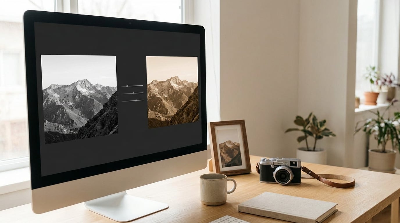
A sepia tone is a monochrome photograph recoloured into warm brown, tan and cream tones, the way a chemically toned print from the 19th century would have aged. The fastest way to create a sepia tone effect in any editor is to turn the image black and white, then add a warm brown tint and pull the strength back until the detail still reads.
In Photoshop that is roughly two minutes. In GIMP or Photopea, five. The difference between a result that looks like an old photograph and one that looks like a smudge is usually the same single step: converting to monochrome before you tint.
Here is the same four-step logic — duplicate, monochrome, warm tint, control strength — applied to Photoshop, Lightroom, GIMP, Photopea and your phone.
What You Need
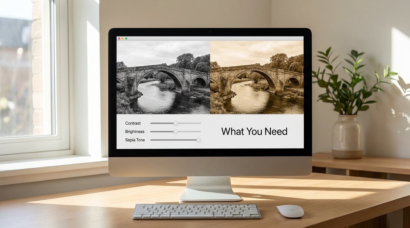
Very little. You need the photograph, an image editor, and about five minutes.
- The image. A JPEG or RAW file is fine. A photo with clear shapes, good tonal separation and strong light works far better than a flat, hazy one.
- An editor. Photoshop for full control. Lightroom if you shoot RAW. GIMP for a free desktop option. Photopea if you want a free browser editor that opens and saves layered PSD files. Any of these is enough — no plugin, no paid extension, no preset pack.
- Adjustment controls. Every editor above ships with a desaturate or black and white tool plus a colour or hue control. Those two are the whole job.
- A reference, optional. An old print or a scan you like the colour of helps more than a preset does, because you can sample a value from it instead of guessing.
Before you start, duplicate your file or open it as a copy. Keeping the untouched original means you can always back the tint out.
Step-by-Step
Every method below does the same three things: it removes the existing colour, it adds a warm brown, and it gives you one slider to control how strong that brown is. The six approaches trade speed against control — none of them is more “correct” than the others.
- Desaturate + Hue/Saturation Colorize (Photoshop). Reversible as adjustment layers, only partly controls highlight colour, and fastest for quick results and small edits.
- Black & White layer + Photo Filter (Photoshop). Reversible, and it does control highlight colour through Preserve Luminosity. Best for portraits and skin tones.
- Color Fill layer + Color blend mode + mask. Reversible, and highlight colour is handled with a gradient mask. Best for hand-painted or graphic results.
- Camera Raw filter + Split Toning (Photoshop or Lightroom). Reversible as a Smart Filter, controls highlight colour directly, and is the one to reach for on RAW files and film-like renders.
- GIMP Hue-Saturation Colorize. Reversible on a duplicate layer, partly controls highlight colour. The free desktop option.
- Photopea Hue/Saturation preset. Reversible as layers, partly controls highlight colour. The free browser option.
How to Create a Sepia Tone Effect in Photoshop
Photoshop has four routes to the same place. Start with the one below, and move on only if the whites go muddy.
- Open the image and duplicate it. Use the Background copy, keep the original underneath, and set the copy’s blend mode to Color. The tint will now sit on top of the original rather than replacing it.
- Add a Black & White adjustment layer. Go to Layer > New Adjustment Layer > Black & White and tick Use Black & White (B&W) adjustment layer when the dialog appears. Drag the channel sliders until the image has a range of greys you like rather than a flat mid-grey. Named presets such as Infrared or High Contrast Red Filter are starting points, not fixed choices.
- Add the brown. Go to Layer > New Adjustment Layer > Photo Filter. Choose Sepia from the filter list, set the Density slider somewhere around 25–50%, and leave Preserve Luminosity ticked so the whites stay white instead of turning milky. Drag the layer opacity to taste afterwards — that is your intensity control.
That is the version I would teach a beginner, because every control is a slider and nothing is baked in.
For a two-minute result with no layers, use Image > Adjustments > Desaturate (Shift+Ctrl+U on Windows, Shift+Cmd+U on Mac), then Image > Adjustments > Hue/Saturation, tick Colorize and set Hue to 39 and Saturation to 43. Those two numbers are Photoshop’s own sepia preset values; nudge saturation down to 30 if the result turns orange.
Two more options are worth knowing. A Solid Color fill layer (Layer > New Fill Layer > Solid Color) with the blend mode set to Color gives you a tint you can paint in with a black-to-transparent gradient on its mask, which lets you leave skin tones alone. And for a graphic, poster-like finish, Image > Adjustments > Duotone with a dark brown shadow colour and a cream highlight colour keeps the brown baked into the tonal range rather than laid over it.
How to Create a Sepia Tone Effect in Lightroom
Lightroom handles RAW files better than Photoshop does, and its controls are built for exactly this kind of look. Stay in the Develop module.
- Set the Profile to Monochrome under the Profile panel. It sits next to the histogram in the right-hand sidebar.
- Refine in the B&W panel. Saturation should read 0. Adjust the Hue and Mix sliders so skies separate from foliage and faces keep their mid-grey structure.
- Add the warmth in the Color Grading panel. Click the Midtones dial, set Hue to about 45 and Saturation to about 40. Then click Shadows and add a small amount of the same hue at 10–20 saturation to warm the dark areas. Leave Highlights clean so skin stays bright.
- Set the Balance slider to somewhere between -20 and -50 to push the warm cast into the shadows, and use the Color Grading > Options > Show Presets dropdown to reset if you want to start over.
- Close the tint back down with the white balance eyedropper or the Saturation slider if the midtones drift yellow.
To see the tint off, click the eye icon in the Color Grading panel. To protect an area from tinting, mask it with the Brushing tool and the new Pin option inside Color Grading.
Because everything lives in the Develop module, the whole look saves as a preset. Open the panel, click the three dots, choose Copy Current Settings, then paste them onto any other photo in the same shoot.
How to Create a Sepia Tone Effect in GIMP or Photopea
Both of these are free, and neither needs an account to start.
In GIMP:
- Duplicate the layer with Layer > Duplicate Layer so the original stays beneath.
- Go to Colors > Hue-Saturation. Move Saturation to -100 for a clean monochrome, then tick Colorize and set Hue to 30 and Saturation to 20 or thereabouts. Watch the Master value on the right — it is the intensity control.
- Add a Layer > Masks > Layer Mask on the tinted layer if you want to keep some colour, and paint the brown away with a soft black brush.
- Use Colors > Brightness-Contrast if the toning flattened the image. The toning step itself rarely needs more than a small contrast lift.
In Photopea, the free browser editor: open the image, then go to Image > Adjustments > Hue/Saturation and pick Sepia from the preset list on the right. Slide Master Hue to change the colour family and Master Saturation to control strength. Add a Levels adjustment layer from the right sidebar to recover any lost highlight, and save the file as a layered PSD if you want to come back to it.
Photopea is the easiest of the four for anyone who does not own a subscription, and it reads the same file structure Photoshop does, so work moves between them without friction.
Step 5: Fine-Tune the Sepia Color and Contrast
Almost every disappointing sepia trace back to one of four things. Here is how to correct each.
Too orange. The tint saturation is above what the photograph can carry. Drop saturation by 10 to 15 points, or shift the hue a few degrees cooler. If you are in Photoshop and used the Hue/Saturation Colorize route, Hue 39 / Saturation 30 is a reliably restrained sepia.
Muddy, milky whites. The brown has been painted over your brightest pixels, which flattens the top end. Tick Preserve Luminosity on the Photo Filter layer, drop its density, or paste black into a layer mask and paint the tint out of the highlights. In Camera Raw and Lightroom, the equivalent is to leave the Highlights wheel untouched.
Flat, lifeless contrast. Toning compresses the tonal range. Add a Curves adjustment and pull the black point down until the shadows have weight again, then check that the brightest highlight is still near white. A +10 to +20 contrast lift after toning is normal and expected.
Harsh or over-contrasty. Usually the black and white conversion, not the tint. Pull the Black & White mix sliders back toward the middle and check the histogram — you want a spread from near 0 to near 255, not two hard edges.
Two useful starting points if you are picking a brown by hand: #6E4B2A for a deep, dark sepia and #C4A484 for a pale, creamy one. Anything more saturated than those starts to read as a colour cast rather than a tone.
Compare against the original the whole way through, not just at the end. Toggling the layer’s eye icon — or the mask thumbnail — is the fastest way to see what the tint is actually doing.
Step 6: Save and Export the Finished Image
Save two files, not one. Keep an editable working file with every adjustment layer intact, then export a flat copy for wherever it is going.
- Working file. Save as PSD (Photoshop, GIMP, Photopea) or leave the image in Lightroom as an XMP sidecar. Do not flatten, do not convert to JPEG, do not merge the adjustment layers down.
- Web and social. Export a JPEG at quality 80–90, sized to roughly 2000 pixels on the long edge. The grain and tonal softness of a sepia render hold up well at JPEG compression.
- Print. Export a TIFF at 300 ppi. If you plan to hand it to a printer who will do their own conversion, give them the flattened TIFF and discuss the colour space first.
- Further editing. PNG keeps the full tonal range and no artefacts, but the file is far larger. Use it when another editor needs to keep working on the file.
- Colour space. Work in sRGB unless your printing workflow says otherwise. In Photoshop, Edit > Convert to Profile handles the switch; in Lightroom, Profile > External Calibration does it.
Do the final flatten and any sharpening on a copy. The last person who needs the layered version is you, two weeks from now, with a new brief.
Common Mistakes
- Tinting a colour image directly. This is the single most common failure. The original hues survive in the shadows and highlights, and the result looks dirty. Convert to monochrome first, every time.
- Starting with a flat or hazy photo. Sepia exaggerates whatever tonal range it is given. A backlit silhouette works beautifully; a flat midday snapshot of a wall does not.
- Leaving the tint at 100% density. A full-strength brown on everything is a colour cast, not a tone. Most good results sit between 25 and 50% density, or a similar layer opacity.
- Losing skin-tone detail. Tinted highlights and shadows turn faces waxy. Keep the mask clean on skin, and check the brightest part of a face at 100% zoom before you call it done.
- Editing in the wrong colour space. ProPhoto RGB or Adobe RGB files show the tint differently on screen than they will print. Convert to sRGB before the final export.
- Flattening too early. Once the layers are merged, the only way to reduce the tint is to start over. Keep the stack live until the file is where it needs to be.
- Assuming a preset is the answer. A one-click sepia preset carries the settings of whoever made it, tuned for their photo. Typing four numbers into a dialog beats it every time.
- Expecting it to fix the exposure. Toning does not recover a blown highlight or a crushed shadow. Fix those on the black and white layer, before the tint goes on.
What photos suit this best? Strong shapes, clear silhouettes, architecture, and portraits with directional light. What suits it badly? Flat landscapes with even light, anything with a lot of competing colour, and shots where the colour was carrying the meaning — a red umbrella, a green field, a sky at sunset.
Frequently Asked Questions
What is a sepia tone effect?
A sepia tone effect turns a photograph into monochrome and recolours it in warm brown, tan and cream tones. It imitates the look of prints that were chemically toned in a darkroom, which is why it reads as vintage or nostalgic. Modern editors create the same look with a black and white conversion plus a warm brown tint, controlled by a density, saturation or opacity slider.
Can I create a sepia effect on a color photograph?
Yes, and every editor above can do it in a few clicks. The important part is that you still convert to black and white first, either with a desaturate command or a black and white adjustment layer. Tinting a colour image without that step leaves the original hues in the shadows and highlights, and the result looks muddy rather than warm.
How do I make a sepia effect look subtle?
Start by lowering the strength rather than by picking a paler brown. In Photoshop, set the Photo Filter density to 25 to 40 percent and tick Preserve Luminosity, then reduce layer opacity further if needed. In Lightroom, use about 40 saturation on the midtones in Color Grading and add nothing to the highlights. A sepia you can barely see at a glance usually holds up better than a heavy one.
What is the best sepia color for photos?
There is no single right value, but a deep warm brown such as #6E4B2A suits most photographs, and a pale creamy #C4A484 suits portraits and high-key images. In Photoshop, the built-in sepia preset uses Hue 39 and Saturation 43. Lowering that saturation to around 30 gives a more restrained result that will not turn skin tones orange.
Can I create a sepia tone effect without Photoshop?
Yes. Lightroom has Bu0026amp;W and Color Grading panels that do the whole job, GIMP has Hue-Saturation with a Colorize option, and Photopea is a free browser editor that opens and saves layered PSD files. On a phone, Snapseed’s Tune Image panel has a Monochrome mode with a warm filter option. None of them require a plugin or a paid extension.
How do I reverse a sepia effect if I do not like the result?
If you used adjustment layers, click the eye icon next to the tint layer or delete it, and the original colours come straight back. If you flattened the file, you need the untouched original, which is why the first step of any of these workflows is to duplicate the image. Keeping that original layer is the only reliable way to undo a sepia later.
Conclusion
Duplicate the image so the original survives, convert it to black and white, then add one restrained warm brown layer and pull the strength back until it reads as tone rather than colour. In Photoshop that takes about two minutes; the free editors take a few more and ask nothing of you in return.
Everything after that is judgement, not technique. Keep the highlights clean, check the skin tones at full size, and compare against the original before you export. The best sepia results are usually the quietest ones — if a viewer notices the brown before they notice the photograph, the tint is too strong. Updated for 2026.