
To make a photo look like a painting, you simplify it into a few large shapes, build the color on separate layers, place texture and brush marks only where light and form demand them, then bring back a handful of sharp details at the focal point. That last part is what separates a convincing painted result from an obvious filter.
The one-click oil paint filter is a fine starting point, but on its own it flattens the image into a plastic sheen. A real painted surface has soft lost edges in the background, loaded marks in the light, thin scrubbed passages in shadow, and at least one area where the paint is thick enough to see. You build those things deliberately.
This is a Photoshop workflow, and every step names the exact menu path. GIMP equivalents are noted where they differ. Budget about 30 to 90 minutes for a single image, and expect the first one to take twice that while you learn where the paint should sit.
One more thing worth saying up front: most disappointing results are not a skill problem, they are a source problem. A soft, noisy, low-resolution frame has no edges for a painter to find, and no tool can invent them convincingly.
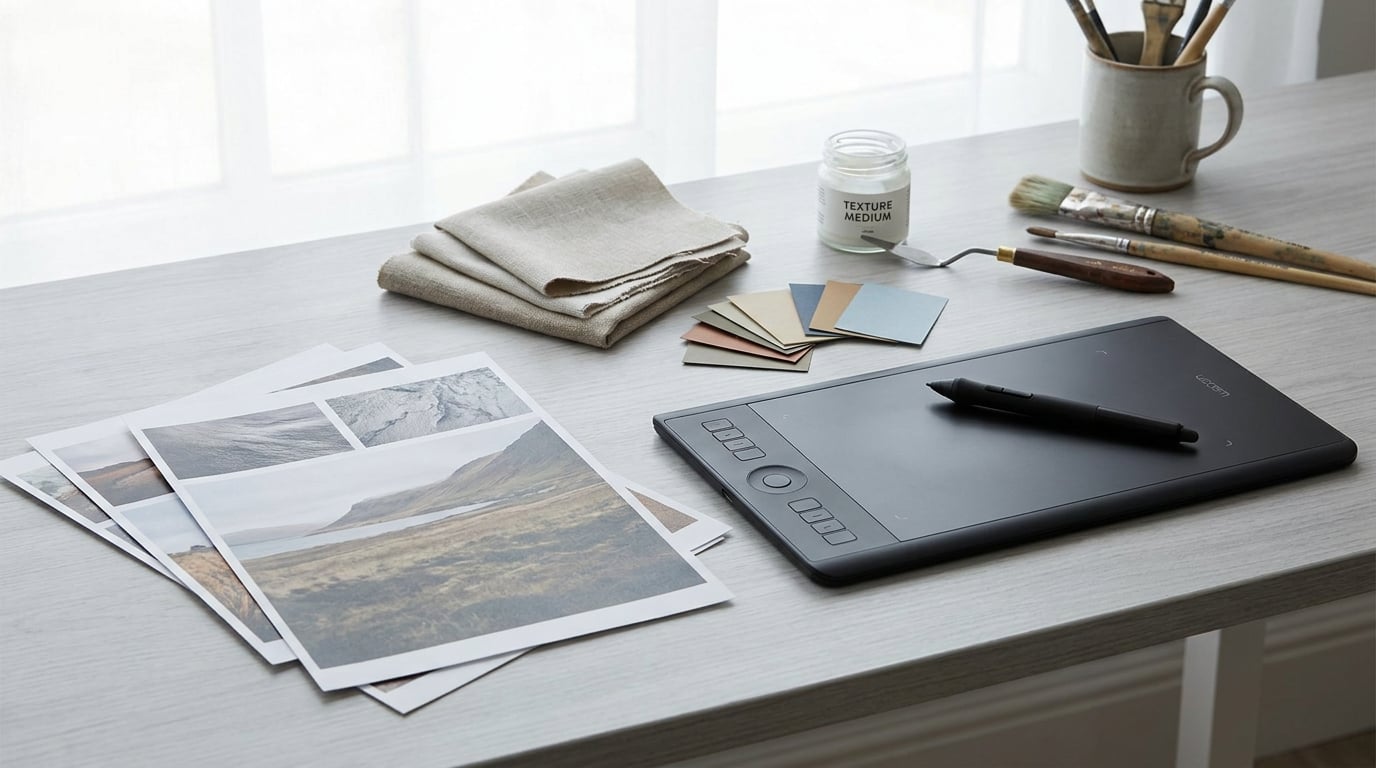
Start with the gear list before opening any file. If you already have a tablet and a decent set of bristle brushes, you can skip straight to the six-stage workflow.
Table of Contents
- What You Need
- How to Make a Photo Look Like a Painting: Step-by-Step
- Common Mistakes and How to Fix Them
- Frequently Asked Questions
- Can I make a photo look like a painting without Photoshop?
- What Photoshop filter makes a photo look painted?
- How do I make a photo look like an oil painting with texture?
- Should I use a preset or custom brushes to create a painting effect?
- How do I keep a photo recognizable after making it look like a painting?
- Conclusion
What You Need
A source photo with real structure
The best input has clear forms, directional light, and a background that stays out of the way. A portrait with a single light source and a plain background gives you shapes to work with. A wide-angle shot of a crowded street rarely does.
Resolution depends on where the finished file ends up. For a screen image, 2000 pixels on the long edge is comfortable. For a print, work from the output size in pixels: 300 pixels per inch multiplied by the printed inches. An 8 by 10 inch print needs 2400 by 3000 pixels. If your original file is smaller, run it through a good upscaler first, because the stylization step will magnify every compression artifact it finds.
Photoshop, or a free equivalent
Photoshop handles the whole workflow described here: Filter > Stylize > Oil Paint, Filter > Render > Lighting Effects, blend modes, layer masks, and non-destructive smart objects. In GIMP 2.10 the equivalent oil paint live effect sits under Filters > Distorts > Oilify, and it offers far less control over brush scale and bristle detail, so the manual stages matter more there.
Krita works well if you plan to paint rather than filter, and Photopea in a browser covers the mask and blend mode steps if you have no software at all. The layers in this workflow are the point, and any program that supports blend modes, masks, and curves can follow it.
Texture sources, scanned or hand made
Real canvas beats a downloaded texture overlay nearly every time. Lay a primed canvas or sheet of cold press paper on a scanner, light it evenly, and scan at 600 pixels per inch. Hand painted swatches work too: scrape a little acrylic across textured cardstock, keep the light consistent, and scan that.
Scanned texture gives you grain, weave, and irregularity that a JPEG of a website texture never has. Save each scan as a separate file so you can swap them per image.
A pressure sensitive tablet and a small brush set
A tablet is not required, but mouse strokes are flat and every edge will read as a hard vector line. A basic pressure sensitive model with tilt is enough. The brush set matters more than the device: bristle and textured bristle brushes for broken edges, a dry media brush for scrubbed passages, and one large soft round for graded background transitions.
Two tablet settings do most of the work. Turn on pressure for size but consider setting pressure to opacity only for the mark-making brushes, so a light stroke stays small and a heavy one stays loaded. And enable brush rotation, so strokes follow the direction of the form instead of all leaning the same way.
A layer stack you can undo
Work on a duplicate of your base layer at all times, and keep the original switched off rather than deleted. Add each stage as its own layer with a mask instead of baking everything together. This is the single habit that turns a frustrating attempt into a quick adjustment, and it costs nothing.
How to Make a Photo Look Like a Painting: Step-by-Step
Six stages, in this order. Each one depends on the last: color controls which edges matter, simplification controls where texture can go, and restored detail only works once the surfaces are finished. Do them out of sequence and you will spend the afternoon painting over your own mistakes.
1. Choose a photograph and establish the composition
Before touching a filter, look at the frame and ask what the subject actually is. Squint at it. If the read survives the squint, a painter will get it too. If it dissolves into gray noise, the photograph is too busy and you should change the photograph rather than stylize it.
Prepare the working file: crop to the composition you want, straighten any tilt, and correct exposure and white balance. A painted image exaggerates color errors, so fix a green cast here rather than trying to neutralize it later. Black and white skies and cyan skin tones are the classic symptoms of skipping this stage.
Then set a working resolution. Zoom to 100 percent and confirm the focal subject holds up. If the eyes in a portrait read as dark holes at full size, they will read as smudges after stylization. Fix them now with a light dodge and burn pass, and only then start simplifying.
2. Simplify the photograph into paint-like shapes
Painters do not render everything. Your job here is to decide what gets dropped. Make a new layer above the photo and reduce the camera noise and micro detail that will read as brush scribble later.
For a quick, effective reduction, duplicate the layer, apply Filter > Noise > Reduce Noise with a strength of 20 to 40 percent, then use Filter > Stylize > Find Edges on a copy and set that copy to Soft Light at low opacity. You have just made an edge map and blended it back as an influence on the tonal structure, which is exactly how a painter thinks about form: big shapes, then the handful of edges that matter.
Two more tools are worth learning. A Curves adjustment on a duplicated layer can crush the midtones so background detail falls away without you painting it out. And a soft black and white gradient on a mask at the edges of the frame quietly pushes attention toward the center, the way a vignette on a canvas does.
Blend If is the quiet hero here. Hold Alt and drag the black and white handles on a Curves or Levels adjustment to carve tonal bands into the image. A few clicks produce simplified shadow, midtone, and highlight zones that any brush will sit on top of beautifully. Use it more than any one filter.
3. Build color with layers instead of heavy presets
This is the stage that decides whether the result looks painted or processed. Presets push saturation everywhere at once, and the image instantly reads as digital. Layered color keeps control of where the color goes.
Start with a Solid Color layer set to Soft Light or Overlay at roughly 40 to 60 percent opacity. That single layer lets you shift the temperature of the entire image without touching a single pixel of detail, because Soft Light only alters the existing tones. Warm the shadows with one layer, cool the highlights with another, and you have the temperature separation you see in real painted work.
Next, a Hue and Saturation adjustment on a layer mask. Paint the mask where the color should be allowed to go, and leave the rest alone. A landscape wants green pushed in the trees and held back in the sky. A portrait wants the skin unified and the background pushed away from it. The mask is what makes the color deliberate.
Keep saturation restrained. Push a Hue and Saturation layer past 60 percent saturation and the muddiness arrives immediately, because you have amplified color in the areas that were already carrying no detail. A better move for those areas is to drop saturation and add texture instead, so the surface is interesting without the color shouting.
Add a Curves adjustment on a soft mask over the shadow regions and lift the blacks a touch toward 15 percent. Fully black shadows read as digital voids; a small lift reads as pigment. Do the same in reverse on the brightest highlight, pulling it down just enough to avoid a clipped white edge.
Finally, unify the palette. Add a Photo Filter adjustment layer, set to a warm or cool color, and blend it at 30 percent. This is the step that makes separate adjustments feel like one hand made them.
4. Add painterly texture and directional marks
Texture is where most tutorials go wrong. Dropped over the whole frame at high opacity, it turns the image into a stained napkin. A painter uses texture unevenly, heavier in the lights and the foreground, nearly absent in the deep shadows.
Place your scanned canvas or paper on a layer and set it to Soft Light or Overlay at 25 to 40 percent opacity. Scale it so the weave reads at the size you want on screen: 100 percent zoom for a subtle tooth, 200 percent for a coarse linen. Then mask it. Brush the texture away in the deepest shadows and in the background, and let it build on the lit side of every form.
Directional marks come next. Pick a bristle brush, set its spacing around 15 percent, and paint along the direction of each form. A hillside takes strokes following its slope. A cheek takes short strokes following the curve of the cheekbone. Vertical strokes on a horizontal surface are the giveaway that tells a viewer the image is a photograph with noise added.
Use the Rotation setting on your brush rather than rotating the whole layer. Per stroke jitter in rotation produces natural variation that a static layer can never give you. Keep flow low, around 20 to 30 percent, so overlapping passes build up gradually instead of stamping.
Two blend modes carry most of this work. Color Dodge pushes light aggressively and creates the hot, loaded highlights characteristic of oil, so mask it to highlights only. Multiply does the same job for shadow. Set each of these layers to Soft Light as a group using Ctrl or Cmd + click on the layer thumbnails, then adjust the whole set at once so you can see them building.
Add a scatter of small bright marks, individual strokes rather than a texture, on surfaces facing the light: the edge of a nose, the rim of a cup, a highlight in the hair. Three or four deliberate marks do more work than a thousand automatic ones.
Work through the frame section by section rather than painting edge to edge. Finish one region, step back, then move on. Trying to hold the whole image in view at once is how texture ends up uniform.
5. Restore selective detail and define the edges
You have deliberately removed detail. Now you put back the small amount that carries meaning. This is the difference between a painted image and a smeared one.
Add a Dodge and Burn layer, which is a merged copy set to 50 percent gray on Overlay. Paint white to lift and black to deepen. Restoring the eyes in a portrait is the single highest value retouch in the whole workflow: two small whites in the iris, a soft lighten under the brow, a dark line along the upper lash line. Fifty percent of the people who try this workflow say the likeness only started to appear at this point.
Edges need different treatment depending on where they sit. Edges between a light and a dark area stay sharp because a painter would draw them. Edges in the middle of a form or inside shadow go soft, so blur them slightly and let them dissolve. Selecting edges with Select > Modify > Find Edges and adjusting a Smart Filter radius is a quick way to soften a whole class of edges at once while leaving the important ones alone.
Sharpen last, and selectively. Use a Smart Sharpen with a small amount, around 50 percent, at 1.0 to 1.5 pixels radius, and mask it to the focal area only. Uniform sharpening over the whole frame brings back exactly the camera noise you spent stage two removing.
Then test the result honestly. View it at 100 percent to check the focal detail, and shrink it to a thumbnail in front of you or on a phone. If the thumbnail reads clearly and the full size image holds detail in one place, the effect is working. If the thumbnail looks like a photo, you have not committed far enough. If it looks like a cartoon, you have removed too much shape information.
6. Finish with color grading, texture, and output
Open the original beside your painted version and compare them in alternating 30 second blocks. Squint again. At this stage you are looking for a consistent temperature across the frame, shadows that share a color rather than sitting as separate gray patches, and a focal point that is unmistakably the brightest, sharpest area.
For canvas feel, add a final grain layer: a new layer filled with 50 percent gray, set to Overlay, with Filter > Noise > Add Noise at 3 to 4 percent and the monochromatic option on. If you want a woven look rather than a film look, use a scanned canvas at 15 percent opacity in Overlay instead. Both together is too much.
Export for screen as a sharpened sRGB JPEG at quality 80 or higher, or a PNG if the file has large smooth areas where JPEG banding shows around skies and walls.
For canvas or paper printing, merge visible layers, convert to the printer’s color profile, usually CMYK with a coated or matte profile matching your paper, and confirm the pixel dimensions still cover your print size at 300 pixels per inch. Never enlarge beyond about 150 percent for a wall piece; stylization masks softness better than an upscale, but it does not create detail that was not there. If you need more, return to the original file and run it through an upscaler before you start the workflow again.
Common Mistakes and How to Fix Them
The result still looks like a filter
A single Oil Paint pass at default settings on a full frame will always look like a filter, because the filter treats every region the same way. Fix it by dropping the filter opacity to 40 to 60 percent on a layer, masking it so it stays strong in the background and fades across the subject, then painting the subject back in with a bristle brush. The background can be loose. The subject cannot.
Texture is too large or too strong
Oversized weave looks like stucco, and a texture at 100 percent opacity looks like a filter over a filter. Scale the texture down until the grain is barely legible at normal viewing size, drop to 25 to 40 percent opacity, and mask it out of the shadows entirely. If the texture is fighting the image rather than sitting under it, it is too strong by a factor of two.
Colors turn muddy
Muddiness comes from saturation in the shadows. Every filter you add pushes color into areas with no detail, and three filters stacked means no readable value structure survives. Fix it with a Curves adjustment that widens the gap between shadows and midtones before adding anything else, and pull Hue and Saturation back toward zero. Then add one color at a time on a mask instead of using a preset that pushes everything.
Every surface is painted and no edge survives
When brush marks cover the entire frame, the image loses depth because every plane now has the same amount of information. Pick three edges in the image and leave them completely clean, sharp, and texture free. Those edges become the places the eye reads as the subject. Everything else can stay loose.
Sharpening applied uniformly
Sharpening the whole frame is the most common step that undoes the previous four stages. It returns camera noise, halos along the simplified edges, and a crisp digital ring around every brush mark. Mask the sharpening layer to the focal area, use a small radius, and check the result at 100 percent rather than at the zoom level where the illusion is convincing.
Shadows go flat and dead
Stylization tends to fill shadows with noise and detail, which flattens depth. Bring the shadows back with a Curves adjustment on a layer masked to the dark areas, pushing the blacks down for a rich passage or lifting them slightly for a lighter, atmospheric one. Pick one and stay with it, because mixed shadow values across a single painting look accidental.
The result no longer resembles the original
This happens when simplification runs too far or a portrait is stylized without a likeness check. Compare against the original early, not at the end, and stop the moment the shapes stop reading. Keep a copy of the base layer switched on next to the working layer and toggle between them every few minutes. If your subject is a face, take the extra step of a dedicated dodge and burn pass on the eyes before doing anything else.
Frequently Asked Questions
Can I make a photo look like a painting without Photoshop?
Yes. GIMP 2.10 handles the whole workflow, with the oil paint effect under Filters, Distorts, Oilify, and full support for blend modes, layer masks, and curves. Krita is a strong option if you plan to paint marks by hand. Photopea runs in a browser and covers masks and blend modes. The stages that matter most, simplification, layered color, and selective texture, are not Photoshop specific.
What Photoshop filter makes a photo look painted?
The Oil Paint filter at Filter, Stylize, Oil Paint is the direct one, and you set it on a smart object so you can reopen it. Start with Stylization around 3, Cleanliness 5, and Bristle Detail 3, then raise the stylization until the shapes read. For line work, Find Edges blended in Soft Light gives you a drawing effect instead. Neither works well alone.
How do I make a photo look like an oil painting with texture?
Put your scanned canvas or paper on its own layer in Overlay or Soft Light at 25 to 40 percent, then mask it so it builds in the lit areas and vanishes in the shadows. Add actual paint marks with a bristle brush set to a low flow, following the direction of each form, and push a few loaded highlights with a Color Dodge layer. Texture plus marks reads as oil in a way texture alone never does.
Should I use a preset or custom brushes to create a painting effect?
Use both, in that order. A preset gets you to a plausible painted version fast and is genuinely useful for a first pass, but it treats every part of the frame the same. Brushwork is what makes regions differ, with a soft background, a loosely blocked subject, and sharp edges where a light meets a dark. Take the preset at 50 percent opacity and finish it with your own marks.
How do I keep a photo recognizable after making it look like a painting?
Protect the features that identify the subject. For a face, that means the eyes, the line of the jaw, and the mouth, so spend your dodge and burn there first. For a place, protect the roofline and the main structural edge. Simplify everything else freely, keep the base layer switched on beside your working layer, and compare the two several times while you work rather than only at the end.
Conclusion
The painted look comes from four decisions made in order: simplify the frame until only the important shapes remain, build the color on separate layers so nothing gets muddy, place texture and brush marks where the light and the forms actually call for them, then restore a few sharp details at the focal point. Miss any one of those and the result reads as a photo with a filter on top.
Start small. Duplicate your original, work on a small crop of the frame, and run all six stages before touching a full resolution file. It takes about twenty minutes and it will show you where your photo is too soft, too busy, or too flat to carry a painted finish. Everything else is repetition, updated for 2026 whenever the tools change.