
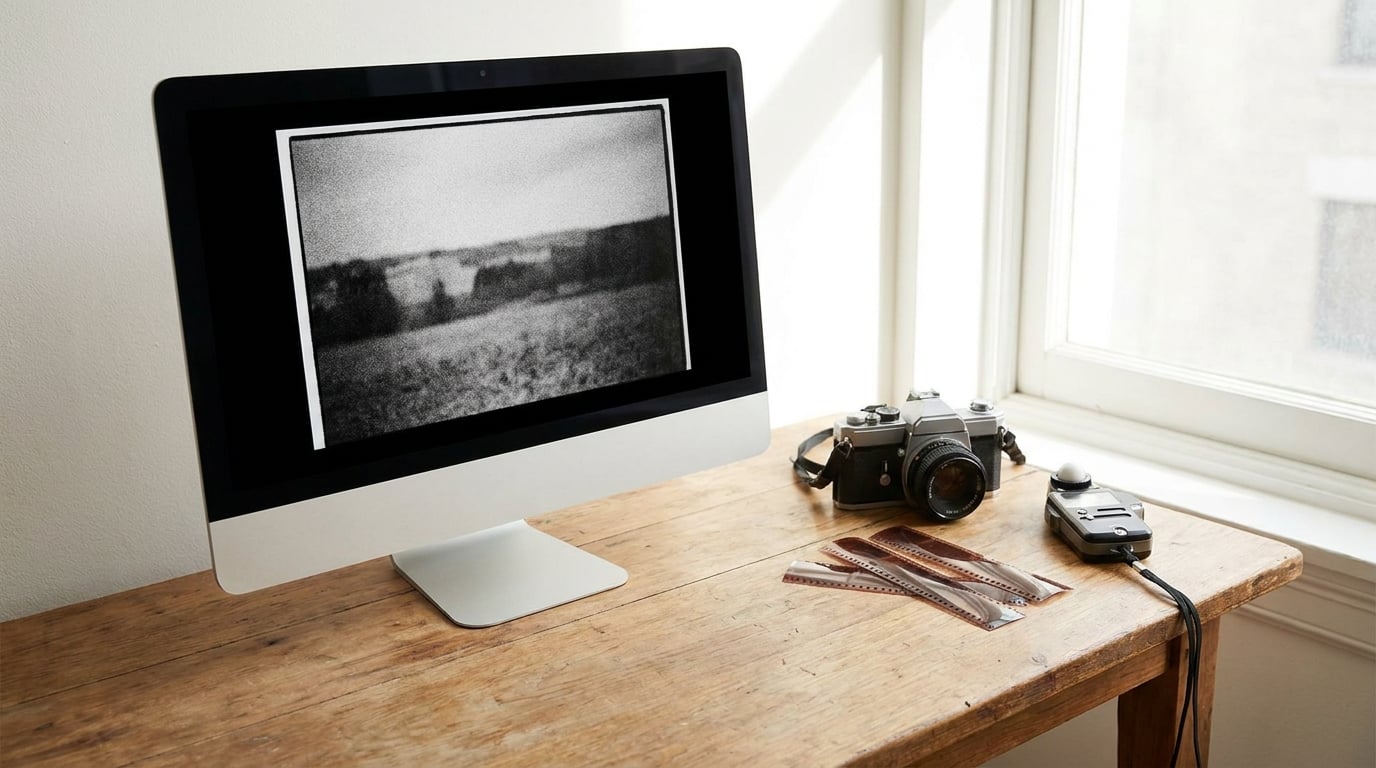
To add film grain to digital photos, put a noise layer or a scanned film frame over the image, set it to Overlay or Soft Light, drop the opacity to 15 or 20 percent, and then mask it away from faces and skies. The whole thing takes about five minutes once you have done it once. The difference between grain that looks real and grain that looks like a broken JPEG is what happens after that first step: controlling the size, the contrast, and where it is allowed to appear.
Grain is not a filter preset. It is a texture that sits inside the image and changes with the tones underneath it, which is why a single slider setting looks wrong on one photograph and right on the next. Treat it like a layer you build up, not a button you press.
Table of Contents
- What You Need
- Step-by-Step
- Choose the Right Photo and Editing Software
- Duplicate the Image and Protect the Original
- Set the Image to Grayscale if Appropriate
- Add the Film Grain or Noise Layer
- Adjust Grain Size, Contrast, and Intensity
- Mask the Grain to Keep Important Areas Clear
- Add Matching Grain Structure and Color Treatment
- Check the Result at 100 Percent and Export
- Common Mistakes
- Frequently Asked Questions
- Conclusion
What You Need
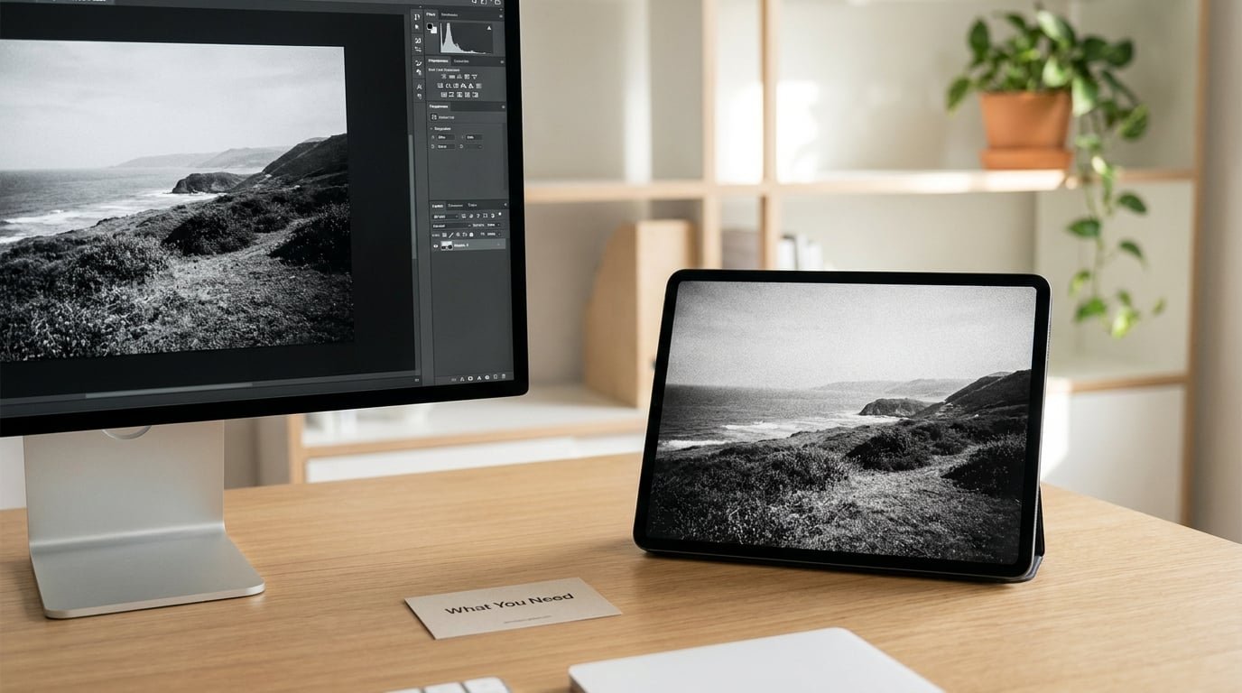
You need four things, and three of them you already have.
- The photograph. Digital frames straight out of a modern camera are almost too clean, which is exactly why grain suits them.
- An editor with a grain or noise control. Adobe Lightroom Classic, Adobe Photoshop, Affinity Photo, GIMP, Capture One, and the mobile versions of Lightroom, Snapseed and VSCO all have one.
- A way to change the texture, not just the strength. Any editor that has noise filters plus layer opacity will do; you are not locked into a paid tool.
- Optional: a mask or adjustment layer. Photoshop and Affinity give you brushes. Lightroom has a masking panel. GIMP uses a layer mask. This is what separates a convincing result from a flat one.
If you are on a phone, the mobile Lightroom app is the closest thing to the desktop workflow, because the same Texture panel with Grain Amount, Size and Roughness lives in the Edit tool. The steps below cover desktop first, with phone paths called out as they come up.
Step-by-Step
Choose the Right Photo and Editing Software
Start with a photo that is technically clean. Grain on top of existing high ISO digital noise just doubles the mess, and no blend mode will separate the two afterwards. Flat skies, clean studio portraits and daylight landscapes with even light take grain best, because grain is visible mostly in the midtones and it has nothing to fight with there.
Dark night scenes and heavy contrast photographs are the hardest cases. In a deep shadow, the eye reads fine texture as digital noise, so you will want less grain there rather than more.
For software, pick the one you already shoot in. The built-in grain control in Lightroom is genuinely good and non-destructive by default. Photoshop gives you the most control but takes longer. GIMP and Affinity Photo give you full control at no cost. Online browser tools are fine for a quick test, and the better ones process the file locally rather than uploading it.
Duplicate the Image and Protect the Original
Never work directly on the only version of a file. In Photoshop, press Ctrl+J or Cmd+J to duplicate the layer, then right click the new layer and choose Convert to Smart Object if you want to keep every filter step editable. In Affinity Photo, duplicate the pixel layer the same way. In GIMP, use Image then Duplicate, which creates a separate image window.
Lightroom needs no duplicate because Develop module adjustments are non-destructive by design. Still, take a snapshot before you start: open the Develop module’s panel menu at the bottom right and choose Create Snapshot, then name it before the grain. If you go too far, that snapshot is your undo button for the whole session.
The reason to bother is that grain is the last thing you should commit to. A lot of images look better at half the strength you first tried.
Set the Image to Grayscale if Appropriate
Black and white film is where grain became famous. Tri-X and HP5 pushed to 1600 develop a heavy silver structure that photographs with an obvious and very deliberate texture, and if that is the look you are after, converting to monochrome first is the honest way to get there. In Photoshop, use Image then Adjustments then Black and White for more control than a straight desaturate. In GIMP, Colors then Desaturate then Desaturate on the Luminosity channel.
Keep the colour when you are emulating a colour negative. Portra 400 and Ektar 100 produce grain with a slight colour cast of their own, built from dye clouds rather than exposed silver, and a monochrome grain on top of a colour photo reads as an effect. Desaturating the grain layer alone while leaving the photo in colour gets you the mixed look many editors prefer.
If you keep colour, decide this before you add the texture, because the size and the strength you pick will differ.
Add the Film Grain or Noise Layer
There are three routes, and they are worth knowing because they produce noticeably different results.
Route one, the built-in control. In Lightroom Classic, open the Detail panel in the Develop module, set Profile to Adobe Neutral so the effect is not fighting a look, and scroll down to Grain. Amount sets how strong the texture is, Size sets how coarse the individual clumps are, and Roughness controls how uneven the clumps are. A starting point of Amount 25, Size 40, Roughness 50 works on most daylight photographs. Then check the Detail panel just above it: if you pull Highlights toward 30 or 40, the grain stays out of skies and bright skin, which is the single most useful control in the whole panel.
Route two, generated noise. In Photoshop, make an empty layer above your photo, then use Filter then Noise then Add Noise. Set Amount to roughly 12 to 20 percent, leave Gaussian checked, and leave the monochromatic option unchecked if you want coloured grain. The result is much too strong as it stands, which is fine. The next step is blend mode. Set the layer to Overlay for mid-contrast texture, Soft Light for a subtler result, and Screen if you want grain that only brightens. Lower the opacity to somewhere between 15 and 35 percent. Cloudy skies and skin are where you will see if you have gone too far.
Route three, a scanned frame. Shoot a roll of the film you actually like, scan the negatives flat, open the scan as a layer, and set it to Overlay or Soft Light. A lot of working photographers prefer this route because the grain is genuinely organic rather than mathematically generated, and because you already know the character of that particular emulsion. In Photoshop, use Layer then Create New Layer from File to place the scan, then set its blend mode and opacity.
All three routes land in the same place, and route three is the easiest to overshoot because a scanned frame is already low contrast.
Adjust Grain Size, Contrast, and Intensity
This is the part that decides whether the texture looks like film or like a broken file, and it has two controls: the scale of the clumps and the contrast between them.
To change the size in Photoshop, put the noise layer into a Smart Object, then use Filter then Liquify or Filter then Noise then Reduce Noise with the preview box checked to preview the result only. A simpler route is to generate a smaller texture: right click the Smart Object and choose Scale, or generate the noise at a smaller canvas size in the first place. Photoshop’s Add Noise is per pixel and gives a very fine, very even texture, which is why it needs scaling or heavy blurring to pass for film. Render then Cloud produces broad clumps that already look more organic, and Render then Fibers gives you directional structure worth trying on a texture like brick or hair.
To change the contrast, open Image then Adjustments then Levels on the grain layer and drag the black input slider up to make the clumps harder and the shadows between them deeper. Pull the white input slider down to soften the texture so it sits more gently over the image. Levels is a better tool here than Curves because you are setting a floor and a ceiling on the texture rather than reshaping it.
Correlated noise, found in GIMP under Colors then Noise then HSV Noise, is the most convincing option if you do not have a scanner. The Red, Green and Blue correlation values tie the colour channels together so the grain moves as one texture instead of three separate patterns. Keep all three near 0.5 and reduce the Holdness slider until the grain is subtle.
Work in small moves. Ten percent opacity then back to 30 is easier to judge than one jump to 80.
Mask the Grain to Keep Important Areas Clear
Real film grain is visible everywhere but reads loudest in the midtones. Uniform grain across a face, a title, or a customer’s logo is the tell that an effect has been pasted on, so pull it back in those places.
In Photoshop, click the grain layer and then click the Add Layer Mask button at the bottom of the Layers panel, which masks the whole layer. Hold Alt or Option and click the mask thumbnail to select it, paint a large soft round brush with Flow between 10 and 30 percent, and paint black over the areas you want to protect. Because the brush is painting at low flow, one pass is not much of a change, which is exactly right. A second pass darkens it further. If the mask has gone too far, paint white back in with the brush set to that colour.
Lightroom takes a different route and is faster for portraits. In the masking panel, choose Select Subject, invert the mask if the subject is not the part you want to keep clear, and adjust the Grain Amount slider for that specific region. Or use Select Sky to protect a bright sky, then use the brush to refine the edges. You can add more than one mask to the same photo and stack them, and each one carries its own amount setting.
In GIMP, add a layer mask, use the Paths tool to select a face, and fill the mask with white or grey at around 40 percent.
Add Matching Grain Structure and Color Treatment
Grain that arrives after your tonal work behaves differently from grain that arrived first, so place it near the end of your edit rather than the start.
On the grain layer itself, add a Hue and Saturation or Color Balance adjustment and give the texture a slight tint, maybe a touch of warmth in the highlights and a cool cast in the shadows. A pure neutral grey grain is a little too neat. Then consider a Curves adjustment above the grain that lifts the blacks very slightly, around 3 to 5 percent, which softens the deepest texture without removing it. This mimics how a real negative loses a little density in the shadows.
Whatever your grade, keep sharpening for the step before the grain. Sharpening exaggerates high frequency detail, and grain added afterwards covers some of that harshness, which is part of why grain can rescue an over-processed portrait. Add it after noise reduction, never before, or the grain will be smoothed away along with the noise.
Check the Result at 100 Percent and Export
Zoom to 100 percent and switch the grain layer off and on by clicking its eye icon. You are looking for two things: whether the texture is visible in flat areas, and whether it has disappeared entirely in the areas you masked. If the texture vanishes everywhere at 100 percent, raise the amount by 10 and look again.
Compare at least two strengths before you commit. Save a flattened version, step back, and open it next to the original. Most people pick the weaker of the two they are unsure about, and that is nearly always right.
Then export in two forms. Save the layered file, PSD or TIFF with layers, so you can revisit the amount later. And export a flattened file, JPEG at quality 90 or above, or a 16-bit TIFF if it is going to a printer. In Lightroom, the export dialog lives under File then Export, and you can also save the whole recipe as a preset by right clicking the image in the Develop module and choosing Copy Settings, then pasting it onto other frames.
That last part is worth doing if you shoot a series, because matching grain across ten frames is what makes a sequence feel like one roll of film rather than ten different decisions.
Common Mistakes
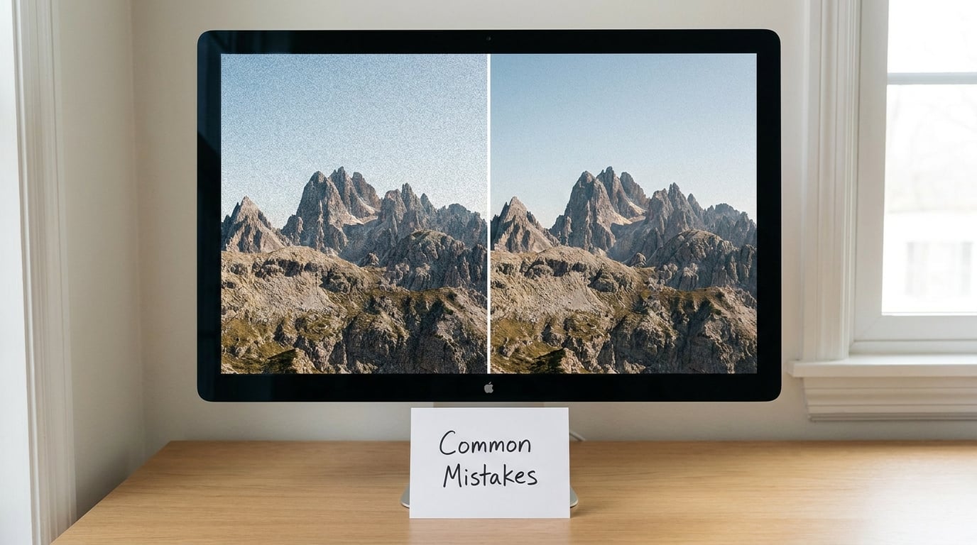
Almost every disappointing grain result comes from one of these eight things.
Grain applied to the flattened image. Once the file is flattened there is nothing to dial back. Duplicate the layer or use a Smart Object first, every time.
Opacity set by feel at a zoomed-out view. Grain is far less visible at fit-to-screen than at 100 percent, so you will always overshoot when judging small. Zoom in before you decide the amount is right.
Even coverage everywhere. Uniform texture is the most common giveaway. Use a mask on faces, skies and any text in the frame.
Per pixel noise at full strength. Photoshop’s Add Noise produces a very fine, even pattern that reads as digital compression rather than emulsion. Scale it up, use Render then Cloud, or lower the opacity to 15 percent so it merges with the image.
Grain added before sharpening. Sharpening amplifies the texture and turns a subtle grain into a rough surface. Grain goes on after sharpening and noise reduction.
Leaving the sky alone. Pulling the Highlights detail slider in Lightroom or masking out the brightest areas keeps the texture where the eye expects it, in the midtones.
Expecting a slider to do everything. A grain slider controls strength and size but not character. Tinting the texture and setting its black and white points in Levels is what makes it look photographed rather than filtered.
Forgetting how it will be seen. Grain that reads well on a screen can disappear on a small print, and grain sized for a monitor can look coarse on a large one. Check at the size you will actually deliver, and for prints keep the texture scaled to the output rather than to the screen.
Grain and digital noise are not the same thing, and the table is worth keeping in mind. Film grain is organic, uneven in size, and strongest in the midtones. Digital noise comes from the sensor and tends to be finer, more uniform, and concentrated in shadows, especially at high ISO. If your texture appears mainly in the darkest parts of the frame and looks slightly coloured and speckled, you are probably seeing noise rather than grain.
| Type | Where it shows | Typical look |
|---|---|---|
| Film grain | Midtones, some shadow detail | Uneven, clumped, organic, sometimes tinted |
| Digital noise | Shadows, smooth gradients | Fine, uniform, speckled, colour fringing |
| Compression artefacts | Edges, flat colour areas | Blocky, ringing, 8 by 8 pixel patterning |
Frequently Asked Questions
What is the best free way to add film grain to a photo?
Lightroom Classic, Photoshop, GIMP and Affinity Photo all include a grain or noise control you can use at no cost, and mobile Lightroom has the same Texture panel with Grain Amount, Size and Roughness. Start with the built-in grain control at around 25 percent, zoom to 100 percent, and raise it slowly. Online browser tools are useful for a quick test, but check whether the site processes your file locally before uploading anything you care about.
How do I add grain to iPhone photos?
Open the Lightroom mobile app, import the shot, and tap Edit, then the Texture group inside the Adjust panel. You get Amount, Size and Roughness sliders, which are the same controls as the desktop version. Tap and hold an adjustment to compare it with the original. For a stronger look, use Snapseed and the Grainy Film or Retro filter, or VSCO where the grain sliders sit next to the film presets.
Should the image be black and white before I add grain?
Only if you want a black and white film look. Converting first suits grain from monochrome emulsions such as Tri-X, which produce a bold silver structure, and it simplifies the edit because you are dealing with one channel. For colour negatives like Portra or Ektar, keep the colour and give the grain layer a slight tint, because real colour grain is made of dye clouds and carries a cast that a neutral grey texture does not.
What blend mode should I use for a film grain overlay?
Overlay gives the strongest, most midtone-weighted result and is the usual starting point. Soft Light is gentler and integrates better with an already contrasty image. Screen only lightens, so it works well on shadows and skins but does nothing to dark areas. Hard Light is the aggressive version of Overlay and rarely looks right on a whole photograph. Set the mode first, then lower the opacity until the texture is barely noticeable at 100 percent zoom.
How much grain is too much?
If you notice it immediately, there is too much. A convincing amount is visible in flat areas and midtones, fades out in bright highlights and deep blacks, and is barely there on faces at normal viewing size. Judge it at 100 percent, then step back from the monitor. If the texture is the first thing you register when you open the image, drop the opacity by 15 percent and look again.
Can I add grain to video the same way?
Yes, and the same blend mode and opacity logic applies. In a video editor, place your grain clip or generated noise layer on an adjustment track above the footage, set the blend mode to Overlay or Soft Light, and start the opacity between 15 and 25 percent. Keep the grain static or animate it very slightly, because fast-moving texture is very obvious. Mask it away from faces if you are grading interviews.
Conclusion
Duplicate the image first, add a noise layer or a scanned frame on top, set it to Overlay at 15 or 20 percent opacity, and check it at 100 percent zoom before you change anything else. Then push the size and the contrast in the texture, mask it away from faces and skies, and add it after your sharpening. Build the amount up in small steps, and when you are unsure between two strengths, take the weaker one.