
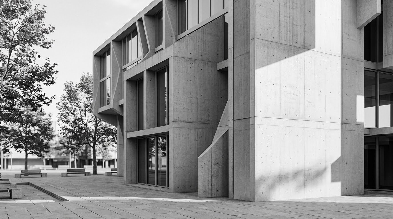
Black and white architecture photography is the practice of photographing buildings, interiors and structures using only shades of black, white and grey, so that line, shape, texture and tonal contrast carry the image instead of colour. In practice it means shooting in full colour, keeping every option open, and deciding the monochrome treatment later in editing.
That second sentence is where most beginners go wrong, and it is the opposite of what most people do. Set a camera to its Monochrome Picture Style, shoot a whole session, and you have thrown away half your choices before you knew what the light was doing. Shoot RAW, decide afterwards, and the conversion becomes a craft step rather than a guess.
It also helps to know why this genre rewards care. Remove colour and the distractions go with it: signage, sky gradient, the neighbour’s car, the year the paint was last applied. What is left is geometry, material and light, which is exactly the vocabulary an architect is describing anyway. The rest of this guide is the field-to-edit workflow I use, from picking a subject to exporting a file that survives a print.
Updated for 2026.
Table of Contents
- What You Need
- Step-by-Step: How to Shoot Architecture in Black and White
- 1. Decide Which Architectural Story to Tell
- 2. Scout the Light and Choose a Position
- 3. Set Up the Camera for Clean Perspective
- 4. Control Exposure and Preserve Detail
- 5. Compose for Tonal Impact
- 6. Capture Essential Variations
- 7. Convert and Refine in Black and White
- 8. Prepare for Print or Online Display
- Common Mistakes and How to Fix Them
- Frequently Asked Questions
- Is a full-frame camera necessary for black-and-white architecture photography?
- Should I shoot architecture in RAW when planning a black-and-white image?
- What aperture should I use when photographing buildings?
- Are graduated filters still useful for modern architecture cameras?
- How do I fix converging vertical lines in architecture photography?
- Conclusion
What You Need
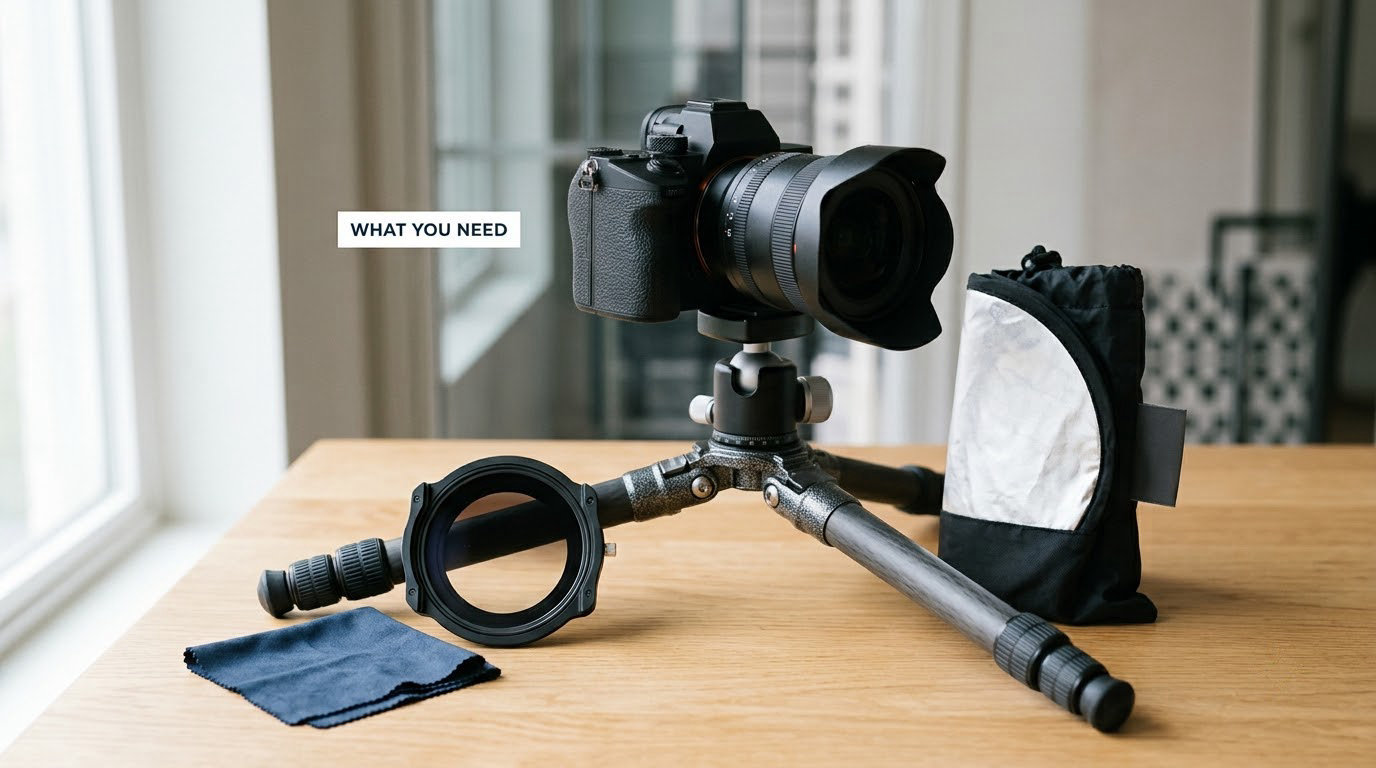
You need far less gear than the genre’s reputation suggests. A camera that shoots RAW, two wide-angle focal lengths, and a tripod will get you through years of architectural work. Everything else is a refinement, and buying it early is a mistake.
The core kit
- Camera body with manual mode, aperture-priority and a rear screen or electronic viewfinder with a live horizon indicator. Manual exposure matters because you will bracket and because auto ISO quietly undoes your decisions.
- Two wide-angle focal lengths. Something in the 16-24mm range on a full-frame body covers most exteriors. A short prime around 24mm is easier to correct and less likely to hit a wall three metres in front of you.
- Tripod with a levelling base. The levelling base matters more than the legs. A tripod with an integrated bubble or a three-way spirit level saves you a separate tool every single setup.
- Remote release or 2-second timer. Micro-shake at wide apertures and long focal lengths is invisible in the rear screen preview and obvious when you zoom to 100 percent.
- Spare battery and a lens cloth. Static on a metal tripod head attracts dust onto a front element faster than anything else in the field.
What is optional
A tilt-shift lens corrects converging verticals optically and lets you shift the whole image plane off the sensor centre, which matters when you are shooting a tall facade from close range. It is a genuine tool, not a marketing prop. It is also not a requirement: every convergence problem it solves can be corrected in software, more cheaply and usually with less distortion at the frame edges.
A polarising filter costs little and does two useful things. It deepens a blue sky, which in monochrome reads as a dark band that can carry a composition, and it kills glare off stone, glass and wet pavement, which is often the difference between a muddy grey wall and a wall with visible texture.
Graduated filters have largely been replaced by digital equivalents, and I would not build a kit around them. The one case where glass still wins is a bracketed set of three or more frames shot quickly in changing light, where a physical filter is simpler than compositing gradients afterwards.
Neutral density filters are for long exposures, and long exposures are optional. A 6 to 10 stop ND lets you run 30 to 240 second frames that smooth moving traffic, flatten moving water and streak cloud along the axis of a building. Bring them when the concept needs it, leave them in the bag when it does not.
One piece of light control is worth more than any of the above: a 5-in-1 reflector or a foam board for bouncing fill into a shadowed facade, and a black flag or dark fabric for stopping light spilling where you do not want it. Monochrome exaggerates both problems, because it removes the colour cue your eye uses to separate a lit wall from a shaded one.
Step-by-Step: How to Shoot Architecture in Black and White
Below is the sequence I work through, in the order that saves the most time on location. Eight steps, and steps one to three happen before the camera comes out of the bag.
1. Decide Which Architectural Story to Tell
Start with a reason to be there. A facade you find pretty is a starting point, not a plan, and it will produce a technically competent frame that says nothing.
Look for one of these instead:
- Geometry. A spiral staircase, a ribbed soffit, a repeating window grid where the interval itself becomes the subject.
- Tonal separation. Materials that sit at different values: dark weathered concrete against pale render, black steel against a blown sky.
- Repetition with a break. A hundred identical balconies, then one with a curtain closed.
- Scale. A small figure in a large opening, or a stair handrail reading against forty floors of facade.
- Human context. The photograph is often about the inhabitant, and the building is the setting.
Build a one-line brief before you travel. “Spiral stair, top-lit, from below” is a plan. “That concrete car park” is not.
Subjects that convert well more often than not: brutalist and modernist concrete, ribbed metal cladding, repetitive fenestration, spiral stairwells, atriums, arcades, underpasses and skylit corridors. They already have structure, depth and a limited palette of values, which is most of what monochrome needs.
2. Scout the Light and Choose a Position
Colour hides weak light. Monochrome exposes it instantly, because with colour gone a flat facade has nothing left to separate it from a flat sky. Read light before you frame anything.
Note three things on arrival: where the sun is, what the shadow shapes look like, and what is reflecting. Then walk the site and find where the geometry and the light overlap.
Direct light — low sun raking across a facade — is the strongest monochrome condition available. It reveals texture in stone and render, throws long shadows that describe depth, and creates hard tonal steps. This is the light for ornate historic buildings, brick, and anything with carving.
Open shade and overcast conditions give the opposite result: a full tonal range with no clipped highlights, subtle gradation across stone, and soft shadow edges that keep detail everywhere. Most beginners underestimate it. A single frame in flat overcast light of a well-composed building will usually beat a badly chosen hard-light frame.
Backlighting isolates a form against a bright background and turns windows into dark voids. It is dramatic and it is dangerous: a glass facade shot straight into the sun will either clip the sky to pure white or reduce the building to a silhouette. Expose for the building and check the histogram before you commit.
Use a compass app or a sun-tracking app to work out sun direction for the time you plan to be there, and a weather forecast to check for fog, rain or cloud cover. Fog is the best free tonal softener there is. Rain is the best reflector.
Practitioners on the Cambridge in Colour architecture thread judge a scene’s monochrome potential during the scout rather than after the shoot, and they often do it by shooting RAW and JPEG simultaneously so the camera’s monochrome preview tells them within seconds whether the frame works. That trick is worth building into your own camera setup.
Interiors need their own scouting pass. Walk the space at midday and again at the time you plan to shoot, and note where the daylight lands. An atrium with a single skylight is a completely different exposure problem at 11am and at 3pm, and a room lit by warm artificial fixtures will need a fixed white balance plus a decision about which light you are exposing for. Mixed lighting is not a defect to be corrected; it is often the most interesting tonal structure in the frame, as long as you metered for the dominant source and kept the white balance off auto.
3. Set Up the Camera for Clean Perspective
Converging verticals are the most recognisable flaw in an architectural photograph, and they start at the tripod, not in software.
Get the camera level first. Tilt the head so the bubble sits dead centre, then set the camera’s own horizon indicator to zero. Most bodies show a small line you can align to the horizon in live view; on some it is a grid, on others a numeric readout.
Next, set the height. Put the camera at the least distracting height the composition allows — for most exteriors, standing height on a full tripod, which puts your eye level where an architect’s drawings roughly put theirs. Shooting a tall building from the ground with the camera tilted up is the direct cause of strong convergence. Step back, and if you cannot get far enough back, accept the convergence and correct it later.
Use two-point perspective. Keep the lens plane vertical, let the vertical lines run parallel to the frame edges, and accept that horizontals recede to a vanishing point above or below the frame. Three-point perspective, where you tilt to keep both axes parallel, is a studio technique and it makes buildings look wrong.
Turn on electronic level or live view, disable image stabilisation, and use the 2-second timer or a remote release. If you are shooting a fixed subject on a tripod, stabilisation actively fights you. If the building is the only thing in the frame and the wind is moving it, a wrapped strap hanging from the tripod leg kills most of the resulting micro-shake.
Before you unpack anything, check whether a tripod is allowed where you are standing. Many buildings, stations, museums and private courtyards ban tripods, and some require a permit or a supervising escort, and the fines and the awkward conversation are not worth thirty seconds of extra sharpness. Ask the site staff, work with them, and if the answer is no, use the 2-second timer on a low wall or a kerb and accept a little noise instead.
Shoot interiors and public thoroughfares without blocking a route or a doorway, put your feet where you were asked to, and if a security guard or a resident objects, leave. Buildings that are privately owned are still photographed by thousands of people, and the professional habit of asking first costs nothing.
4. Control Exposure and Preserve Detail
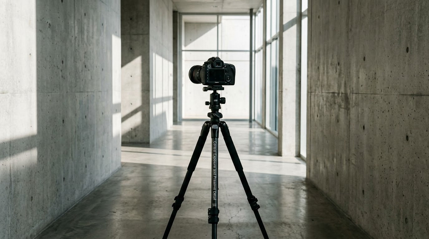
Tonal range is the whole game. Architecture usually has something very bright and something very dark in the same frame, and the exposure decision decides which detail you get to keep.
Shoot in RAW. It gives you roughly an extra stop over JPEG on many bodies, and it keeps all three colour channels intact so you can remap them later — which is the entire basis of good channel mixing.
| Setting | Recommended value | Reason |
|---|---|---|
| File format | RAW | Maximum highlight and shadow latitude, plus the colour data channel mixing needs |
| Exposure mode | Manual, with aperture priority as a fast fallback | Manual keeps ISO and shutter speed exactly where you put them while you bracket |
| ISO | Lowest native ISO, usually 64 to 200 | Monochrome hides noise early, but it is still noise, and grain you add later looks better than noise you inherit |
| Aperture | f/8 to f/11 | Keeps front-to-back detail on anything from a doorway to a facade, with diffraction still well under control on modern lenses |
| Shutter speed | Whatever the tripod and light require; use Bulb for long exposures | On a tripod the shutter is a light meter, not a motion control |
| White balance | Daylight, set manually, not auto | Auto shifts between frames and wrecks your channel-mixing consistency across a set |
| Metering and compensation | Evaluative, then check the histogram and dial in compensation | Metering aims for middle grey, which is usually wrong for a facade with a bright sky |
| Stabilisation | Off on the tripod | It hunts for movement that the tripod is preventing |
| Trigger | 2-second timer or intervalometer | Cuts contact with the tripod at the moment of exposure |
Watch the histogram, and treat both ends as warnings. A histogram that runs hard against the right edge means highlights are clipping and detail there is gone permanently. One that sits hard against the left means open shadows are turning to solid black. Neither is a soft problem; a clipped white sky cannot be recovered in any editor.
Exposing to the right, the habit of pushing exposure until the histogram approaches the right edge without touching it, gives you the largest possible tonal data in the RAW file and the most room to lift shadows later. It is the right instinct for most architecture. The exception is a frame with a bright sky and a shaded facade, where exposing for the sky leaves the building too dark to recover cleanly.
When the dynamic range genuinely exceeds what one frame can hold, bracket. Shoot a sequence at plus or minus one and two stops, or a full three-frame set at one-stop intervals, without touching the tripod. Bracketing only works if nothing moves and the light does not change between frames, which is another argument for picking your time and place carefully.
For interiors with mixed lighting, the exposure problem flips. Windows are far brighter than the interior, and no single exposure holds both. Bracket, or expose for the interior and let the windows go white, which often reads better in monochrome than you expect.
5. Compose for Tonal Impact
Once the light is right, the frame follows fairly quickly. What you are looking for is a distribution of dark, mid and light areas that reads at thumbnail size.
- Foreground anchor. A wall, a kerb, a doorway edge in the near dark. It stops the image floating in the middle of the frame.
- Repetition and intervals. Window grids, columns, railings. Shoot straight on so the pattern is the only thing moving.
- Leading lines. A parapet, a handrail, a shadow line, a kerb. In monochrome these read as tones, not just lines, so follow the brightest or darkest path through the frame.
- Symmetry. Fountains, atriums, staircases, doorways. Centre the frame and shoot level, and the image is almost done before you start.
- Negative space. A large empty sky or a blank wall above a small building. This is where minimalist work lives, and it is where most people over-fill the frame.
- Scale cues. A person, a tree, a car, a bin. One small figure converts a huge facade from an abstraction into a building.
Shoot the wide establishing frame first, because it is the one you cannot get later if the light changes. Then move in for a structural frame that shows how the building is put together, then a tight frame that is almost abstract.
When a small perspective correction will not rescue converging verticals, correct it. In Lightroom Classic, Profile is usually enough; a small Upright or Guided fix plus a post-crop vignette of 15 to 20 handles the rest. Do more than that and you start inventing a building that does not exist.
6. Capture Essential Variations
At a good location, budget for three to five compositions rather than one. Once you are set up, moving the tripod and rebuilding the composition takes longer than pressing the shutter.
For each composition, capture the vertical frame, the symmetrical frame, and one detail or abstraction. Shoot the detail at a wider aperture around f/4 if the light allows, to give yourself a genuine contrast in depth of field across the set rather than four variations of the same deep-focus image.
Move for light, not just for angle. Half a step to the left often changes a shadow edge from merging with the background to separating cleanly from it. That is a bigger difference than any lens choice.
Long exposures belong here, and only when they serve the concept. A 30 to 240 second frame with a 6 to 10 stop ND turns traffic into a soft ribbon, smooths water into a mirror, and draws cloud streaks along the building’s own axis. If nobody is moving through the frame, skip it.
Turn on intervalometer capture for a slow shutter and stay completely still while it runs. A two-minute frame shot with a hand resting on a tripod leg is a two-minute frame with a diagonal blur across it.
7. Convert and Refine in Black and White
Conversion is where the shoot is actually decided. Work on the RAW, and start by looking at the image with the colour desaturated in your eyes — squint until colour fades, and judge only the values. If it does not read as an image in greyscale, no slider combination will save it.
In Adobe Lightroom, open the black and white mix panel in the Basic section. Do not start with a preset, and do not start with contrast. Start with the sliders until each colour lands where you want it:
- Red around +40 for brick and warm stone, to hold the midtones open.
- Orange around +60 to +80 for raking-light texture on historic facades; this is the control that makes brick and limestone look tactile.
- Yellow around +30 as a general-purpose lift.
- Green around -20 to -40 to darken foliage and separate trees from stone.
- Blue around -50 to -70 to darken sky, which then behaves like a negative space block.
- Aqua and purple near 0 unless you are separating copper or violet accents.
Those are starting values, not a recipe. The one useful rule: put each colour where it needs to sit in the finished image, and check the histogram after every slider rather than all at once.
Then work on tone with a curve. Place the black point just above clipping so the darkest areas are dense but still show a trace of texture, and pull the highlight point down until the brightest surfaces sit at 250 to 255 instead of 255. For a high-contrast concrete scene, a gentle S-curve works. For an overcast stone facade, a straight lift with minimal contrast keeps the gradation that is the whole reason you shot in that light.
Use a linear gradient or radial mask to control the tonal separation between the sky and the building, and a colour range mask if you need to adjust one material without touching the rest of the wall. Add clarity and texture sparingly; on architecture, pushing clarity is the fastest way to make a real building look processed.
Dodge and burn with soft brushes in small doses, roughly 10 to 20 percent exposure at large feathered radius, to guide the eye along a facade or hold attention on a doorway. Then add grain, 15 to 30, to unify the image and mask any residual noise from a high ISO. Finish with sharpening applied to luminance only, masked so the sky stays smooth.
There is a case for shooting in camera, and it is a preview rather than a delivery format. Most bodies offer a Monochrome Picture Style in the Creative Zone modes, with filter effects that mimic the classic yellow, orange, red and green B&W filters, plus toning effects such as sepia, blue, purple and green. Orange darkens blue sky and lifts the texture in brickwork and warm stone, which makes it the most useful of the four for buildings; red darkens sky hard and emphasises cloud, at the cost of very dense shadows; yellow is a mild general option, and green darkens foliage and can be useful against a wall of leaves.
That preview is genuinely useful for deciding whether to stay or move, and Live View shows the filter effect before you press the shutter. The problem is what you lose. A JPEG straight from the camera is a fixed conversion with no channel data, no curve, and no second chance, and the filter effect is baked into a file you cannot re-grade. Shoot RAW, use the monochrome preview as a scouting aid, and keep the real decision for the edit.
Shooters on the discuss.pixls.us fine-art thread treat this digital post step as a craft in its own right, not a finishing touch, and that is the right frame. The conversion is where the photograph is made.
8. Prepare for Print or Online Display
Zoom to 100 percent and inspect the image at the size it will be seen. A frame that looks good at fit-to-screen often has a highlight edge that only appears at full size, and that is the moment to fix it rather than after printing.
For screen output, export sRGB as a high-quality JPEG around 90 to 100 quality, and apply a small amount of output sharpening for the medium. For a print, work in 16-bit, export as TIFF, and keep sharpening minimal in the master because the output device will add some.
For large monochrome prints, consider a soft proofing workflow with the printer, and remember that monochrome prints have a maximum black density that digital displays do not, so a file that looks right on screen can look flat on paper. Check total ink coverage with the printer’s specification before you send anything large.
Deliver a small set: a master file, a web JPEG, and a version with the crop and vertical corrections recorded as a preset so the next building is faster.
Common Mistakes and How to Fix Them
These six account for most of the weak monochrome architecture images I see, including my own, both on location and in portfolios.
Converging verticals
You tilted the camera up. Level the head, set the camera’s horizon to zero, step back, and correct the remainder in software with Profile plus a small post-crop vignette. Buy a tilt-shift lens when verticals are the core of your work, not before.
Clipped highlights
A white sky or a pale render hit pure white and the texture is gone. Watch the histogram, use exposure compensation to protect the bright end, and bracket when the range is genuinely too wide. In post, highlights sliders recover very little real detail, so prevent it at capture.
Muddy shadows
Open shadows lift to grey and the image goes flat. Lower the black point on the curve until the darkest areas reach near 0, and add a local adjustment to the shadowed wall rather than lifting globally. If the shadow detail was never recorded, no curve will invent it.
Excessive contrast
An S-curve pushed too hard, plus clarity, plus texture, produces a brittle image with no midtones. Overcast light and a foggy morning are gifts: they produce a full tonal range with nothing to fix. Pull contrast back until the midtones are continuous again.
Converting a scene that needed a different frame
Some frames never worked in monochrome because two materials sat at the same value. Judge with the RAW plus JPEG simultaneous capture method, or desaturate a test frame on the back of the camera. If the forms merge, move. You cannot separate them in editing.
Over-sharpening and aimless corrections
Sharpening every edge makes concrete look like a texture preset, and it amplifies noise along edges and in the sky. Mask sharpening to the subject, keep it to luminance, and stop. If you have made six local adjustments and are not sure why, you are editing rather than developing.
Frequently Asked Questions
Is a full-frame camera necessary for black-and-white architecture photography?
No. Sensor format matters far less than control. What you need is manual and aperture-priority modes, RAW capture, a live horizon indicator, and a lens wide enough to avoid shooting a tall building from directly below. Those exist on every mirrorless and DSLR made in the last decade, at any format. Full frame gives you shallower depth of field and cleaner high-ISO files, but neither matters much when you are working at f/8 on a tripod in good light.
Should I shoot architecture in RAW when planning a black-and-white image?
Yes, always. A monochrome Picture Style converts colour to grey in the camera and discards the data you need for good channel mixing. A RAW file keeps all three colour channels intact, so you can remap red, orange and blue to whatever values suit the building later. It also gives you roughly an extra stop of highlight and shadow latitude. If your body allows it, shoot RAW and JPEG simultaneously so the monochrome preview tells you immediately whether the frame works.
What aperture should I use when photographing buildings?
Start at f/8 and move to f/11 when you need more depth of field. Both keep detail sharp from a doorway detail to a full facade, and diffraction on modern lenses stays out of sight at these values. The point of stopping down is depth, not blur, so check the far corners of the frame at 100 percent rather than the centre. Go wider only when you deliberately want a detail shot with a shallow plane of focus.
Are graduated filters still useful for modern architecture cameras?
Rarely. Digital gradients in editing software do the same job with more control, no extra stops of light, and no risk of an uneven horizon line. A physical graduated filter still has one edge: bracketed exposures of three or more frames in light that is changing quickly, where compositing gradients is slower than changing a filter. For most work, skip it and put the money into a polariser for glare control or a reflector for light control.
How do I fix converging vertical lines in architecture photography?
Prevent most of it at the tripod: level the head, set the camera horizon to zero in live view, and keep the lens plane vertical so verticals stay parallel to the frame edges. Accept the convergence that remains and correct it in software with Profile, then a small Upright or Guided adjustment plus a 15 to 20 post-crop vignette. A tilt-shift lens solves it optically and allows shifting the image plane, which matters for tall facades shot from close range.
Conclusion
To shoot architecture in black and white well, do five things in order. Decide the tonal idea before you travel, so you know which shadows and shapes you are looking for. Scout the light on arrival and pick a position where the sun and the geometry agree. Level the camera before you frame anything. Protect highlight detail, because clipped white is the one error editing cannot fix. And refine only after you have a clean colour capture with every option still open.
Make it a sequence rather than a session. One building, three compositions, one of them a detail, and the monochrome conversion done properly afterwards. That is a repeatable workflow, and repeatable workflows are what make the tenth building better than the first.