
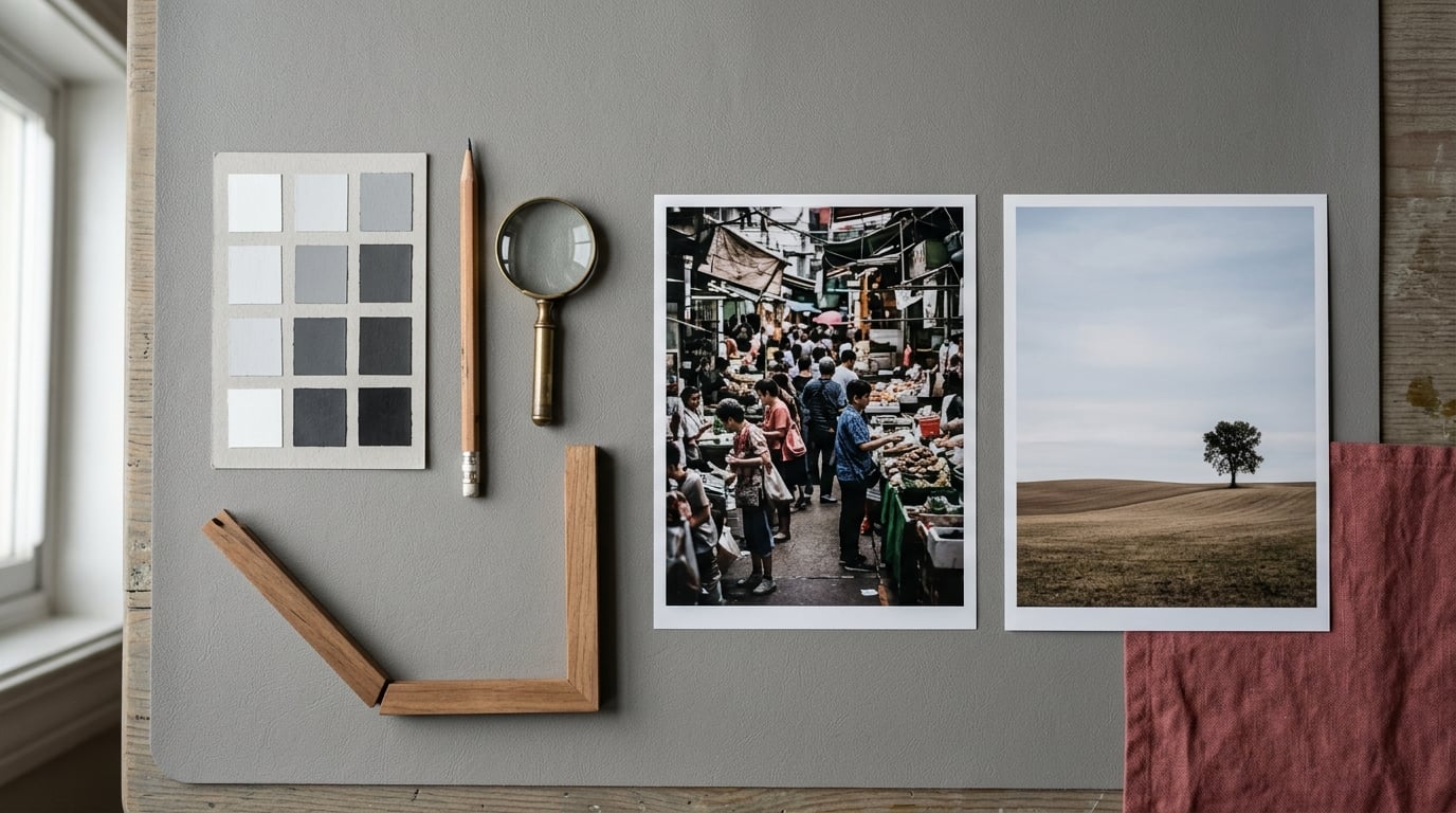
A busy composition is one where too many elements compete for attention at roughly the same visual weight, so nothing reads clearly as the subject. To fix it, decide what the image is about, reduce the scene to three to five large shapes of light and dark, give the subject room to breathe, and crop the rest away. A full pass takes about 30 minutes, and the hard part is not the technique, it is agreeing on what to lose.
When I need to simplify a busy composition, whether that is a photo, a drawing, or a half-finished painting, the scenes that fall apart are rarely the ones with too little in them. They are the ones with too many good bits and no decision about which one matters. The fix is not more detail. It is fewer decisions.
Table of Contents
- What You Need
- Step-by-Step: How to Simplify a Busy Composition
- Step 1: Define What the Image Is About
- Step 2: Choose One Clear Focal Point
- Step 3: Remove Distracting Tensions
- Step 4: Isolate the Subject With Negative Space
- Step 5: Simplify Lines, Shapes, and Background Patterns
- Step 6: Control Light, Color, and Tonal Contrast
- Step 7: Crop and Refine the Final Frame
- Step 8: Test the Composition at a Glance
- Common Mistakes
- Frequently Asked Questions
- How do I know when a composition is too busy?
- What is the difference between a simple composition and a minimalist one?
- Should every distracting element be removed from a photograph?
- How much negative space should I leave around my subject?
- Does converting a photo to black and white make the composition less busy?
- Conclusion
What You Need
You need a finished image or a live scene, ten quiet minutes, and a way to judge value. That last one is the only piece of equipment that matters, and it can be free.
For a painter or drawer, that means a small piece of paper or a square of canvas, a pencil, and either your eyes or a red transparency filter held at arm’s length. A physical transparency sheet taped over a reference is the cheapest diagnostic tool in art, and it works the same way a curves layer does in an editor. Both collapse the image to its light and dark masses so clutter disappears and the real structure shows.
For a photographer, the tools are your feet and a longer lens. Changing vantage point and focal length removes more clutter from a scene than any edit made afterwards, and it costs you nothing but walking a few paces.
A squint test, a mirror, and a small screen or print to view the result at a glance complete the kit. None of this depends on having better tools, and honestly the biggest gains come from deciding what to leave out, not from a new piece of equipment.
Step-by-Step: How to Simplify a Busy Composition
Work through these in order and make one decision at a time. Compare each version against the one before it, keep the original file untouched, and never simplify more than one thing in a single pass or you lose the ability to tell what helped.
Step 1: Define What the Image Is About
Finish this sentence before touching anything: I want viewers to notice this first, then this, and finally this. The blanks are the whole composition. If you cannot fill them, you do not have a composition yet, you have a scene with good bits in it.
Change the answer and the details that matter change with it. A harbour painting about the last light is about value and the silhouette of one crane. The same harbour about working life is about figures and rhythm, and the crane becomes a shape in the background. Neither version is wrong. Mixing the two into one frame is what produces the jumble.
Step 2: Choose One Clear Focal Point
Pick a single element to hold first attention, and let everything else be secondary. The focal point is wherever contrast, isolation, scale, gaze direction, or overlap happens to be strongest, so you can find it by looking rather than by deciding in advance.
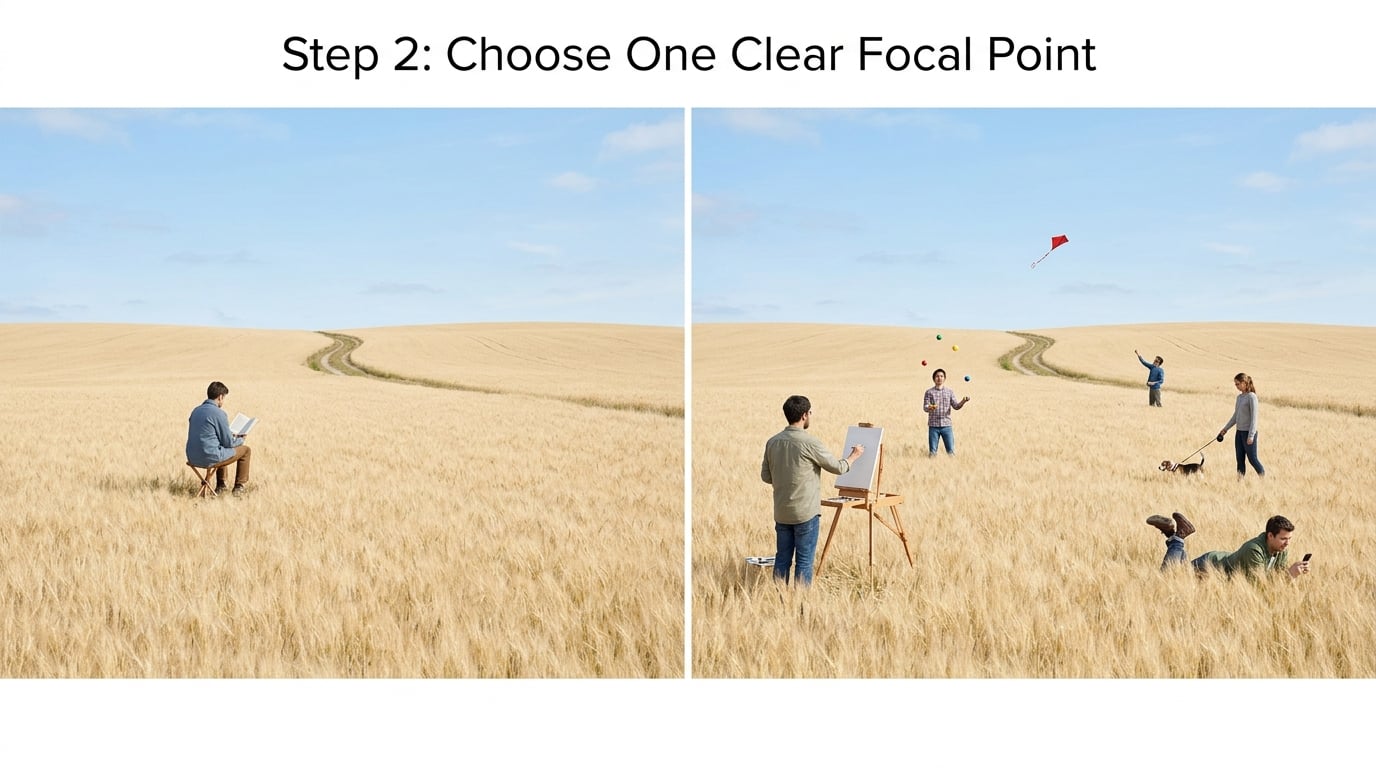
Then check for competing pull. Ask a second person what they looked at first and how long it took them to get there. If they report two answers, you have a hierarchy problem, and no amount of extra detail on your subject will fix it.
Step 3: Remove Distracting Tensions
Busy scenes rarely fail from clutter alone. They fail from small frictions, and those are easy to name: a branch tangent to a head, a bright window cut by the edge of the frame, a figure half sliced by a border, a stripe in the background pointing straight at your subject.
Most of these resolve by moving rather than editing. Shift a step to the side, wait for the pedestrian to clear the lamp post, or turn the frame. When you cannot move, the fixes are limited but real: darken the offender, soften its edge so it stops competing, crop it out, or paint over it. In fine-art work, complete realism is rarely required, and a background that reads as an impression of a place serves the picture better than an accurate wall of detail that does not.
Step 4: Isolate the Subject With Negative Space
Negative space is the empty or quiet area around your subject, and it does two jobs at once. It isolates the subject and it gives the viewer somewhere to rest, which is what makes an image feel calm rather than merely empty.
Leave space in front of whatever is moving or looking. A figure walking toward the right edge of the frame needs room on the right. A portrait looking off to one side needs that side open, not blocked. Space behind is the exception, and it works only when it is deliberate: a small shape against a large empty field, where the size of the emptiness is the point.
This is where most people overshoot. A subject that is too small in a sea of emptiness is not minimal, it is lost. Shrink the frame until the subject has just enough room around it to read, then stop.
Step 5: Simplify Lines, Shapes, and Background Patterns
Break the scene into the armature underneath it, which is the triangle, L, or S shape that holds the design together, and then into a few big value shapes. If you cannot name the armature in one sentence, the structure is not settled yet.
Keep the lines that lead toward the subject and do something useful with the rest. A path, a wall edge, or a row of shadows that points at the focal point is doing real work. A fence post that happens to fall near the same line is a coincidence, and coincidences read as noise.
Backgrounds cause most of the trouble in crowded scenes. A repeated pattern at the same value as your subject destroys the figure, no matter how carefully you painted it. Either break the pattern, change the value of the whole area, or make the edge around the subject softer than the edges inside the background.
Step 6: Control Light, Color, and Tonal Contrast
Simplify by tone before you simplify by content. Convert to black and white, or use a threshold adjustment, and anything that is not clearly darker or clearly lighter than its surroundings will jump out as a distraction. Most of the time the answer is a small local correction rather than a global one.
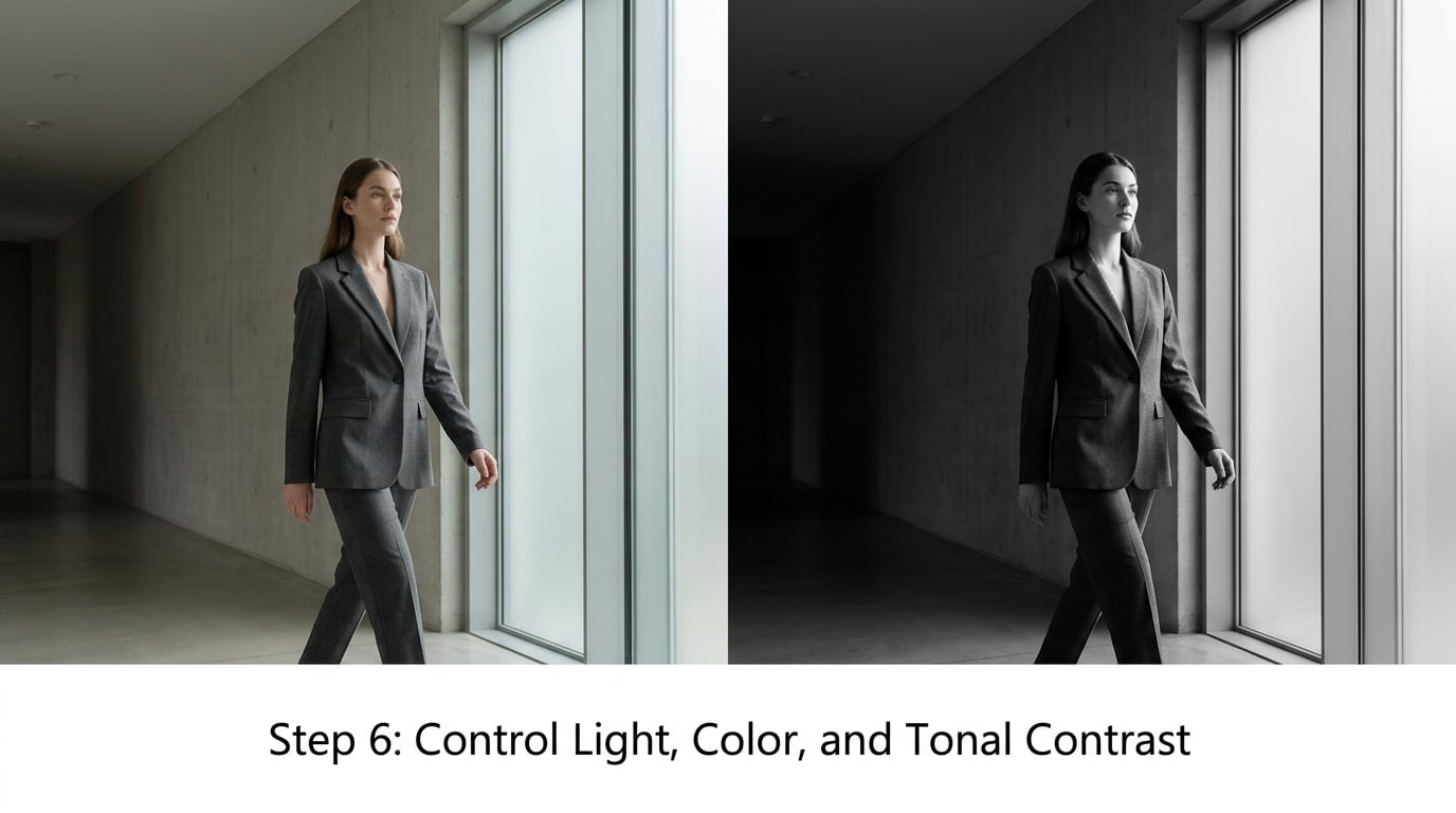
Desaturate the background slightly while keeping skin, food, or whatever the story needs, and let a single colour carry the emphasis. Dodge a little light onto the subject, burn a little darkness into the edges, and keep both adjustments small. Global sliders, big saturation boosts, heavy clarity, and strong filters add contrast everywhere at once, which flattens the hierarchy you just built.
Check the result at thumbnail size before you judge it. Small tonal differences that read correctly at 10 per cent are usually the ones that matter.
Step 7: Crop and Refine the Final Frame
Choose the aspect ratio last, after the design is settled, and let the format serve the content. A tall portrait frame suits a standing figure, a wide one suits a receding road, and a square handles a single centred subject better than almost anything else.
Then walk the four edges of the frame one at a time. Anything cut in half at a border is asking for attention unless the cut is the point, and small shapes that touch an edge tend to read as unfinished. Straighten anything leaning for no reason, tighten the crop until the subject has firm edges and clear breathing room, and stop.
Cloning and compositing can remove a stubborn distraction in a fine-art image, and a viewer will rarely notice. They will notice when the light no longer matches, so keep the patch small and the surrounding light consistent.
Step 8: Test the Composition at a Glance
View the finished work at thumbnail size, then squint, then look at it upside down or in a mirror if you can. Your brain stops recognising objects and starts seeing shapes, which is exactly the read you want a stranger to have in the first three seconds.
Trace the path your eye actually takes, in order. The first stop should be the subject you chose in step 1, the second and third should be the supporting points you named, and the route between them should be visible rather than accidental.
If the path is right but the image still feels busy, you have not found the stopping rule. A composition is simple enough when the read is immediate and nothing else is competing. That is the test, and it is more reliable than any number of elements.
Common Mistakes
Simplifying before defining the purpose is the first and most common failure, and it explains most half-finished work. Everything looks slightly wrong because the picture was trying to say three things at once. Fix: write the notice-this-first sentence before removing anything.
Cutting every detail indiscriminately is the opposite error, and it produces the grey, dead images people mistake for style. Some detail earns its place by leading, by framing, or by giving scale. Fix: keep any detail that supports the read, and cut only what competes.
Making the subject too small is easy to do and hard to see while you are working, because you are standing too close to it. Fix: view at thumbnail size after every change.
Removing all negative space flattens the image against the format and leaves the subject nowhere to sit. Breathing room is not wasted area, it is structure. Fix: leave enough space for the subject to read, then no more.
Using effects that overpower the scene is a tonal problem disguised as a style choice. Heavy clarity, aggressive vignetting, and stacked filters push every area toward the same contrast, so nothing leads. Fix: make small local adjustments and leave the global sliders alone.
Cropping in a way that weakens the visual path is easy to miss because the new frame looks tidier. If your path ran from a lower corner to the subject, a tight crop can delete the corner the path started from. Fix: re-run the eye trace after the crop, not before.
Judging only at full size is how over-detailed work gets past its own maker. Fix: check small, then check in greyscale, then check with the object names removed.
Work non-destructively while you learn this. Keep the original file, make new versions rather than editing over the first attempt, and add detail back later only in the areas that already read clearly. Most beginners find the tension harder than the technique, and learning when to stop is a skill of its own.
One last thing: leave a little ambiguity in. A scene that resolves completely in half a second can be flat. A touch of unresolved space invites the viewer to finish the picture, and that is where the interest lives.
Frequently Asked Questions
How do I know when a composition is too busy?
Run three quick checks. Show the image for three seconds, then ask someone what they saw first and what it was about. Squint until detail blurs and count the large shapes of light and dark, which should be three to five. View it in greyscale and look for a clear darkest or lightest area. If the first read is wrong or the shapes number more than five, the composition is competing with itself.
What is the difference between a simple composition and a minimalist one?
A simple composition has one clear subject, a readable path for the eye, and supporting detail that stays subordinate. A minimalist one reduces the image to almost nothing, often very few elements and a lot of empty space. Simple solves a readability problem, minimalist is an aesthetic you commit to deliberately. A busy scene can be made simple without ever approaching minimalism.
Should every distracting element be removed from a photograph?
No. Remove or suppress what competes with the subject, and keep what supports the mood, scale, or story. A single lamp post, path, or patch of light can make a scene feel inhabited rather than sterile. Judge each element by whether it pulls the eye away from the focal point, not by whether it is technically unnecessary. Simplification is about attention, not emptiness.
How much negative space should I leave around my subject?
Enough for the subject to read clearly and for the space to feel deliberate rather than accidental. Leave more room in front of a subject’s movement or gaze than behind it. A useful test is to crop tighter in small increments and stop at the last point where the subject still feels comfortable rather than pressed against the frame. If the subject looks abandoned in a large empty field, the crop is too loose.
Does converting a photo to black and white make the composition less busy?
Often, yes, because it removes the distractions of competing colours and asks the image to work on tone alone. Areas separated only by hue can collapse into one value, which makes clutter more visible but also easier to fix. Black and white does not solve a weak hierarchy on its own, though. If several things are still equally light and equally dark, simplify the structure first and convert afterwards.
Conclusion
Start with one written sentence naming the thing the image must communicate, then find the focal point that supports it and remove the first thing that competes. Work in a single pass rather than a hundred small corrections.
What most people are after when they ask how to simplify a busy composition is not less image. It is the same image, delivered properly, with the atmosphere and the meaning intact and the noise gone. Cut the noise first, then decide what earns its way back in.