
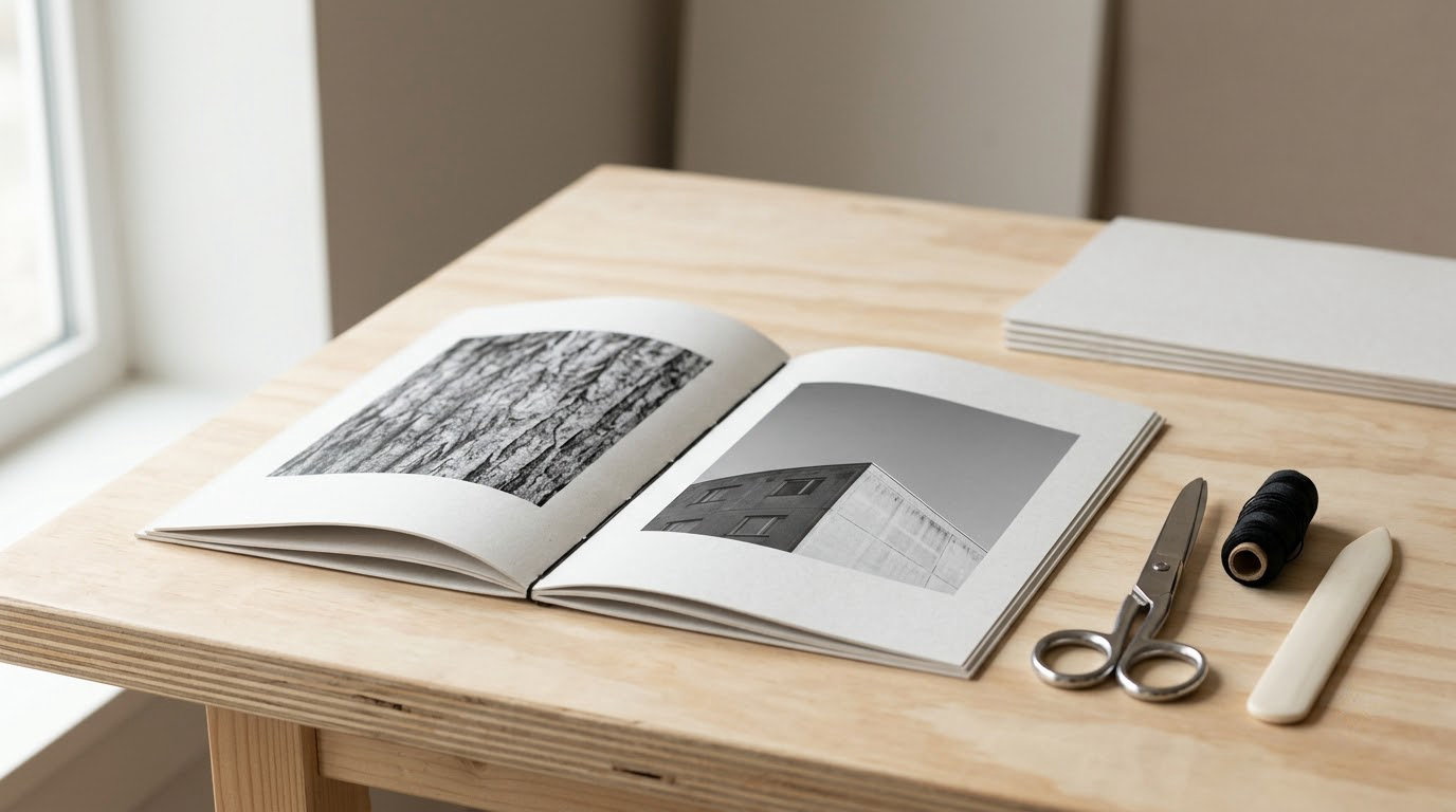
A photo zine is a small, self-published booklet a photographer makes from their own images, usually somewhere between 8 and 64 pages, printed in a short run and handed out or sold directly. To make one, you need a theme, a photo count that matches a page count in multiples of four, a layout tool, a printer, and a stapler. A single zine takes an afternoon to lay out and an hour to assemble, and the whole job is well within reach if you have never set a page before.
The part that trips people up is not the printing. It is the page count maths, the duplex alignment, and the sequencing. Get those three right and the rest is folding and stapling. This guide walks through all eight steps, with the exact measurements so you are not guessing at the bleed or the margins.
One note before we start: nobody needs InDesign. Free tools handle an eight-page zine perfectly well, and a hand-cut collage zine is a legitimate route too. Pick the method that fits the photographs you have, not the method that sounds most professional.
Table of Contents
- What You Need
- Step-by-Step: How to Make a Photo Zine
- Step 1: Define the zine’s theme and format
- Step 2: Select and edit your strongest photographs
- Step 3: Create a page sequence
- Step 4: Set up the page size and margins
- Step 5: Design the pages in a photo editor or layout tool
- Step 6: Add text without competing with the photographs
- Step 7: Proof and export print-ready files
- Step 8: Print, assemble, and finish the zine
- Common Mistakes
- Frequently Asked Questions
- Conclusion
What You Need
Here is the full kit list, with a cheaper option beside every item. Most beginners already own two or three of these things.
- A layout tool. This is where the pages get designed. Adobe InDesign is the industry standard, Affinity Publisher does the same job for a one-off payment, and Photoshop or Affinity Photo work if you are comfortable with layers. For a free route, Photopea runs in the browser, Scribus is a free desktop layout tool with proper bleed controls, and Canva covers the basics well enough for a simple saddle-stitch zine.
- Your selected images. Set aside a folder with only the photographs you have chosen, at their highest available resolution. An A5 page filled edge to edge at 300 DPI needs roughly 1800 pixels on the long edge, and a full A4 page needs about 3500. Anything smaller will look soft on paper, however good it looked on screen.
- Paper. Matte uncoated stock between 120 and 170 gsm is the safest choice for photographs, because it absorbs ink without glare. Gloss or satin gives punchier blacks and more contrast, but fingerprints show straight away. For the cover, use 200 to 250 gsm card so the spine survives being read.
- A printer, or a print service. A home inkjet is fine for a first run of a handful of copies. A local print shop handles longer runs, heavier stock and accurate colour, and usually becomes cheaper per copy somewhere around thirty copies.
- Binding supplies. A stapler and a box of staples, a metal ruler and a folding bone. The bone is optional but it makes a crisp fold instead of a rounded one, and you can use a ruler edge in a pinch.
- Optional finishing tools. A craft knife and cutting mat for trimming edges, a lighter or bone folder for a wrapped cover, thicker card for the cover, and a needle and thread if you want a hand-stitched journal rather than a stapled zine.
If you want the cheapest possible first zine, you need one sheet of A3 paper, a printer, and a stapler. Everything else is refinement.
Step-by-Step: How to Make a Photo Zine
Step 1: Define the zine’s theme and format
Start with one sentence describing what the zine is about. A black-and-white street zine built around a single winter, a surreal portrait series shot with a cheap flash, a pocket-sized nature zine from one weekend of walking. Vague themes produce vague edits.
Then choose a physical format, because the format decides your page count:
- One-sheet zine. Eight pages folded from a single sheet of A4 or A3. The cheapest route and the best one to learn on.
- Saddle-stitched zine. Pages printed 2-up, folded together, and stapled along the spine. Page counts must be 8, 12, 16, 20 or 24. This is the standard zine format.
- Loose-leaf or hand-bound journal. Pages stacked and bound with thread, or held with a strip of card. No page count restrictions, and you can add pages later.
- Digital flipbook. The same pages exported as a single PDF designed to be read on a phone. Worth doing as well as the printed version, since most people will see it first on a screen.
You are ready to move on when you have a theme sentence, a format and a page count written down. Everything after this is execution.
Step 2: Select and edit your strongest photographs
The hard part of a zine is not making the pages, it is cutting. Lay your library out as thumbnails and remove duplicates: two frames of the same gesture, the same location shot in four exposures. A zine of 16 pages holds roughly ten to twelve photographs once covers and blank pages take their share.
Ask one question of every image: does this belong with the others? If the answer needs a paragraph, it is the wrong shot.
Then make the edit consistent. Apply the same black point, contrast curve and colour treatment to every frame, so the zine reads as one body of work rather than a scrapbook. If you are going monochrome, converting the whole set at once is the reliable route, and it is worth reading up on how to convert a photo to black and white in Photoshop before you commit.
Check each file for resolution, cropping and dust before it goes into the layout. One stray sensor spot at full page size is unmissable.
You are ready to move on when every remaining file is full resolution, edited to match, and the count is no more than the pages you have.
Step 3: Create a page sequence
A zine reads in order, so treat the layout as a narrative. Open with a single image that sets the place or the mood, and give it a full page. Alternate dense spreads with quiet ones: a run of two images side by side, then one image alone. Pace is what stops an eight-page zine feeling like a contact sheet.
Set your thumbnails to something tiny, around 200 pixels wide, and view the whole sequence in order. At that size you cannot see detail, only rhythm, and rhythm is what you are checking. If two images in a row feel redundant, swap or drop one.
Decide which images run full-bleed and which sit inside a margin. Full-bleed is punchy and expensive-looking; framed pages give type somewhere to live. Mixing one of each usually works better than committing to one style throughout.
You are ready to move on when the thumbnail run has a clear opening, a middle and an ending, with no two consecutive images saying the same thing.
Step 4: Set up the page size and margins
Work in millimetres and turn on rulers, because printers and folding bones both use them. For an A5 saddle-stitch zine, set the page to 148 by 210 mm. For a full-size US Letter zine, 8.5 by 11 inches. A one-sheet zine is laid out as a single sheet of 210 by 297 mm, divided into eight panels.
Then set three measurements and everything else follows from them:
- Bleed: 3 mm on every edge, so a slight trim error does not leave a white sliver.
- Safe margin: 5 mm inside the trim line, so nothing important sits where the fold or the trim lands.
- Gutter: 5 to 8 mm extra inside margin on pages that sit against the spine, so text and image edges are not swallowed by the binding.
You are ready to move on when every text block and every important part of every photograph sits inside the safe margin, and the bleed extends past the trim line on all four sides.
Step 5: Design the pages in a photo editor or layout tool
Open your layout tool and place one image on the first page. Build the rest by duplicating that page rather than starting each one fresh, so margins, image widths and type sizes stay identical by default. That single habit removes most of the inconsistency beginners complain about later.
Pick one type family and use it for everything. A plain sans serif or a neutral serif at one size, left aligned, does more for a zine than a decorative font at three sizes. If you want a handmade feel rather than a designed one, torn paper, tape, photocopies and scanned textures work; there is a straightforward method for adding texture to a photo in Photoshop when you want a printed edge rather than a digital one.
Use a simple grid even if it feels fussy. Aligning to invisible columns is invisible until someone flips the pages and the layout still holds together.
You are ready to move on when the pages sit in sequence, share one visual system, and no two pages have the same margins by accident.
Step 6: Add text without competing with the photographs
Most photo zines need a title, a name, and nothing else. Captions belong only where a reader genuinely cannot tell what they are looking at, and a short statement on page two is usually more than most audiences will read.
When you do set type, keep it readable: 9 point or larger, dark text on light paper or the reverse, and never stretched over a busy part of an image. Set text on the lightest area of the photograph or on empty paper, not across the middle.
Leave space on purpose. White space is what makes a full-bleed image feel considered rather than squeezed in.
You are ready to move on when you can read every line at arm’s length and nothing is hard to make out against its background.
Step 7: Proof and export print-ready files
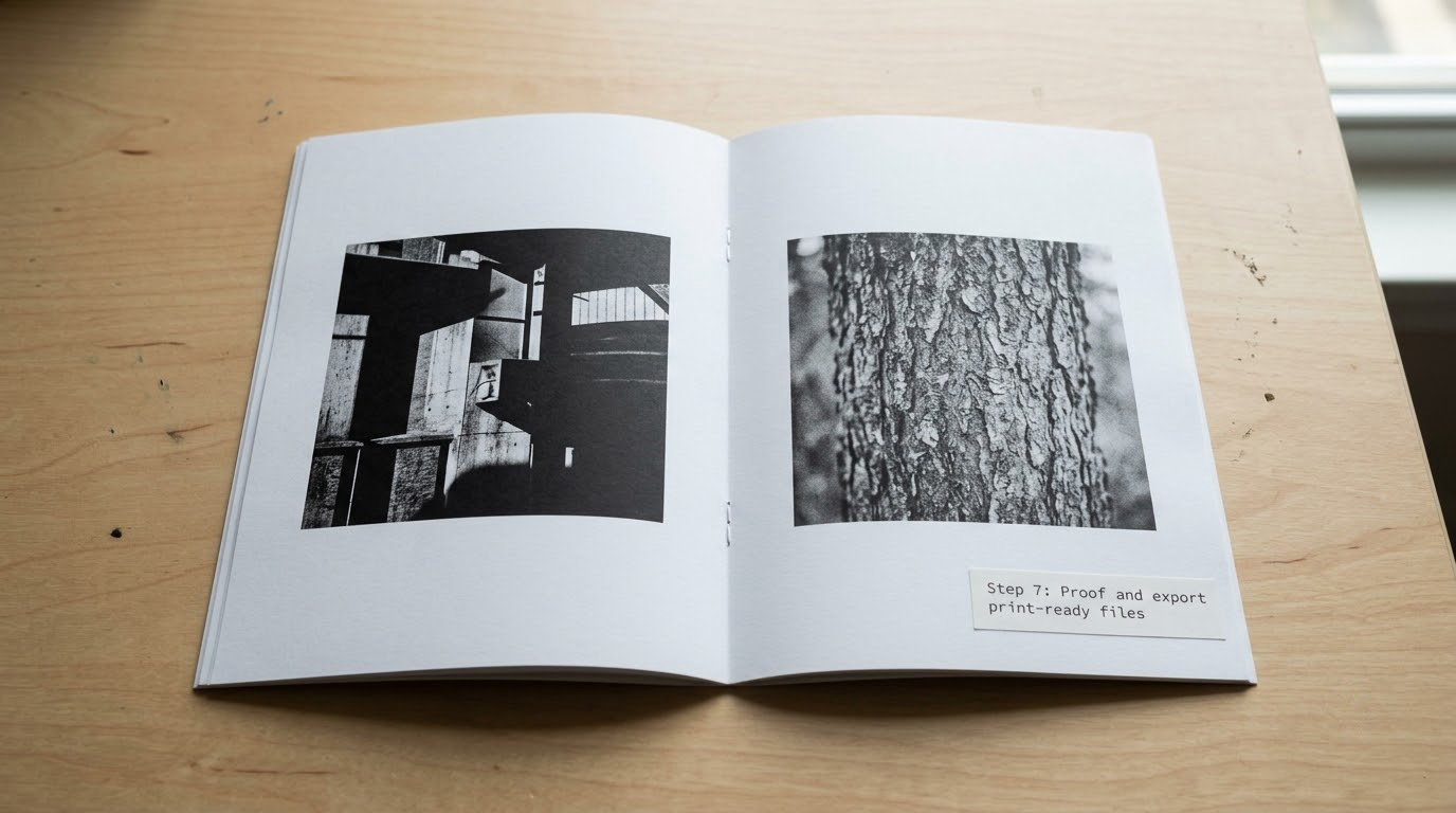
Proof twice, in two states. First at actual size on screen, checking spelling, page order, margins and contrast. Then zoomed out to thumbnail size, checking rhythm and whether the covers read as a pair.
Then check the print setup, which is where most first zines go wrong:
- 300 DPI throughout, with no image placed above 100% scale.
- sRGB colour for home printing, or convert to CMYK with your print shop’s profile if they are doing the printing.
- Export as PDF at print quality, with crop marks and bleed turned on if you are sending it to a print shop.
- Print duplex, flip on long edge, so page 2 lands on the back of page 1 rather than on the back of page 3. On a printer that only does short-edge duplex, print single-sided and feed the sheets back in manually.
Before a run of 25, print one complete copy and staple it. One proof copy costs minutes and saves a wasted batch.
Step 8: Print, assemble, and finish the zine
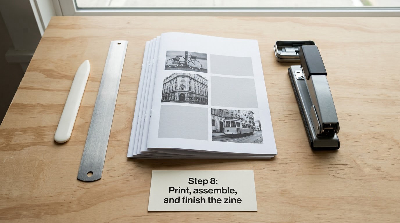
Print a single-sided test sheet first and fold it before you print the rest. For a one-sheet zine, fold the sheet lengthways, then fold it again, then open it out and press the creases firmly with a folding bone. The panels will read in order: front cover, back cover, two pages on each side, and the centre spread last.
For a saddle-stitched zine, print 2-up with page 1 and page 2 side by side, stack all the sheets in order, fold the stack once so the pages nest, and staple along the fold. Put one staple about 8 mm from the top and one the same distance from the bottom. Use three staples for anything 32 pages or longer.
Here is the rule that catches everyone: the folded stack must be thinner than the staple itself. If it is thicker, the staple will not fold over inside the crease, and you will be unpicking it. Fewer pages or a longer staple fixes it.
Once assembled, add the optional details. A cover on heavier card, a strip of wrapping paper around the whole run to hold it together, and a colophon on the last page with your name, the year and the print run.
Finally, decide where it goes. Hand copies to friends, take a stack to a zine fair or a market, swap copies with other photographers, and post the spreads online. If you want the digital version, export the same pages as a phone-sized PDF as well. A first print run of 20 to 30 copies covers a small launch, and a digital PDF costs nothing to extend afterwards.
You are done when page 1 through to the last page runs in order with no blank or missing pages, and every photograph is the right way up.
Common Mistakes
Almost every beginner zine problem has the same small list of causes. Here is what goes wrong and the fix.
- Too many images. The result feels random and nobody can see the story. Cut the count to match your page count, and let some pages stay blank.
- Printing from the screen file. Images look soft and pixelated on paper. Re-export the finished layout as a 300 DPI PDF rather than printing the working file directly.
- Ignoring the fold and the spine. Text disappears into the binding and edges get trimmed off. Add a 5 to 8 mm gutter and keep everything inside a 5 mm safe margin.
- Overcrowded pages. Two images on a spread with no breathing room looks like a slide deck. Give one image the page, or add a margin so the two sit apart.
- Weak contrast and grey blacks. A flat edit is the most common reason a printed zine looks dull. Deepen the black point and add a little contrast, then re-check on paper, because screens flatter everything.
- Inconsistent treatment across frames. Mix of warm and cool images, or one heavily edited frame among neutral ones. Edit the whole set with the same settings before layout.
- Skipping the proof. Misspelled titles, swapped page order and a cover printed inside out all survive until the last moment. Proof the whole thing once, and fold one printed sheet before committing.
- Duplex printing out of alignment. Pages do not line up when folded, which usually means the wrong flip edge. Switch to long-edge duplex, or print single-sided and re-feed the paper.
- Staple failure on a thick stack. The staple will not fold inside the crease. Use fewer pages or a longer staple, and remember that three staples hold a longer zine better than two.
Two finishing habits separate a good zine from a rushed one. Trim the edges with a sharp knife on a cutting mat, and give it one full night to dry before stacking. A zine that is cut square and left overnight will still look good in a year.
Frequently Asked Questions
What is the best program to make a zine?
Photopea and Scribus are the strongest free options, and Canva covers the basics if you would rather drag and drop. Affinity Publisher handles print setup and bleed properly for a one-off payment. Adobe InDesign is the industry standard but is overkill for an eight-page zine. Any of them will do, as long as you export a print-ready PDF at the end.
How many photos should go in a photo zine?
An eight-page zine holds about five or six photographs, because covers and blank pages take up room. Page counts always divide by four, so your realistic options are 8, 12, 16, 20 or 24 pages, and each printed sheet carries four pages. Pick the page count first and then edit your selection down to match, rather than choosing images first and forcing the layout to fit them.
What paper should I use for a photo zine?
Matte uncoated stock between 120 and 170 gsm absorbs ink without glare, which suits a zine people read closely. Gloss or satin gives punchier blacks and more contrast, but fingerprints show immediately. Print the cover on 200 to 250 gsm card so the spine survives handling, and always dry a single test sheet before printing the whole run.
Should I print my zine at home or use a print shop?
Home printing suits a first run of five to twenty copies, and quality is fine on a decent inkjet. A local print shop handles larger runs, heavier cover stock and accurate colour, and usually costs less per copy past thirty or forty. Send them a proofed PDF, print one full copy at home first, and ask for a single bound sample before the batch goes out.
How do I make a photo zine look professional?
Consistency does most of the work. Match colour, contrast and black point across every photograph, pick one typeface and one size, keep margins identical, and leave real empty space on the page. A colophon on the last page with your name, the year and the print run is the detail people notice. Sloppy trimming gives everything away, so cut the edges carefully.
Are zines legal, and do I need permission to publish my own photos?
Yes, a self-published photo zine is perfectly legal to make and sell. You hold copyright in the photographs you took, so printing your own work needs nobody’s permission. Credit any images, text or music you did not make, and add a copyright line with your name and year on the colophon if you want the claim stated explicitly.
Conclusion
Start small. Write down one sentence about your theme, pick a page count, and cut your photo selection until it fits. Test the sequence as thumbnails before you open any layout software, because reordering twenty pages afterwards is the part nobody enjoys.
Design once, using a single type family and consistent margins, then print a single proof copy. Fold it, staple it, and if it reads the way you wanted, print the rest. That is genuinely all there is to learning how to make a photo zine, and your second one will take half the time.