

A Lightroom preset is just a saved bundle of Develop module settings, and making one takes a couple of minutes. Edit a photo until you like the look, open the Presets panel, choose Create Preset, pick the settings you want stored, give it a name, and it sits in your panel ready to apply to any other image. Most of the work is not in the saving, though, it is in editing an image in a way that will hold up on the next forty photos from the same shoot.
That last part is where a lot of presets fall down. You see it constantly on r/Lightroom, where people ask for a preset that does not tear the image apart, because the preset they made only works on the single photo it was built from. A useful preset is a base render, not a finished edit, and the difference comes down to which settings you save and which ones you deliberately leave out.
Below is the workflow I use. It applies to 2026, and the menu paths are for Lightroom Classic on a desktop machine.
Table of Contents
- What You Need
- Step-by-Step: How to Create Lightroom Presets
- Common Mistakes
- Frequently Asked Questions
- Can I create presets in the Lightroom mobile app?
- Should a Lightroom preset include every adjustment I make?
- Why does my preset look different on other RAW photos?
- How do I share a Lightroom preset with another photographer?
- Can one Lightroom preset work across different cameras and lighting conditions?
- Conclusion
What You Need
You need Lightroom Classic running on a computer, a catalog with a handful of representative photographs, and a display you have actually calibrated. That last one matters more than people expect, because a preset built on an uncalibrated screen will look wrong everywhere else.
The catalog should hold several images from the same shoot, ideally with the same camera, lens and lighting. Five or six frames beat one by a wide margin, since a single image can hide a bad decision that only shows up on the next twelve.
One thing to get straight early: the creation interface described here belongs to Lightroom Classic. The current Lightroom desktop app and Lightroom mobile both have a Presets panel, but neither gives you the same Create Preset dialog with per-setting checkboxes. You can make look presets on mobile, but the fine-grained control over what gets stored still lives on the desktop. If your only device is a phone, expect to re-visit the preset on a computer before it goes near client work.
Step-by-Step: How to Create Lightroom Presets
Five stages, in this order. Work through the correction before the style, and you will spend far less time undoing a look that was built on a bad base.
1. Prepare a Consistent Set of Test Photos
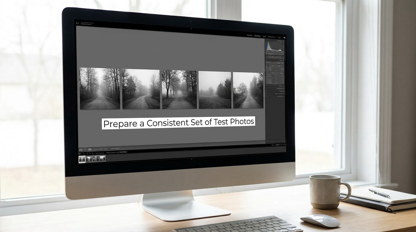
Open five to ten photos from the same session into the Develop module, one after another, and look at them without touching a slider. You are checking that they share enough in common for a preset to transfer: similar exposure, similar contrast, similar white balance, the same kind of subject matter and light direction.
If your test set includes one frame shot in open shade and one in direct sun, stop and split the set. Those two need two presets. A preset built across them will always be a compromise that suits neither.
How do you know the set is right? Scroll through it and ask whether the histograms roughly overlap. If one image is a stop darker than the rest, or noticeably flatter, the set is not yet consistent enough for a meaningful test, and no preset is going to rescue that.
2. Make a Neutral Global Correction
Start in the Develop menu and set the Profile. The Neutral or Adobe Color profile is a good base for most preset work, because it hands you a flat, predictable starting point instead of a look you then have to undo. If you prefer to start from your camera profile, that works too, as long as you know what look it is handing you.
Next, set the White Balance using the eyedropper on a neutral area. Paper, a wall, a piece of clothing, whatever you know should be truly neutral in the frame. Getting this right before anything else means your color work later has a real reference to sit on.
Then work down the Basic panel: Exposure, Contrast, Highlights, Shadows, Whites, Blacks. Take them in that order, because each one changes what the next one sees. Pull highlights down and shadows up gently rather than aggressively, and check the histogram as you go.
How do you know the correction is done? Skin tones look natural, bright areas hold detail without going chalky, and shadows stay open without turning grey and milky. If any of those three fail, fix it now. Every extra stop of contrast you pile on later will exaggerate the problem you are trying to hide.
You can use a masking tool such as the Adjustment Brush to tame a face that is brighter than the rest of the frame, but leave that out of the preset. It is specific to one photo, and it is the first thing to check for when a preset behaves badly.
3. Build the Creative Treatment
Now the style goes on, and restraint matters more than taste here. A preset that is two stops too strong has to be pulled back on every single image afterwards, which defeats the point of having one.
For a monochrome conversion, work through the Color Mixer panel and set saturation to zero. Adjust each channel slider against the actual image, since reds and oranges usually sit around 40 while blues and cyans want to sit lower. A simple S-curve in the Tone Curve panel gives you the contrast the Basic panel could not. Color Grading is optional and usually unnecessary once the image is black and white, though a small shift into the Color Mixer in the post-conversion stage can add a warm or cool cast.
For a color look, the Tone Curve sets the overall contrast, Color Grading handles the split between shadows and highlights, and Color Mixer lets you adjust individual hues without touching saturation everywhere at once. Vibrance is often safer than Saturation, because it protects already-saturated colors like skin. Keep dehaze and clarity small, since both amplify texture and will look crunchy on skin or foliage at higher values.
In the Detail panel, noise reduction and sharpening values are the two most common things to leave out of a preset. Sharpening that looks right on a sharp RAW file can look terrible on one shot at a higher ISO. Optik and Effects can go in, with grain amount kept low so it does not fight with a camera that already produces plenty.
How do you know the treatment works? Turn panels off and on one at a time, Alt-clicking the panel name to compare with the unedited version. Every change should have a visible, nameable purpose. If toggling a slider produces a difference you cannot describe, set it back to zero.
4. Save and Name the Preset
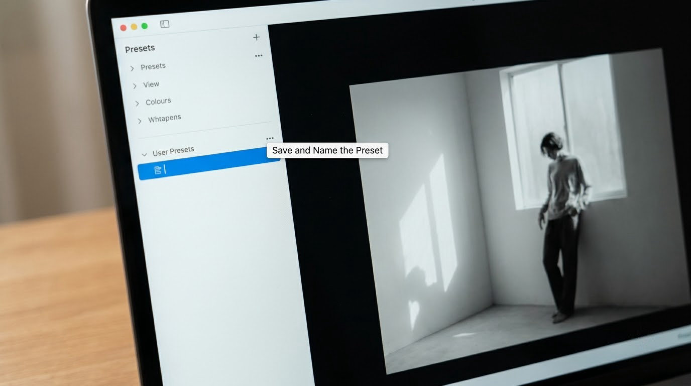
In Lightroom Classic, open the Presets panel in the left sidebar. In the panel header, click the disclosure icon at the right, then choose Create Preset. The Create Preset dialog opens with a name field at the top and a long list of checkboxes underneath.
Type a name that describes the look and the job it does. Something like BW Documentary Base 01 tells you far more at a glance than Preset 7, and it sorts well when you have thirty of them. Choose the folder too: create a new group with Create New Preset Group rather than dumping everything into User Presets, since that folder cannot be renamed later.
The checkboxes are the part worth thinking about. Tick Tone, Presence, Color, Detail, Optics and Effects. Leave Cropping, Lens Corrections, and the white balance and exposure-related items unchecked, along with any detail values you would rather set per image. A preset that carries a fixed white balance will turn a warm indoor frame blue the moment you apply it.
Click Create, and the preset appears in the group you chose. How do you know it saved correctly? Scroll to the top of the group, click the preset with the Alt key held down, and watch the image change. If nothing happens, you are probably looking at the wrong group or the dialog saved an empty name.
5. Test, Refine, and Export the Preset
Now do the test that separates a preset that lasts from one that only works on its reference photo. Select five frames you have not opened yet, including the brightest and the darkest, and apply the preset to each. Use the Amount slider under the preset name to dial the strength, which is also the quickest fix for a treatment that turned out slightly strong.
Look for three things. Highlights that have gone flat and white, shadows that have crushed, and skin that has drifted orange or grey. If you need more than a small exposure nudge on most images, go back to the Develop module and lower whatever is responsible before you start hand-editing frame by frame.
Once the preset holds up, keep a copy of the original file. In Lightroom Classic, presets live as XMP files in your presets folder, and there is a Master Presets option in the preset context menu that copies the file somewhere safe. That one habit saves you from losing a year of look development to a reinstall or a catalog problem.
For sharing with another photographer, send the XMP file. They drop it in their own presets folder and restart Lightroom, then it shows up alongside their own. For syncing between your own devices, use Lightroom sync with the preset folder included, and keep the local backup regardless, since sync reflects deletions too.
Expect a compatibility gap on mobile. Presets built in Classic with HSL and Color Mixer adjustments do not map cleanly onto the mobile app, which uses its own simplified panel structure. Check the look on your phone before you build a client gallery around it.
Common Mistakes
The most common failure is a preset that is simply too strong. It looks wonderful on the photo it was made from and flattens everything else. Fix it by halving the strength of every slider that is doing creative work, then re-testing.
Second is baking in the wrong settings. Crop, white balance, exposure and lens corrections are scene-specific, and saving them means the preset fights the photo instead of helping it. Untick them in the Create Preset dialog and fix any damage by recreating the preset with the same checkboxes cleared.
Third is clipped highlights and shadows. A Tone Curve that lifts contrast hard will blow out a bright sky or block up a dark jacket on any image brighter than the one you built it from. Build the curve with the curve tool set to medium contrast and check the clipping indicators in the histogram panel.
Fourth, inconsistent skin tones. Heavy saturation or vibrance, or a hard Color Grading move, will push skin away from natural. Desaturate reds and oranges a little in the Color Mixer instead of dropping global saturation.
Fifth, one preset trying to cover several cameras. A look built on a mirrorless body will land differently on an older DSLR with a different base profile and different noise. Build a separate preset per camera system rather than one universal file.
Sixth, treating a one-off look as a preset. If the effect only works on that frame, it is not a preset, it is an edit. Keep it as local adjustments on that image.
Seventh, losing everything. Presets vanish after a reinstall or a catalog rebuild, and synced presets vanish on every device when you delete them once. Keep a Master Presets folder, add a date or version to the name when you revise a look, and delete in batches rather than one at a time.
Frequently Asked Questions
Can I create presets in the Lightroom mobile app?
You can, but the controls are narrower. Mobile lets you edit an image, open the plus icon beside Presets, and save the current look as a new preset, including its name and group. What you do not get is the Create Preset dialog with a checkbox for each setting, so you cannot exclude white balance or crop individually. Treat mobile presets as look previews and rebuild the final preset in Lightroom Classic, where you can choose exactly what gets stored.
Should a Lightroom preset include every adjustment I make?
No, and this is where most homemade presets go wrong. Save the settings that describe your style: tone, presence, color, detail, optics and effects. Leave out white balance, exposure, crop, lens corrections and sharpening, because those depend on the individual photo. A preset that carries a fixed white balance will recolor every frame you apply it to, usually in the wrong direction.
Why does my preset look different on other RAW photos?
Because the reference image was the only one the preset was designed for. RAW files respond differently depending on exposure, the lighting on the day, the camera body and the chosen profile. If the differences are large, the preset is probably too strong. Test it on five varied frames from the same shoot, watch the histogram, and dial the Amount slider or soften the curve until it holds up on all of them.
How do I share a Lightroom preset with another photographer?
Send the XMP file. Right-click the preset in the Presets panel and copy it, or use the Master Presets option to write a copy into a folder you can zip. Your contact drops that file into their own presets folder and restarts Lightroom, where it appears next to their own presets. Presets made on mobile can be shared the same way, though some settings do not translate across the apps.
Can one Lightroom preset work across different cameras and lighting conditions?
Partly. It can hold up across lighting if you keep the adjustments relative and restrained, and it can cross camera bodies if you set the same profile as your base, but tone response and noise differ enough that you will usually get better results with one preset per camera system. If a preset needs large per-image corrections to look right, split it rather than forcing it. Two honest presets beat one that works on nothing.
Conclusion
Start with one restrained preset, not a library. Pick five frames from a single session, get the profile, white balance and basic correction right on one of them, add the style in small steps, then save it with tone, presence, color, detail, optics and effects checked and everything else left alone. Apply it to four images you have not opened yet and look at the highlights, the shadows and the skin. Fix whatever breaks, keep a copy of the file somewhere safe, and only then start building the next look.