
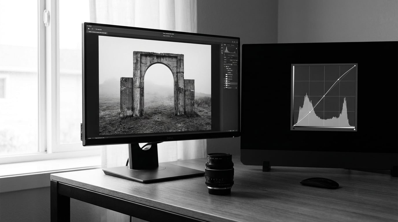
To add contrast to black and white photos, you widen the gap between the darkest and lightest tones: pull the tone curve into a gentle S-shape, then fix the few areas that still sit in gray with masked dodge and burn. On a properly converted file that takes about five minutes per image, and the whole job is knowing which control to reach for in what order.
Monochrome images have no color to separate a face from a wall or a sky from a horizon. Tone is doing all of that work alone, so when the tones bunch up in the middle, the picture reads as flat no matter how good the composition is.
Most of the trouble I see in forum threads comes from pushing the global contrast slider too hard and losing both ends of the tonal scale in one move. The tools below give you the same punch while keeping you in control of where the detail goes.
Table of Contents
- What You Need
- Step-by-Step: How to Add Contrast to Black and White Photos
- Common Mistakes
- Frequently Asked Questions
- What is the best way to add contrast without losing detail in a black-and-white photo?
- How much contrast should I add to a black-and-white image?
- Should I add contrast before or after converting a photo to black and white?
- Is the contrast slider better than a curves adjustment for black-and-white photography?
- Can I rescue a black-and-white photo whose highlights or shadows are already clipped?
- Conclusion
What You Need
You need very little. A working copy of the image, an editor that exposes a histogram and a tone curve, and about fifteen minutes of uninterrupted attention.
For the image itself, a RAW file gives you the most room because nothing has been thrown away yet. A JPEG still works, though its highlights and shadows are already compressed, and a scanned old print is the most constrained of the three.
For software, the workflow below is written for Adobe Lightroom Classic, Adobe Camera Raw, Adobe Photoshop and GIMP, and I note exact menu paths for each. GIMP is free, as is Photopea, which runs in a browser and opens the same kinds of files, so you can do the whole thing without a subscription. Menu names shift a little between releases and platforms, so if your version labels a panel differently, the function you need is the same.
Inside the editor you want four capabilities: a histogram to check clipping, a tone curve for shaping contrast, a way to mask an area, and a dodge and burn tool set to low flow. An optional calibration reference helps, though a printed photograph you trust is good enough for most people.
Step-by-Step: How to Add Contrast to Black and White Photos
1. Check the Original Tonal Range
Before changing anything, look at the histogram with the image unadjusted. In Photoshop it is under Window and then Histogram, in Lightroom Classic it sits in the Develop module alongside the other panels, and in GIMP it is under Windows, Dockable Dialogs, Histogram.
Read it for three things. If the data touches the far edge of the scale, that end is clipped and you cannot put the detail back. If there is a gap in the middle, your subject is not separated from its background. And if the whole histogram is squeezed into a narrow band around the center, the image is flat and has plenty of headroom to work with.
Then make sure the file is a proper monochrome conversion rather than a desaturated color image. In Lightroom that is the B&W mix panel in the Develop module. In Photoshop it is a Black and White adjustment layer from Image, then Adjustments, where you can weight the red, yellow, green, cyan, blue and magenta sliders. GIMP offers Desaturate, then Desaturate with a luminance mode, or a Curves layer per channel if you want full control.
The reason it matters is that each of those sliders changes which scene tones land in the midtones, and those midtones are exactly what a contrast adjustment acts on most. On r/photography the recurring advice is to stop dropping saturation and use a real black and white conversion, tuning reds and greens upward and blue well downward, because desaturation is what produces muddy skies and blotchy skin.
If your file is already black and white, from a scan or a phone edit, work with what is there: check whether the extremes are clipped, then focus on the midtones, where most of the recoverable information usually lives.
2. Set a Safe Global Contrast Baseline
Start with a small global move so you have a baseline to shape. The contrast control is in the Tone section of the Basic panel in Lightroom Classic and Camera Raw, in the Properties panel under Image, Adjustments in Photoshop, and under Colors, Brightness-Contrast in GIMP.
Move it to somewhere between +15 and +30 and watch two things: the histogram and the image itself. A modest change should push the darkest areas a little deeper and the lightest a little brighter, while the midtones stay where they are.
If the histogram data reaches either end of the scale after the move, back off until it no longer does. The contrast slider pivots around the midtones, so a hard push tends to close the gap between them and quietly clip the extremes. It is a good tool for a first pass and a poor tool for the last one.
Starting values only go so far. Adobe’s own help documentation points to roughly +25 on the clarity slider as a starting point, which is a useful sanity check for a typical image, though the right number depends entirely on your source file.
3. Shape Midtone Contrast With a Tone Curve
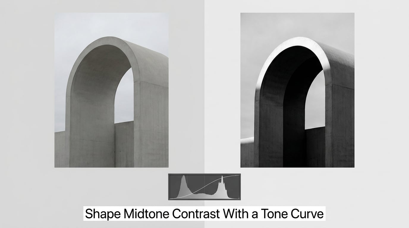
The tone curve is where real control happens. It is under Tone Curve in the Develop module of Lightroom Classic and Camera Raw, it is a Curves adjustment layer under Layer, then New Adjustment Layer in Photoshop, and it is Colors, then Curves in GIMP.
A tonal map works as an input to output lookup: for every input tone it shows you what output tone you get. The default diagonal line means tones pass through untouched. Pulling that line into a shallow S means dark inputs map to darker outputs and light inputs map to lighter outputs, which is contrast.
To build one, set the input sliders to 25, 50 and 75 so the important points line up, then place three points on the curve. Drop the shadows point near 25 to about 15, keep the midtone point near 50 close to where it sits or lift it slightly, and raise the highlights point near 75 to about 85. Leave the two end points pinned at the bottom-left and top-right corners, because moving those is what clips your blacks and whites.
Each region does something different. The shadow section darkens areas below your subject and makes textures like brick or hair read. The midtone section controls overall lightness and local separation, so lifting the center is what makes a face stand out from a wall. The highlight section brightens skies, windows and skin, and pulling it down instead tames a blown background.
If you overshoot, several things go wrong. Steep curves posterize, breaking smooth gradients into visible bands. Very strong settings also drag the image toward a harsh, processed look, especially in skin tones. If you need the opposite effect, drag the curve into an inverted S, lifting shadows and pulling down highlights, which softens a harsh original without going gray.
In Photoshop the curves dialog also offers preset shapes such as Medium Contrast and Strong Contrast, and Lightroom has a matching dropdown. They are decent starting points, and the Strong Contrast preset is a fast way to see the ceiling before you dial back to a custom curve.
4. Protect Extremes and Correct Local Tones
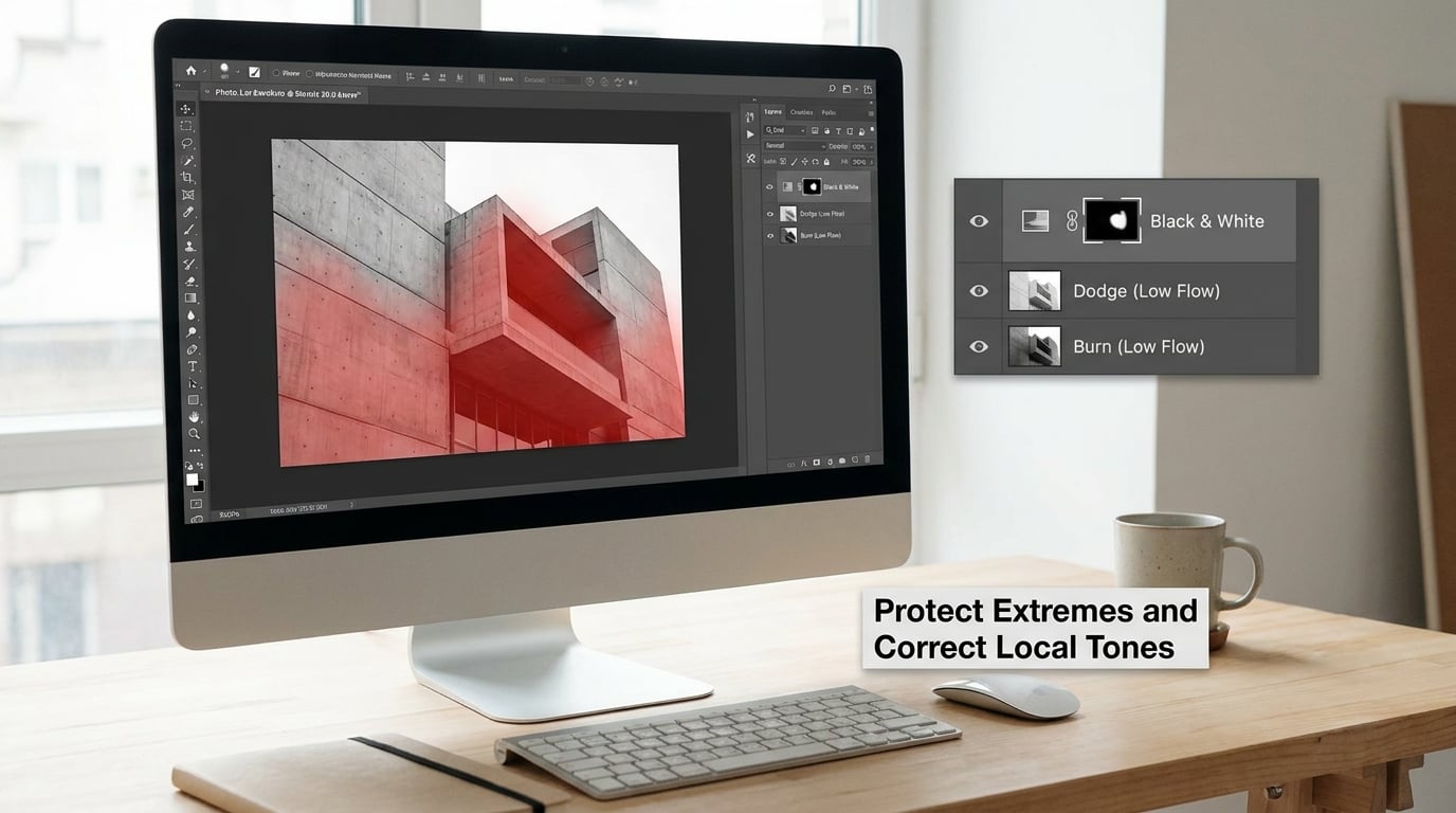
Global contrast cannot fix one problem area without disturbing the rest of the frame, which is where masks come in. A mask limits an adjustment to a defined region, so a local correction costs you nothing elsewhere.
Consider an architectural still life: a concrete archway shot at noon on a bright day. The whole frame sits in a narrow band of gray and the subject does not separate from the background. In Lightroom you would add a mask to the archway with the adjustment brush, or use a radial filter, and give that area its own gentle S-curve. In Photoshop you would add a Curves adjustment layer, press Alt and click the archway to load it as a mask, then paint the mask to refine the selection.
The classic way to add local contrast is dodge and burn, and the restraint matters more than the technique. In Photoshop, create a new layer filled with 50 percent gray, set it to the Luminosy blending mode, and paint with a soft brush at low flow. Darken the layer to burn shadows under a cornice or inside a doorway, lighten it to dodge the face or the top edge of an arch. Keep the flow around 1 to 2 percent, work in small dabs, and reset the brush opacity regularly. In Lightroom, the equivalent is the adjustment brush with a low flow and exposure around minus 0.3 EV for burning, or plus 0.3 EV for dodging.
Always mask your dodge and burn. On r/photocritique and r/postprocessing, over-brightened edges and crunchy halos around subjects are among the most common complaints in monochrome edits, and they almost always trace back to unmasked burning.
You will know the local treatment is working when the subject separates without a bright rim, edge detail stays visible instead of dissolving, and the mask edges are invisible at 100 percent. If a background wall starts to look brighter than the subject, you have gone past the point of useful.
5. Finish With Texture, Sharpness, and Proofing
Once the tones are shaped, go back and re-check the extremes. Open Levels, either from Image, Adjustments, Levels in Photoshop or Colors, Levels in GIMP, and set the black point around 10 to 15 and the white point around 245 to 250. That leaves a small margin at each end instead of butting right up against pure black and pure white, which gives you room to print.
Texture and clarity handle a different kind of contrast. Texture works on fine detail, hair, gravel and fabric. Clarity works on midtone edges, pushing one side of a boundary darker and the other lighter. Both are useful in moderation; Adobe’s guidance is worth remembering here, since clarity can look harsh and over-processed very quickly if you push it. Around +10 texture and +15 to +25 clarity is a reasonable place to start, then dial back.
Sharpen last, never first. Sharpening amplifies whatever contrast is already there, so doing it before you shape the tones doubles the crunch you are about to add. In Lightroom the sharpening controls sit under Detail in the Develop module, and the masking slider is what keeps flat areas like skies clean. In Photoshop use Camera Raw, then Sharpening, or Smart Sharpen with the shadow and highlight options checked. Ken Rockwell’s classic reference page on this makes a useful point about the same tool: at around 10 percent amount and a 30 to 100 pixel radius, Unsharp Mask is really a local contrast effect, not a sharpening effect. That is the setting to reach for when you want the landscape to gain bite.
Finish with a proper proof. Compare before and after at 100 percent by toggling the layer visibility, then look at the image on a second screen or a phone, and print one if the image is going on paper. Look for clipped tones along the edges, halos around high-contrast boundaries, and any crunchy texture that only showed up after sharpening.
One last habit worth building: save the finished look as a Lightroom preset once you are happy with it, through the panel menu and Create Preset. It gives you a consistent starting point instead of a fresh guess on every file, and consistency is what makes a set of images look like one body of work.
Common Mistakes
Using too much global contrast. The contrast slider is tempting because it moves fast, and it clips the extremes without telling you. Reset it to zero and do the work on a tone curve with the end points pinned, which gives you the same separation with visible control.
Clipping blacks and whites. Turn on the histogram clipping indicators, which in Lightroom are the little triangles at either end of the histogram panel, or hold Alt while dragging an end point in Curves to preview the clipping. Pull the white point back in until the indicator stops flashing and your highlights regain texture.
Sharpening before contrast. Sharpening is an amplifier, so applying it early doubles whatever you add later. Move your sharpening step to the end of the workflow and keep the masking slider high enough to protect flat areas.
Confusing clarity with contrast. Contrast changes the overall separation between tones. Clarity changes local midtone edges, and texture changes fine detail. When an image looks crunchy, clarity or texture is usually the culprit rather than the contrast setting, so reduce those first.
Dodging and burning without masks or soft brushes. Mask every local adjustment, keep the brush soft, and set flow low. Halos and chalky edges come from unmasked work or a flow set too high, and both are much easier to prevent than to repair.
Judging the edit on a bright screen in a bright room. A bright editing interface on an uncalibrated display makes a properly exposed image look flat, which pushes you to over-correct. Turn off the colored overlays, dim the room, and check the file on a device you have not calibrated before you decide the edit is finished.
Two tips that cover most of the rest. Follow the same order every time: convert to monochrome, set exposure, shape the tone curve, apply local dodge and burn, then sharpen. And keep a copy of the file that has the conversion but no contrast work, so you can always re-evaluate from a neutral starting point instead of compounding four adjustments.
Frequently Asked Questions
What is the best way to add contrast without losing detail in a black-and-white photo?
The best answer to how to add contrast to black and white photos without losing detail is a gentle S-curve rather than a hard slider push. Lower the shadows anchor, raise the highlights anchor, and pin both end points so nothing clips. A masked dodge and burn layer adds local contrast without moving the overall tone scale.
How much contrast should I add to a black-and-white image?
There is no magic number, but a usable starting range is contrast +20 to +30 with clarity around +15 to +25, then adjust from there. If your histogram data touches both ends of the scale after the change, you have gone too far. Judge the result at 100 percent on screen and in a print, never from across the room.
Should I add contrast before or after converting a photo to black and white?
Convert first. Your camera records red, green and blue channels, and a proper black-and-white conversion mixes them into a single luminance signal. Contrast is applied to that mixed image, so adjusting it beforehand changes which tones end up in the midtones. Set exposure, convert, shape contrast, then finish with local corrections and sharpening.
Is the contrast slider better than a curves adjustment for black-and-white photography?
Neither is better, but they behave differently. The contrast slider is fast and pivots around the midtones, so a strong push can quietly clip shadows and highlights. Curves let you move shadows, midtones and highlights independently while keeping the ends pinned, which makes them easier on detail. Use a small slider amount to start and a curve to finish.
Can I rescue a black-and-white photo whose highlights or shadows are already clipped?
Only partly. Clipped tones are gone, so no adjustment can bring them back, but the rest of the frame can still be improved. Raise the black or white point to the exact clip point, use masks so the recovered area is not pushed further, and add local contrast around the subject instead. On future files, expose for the highlights and lift the shadows in post.
Conclusion
Adding contrast to black and white photos works the same way in every editor: check the histogram, make a small global adjustment for a baseline, shape the midtones with a tone curve, correct the few areas that still need it with masked dodge and burn, then sharpen last and proof the result at 100 percent.
If you do one thing first, open the histogram on your next file and look at where the data actually sits. If it is bunched in the middle, you have room to work and the whole workflow above will take you five minutes.