
A Black and White adjustment layer sits above your photo and maps every colour in the layers beneath it to a grey tone, with a separate slider for reds, yellows, greens, cyans, blues and magentas. The whole conversion happens on its own layer, so you can dial it in, mask parts of it, and switch it off without touching a single pixel of the original.
Below is the full workflow in the order I’d actually work in it: prepare, add the layer, set the sliders, balance the tones, add contrast where it helps, mask what you want to keep in colour, and save. It takes about five minutes on a single photo once you’ve done it a couple of times.
Table of Contents
- What You Need
- How to Use the Black and White Adjustment Layer: Step by Step
- 1. Open and prepare your image
- 2. Add a Black and White adjustment layer
- 3. Set the red, yellow, green, cyan, blue and magenta sliders
- 4. Fine-tune the tonal balance
- 5. Add contrast or black-and-white effects
- 6. Mask the adjustment for selective changes
- 7. Export or save the final monochrome image
- Common Mistakes
- Common Mistakes and Quick Fixes
- Frequently Asked Questions
- What is a Black and White adjustment layer in Photoshop?
- Can I use the Black and White adjustment layer in Photoshop Elements?
- Why does my black-and-white image look flat or muddy?
- Should I use a Black and White adjustment layer or convert the image to grayscale?
- How do I make only part of an image black and white?
- Can I add a tint to a Black and White adjustment layer?
- Conclusion
What You Need
You need Photoshop itself, and one photo to work on. A few small bits of setup make the rest much less fiddly.
Version. The Black and White adjustment layer has been in Photoshop since CS3 (2007) and works the same way in every version since, including the current releases and Photoshop Elements. The menu path, the six sliders and the layer mask behaviour are identical across them.
File format. Work in PSD while you edit. PSD keeps your layers, adjustment layers and masks intact, so you can come back and change a slider six months later. JPEG flattens everything into one grid of pixels, and any adjustment layer is baked in permanently.
Image mode. The layer only works in RGB, Grayscale, Lab, Bitmap and some Multichannel documents. If your image is in CMYK, Bitmap mode is a real limitation you will run into, and the fix is in the troubleshooting section below.
Workspace. Open the two panels you will live in: Window > Adjustments for the icons, and Window > Properties for the sliders that appear once a layer is selected. If Properties is empty, no layer is selected — that’s the usual cause.
Preparation. Crop, straighten and fix exposure first. A monochrome conversion amplifies whatever is wrong, so a crooked horizon and blown sky stay crooked and blown after you go grey.
How to Use the Black and White Adjustment Layer: Step by Step
The whole method rests on one idea: an adjustment layer applies to every layer below it in the stack, and the mask on that adjustment layer controls where it shows through. Everything else is a detail of that idea.
1. Open and prepare your image
Open your photo with File > Open. In the Layers panel at the bottom of your screen, you should see a single Background layer with a padlock icon beside it.
That lock means the pixels are baked into the layer. Before you convert, do any retouching that needs to touch pixels: spot the sensor dust, pull back a highlight, straighten the frame. Adjustment layers sit above locked layers perfectly well, so this all happens first.
Check the image mode now, while it is easy to change. Look at Image > Mode: RGB Color is what you want. If it reads CMYK Color, switch to RGB before adding the layer, because Black and White is greyed out in CMYK.
While you’re here, do the crop and the exposure. A photo that needs half a stop of lift in the shadows will look far worse once every colour collapses into one channel.
2. Add a Black and White adjustment layer
There are three routes to the same layer, and any of them is fine.
- Panel route: Window > Adjustments, then click the Black and White icon — a small rectangle half-filled with black. It sits in the top row of the panel, near Hue/Saturation and Color Balance.
- Menu route: Layer > New Adjustment Layer > Black and White.
- Keyboard route: Ctrl+Shift+Alt+B on Windows, Cmd+Opt+Shift+B on Mac. This adds the layer without opening the panel.
A new layer appears above your photo, with an adjustment icon and a white mask thumbnail beside it. That white mask is why nothing is hidden: white reveals the adjustment, black conceals it, and gray sits somewhere in between.
Worth being clear about why this is better than the alternatives people reach for first. Image > Desaturate and Image > Mode > Grayscale both throw the colour data away permanently, and the grayscale mode route is a one-way door. The adjustment layer stores the colour and keeps working from it, which is why it is the recommended approach in the Photoshop community rather than a stylistic preference.
3. Set the red, yellow, green, cyan, blue and magenta sliders
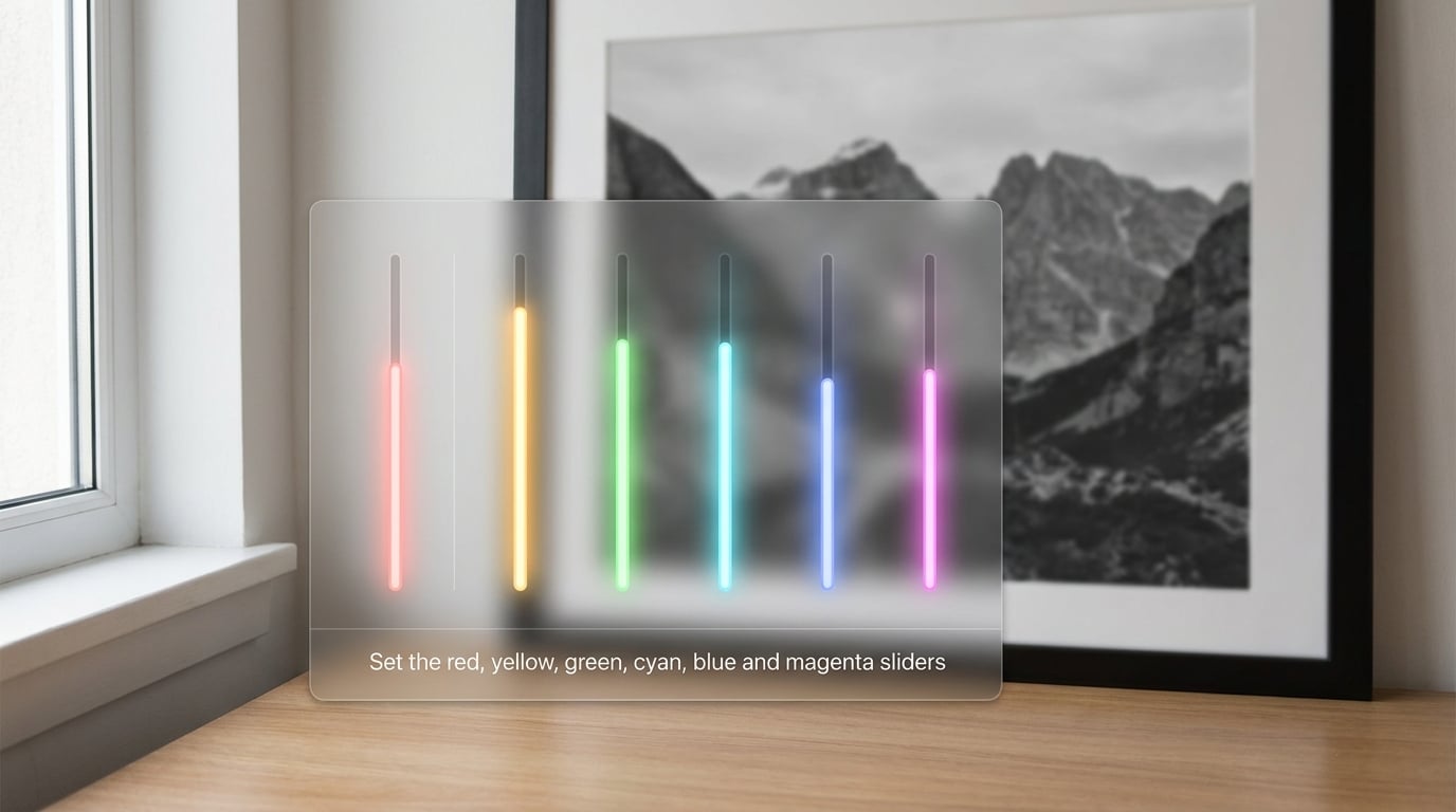
The Properties panel now shows six sliders. Each one controls how bright or dark that family of colours renders in the greyscale result. The default value for all six is 50 percent, which is Photoshop’s own idea of an average conversion and rarely the best one for your picture.
- Reds — skin tones, warm brick, autumn leaves. Push it up to make a face bright and open; push it down for a moody, sculpted look.
- Yellows — highlights on skin, golden grass, autumn foliage, sand. Lower it slightly to stop skin from going flat and bright.
- Greens — leaves, grass, clothing. Lower it to make foliage dark and moody, or raise it for a bright, airy, high-key result.
- Cyans — shadows, water, blue-green clothing, denim. Lower it to deepen shadows; raise it to open them up.
- Blues — skies, water, shadows on skin. Lower it for a dramatic sky, raise it for a soft, misty one.
- Magentas — flowers, purple clothing, skin undertones. Usually the most subtle adjustment of the six, and the first one I’d leave alone.
Two controls sit above the sliders. The Auto button lets Photoshop analyse the image and set all six for you, which is a genuinely useful starting point — you refine from there rather than building the conversion from zero. The Targeted Adjustment tool, the small icon beside Auto, does something simpler: click it, then drag up or down on any colour in the image, and Photoshop finds the matching slider and moves it for you. That is the fastest way to handle a colour you cannot name.
A practical starting point worth trying on a landscape: greens down to around 30, blues down to 25, cyans down to 20, reds up to 60. Numbers are only a starting point — every photo is different, and if a slider blows out detail, back it off until the texture comes back.
4. Fine-tune the tonal balance
Conversion is only half the job. Now balance the light and dark so the image has somewhere to go.
Zoom to 100 percent and look at the darkest and brightest areas. Shadows that have collapsed into a single flat black are holding no detail, and highlights that are pure white have lost texture too — in skin, in fabric, in water. Both are recoverable at this stage because you are still working on an adjustment layer, not pixels.
Open the Histogram panel (Window > Histogram) and check the shape. A healthy monochrome histogram has a visible gap at the far right — no bright pixels touching the edge — and doesn’t start right at zero in the shadows. If either end is pinned, that’s your area to fix.
Use the eyedropper to sample a colour before you touch the slider. Click a patch of sky, a cheek, a shadow under a chin, and note how the value shifts after each move. Working this way beats guessing, and it takes a minute.
5. Add contrast or black-and-white effects
Once the sliders are doing their job, stack a second adjustment layer above it. Never fold contrast into the Black and White layer itself — keeping them separate means you can change one without wrecking the other.
- Curves is the precise tool. Pull the shadows down and the highlights up on an S-curve for punch, or add a gentle fade at both ends for a soft matte look. Curves gives you exact control over where the bend happens.
- Levels is the fast tool. Set the black and white points and move the midtone slider if the image feels too heavy or too thin. Good for a fast technical correction.
- Photo Filter is for character rather than contrast. A warming or cooling filter, or a yellow filter, simulates the classic film look — a yellow filter darkens blue skies the way a darkroom filter did, while keeping skin natural.
For a grainy, high-key editorial look, a third option works well: add a Hue/Saturation adjustment layer above the Black and White one, desaturate to zero, then raise the Threshold slider until only the brightest part of each tonal group survives. This is the trick people in the Photoshop tutorial communities use for that hard posterised result.
The Black and White panel also has a Presets menu with built-in options such as Infrared and High Contrast, plus a Tint checkbox that lays a flat colour over the whole conversion. Save your own settings from that menu to reuse the look on every photo in a shoot.
6. Mask the adjustment for selective changes
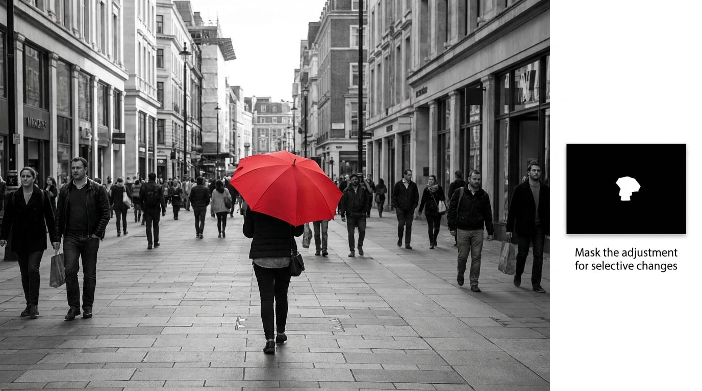
This is where the adjustment layer earns its keep. Make a selection first, and Photoshop builds the mask for you.
Grab the Quick Selection tool, the Lasso, or whatever selection tool suits the subject, draw around the area, then add the adjustment layer. The new layer’s mask comes in already restricted to your selection, with white inside and black outside.
For a selection based on colour rather than shape, use Select > Color Range. Click the colour you want in the preview area, then raise the Fuzziness slider to widen the selection. Refine it with Select > Modify > Expand or Feather if the edge looks hard. That gives you a clean mask without painting at all.
To refine the mask by hand, select the mask thumbnail — the black-and-white one, not the adjustment icon. A white circle appears around the layer thumbnail when the mask is active. Paint with white to reveal the adjustment, black to hide it, and press X to swap the foreground and background colours. Use [ and ] to shrink and grow the brush.
Two more controls worth knowing. Drop the Opacity at the top of the Properties panel to about 50 percent and you get a soft, half-converted look rather than a hard switch. And Ctrl+2 on Windows (Cmd+2 on Mac) selects the adjustment layer, Ctrl+3 selects its mask, so you can move between the two without hunting in the Layers panel. Press to view the mask on its own as a greyscale overlay.
Here are the shortcuts worth memorising:
- Add a Black and White adjustment layer — Ctrl+Shift+Alt+B on Windows, Cmd+Opt+Shift+B on Mac.
- Select the adjustment layer — Ctrl+2 on Windows, Cmd+2 on Mac.
- Select the layer mask — Ctrl+3 on Windows, Cmd+3 on Mac.
- View the mask as an overlay — the key, on both platforms.
- Clip a layer to the one below it — Ctrl+Alt+G on Windows, Cmd+Opt+G on Mac.
- Shrink or grow the brush size — the [ and ] keys, on both platforms.
- Swap foreground and background colour — the X key, on both platforms.
Clipping masks (Ctrl+Alt+G on Windows) keep an adjustment layer attached to the single layer beneath it instead of the whole stack. That is the answer to the common puzzle of wanting one photo in a shoot converted a particular way: convert the first one, then clip the same layers to each duplicate.
7. Export or save the final monochrome image
Save the working file as a PSD first, with every layer intact. If you save a JPEG, Photoshop flattens the document and the adjustment layer is merged into pixels — you lose the sliders and the mask permanently.
For delivery, duplicate the layer stack (Ctrl+Shift+Alt+E on Windows, Cmd+Opt+Shift+E on Mac) to flatten a copy, then export that copy with File > Export > Save for Web or File > Export As. A good quality monochrome JPEG is around 8-bit sRGB; if you’re delivering for fine art print, flatten a copy and save it as a 16-bit TIFF instead.
Then look at the result at the size it will actually be seen — a thumbnail, a full-screen view, a phone screen. Tonal separation that looked right at 100 percent on a monitor can disappear at small sizes, and edges that read cleanly on screen pick up halos on paper. Most editors judge the file at delivery size, not at 100 percent.
Common Mistakes
Starting with all six sliders at 50 percent. That’s Photoshop’s default conversion, not an optimised one. Click Auto first, then adjust from there — you’ll get a better base in ten seconds than by starting from scratch.
Adjusting the whole layer and losing skin detail. Reds above about 70 start to blow out faces. Pull it back until texture returns to the cheeks and forehead.
Forgetting the layer affects everything below it. This is the single most common source of confusion. An adjustment layer doesn’t apply to “the layer” — it applies to every layer beneath it in the stack. Clip it to one layer or use its mask.
Painting on the layer instead of the mask. If you paint directly on the adjustment layer’s pixels, you’re painting flat grey. Select the mask thumbnail first — the thumbnail with the white and black square, not the one with the adjustment icon.
Masking from a selection that was too tight. Feather the selection edge by 1 or 2 pixels before adding the layer, or you’ll cut a hard, obvious line around your subject.
Common Mistakes and Quick Fixes
The most searched question about this layer is why it is not available at all. If the Black and White icon is missing, greyed out, or absent from the Adjustments panel, it is almost always one of these four things.
The document is in CMYK Color mode. Check Image > Mode. Switch to RGB Color, and the icon comes back. CMYK is a print workflow mode and the monochrome adjustment is not offered there.
The layer is too small. Photoshop greys out adjustment layers for a layer smaller than 1 pixel in any dimension. Undo the resize, or mask the layer back up.
You’re in the wrong panel. The Black and White icon lives in the Adjustments panel (Window > Adjustments), not the Fill Layers panel. If the panel dock is collapsed, the icons are hidden behind the disclosure triangle.
You’re looking at a Smart Object or a 3D/vector document. Some smart object and 3D states don’t accept the layer directly. Double-click the smart object to enter it, or convert it to a regular layer first.
Beyond the missing-icon problem, here are the tonal failures and their fixes.
Muddy midtones. Everything is sitting in a narrow band of grey. Open Curves above the Black and White layer and add contrast at the midtone pivot, or widen the gap between your darkest and lightest areas. A histogram that’s bunched in the middle with nothing at either end is the clearest sign.
Shadows blocked to solid black. Lift the shadow end on a Curves layer, or lower the Cyans and Blues sliders if the shadows are going dark because of the colour mapping. Almost always one of those two fixes works.
Blown highlights. Look at whether the slider is the cause before reaching for Curves. If a specific colour is clipping, pull that slider down; if the whole tonal range is too bright, use the Levels white point or a Curves highlight roll-off.
Weak local adjustments. If painting on the mask seems to do almost nothing, check the mask thumbnail — it may be inverted, or the brush may be painting in a colour that hides rather than reveals. Also check the layer opacity, since anything below 100 percent softens the whole effect.
Colour fringing on edges. That’s usually a halftone or sharpening artefact from another layer, not the conversion itself. Select the layer above the Black and White one and check its settings before touching the sliders.
Beyond fixes, a few habits keep this workflow flexible. Work in 16-bit mode if your file supports it, since the conversion throws away a lot of tonal information and 8-bit banding shows up more in greyscale. Keep the Black and White layer unclipped while you’re exploring, then clip it once you know what you want. And never flatten a working file — the value of this layer is entirely in the fact that you can change your mind later.
Frequently Asked Questions
What is a Black and White adjustment layer in Photoshop?
It is a layer that converts everything beneath it to monochrome without altering the original pixels. Six sliders, one each for reds, yellows, greens, cyans, blues and magentas, control how bright or dark each colour family renders in the result. Because the colour data is kept, you can revisit and change any slider at any time, and the layer’s mask controls where the conversion applies.
Can I use the Black and White adjustment layer in Photoshop Elements?
Yes. Photoshop Elements includes the same Black and White adjustment layer with the same six colour sliders, the Auto button and the layer mask. The menu path is identical, under Layer and Create New Adjustment Layer. Elements lacks some of the presets and the Targeted Adjustment tool in some versions, so check your panel before assuming a missing button is an error.
Why does my black-and-white image look flat or muddy?
Flat results almost always mean a narrow tonal range, not bad colour mapping. Open the Histogram panel and check whether pixels are bunched in the middle with nothing at either end. Fix it by adding a Curves or Levels adjustment layer above the Black and White one and widening the range, and by pushing your colour sliders further apart in value so light and dark areas separate clearly.
Should I use a Black and White adjustment layer or convert the image to grayscale?
Use the adjustment layer. Image and then Mode and then Grayscale permanently discards the colour, and the change cannot be undone once the file is closed. Desaturate has the same problem, with less control. The adjustment layer keeps the colour data, gives you per-colour control, adds a mask for selective conversion, and can be hidden or deleted at any point without touching the photo.
How do I make only part of an image black and white?
Make a selection first, then add the Black and White adjustment layer. Photoshop builds the layer’s mask from that selection, so the conversion appears only where you painted. Refine the mask with the Brush tool, or use Select and Color Range for a precise colour-based selection, painting white to reveal the effect and black to hide it.
Can I add a tint to a Black and White adjustment layer?
Yes, in two ways. Tick the Tint checkbox in the Black and White Properties panel for a flat colour wash controlled by the Tint Colors button, or add a Photo Filter adjustment layer above it for a subtler, more photographic warm or cool cast. A Solid Color fill set to Color blend mode above the conversion also works well for stronger, gradient-based tints.
Conclusion
Start here: press Ctrl+Shift+Alt+B on Windows or Cmd+Opt+Shift+B on Mac, then click Auto in the Properties panel. That gets a Black and White adjustment layer on your photo and a reasonable base conversion in about ten seconds, with the original colour still sitting underneath untouched.
From there, the sliders are where the work happens. Move greens and blues down for depth, lift reds for open skin, and check the histogram so nothing is pinned at either end. Add a Curves layer above for contrast, and paint on the mask when you want part of the photo to stay in colour.
Treat the sliders as a starting point rather than a verdict. Most photos look wrong on the first pass and right on the fourth, and the layer stays editable the whole time, so there’s no reason to commit to a look before you’re ready.