
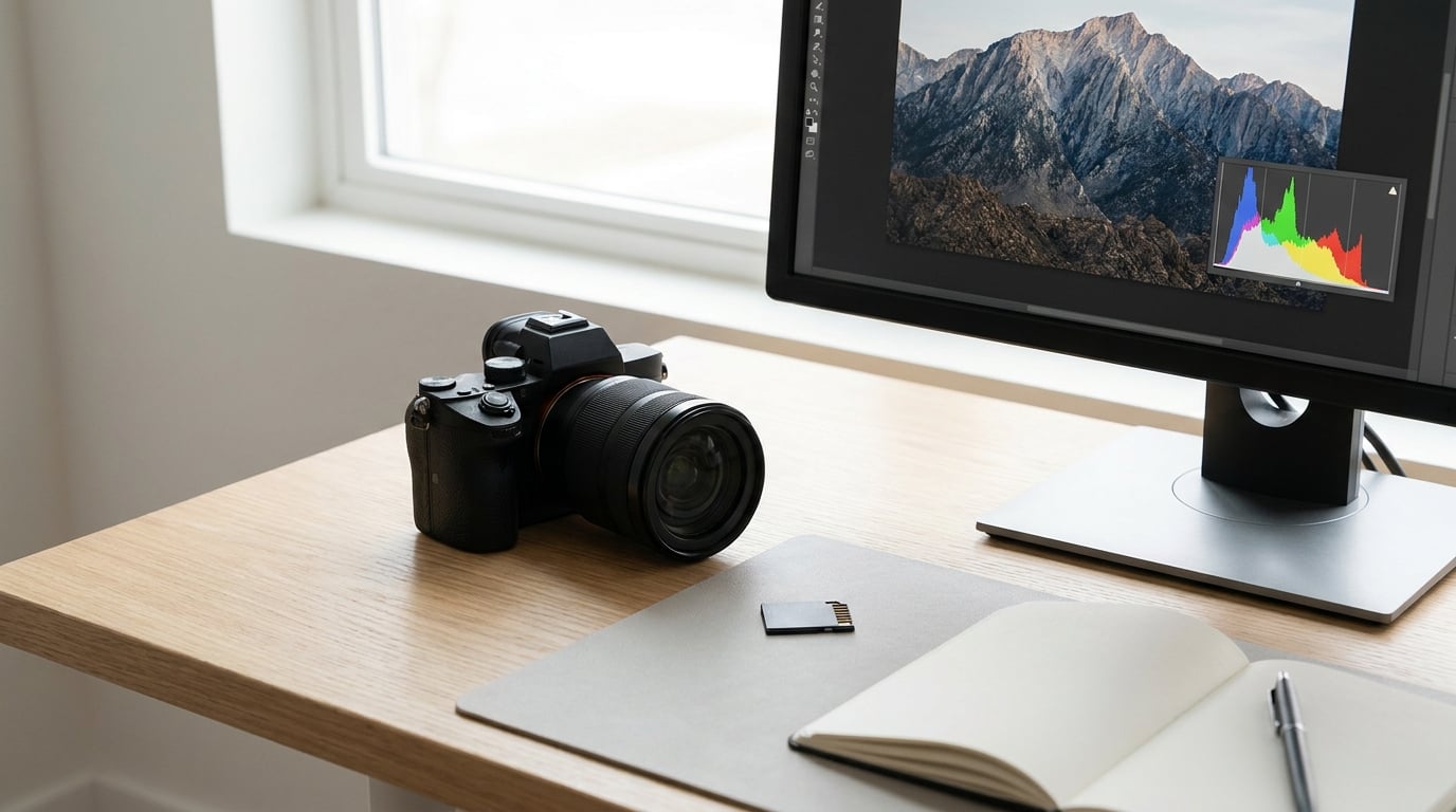
A histogram is a graph of how many pixels in your photo sit at each brightness level, from pure black on the left to pure white on the right. Knowing how to use histograms in photography means reading that graph for two things: whether the data is clipped at either end, and how much detail is left in the midtones. It does not tell you whether a photo is well exposed, and it never will.
That distinction matters more than most tutorials admit. Plenty of people learn the graph, decide a neat bell shape in the middle is the goal, and then spend years underexposing perfectly good shots. The histogram is a measuring tool, not a target.
This guide works on any camera and any editing software. Menu names differ by brand and model, so I have kept the paths general enough to follow and flagged where they diverge. Everything else, the reading, the workflow and the mistakes, is identical everywhere.
Table of Contents
- What You Need
- Step-by-Step
- Step 1: Set the Correct Exposure Mode Before You Read Anything
- Step 2: Display the Histogram Before Shooting
- Step 3: Read the Shape and Position
- Step 4: Check the RGB Channels for Color Clipping
- Step 5: Protect Highlights and Shadows on Purpose
- Step 6: Confirm the Result in Post-Processing
- Common Mistakes
- Frequently Asked Questions
- How to Use Histograms in Photography Every Day
What You Need
A histogram display is built into every current DSLR, mirrorless body, bridge camera, phone and desktop editing app. You do not need anything extra. The graph is usually a small overlay in the corner of the screen while shooting, and a full panel in post.
Three things are worth finding before you go out, because each one changes how you read the numbers:
- Luminance view. One combined graph of overall brightness. This is the default almost everywhere and it is the right starting point.
- RGB channels. Red, green and blue plotted separately, or blended in colour. This is where you catch colour-specific clipping and colour casts.
- Black-and-white view. A plain single-tone graph, handy if you are reading shape rather than colour.
You also need control over exposure, which in practice means knowing your camera’s exposure mode dial, its exposure compensation button, and where the highlight warning or zebra settings live. Those three controls are what you use once the graph tells you something is wrong.
Step-by-Step
Step 1: Set the Correct Exposure Mode Before You Read Anything
Start in manual exposure or one of the semi-auto modes. Aperture priority is fine for most work because you control brightness with the compensation dial and watch the graph respond. Shutter priority works the same way with the shutter speed as your dial.
Program and fully automatic modes make the histogram close to useless, because the camera retakes the decision every time the scene or the metering shifts. You end up chasing a moving target instead of reading a fixed one.
One clarification that saves a lot of confusion: the histogram plots the data the camera captured, not how bright the rear screen looks. A monitor in shade can look dim while the file is correctly exposed, and a screen in full sun can look blindingly bright while the file is two stops under. The graph is the neutral read.
Step 2: Display the Histogram Before Shooting
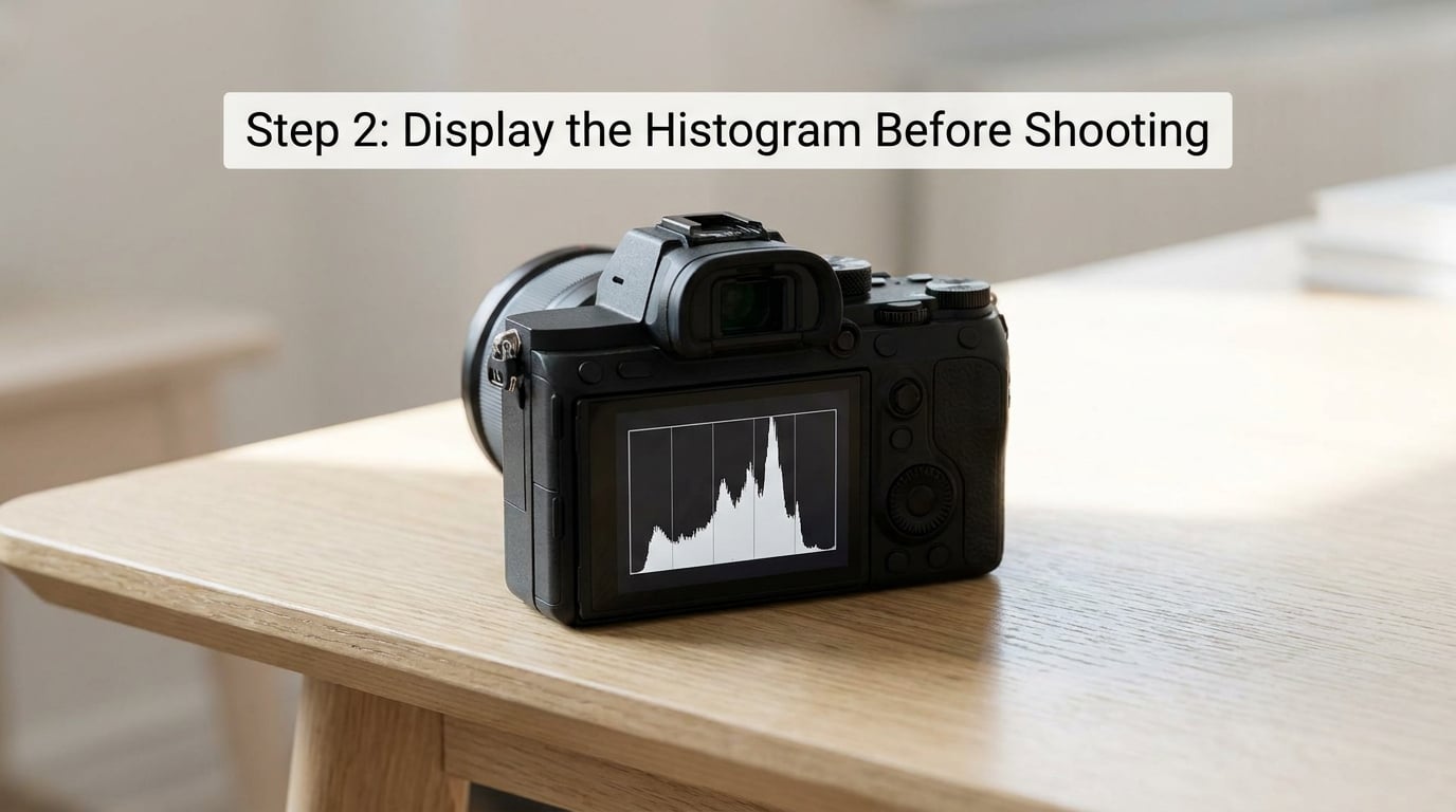
Turn the display on once, before the light changes, so you are not searching menus in a hurry. The usual routes look like this:
- Canon presses the DISP button repeatedly while shooting or in playback. On newer bodies, Menu 1 has histogram display options, including show clipping and a blackout screen for bright conditions.
- Nikon uses the i button for the info display, with the graph as one of the pages. The MONITOR button opens the shooting monitor, where the histogram can be a tab. Custom settings control which pages appear.
- Sony cycles the DISP button, then chooses which data is shown, including the histogram. A live-view DISP panel can be configured the same way.
- Fujifilm has a dedicated histogram setting in the display menus that offers brightness, RGB and RGB with brightness views, with a live histogram, plus separate highlight and shadow peak indicators.
Sony and Fujifilm also let you overlay the graph directly on the live-view image, which is useful when you want to see which part of the frame is doing the clipping. Labels and menu depth vary between models and firmware versions, so check the manual for your body if the option is not where this says it is.
Playback histograms are worth knowing too. Right after a shot, the graph describes that specific frame, which is the honest place to confirm what you just did.
Step 3: Read the Shape and Position
Learning how to use histograms in photography comes down to three positions that matter. Data bunched hard against the left edge means the image is dark and the shadows are running out of room. Data crowded at the right means the brightest parts are piling up against pure white. Data spread across the middle means you have midtone information to work with.
The height of the bars tells you how many pixels share a brightness level, and the width tells you the spread. A single tall spike in the middle means most of the frame is one tone. A flat, low graph across the whole width usually means flat light, not bad exposure.
Here is the shortcut table. Shape is a clue, not a verdict.
- Packed against the left edge with black also against the edge: shadows are clipping. Raise exposure or add fill light if you need shadow detail.
- Packed against the right edge with white touching the edge: highlights are clipping. Lower exposure and watch what you lose.
- Bell shape in the centre: ordinary, well-exposed subject matter. Nothing to fix.
- Data pushed left, nothing at the far right: a low-key or night scene. That is the intent, not a fault.
- Data pushed right with a small white spike: a high-key scene such as snow, fog or a white studio wall. Judge whether the whites are meant to be paper white.
- Flat and wide with a soft top: overcast or hazy light. The camera meter will still put everything mid-frame regardless of how dark your subject should look.
Clipping is what costs you data. The bell shape is a coincidence of normal scenes, and trying to recreate it is how people end up with grey, lifeless files.
Step 4: Check the RGB Channels for Color Clipping
Switch the display to RGB and a second layer of information appears. Each colour channel is a separate set of pixels with its own brightness values, and any one of them can run out of room before the combined luminance graph shows a problem.
Deep saturated colours are the usual culprits. A red rose against green foliage, a bright red jacket at a stadium, a blue sky at the top of the frame. A clip in the red channel turns saturated red into a flat, poster-like patch, and because the other two channels are still climbing, the luminance graph barely moves.
Green clips most often, which surprises people, and it typically happens in bright green foliage under hard sun. If you are checking one thing in a colour scene, check the channel peaks against the right edge.
The same view doubles as a white balance check. If the red, green and blue peaks are at noticeably different positions on the axis, your image has a colour cast, and moving the peaks toward each other is the visual version of correcting it in post.
Step 5: Protect Highlights and Shadows on Purpose
Once you see a clip forming, the fix is usually one rotation of the compensation dial or one press of the shutter button, then a look at the graph again. What you are not doing is nudging exposure back and forth until the graph looks tidy.
Not all clipping is a mistake. Clip the sun in the sky, clip a reflection in a window, clip a bare light bulb in a night street scene. In each of those cases the brightest point is supposed to be pure white, and there is no detail there to lose. Photographers argue about this in r/photography constantly, and the recurring practical advice is to watch the far right edge and use your camera’s highlight warning as the backstop.
Shadows are the opposite problem. Underexposing badly does lose data at the black end, and the recovery is much harder than a small highlight adjustment, but the standard raw workflow recovers a surprising amount. That is why advice tends to lean slightly bright rather than slightly dark.
What matters is which part of the frame you are protecting. In a backlit portrait, the brightest thing is the window behind the subject, and letting that clip while you expose for the face is the right call. In a wedding dress against a dark church interior, protecting the dress costs you nothing.
Step 6: Confirm the Result in Post-Processing
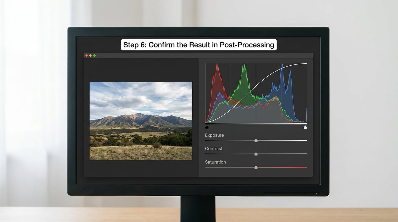
The post-processing histogram reads the raw data, which makes it the most accurate version you will ever see. In Lightroom and Lightroom Classic it sits at the top of the Develop module, under the histogram icon, with a channel dropdown for RGB, red, green, blue, luminance and a colour overlay option. In Photoshop, use Window, then Histogram, then open the panel menu for un-cached refresh so the graph updates as you adjust rather than after you stop.
Watch the graph while you move the exposure slider. Pushing exposure down drives the data left until the shadows hit the edge, and the peaks in each colour channel show you first which tone is about to go. Tone curve adjustments do the same thing in a more controlled way, moving three or four points instead of one global slider.
Here is the difference that catches people out: the live histogram on your camera is computed from the JPEG preview image, while the graph in Lightroom is computed from the raw file. They will not always agree. The raw file has more latitude at both ends, so a highlight the camera flagged as near-white may sit comfortably below clipping in the raw data, and a shadow the camera showed as lost may still hold recoverable colour.
That is why a graph from playback is a good exposure guide and a poor prediction of what the raw file will allow.
Common Mistakes
Underexposing to protect highlights. This is the most common habit people pick up from well-meant advice. If you are metering for a backlit scene and stopping down until the graph looks safe, you can easily produce a file two stops dark with shadows that will never fully come back. Check the far right edge specifically, not the overall shape.
Chasing a bell curve. A symmetric mound in the middle is a sign of a reasonably ordinary scene. It is not a specification. If your subject is meant to be dark or meant to be bright, a graph that fills one side of the frame is a more accurate description of the image you wanted.
Treating the graph as a substitute for looking at the photo. The histogram knows nothing about whether your subject is recognisable, whether the light is flattering, or whether the composition works. Check the graph, then look at the image. The graph is one input, not the decision.
Confusing brightness with contrast. A wider spread of data means more contrast, not more exposure. Two frames can sit at the same average brightness on the graph and feel completely different, because the second one has a narrower tonal spread. Judge the middle of the graph for exposure and the width for contrast.
Protecting whites that do not matter. If the brightest thing in the frame is a white ceiling tile or a blown patch of sky in a reflection, spending a stop of exposure on it makes the rest of the image worse. Identify the part of the frame that carries the detail you care about and expose for that.
Applying one rule to every scene. Overcast light, a night street and a snowfield all produce different graphs, and in flat light the camera meter reliably parks the data in the middle no matter what the subject deserves. That is the case for manual exposure and for stepping back from the graph entirely.
Trusting the preview graph over the raw data. The live view graph is built from a JPEG preview with its own tone curve applied. It is a good field guide, and it is not the file you will edit.
Zebras and blinkies are worth using alongside the histogram rather than instead of it. Zebras mark every pixel above a threshold you choose, which is easier to read at a glance under pressure, and levels around 100 percent, 70 percent and two stops over are common starting points that you narrow down with the histogram once you know where the exact edge is. Blinkies simply flash the clipped areas. Video shooters on r/cinematography put it plainly: the histogram tells you where the data is, the zebras tell you the moment it stops.
Frequently Asked Questions
What does the histogram tell you about a photo?
It tells you how many pixels sit at each brightness level from black to white, which reveals whether highlights or shadows have lost data. It does not tell you whether the photo is well exposed, whether the colours are right, or whether the subject looks good. Read it for clipping, then judge the picture with your eyes.
Why is my histogram pushed to the left?
A graph crowded against the left edge means most of your pixels are dark and the shadow end is running out of room, so shadow detail is being clipped to black. Raise the exposure, add fill light, or shoot at a different time of day. If the scene is meant to be dark, such as a night street or a low-key portrait, the position is intentional rather than a mistake.
When should you not use a histogram?
Skip it in flat, overcast light, where the meter puts the data mid-frame no matter how dark your subject should look, and in situations where colour and subject matter matter far more than exposure numbers. Also ignore it when you are deliberately clipping, such as a sun in frame or a studio light source. And in video, expose with false colour rather than through a display LUT, which can cost you real dynamic range.
How do I use the histogram in Lightroom?
Open the Develop module and click the histogram icon in the top panel group to collapse or expand the graph. Use the channel dropdown to switch between RGB, individual colours, luminance and the colour overlay. Watch the peaks as you move the exposure and tone curve sliders, so you can see which tone is about to clip before it does rather than after.
How do I activate the histogram in Photoshop?
Go to Window, then Histogram, to open the panel. Open the panel menu and turn on un-cached refresh so the graph updates continuously while you adjust sliders instead of only after you release the mouse. Panel menu also holds expanded view for a larger graph and the channel options for RGB, red, green, blue, luminosity and colour overlay.
Why is my camera histogram different from the one in Lightroom?
The live histogram on your camera is calculated from the JPEG preview image, complete with the camera’s own tone curve, while the Lightroom and Photoshop panels read the raw file. Because the raw file has more latitude at both ends, a highlight the camera shows near clipping can sit well below it in the raw data, and shadows the camera shows as lost may still be recoverable.
How to Use Histograms in Photography Every Day
Turn on the histogram display now, before your next shoot, so it is already there when the light gets difficult. Shoot in manual or aperture priority, watch the far right edge, and treat any clip there as a decision to make rather than an error to prevent.
Once that is automatic, add the RGB view and check your channels. That single habit catches the clipped reds and greens that the combined graph hides, and it takes about a month before you stop seeing it.