
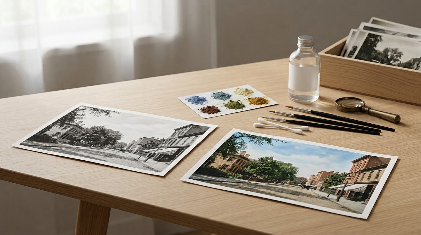
To colorize a black and white photo in Photoshop, duplicate the background layer, isolate the areas that need color with selections or the Pen tool, then paint a base color onto new layers set to the Color blending mode so the original grayscale detail shows through. Add an AI starting point with the Colorize Neural Filter if you want to speed things up, then correct it by hand.
A clean portrait takes me about 30 minutes by hand. An AI pass gets you 80 percent of the way in 30 seconds, which leaves plenty of time to fix the parts it guessed wrong. That correction step is where the difference between a colorized photo that looks real and one that looks plastic actually lives.
Table of Contents
- What You Need
- How to Colorize Black and White Photos Step by Step
- Common Colorization Methods Compared
- Common Mistakes and Quick Fixes
- Frequently Asked Questions
- Can I colorize a black-and-white photo without Photoshop?
- Should I use AI colorization instead of adding color manually?
- How do I make colorized skin look realistic rather than orange?
- What colors should I use for a black-and-white outdoor scene?
- Can I print a colorized photo at a large size?
- How do I know whether a colorized historical photo is accurate?
- Conclusion
What You Need
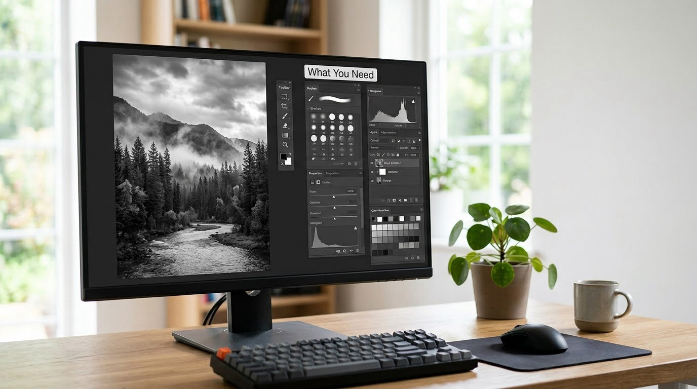
You need a high-resolution grayscale image, a copy of the file, and a way to add color in layers. Photoshop is the obvious choice, but the same logic works in GIMP, Krita, Affinity Photo, or Procreate on an iPad.
For the image itself, the quality of your source decides everything. A flatbed scan of a good print holds far more usable detail than a phone shot of an album page, and no filter puts detail back that was never captured. A flat, evenly lit outdoor shot colorizes well. A dark interior full of grain, deep shadows, or a face turned away from the lens usually comes back blotchy.
Before you start, straighten and crop the frame, correct any dust or scratches, and set the image mode to RGB Color so Photoshop can hold chroma at all. Levels or Curves first is worth it, because a colorizer reads contrast before it reads color, and a flat, gray scan gives it very little to work with.
Optional extras speed things up considerably:
- A browser AI colorizer such as Palette.fm or Canva’s colorize filter, for a fast draft you can bring into Photoshop later
- A Neural Filter preset saved from a first run, so you can reapply the same starting point to a whole album
- Reference photos of the era, the location, and the clothing, which beat guesswork more often than people expect
How to Colorize Black and White Photos Step by Step
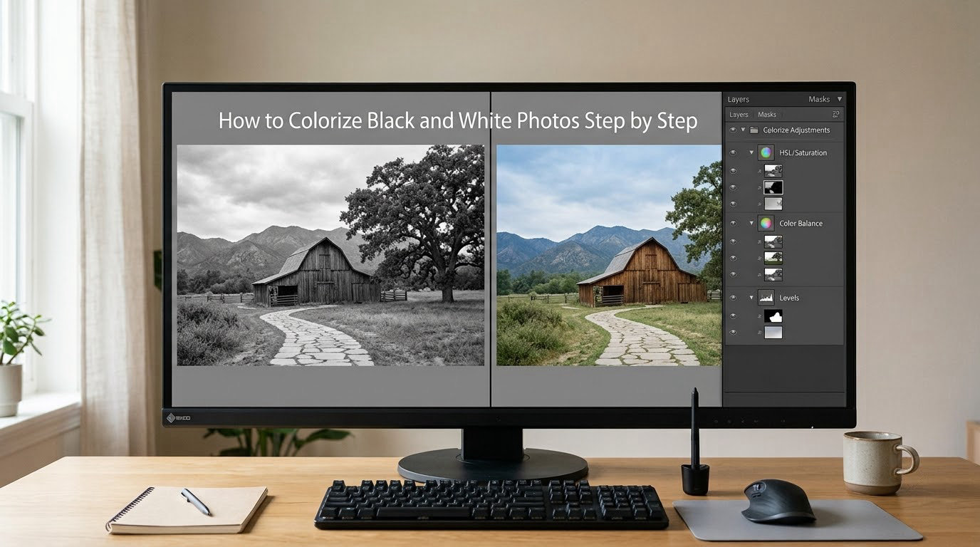
Work in adjustment layers and masks the whole way through. Nothing touches the background, so you can always pull a step back and try a different approach without damaging the original scan.
1. Open and Prepare the Black-and-White Image
Open the file, then immediately duplicate the background. Name the copy something like Color Base and lock it. Drag it above the grayscale layer so the grayscale underneath stays untouched and available for comparison.
Check the histogram first. If the tonal range is squeezed into the middle third, stretch it with Levels before anything else. Watch for clipped shadows on dark hair and blown highlights on white shirts, because those two areas are where colorizers lose their nerve and produce muddy patches.
2. Identify Areas That Need Color
List the zones before you touch anything: skin, hair, the garment, the wall or sky behind, any foliage, any hard object like a car or a window frame. Working through that list in order stops the common failure of coloring a face beautifully and then running out of attention for the background.
For a hard-edged subject, Object Selection followed by Select and Mask gives you a clean edge quickly. Refine Edge with a small radius and a little feathering handles hair and soft clothing, which is where a beginner’s selection usually bleeds. For an architectural scene, the Pen tool makes a cleaner path than any brush.
Save each selection as its own layer mask. You can then adjust one zone without disturbing its neighbors.
3. Add Base Colors With Adjustment Layers
Create a Solid Color layer above the grayscale, name it for what it covers, and set its blending mode to Color. In that mode Photoshop keeps the luminosity from below and takes only hue and saturation from the layer, so shadows and highlights from the original scan survive intact.
Pick a mid-tone version of the hue and dial the opacity to around 50 percent. Too dark a fill and shadows go muddy, too light and the whole frame goes chalky. For skies, a Color Balance adjustment layer often behaves better than a flat fill because it shifts shadows and highlights separately.
Hue/Saturation is the fastest tool for a global base pass: tick Colorize, set the hue, and nudge saturation. Selective Color is better when you want a warm or cool shift that leaves skin alone.
4. Create Natural Skin Tones
Skin is where colorized photos give themselves away. A single flat peach across a face reads as plastic within seconds, so vary it. Paint a base with a soft brush at low opacity, then a warmer, slightly darker tone on the cheeks, nose, and jaw, and a cooler, lighter tone on the forehead and under the eyes.
Useful starting points sit around the warm beige to soft tan range rather than orange. If your source is an old faded print, warm it slightly, since period film was rarely neutral. A muted red layer at very low opacity with Multiply blending mode gives blood under the surface that no flat fill can fake.
Watch the boundaries. Paint past the edge of the face slightly and let the mask take care of the line, because a hard outline around the jaw instantly reads as painted.
5. Colorize Clothing, Hair, and Backgrounds
Clothing is fabric, not a color swatch. A white shirt in shade sits somewhere near a pale blue-gray, while the same shirt in direct sun goes to a warm off-white. Layer two fills per garment, one for the shadow areas and one for the light, and blend between them with a soft brush.
Hair takes the darkest version of whatever color family the garment suggests. Deep brown, near-black, or a muted red read as period-correct far more often than the bright shades people reach for first.
For the background, start from the least saturated option you can get away with. Walls, roads, and sky should sit back so the subject carries the frame. An outdoor scene usually wants a light blue sky that fades paler at the horizon, and foliage in two greens rather than one.
6. Refine Colors and Add Subtle Variation
Step back and zoom to 50 percent. Real photographs have color variation in every surface, and flat digital fills never do. Add a low-opacity noise layer, set it to Overlay, and mask it to the area you need to break up.
A clipped Curves layer on top of each masked group lets you deepen shadows and pull down highlights without touching the color. Cap overall saturation with a Hue/Saturation adjustment layer at the top of the stack, holding it somewhere around 60 to 80 percent of full.
7. Check Realism and Export the Finished Photo
View the result at thumbnail size, then at 100 percent, then side by side with the grayscale. Anything that pops out as a hard edge or a strange hue at thumbnail size is a problem the eye will notice at print size.
For prints, upscale before you export. A 300 DPI target means an 8 by 10 inch print needs about 2400 by 3000 pixels, and most family scans are well under that. Export a flattened sRGB JPEG for sharing and keep a layered PSD or TIFF as the master.
Common Colorization Methods Compared
Choosing between an AI filter and hand painting depends on how much control you need and how much time the photo deserves.
| Method | Skill level | Speed | Control | Best for |
|---|---|---|---|---|
| Browser AI colorizer | Beginner | Under a minute | Low | Quick previews and drafts |
| Phone app | Beginner | Under a minute | Low | Colorizing on the spot |
| Photoshop Colorize Neural Filter | Intermediate | A few minutes | Medium | A strong starting point you refine |
| Manual brush and Pen tool | Advanced | 30 minutes or more | Full | Prints, archives, and accuracy |
One note on the AI options, since it comes up constantly: general-purpose image generators are not colorizers. They tend to return a brand-new picture inspired by your upload rather than a tinted version of the same photograph, quietly changing faces and backgrounds along the way. Test any tool with a family picture you would be upset to lose before you trust it with an album.
Common Mistakes and Quick Fixes
Almost every disappointing colorized photo fails in one of a handful of ways, and each has a short fix.
| Symptom | Likely cause | Fix |
|---|---|---|
| Skin looks orange or plastic | One flat fill, over-saturated | Lower the layer opacity, drop saturation, add warm and cool variation |
| Green or gray cast on a face | Neon fill, or no layer mask edge control | Mask tighter, shift the Hue/Saturation hue a few degrees |
| Color bleeds past the outline | Rigid selection, zero feathering | Refine Edge with 1 to 2 px feather, or Select and Mask |
| Whole image looks washed out | Fills too light, base layers too opaque | Drop opacity, deepen with a Multiply layer |
| Detail looks smeared | Skin retouched too far | Keep an unretouched copy, brush back texture, keep skin work subtle |
| Clothing color is wrong | AI guess with no reference | Find a period photo of the same uniform or garment |
| Sky is blotchy | Low contrast in the original | Even gradient fill, then add noise at low opacity |
| Output looks painterly | Too much visible brushwork | Soften the brush, lower opacity, add grain over the top |
One habit covers most of the table: work in layers and change your mind freely. The grayscale underneath is your safety net, and the Color blending mode is what keeps it visible while you work.
Frequently Asked Questions
Can I colorize a black-and-white photo without Photoshop?
Yes. Browser AI colorizers such as Palette.fm and Canva’s colorize filter handle the job in a few clicks, and phone apps do the same on iPhone and Android. They are faster and need no skill, but their output is a guess you cannot steer. If you want to correct the skin tone or hold the background back, you need a layer-based editor, and that is where Photoshop, Affinity Photo, GIMP, or Krita take over.
Should I use AI colorization instead of adding color manually?
Use AI as a starting point, then correct by hand. The model reliably gets skin, sky, and foliage roughly right because those appear constantly in its training data, and it guesses fabric, uniforms, and car colors almost every time. Starting from its output saves you the broad blocking work, and the correction pass is far shorter than painting from an empty canvas.
How do I make colorized skin look realistic rather than orange?
Start with a muted beige or tan rather than orange, keep the fill at around 50 percent opacity, and build variation in layers. Add a slightly warmer, darker tone to the cheeks and jaw and a cooler, lighter one to the forehead and under the eyes. A very low-opacity red Multiply layer restores the blood under the surface that flat color always misses.
What colors should I use for a black-and-white outdoor scene?
Keep it restrained. A pale blue sky that fades lighter at the horizon, foliage in two greens rather than one, earth tones for soil and stone, and the brightest value reserved for the sunlit subject. Anything that is not the focal point should be less saturated than the subject, so the eye lands where you want it to.
Can I print a colorized photo at a large size?
Yes, but check the pixel dimensions against the print size first. At 300 DPI an 8 by 10 inch print needs roughly 2400 by 3000 pixels, and a scan from a family album is often well under that. Upscale with a dedicated enlargement tool before printing, and inspect the result at full size, because softness and clumped grain show up first in a printed face.
How do I know whether a colorized historical photo is accurate?
You usually cannot know from the tones alone, which is the honest answer. Compare against period sources such as military uniform regulations, studio portrait conventions, street photography, and surviving color material from the same year and place. Label the result as a colorized interpretation rather than a record, and keep the original grayscale scan alongside it, since that is the actual historical source.
Conclusion
Start by duplicating the image and making the broad color decisions first: skin, garment, background. Only once those areas are established should you chase realism with masks, grain, and saturation limits. That order keeps the photo recognizable as the original rather than a new picture wearing its face.