
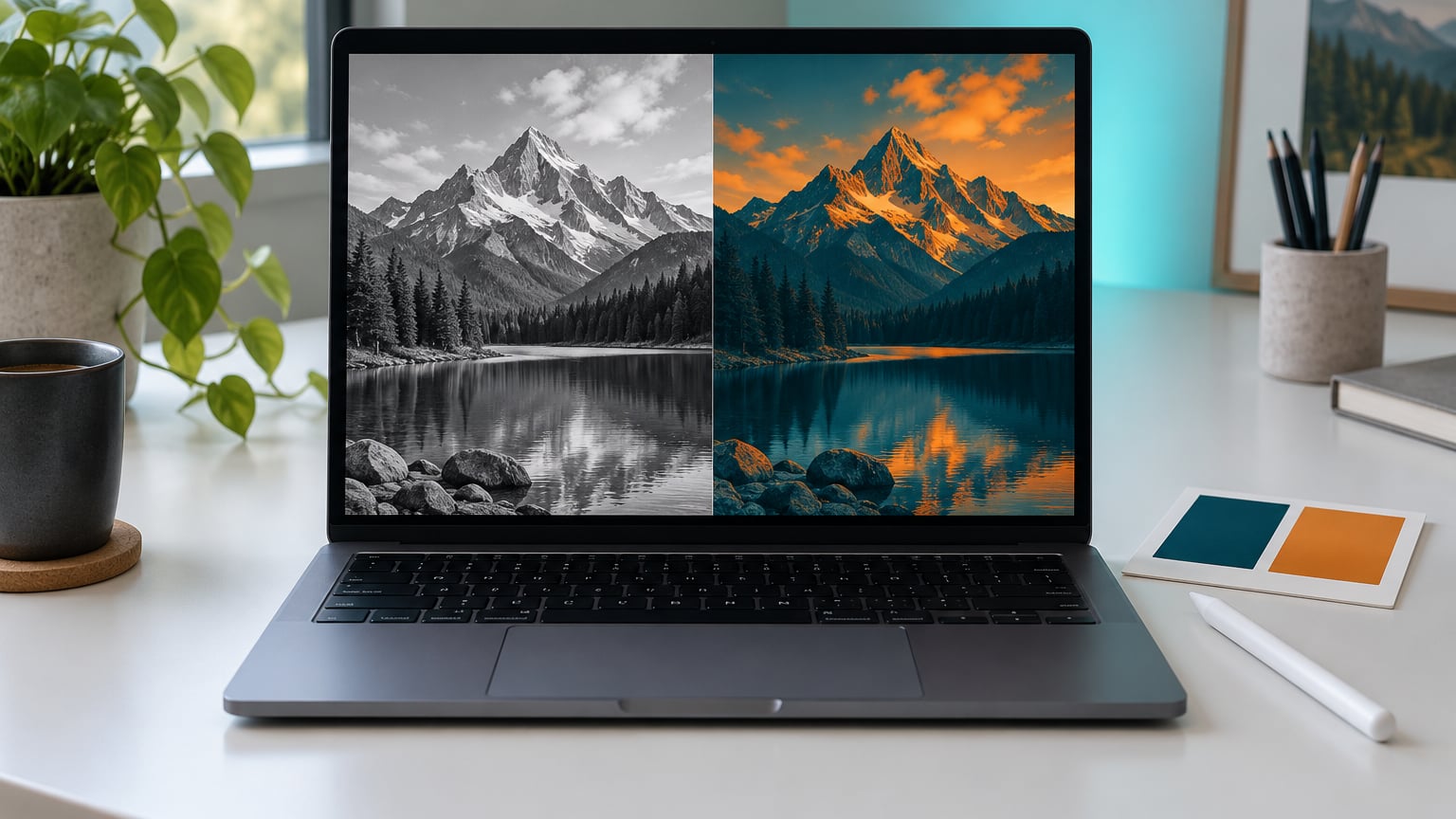
You can make a duotone image in Photoshop non-destructively with a Gradient Map adjustment layer. Add the layer above your photo, click the gradient swatch, and set a dark shadow color and a light highlight color in the Gradient Editor. The original pixels stay exactly as they were, so either color is still changeable ten minutes later.
The classic print route is different: convert to 8-bit grayscale, then open Image > Mode > Duotone. That version bakes two inks into the file itself, which is useful for a press but far less flexible on screen.
Either way the job takes about ten minutes once you know where the clicks live. These steps match the current desktop release of Photoshop (2026). If adjustment layers are still new to you, my guide to using Smart Objects in Photoshop explains why keeping the photo separate pays off here.
Table of Contents
- What You Need
- How to Make a Duotone Image in Photoshop: Step-by-Step
- Step 1: Make a Duotone Image in Photoshop with Adjustment Layers
- Step 2: Choose Two Colors for the Duotone Effect
- Step 3: Refine the Shadow and Highlight Mapping
- Step 4: Balance the Duotone Colors and Contrast
- Step 5: Compare Duotone and Black-and-White Versions
- Step 6: Export the Finished Duotone Image
- Common Mistakes
- Frequently Asked Questions
- Conclusion
What You Need
You need the desktop version of Photoshop, not the browser or mobile app. The mobile editor has no Gradient Map, so the workflow below simply is not available there.
You also need one photograph with genuine contrast. Duotone remaps the tones you already have, and it cannot invent detail that was never captured. A flat midday snapshot of a white wall gives you a flat duotone no matter how good the colors are. Look for a frame with something dark in it, something bright in it, and a smooth run of midtones between.
Third, pick your two colors before you open the dialog. Brand colors are easiest because you already have the exact values in a hex code or swatch library, and a photo that matches a palette is far easier to build a page around. Have a fallback pair in mind too.
Last, you need to be comfortable with layers and clipping masks. That is genuinely all. If you have never used an adjustment layer before, the Black & White layer in Step 1 is a good place to start, since it lives in the same panel as everything else.
How to Make a Duotone Image in Photoshop: Step-by-Step
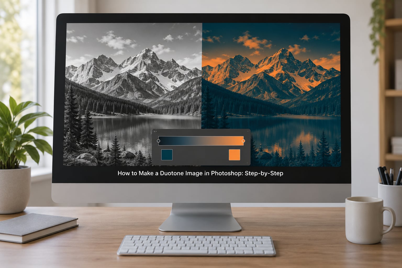
The whole workflow is three adjustment layers stacked on top of one smart object. Build it in that order and every later step stays reversible.
Step 1: Make a Duotone Image in Photoshop with Adjustment Layers
Open your photo, then right-click the Background layer and choose Layer > Smart Objects > Convert to Smart Object. That wraps your pixels in a separate object so filters and resizing never touch the real layer underneath.
With the smart object selected, click the half-black, half-white circle at the bottom of the Layers panel, then choose Black & White from the Adjustments list. This desaturates the image without deleting any color data, and it gives you sliders for the six primary colors.
Raise the Reds and Yellows, drop the Cyans and Blues, and watch the histogram spread out. Doing your contrast work here means the Gradient Map receives a cleaner tonal range to work with. Skip this layer entirely if your photo already converts to a punchy black and white on its own.
Step 2: Choose Two Colors for the Duotone Effect
Set the Black & White layer visibility off for a moment. Go to Layer > New Adjustment Layer > Gradient Map, and name it something useful like Duotone so you can find it later.
In the Properties panel, click the gradient strip itself, not the mask thumbnail next to it. That opens the Gradient Editor. Delete the two existing stops with the minus button, then build your own pair.
Click the left-hand stop and open the Color Picker to set your shadow color. Choose the right-hand stop for your highlight color. A dark, slightly desaturated tone paired with a warm light tone is a safe starting point; a near-black paired with near-white is a stronger, more graphic option. Shadows take the first stop and highlights take the second, so the dark color belongs at the shadow end.
Step 3: Refine the Shadow and Highlight Mapping
Drag the two stops inward toward the middle of the ramp. The gap between them controls how much of the image sits in the pure colors, and narrowing it deepens contrast fast.
Now check the underneath. Hide the Gradient Map with the eye icon and look at your Black & White layer. If the shadows there are weak, no amount of color fixing will rescue the duotone, because the gradient has nothing to work with. Fix the grayscale first, then look again.
Watch the midtones. When both stops sit close together, everything soft turns into a muddy blend of the two colors. Move them apart slightly and the middle of the frame returns to a clean neutral.
Step 4: Balance the Duotone Colors and Contrast
Set the Gradient Map layer opacity to around 90 percent and lower it until the two colors read without looking like paint. Some original color bleeding back through is what keeps skin tones believable in a portrait.
Add a Hue/Saturation layer above the Gradient Map if one half of the frame looks more saturated than the other, which usually happens with a strong sky or a warm interior. Keep the saturation slider modest. If you need more punch in the shadow color, raise Vibrance slightly on the same layer rather than pushing Saturation.
Finish with a Curves adjustment above everything. A gentle S-curve on the midtones sharpens the result without touching your carefully chosen colors. If you decide you would rather the photo look like a scanned print, my piece on making digital photos look like film covers the grain step that goes after this one.
Step 5: Compare Duotone and Black-and-White Versions
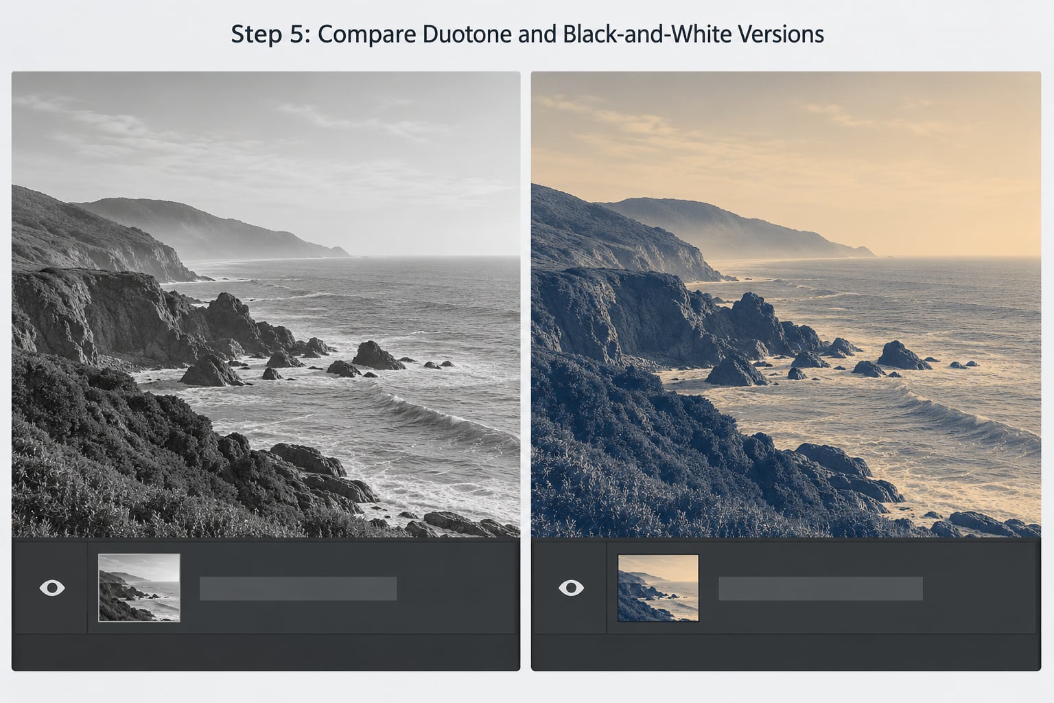
Click the eye icon beside the Gradient Map layer to flick between the two versions at full size. That single toggle is the fastest way to judge whether the color treatment earned its place.
Photoshop can also split the window so both versions show at once. Go to View > Split View, drag the divider with the arrow keys, and set the split to side by side. Do not use this for color-critical judging, since the preview is compressed, but it is excellent for showing a client the difference in one motion.
A high-contrast black and white conversion usually wins for a detailed city street or a busy portrait where the crop does the work. Duotone wins for a face against a simple background, a product shot, and any image where you need it to sit inside a designed layout.
If your stack has more than one duotone layer, reduce it to one. Stacked gradient maps blend their colors together and the detail collapses.
Step 6: Export the Finished Duotone Image
Save your working file as a layered PSD first, through File > Save As. Never flatten the master. If the file ends up as a single Background layer you cannot get back to the version you liked three steps ago.
To export, duplicate the layer stack, choose Layer > Merge Visible, then use File > Export > Export As. Merging a copy keeps your editable version intact.
Check Image > Image Size before you export for print. For a fine art print you want roughly 300 pixels per inch at the final printed size, and for a poster it can drop closer to 150 without looking soft from across a room.
Then pick the format that matches where the file is going.
| Format | Best for | Note |
|---|---|---|
| PNG | Web images with transparency | Large files, sharp edges stay crisp |
| JPEG | Photos on web or email | Use quality 80 or higher |
| TIFF | Fine art and large print runs | Big files, no compression loss |
| PSD | Anything you will edit again | Keeps every layer and adjustment |
If the original print is the classic two-ink look rather than a gradient effect, convert a copy to 8-bit grayscale first and then use Image > Mode > Duotone. Photoshop will ask you to flatten and to discard color information, which is exactly why you keep this on a duplicate. That dialog also offers Tritone and Quadtone, which are the same idea with three and four inks.
Common Mistakes
Muddy shadows. The grayscale underneath is too flat. Hide the Gradient Map, fix the Black & White sliders, then come back. Another cause is two gradient map layers stacked on top of each other; keep one.
Clipped highlights. Everything bright has turned into one flat block of the highlight color. Drag the light stop further toward white, or pull the stops apart to give the top end more room.
A third color appears. Usually a green or magenta cast coming from the source photo showing through at partial layer opacity. Drop the Gradient Map opacity a few more points, or add a Hue/Saturation layer and correct that single hue range.
Everything looks the same flat. The two colors are too close in lightness. Pick a shadow color that is genuinely dark and a highlight color that is genuinely light, then narrow the stops.
Colors bleed when layers combine. Check the blend mode on the adjustment layers. Normal is correct for this effect, and my guide to how blend modes change a layer explains what the other modes do to your two colors.
The print looks duller than the screen. That gap is normal. Check the file against a CMYK soft proof, ask the printer for a wet proof on the actual stock, and keep the highlights below solid so the brightest areas still hold detail.
The Duotone command is greyed out. Photoshop only offers it on 8-bit images. Flatten any extra layers first, or use Image > Mode > 8 Bits/Channel, then reopen the menu.
Frequently Asked Questions
What is a duotone image in Photoshop?
A duotone image is a picture rendered in two colors instead of the full grayscale range. Photoshop first converts your photo to black and white, then maps its tonal values onto a two-color ramp, so the dark color replaces the shadows and the light color replaces the highlights. In Duotone mode the same idea uses two printing inks, and Photoshop also offers Monotone, Tritone and Quadtone in that dropdown.
Should I make a duotone from a color or black-and-white photo?
Start from a color photo. A Gradient Map adjustment layer converts the image to grayscale itself, then maps that range onto your two colors, so nothing is lost and you can undo any decision. Working from a photo that is already black and white gives you one less variable, but you also lose the original color data for later, which is why the adjustment layer route is the one most artists stick with.
How do I choose the best two colors for a duotone?
Pick a dark color and a light color with a clear lightness difference, since that difference is what carries the contrast. Brand colors work well because you already have exact values and the photo will match the rest of your layout. A dark, slightly muted tone with a warm light tone is the safest starting point, and you can always swap either stop later without redoing the work.
Can I make a duotone without using Gradient Map in Photoshop?
Yes, and there are two main ways. Image Mode Duotone converts the file itself into a two-ink document, which is the classic print workflow but flattens your layers and discards color information, so work on a duplicate. You can also run a free duotone action from the Actions panel, opened with Window Actions or Shift+F9, which applies a saved stack of steps in one click.
How should I export a duotone photo for printing?
Keep a layered PSD as your master and export a flattened copy for the printer. Check Image Image Size first and aim for about 300 pixels per inch at the final printed size, or 150 for a large poster. TIFF keeps the most quality for fine art, while PDF with crop marks and a small bleed suits commercial print shops. Send a CMYK soft proof so you see the CMYK version before committing.
Conclusion
The sequence is short: convert the layer to a smart object, add a Black & White adjustment layer for contrast, add a Gradient Map layer and set your two color stops, then refine with opacity, Hue/Saturation and Curves before exporting a flattened copy.
Start with the smart object conversion and pick your shadow and highlight colors deliberately before you touch the Gradient Editor. Those two choices decide whether the result looks designed or accidental.