
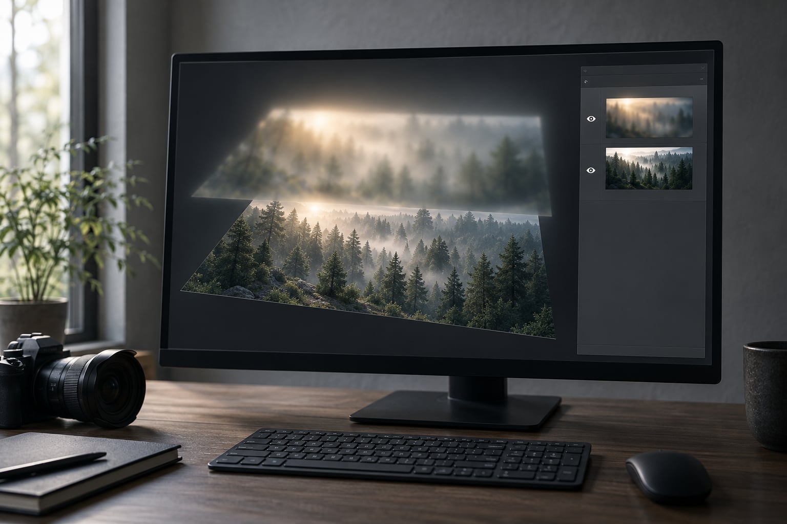
If you want to know how to make an Orton effect in Photoshop, it comes down to sandwiching two copies of the same photo: one sharp, one blurred, combined with a blend mode so the light spills across the frame. Photographer Michael Orton came up with it on film, stacking an underexposed sharp transparency against an overexposed out-of-focus one on a light table. The digital version takes about ten minutes once you have the muscle memory, and almost every disappointing result comes from one of two mistakes: too much blur, or a base photo with no tonal range to work with.
The whole effect rests on a strange little piece of maths. Screen and Multiply are inverse operations, so blending a layer with itself produces a result that is brighter than the original but still holds detail in the highlights. That is the glow, and everything after it is restraint.
Table of Contents
What You Need
You need three things: a source image, an editor that can blur a layer, and enough restraint to stop before it looks fake. That last one matters more than the first two.
A base image with real tonal separation. Misty forests, backlit trees, water, distant city lights, sun flare around a subject, anything with a bright area next to a dark one. A flat overcast scene with no highlight anywhere will produce a dull result, because the effect has nothing to lift.
Faces also work if the skin has tonal variation, but smooth studio skin is the hardest case. Portraits need the glow kept off the eyes, the lips and the edge of the hair.
Photoshop or Affinity Photo. Both handle the layer sandwich natively, and the steps are identical in both. Affinity Photo’s layer stack sits in the panel on the right; in Photoshop it is the bottom-right dock. Menu names differ slightly but the commands are the same.
Lightroom will not do it properly, and that is a real limitation rather than a workaround gap. Lightroom has no layers, and without layers there is no sandwich. The closest native approximation is pushing Clarity and Dehaze in opposite directions on two masked copies, but you cannot blend a blurred version over a sharp one.
People on photography forums have tried this route and the honest verdict comes back the same each time: it looks like contrast, not glow. If you shoot in RAW and want this effect regularly, budget for a layer-based editor.
A non-destructive starting point. Open your raw file, do your crop and white balance first, then convert to a smart object before you duplicate anything. Right-click the layer and choose Convert to Smart Object, and every blur and blend afterward stays reversible.
On a 45-megapixel file this also keeps working copies small, because the blur does not bake into a new full-resolution document every time.
Two optional extras save real time later: a Curves adjustment layer, which you will use in step four, and a soft light brush on a separate layer if you want to dodge the glow back into the highlights by hand.
Step-by-Step: How to Make an Orton Effect in Photoshop
Here is the core workflow. Five steps, roughly ten minutes, and every value is adjustable afterward because nothing is flattened.
1. Choose a Sharp Base Image
Open your photo and flatten nothing. Crop, straighten, set white balance, and apply your basic exposure while the image is still a single layer. Getting the tonal range right first is what makes the effect look like atmosphere rather than a filter.
Convert the layer to a smart object, then press Ctrl+J to duplicate it. You now have a locked sharp copy and an identical copy above it, and every step from here happens to the top one. If the result is wrong at any point, you can re-edit the smart object and the whole stack rebuilds itself.
2. Create the Soft-Focus Layer
With the top layer selected, go to Filter, then Blur, then Gaussian Blur. Set the radius to 20 to 30 pixels on a 24-megapixel file, and scale up from there for larger sensors.
That 30-pixel figure is not universal, and treating it as one is the most common reason results look bad. A useful rule is roughly 0.1 percent of the image width. On a 6000-pixel-wide frame that lands near 25 pixels, which is why the number travels between tutorials.
Watch the preview and hold back from the number you think you should use. The blurred layer is a light source, not a subject. If you can read text in it, it is far too soft.
3. Combine the Images with the Right Blend Mode
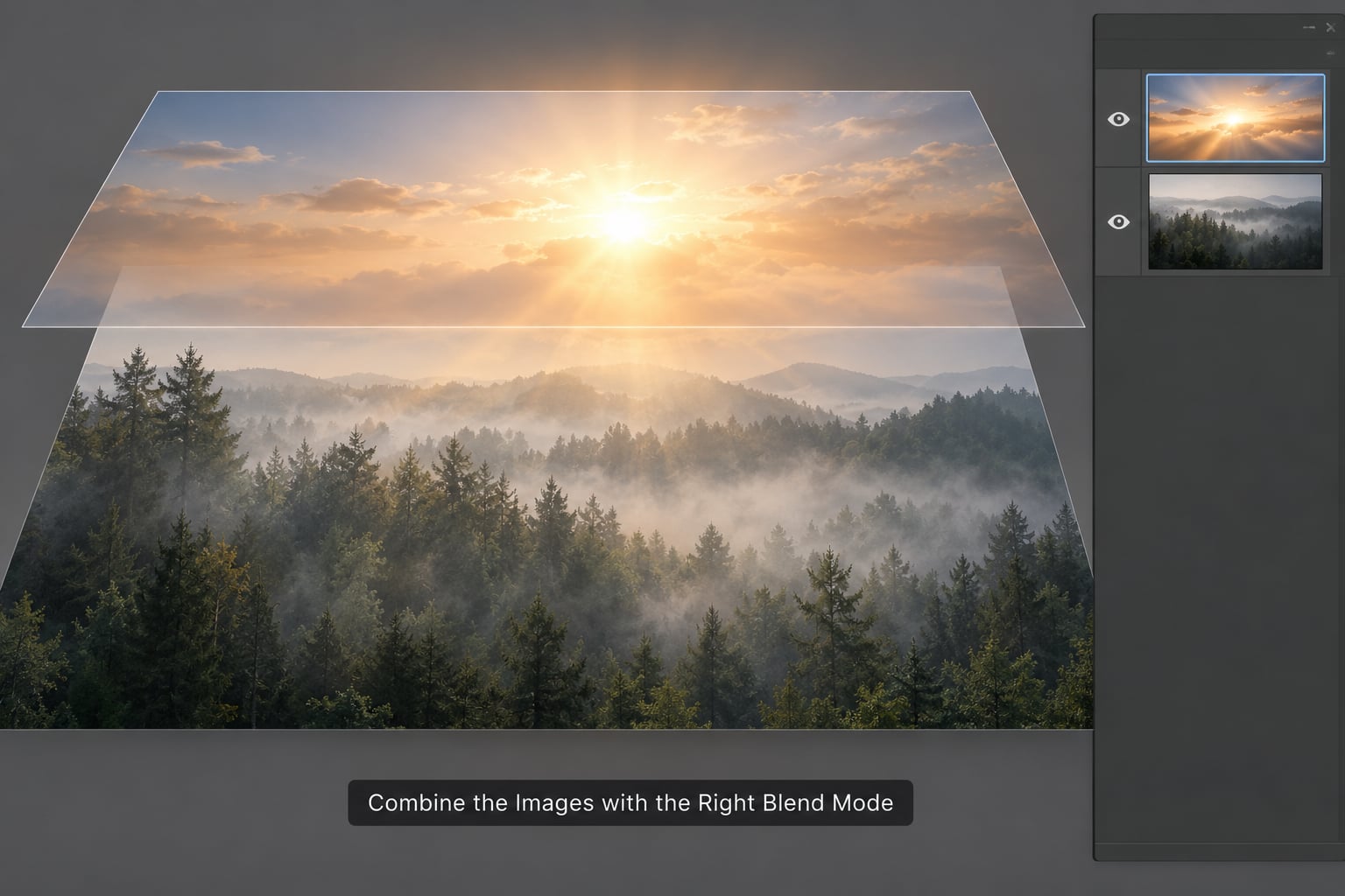
Set the blurred layer’s blend mode in the top of the Layers panel. The classic Orton recipe uses two different modes on two different layers, and here is why.
Set the blurred top layer to Multiply, which darkens and multiplies the two images together and keeps the shadows rich. Then add a new layer above it, drag the sharp layer into it with Alt, and set that one to Screen, which lightens the two images and creates the luminous spill. Multiply underneath, Screen on top, is the combination that gives you glow with structure instead of glow with haze.
Linear Light is the fast alternative: put the blurred layer in Linear Light over the sharp one and skip the second layer entirely. It is punchier and more contrasty than the classic recipe, which makes it good for a more graphic, less filmic result. Overlay sits between the two and gives you something in between, useful when Multiply and Screen together feel too soft.
Whichever route you take, the composite should be visibly brighter than either source layer. If it is not, the blur is too weak or the mode is wrong.
4. Control the Opacity and Add Contrast
This is the step that separates a photograph from a filter. Drop the blurred layer’s opacity to between 20 and 40 percent and watch what happens to the glow.
At 100 percent the effect is a white haze. At 20 percent you get atmosphere and the sharpness still reads. Start at 30 and move in small increments; the useful range for most photographs sits between 25 and 50, and anything past 60 needs a very good reason behind it.
Now add a Curves adjustment layer above the stack. Put a point at input 0 and drag the output up to roughly 25, then add a second gentle point in the highlights to recover what the Screen blend blew out. That first move lifts the blacks off the floor, which is the fix for the dark, heavy shadows that plague the standard method. Where shadows matter most, the approach in how to make shadows look real in photo composites covers the same lifting trick in more depth.
If a specific area is taking too much glow, mask it. Paint black on the layer mask with a soft brush over the offending region and the effect retreats there while the rest of the frame stays untouched. This is far more reliable than going back and forth with the opacity slider when only one corner is misbehaving.
5. Refine Color and Add a Painterly Finish
With the structure settled, treat the color. The blend tends to lift saturation in the midtones, so pull a Hue and Saturation adjustment layer back by about 10 points and then push saturation back into specific areas with a second mask.
Adding a color grade on top is where the effect stops looking like a preset and starts looking like a decision. Split toning with cool shadows and warm highlights suits the ethereal look best.
If you want the surface to feel less digital, a light grain layer and a soft texture overlay do more for you than another bump of blur ever will. Texture works because it reintroduces micro-contrast in an area the effect deliberately smoothed out, which is what stops the frame reading as a filter. If the goal goes further toward brushwork, how to make a photo look like a painting in Photoshop takes it the rest of the way.
Sharpen last, and only lightly. Sharpen the subject, never the whole frame, and use a high threshold so the glow itself stays soft. A radius of 1 to 2 pixels with a 50 to 60 percent amount is plenty.
For print, reduce the effect by about 20 percent from what looks right on screen and check the soft proof, because a glow that reads as subtle on a backlit monitor routinely looks heavy on paper. For web, flatten to sRGB and reduce the long edge to roughly 2000 pixels. Where you want the finished file to carry a film-like density rather than the clean digital base, how to make digital photos look like film is the natural next layer of the workflow.
Common Mistakes
The blacks went dead. This happens because Multiply darkens the shadow range before Screen lightens everything else. Add a Curves adjustment layer and lift input 0 to output 25, exactly as in step four.
It looks like fog. Your blur radius is too high and your opacity too low, so the sharp layer has lost its job. Drop the radius by a third and raise the opacity before anything else.
Halos ring around high-contrast edges. The blurred layer is spilling light across a hard boundary. Paint those areas out on the layer mask with a soft black brush, or reduce the radius slightly.
Highlights are gone. Screen and Linear Light both push the top end. Pull the white point down in Curves, or switch from Screen to Overlay and check whether you still need the second layer.
The whole thing looks like a preset. You applied the effect at one setting to every photo in the folder. Blur radius and opacity are per-image decisions; a dark forest needs far less than a backlit cityscape.
The file is enormous. Repeated smart object duplicates on a high-resolution file add up fast. Work at half resolution during the effect, then apply the whole stack as one smart object to the full-size image at the end.
It is simply the wrong photo. Too much contrast ruins a photograph, and the Orton effect is built on contrast. Images with a full histogram, harsh midday sun, or deep unrescuable shadows will only turn worse. If the effect is doing heavy lifting to make a frame look interesting, the problem is in the capture.
Frequently Asked Questions
What is the Orton effect and who created it?
The Orton effect is a post-processing technique developed by photographer Michael Orton, who originally created it on film. He sandwiched an underexposed sharp transparency against an overexposed out-of-focus transparency on a light table, producing an image that is sharp and blurry at the same time. Photographers often notice the hazy glow it produces in the background of a shot and want to recreate it. The digital version fakes the same light behaviour with a blurred duplicate layer and a blend mode.
Can you make an Orton effect in Lightroom without Photoshop?
Not properly, because Lightroom has no layers and the effect depends entirely on blending two copies together. You can approximate it by masking one copy and pushing Clarity or Dehaze in opposite directions, but the result reads as added contrast rather than the characteristic glow. Photoshop or Affinity Photo both reproduce the original technique exactly, using the same menu commands.
Which blend mode should I use for the Orton effect?
The classic recipe sets the blurred layer to Multiply and adds a second sharp layer above it set to Screen. Multiply keeps the shadows dense while Screen creates the luminous spill, and together they give glow with structure. Linear Light on a single layer is a faster, punchier alternative, and Overlay sits between the two for a gentler result.
Why does the Orton effect crush my shadows?
The Multiply blend mode darkens the bottom of the tonal range before the Screen layer lightens everything above it, so shadow detail gets squeezed out and the blacks go heavy. The fix is an adjustment Curves layer with a point at input 0 and the output lifted to around 25, which raises the floor and lets the shadow detail come back. Masking the effect out of problem areas also prevents local crushing.
How much Orton effect is too much?
For most photographs the useful range is 20 to 40 percent opacity on the blurred layer, and anything past 60 percent starts to look like a filter rather than atmosphere. Judge it by whether the subject still reads as sharp and whether the blacks still have detail. If you find yourself adjusting shadows to recover lost information, you have gone too far and should back the opacity off.
Can I batch process the Orton effect on multiple photos?
You can, by recording the whole workflow as a Photoshop action. Start the recording, run your blend and adjustment layers on the first image, stop the recording, and then apply the action to a batch of files. Keep the smart object conversion outside the action so each file still opens editable, and expect to touch up blur radius and opacity on individual frames, since every photograph takes those settings differently.
Conclusion
Start with one sharp photograph, correct its exposure and white balance, and turn it into a smart object before you touch anything else. Duplicate it, blur the top copy to about 0.1 percent of the image width, and combine the two with Multiply underneath and Screen on top.
Then bring the opacity down to 30 percent and lift your blacks with a Curves point at input 0 and output 25. If it looks like fog, reduce the blur. If it looks cheap, reduce the opacity. Color grading and export come last, and by that point the effect is already working.