
Minimalist photography is the practice of building a frame around one dominant subject and a deliberately empty area around it, where the absence does as much work as the subject. Learning how to shoot minimalist photography is mostly subtraction: deciding what to leave out before you press the shutter. It takes about ten minutes to understand and a working lifetime to get good at.
The sloppy internet version of the style, which is just “less is more, nice empty background,” is not enough on its own. The style has roots in a 1960s art movement that pushed back against Abstract Expressionism, one that cared about form, line and colour rather than self-expression or implied story. Photographers arguing about this on the DPReview boards keep landing on the same complaint: most articles give a recipe and skip the principle, so nothing transfers to a scene you haven’t seen before. The principle is simple, though, and it is what this guide is built on. Every element in the frame, including the empty part, has to be doing deliberate work.
Here is the order I’d work in. Define one idea, strip the scene, shape it with light, place the subject on purpose, control exposure and focus, then shoot variations and edit with restraint. It reads slower than a list of tips, and it survives contact with a messy real-world scene much better.
Table of Contents
What You Need
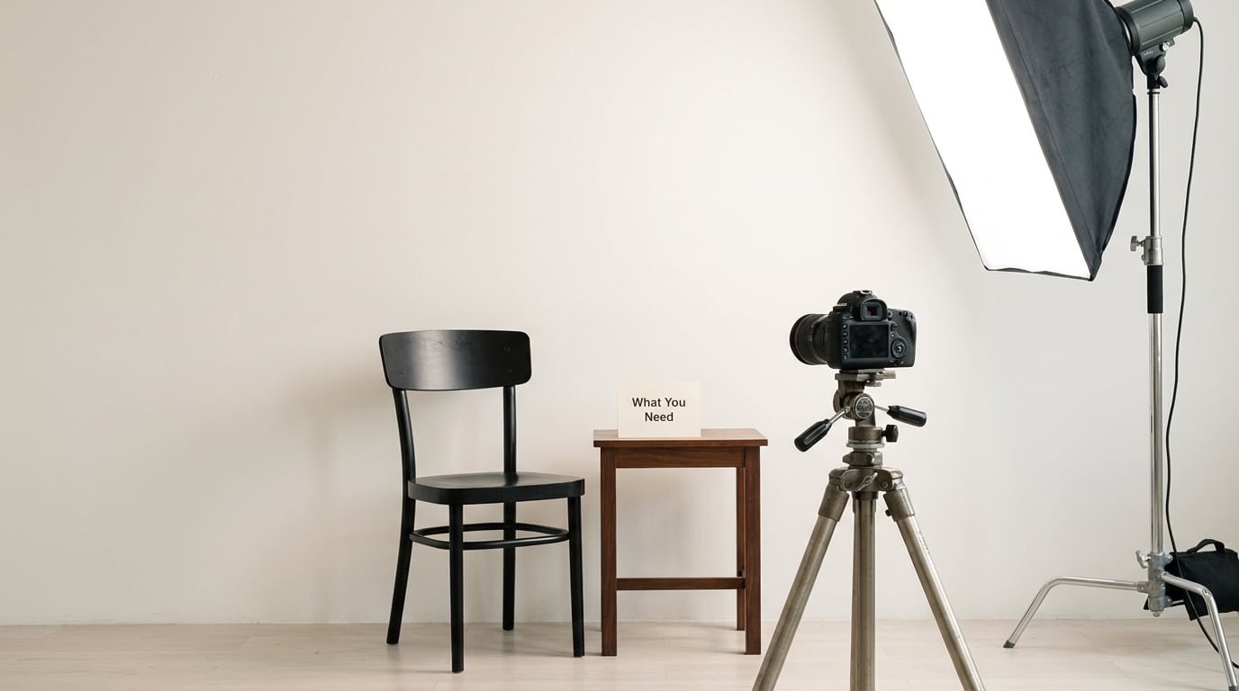
You need very little. That is partly the point, and partly the thing beginners fight hardest against, because minimalist photography carries a reputation for requiring expensive equipment. It doesn’t. What you need is a camera, some way to hold it steady, one subject, one controlled light and an editing application.
A camera or a smartphone. Any camera that lets you fix the exposure and focus manually will teach you more than an automatic mode, because the decisions get visible. Most phones now expose in 1/120 step increments and let you lock focus and exposure with a long press on the screen, which is enough to work with if that’s what you have.
A lens. A 35mm or 50mm prime covers most interior and still-life work and gives you a single focal length to learn deeply. For outdoor work, a short telephoto in the 70 to 200mm range compresses layers and cuts clutter out of the background in a way a wide lens never will. A wide lens is useful for architecture and for shooting into large empty areas such as a bare beach.
A tripod or some stable support. You need one for long exposures, low-light work and any time you want the camera to stay still while you move the subject. A stack of books and a flat surface will do for a phone.
A subject and a background that are already on speaking terms. One object, one wall, one patch of sky. If the two things next to each other in your frame are fighting for attention, the frame isn’t minimal yet, and no lens will fix that.
One light source you can move. A window, a lamp, a softbox, a bare bulb. The single most useful piece of kit in this style isn’t a camera at all, it’s whatever lets you put light exactly where you want it and nowhere else.
Editing software. Anything that can crop, adjust exposure and convert to black and white will do the job. The heavy editing packages exist for the small part of this work that involves removing things, and even that should be a last resort rather than a starting point.
One honest note before we go further. In the same DPReview discussion, one photographer said minimalist photography is good for your back and your wallet because you carry less gear, and another replied that it is surely about the photos themselves, not the weight or the cost of the kit. Both are right, and the second point is the one that matters. Owning less makes the style easier to practise; it does not make the pictures better on its own.
How to Shoot Minimalist Photography Step by Step
The seven moves below are the whole process. They are listed in the order they actually happen in the field, not in the order they appear in a textbook.
- Define one visual idea: a single dominant subject, shape, colour relationship or contrast that carries the frame.
- Simplify the scene by subtraction, removing anything that competes with that idea.
- Use light to create shape, so an empty area becomes active rather than blank.
- Compose deliberately, placing the subject and the space on purpose instead of by default.
- Control exposure and focus so tone, not the autofocus, decides what the viewer sees first.
- Shoot variations of the same idea before you settle.
- Edit with restraint, reinforcing the idea you started with instead of adding a new one.
Define One Visual Idea
Start by writing the sentence your photograph has to say, in as few words as possible. A weathered chair against a white wall. Three power lines crossing an empty sky. A single lit window on a grey facade. That sentence is your visual idea, and it decides everything downstream, including which of two scenes you are standing in front of.
This is the step most guides skip, and skipping it is why generic advice never transfers to your own locations. Once you have the sentence, every element either supports it or gets removed. A chair against a white wall, and the mug, cable, plant and coat hanger that were already in the room, are not part of the sentence.
Keep the idea narrow. A vague idea like “make it feel calm” produces a vague frame, because calm is a result rather than a subject. A specific idea gives you something to test, and it tells you instantly when a variation has failed.
Simplify the Scene
Now subtract. Walk into the location and identify the one thing worth keeping, then look at everything else as a candidate for removal. Most of the time the answer is that the clutter stays in the room and you change your position instead.
Moving your feet is the most underrated technique in this style. Stepping two metres to the left or lowering yourself thirty centimetres changes what sits behind your subject, often turning a cluttered background into a plain wall. Changing lenses does the same thing from further away, which is why telephoto compression is the standard tool for isolating a subject in a busy place.
When the clutter cannot be moved, the light can do the work for you. Turn your subject into a silhouette against a bright sky and the background stops mattering entirely. The same thing happens in fog, snow, heavy rain or darkness, which strip detail out of a landscape and hand you a clean field for free. Weather is the cheapest minimalist tool available, and waiting for it is often more productive than moving props around.
Also consider the background’s texture. A blank wall that is rough, stained or patchy is not a bad background, it is a subject-bearing surface with tone and character. Smooth empty space is easier to make, but it can read as an accident unless the light gives it a gradient.
Use Light to Create Shape
An empty area is only dead when it is evenly lit and featureless. Light is what turns space into shape, and it is the difference between a frame that reads as intentional and one that reads as unfinished.
Side light does the most for you. Put your source at ninety degrees to the subject, a metre or two away, and the shadows it casts build form and separate planes that would otherwise merge. Hard light gives crisp edges and geometric shadow shapes, which suits architecture. Soft light, from a window with a sheer curtain or a diffused panel, gives tonal gradients and a calmer, more even feel.
Direction defines the mood. High key setups keep the tones bright and open. Low key setups let most of the frame fall into shadow with a single lit area, which is a different kind of minimalism entirely and often the more striking one. Silhouettes sit between the two, and they are the most forgiving of imperfect backgrounds.
Watch the falloff. A wall lit by a single source goes from bright to dark, and that gradient is what gives a large empty area a shape. The failure mode, which the top comment on an r/AskPhotography thread about minimalism describes well, is a large rectangular block of evenly lit nothing. When the viewer’s eye lands there, there is nothing to look at, and the space reads as unused rather than intentional.
The fix is not to add clutter back. It is to give the empty area a gradient, a texture, a shadow edge or a line, so the eye travels through it instead of stopping in it.
Compose Deliberately
Place the subject on purpose. Not dead centre, which reads as a snapshot, and not mechanically on a thirds grid, which is a useful instinct but produces formulaic results when applied without thought. Put the subject where the shape of the space supports it.
Give the subject room in the direction it faces or moves. An object looking or travelling to the right wants space on the right, and cutting that off feels like the picture is being interrupted. This is the one compositional rule that is close to absolute, and it applies whether your subject is a person, a bird, a boat or a shadow.
Then check the edges, which is where most frames are lost. Look at all four edges of the viewfinder and cut anything that touches them awkwardly: a half-object, a stray line, a bright spot that pulls the eye out of the frame. A shape can run off the edge of the frame with real intent, but a tree, a lamp post or a person’s arm half-cropped by accident reads as a mistake.
As a starting point for balance, a portrait subject often works at roughly thirty to forty percent of the frame, a single element in a wide outdoor scene somewhere around ten to fifteen percent, and an architectural feature around twenty-five to thirty-five percent. Treat those as a place to begin rather than a rule to obey. A subject far smaller than these numbers only works when the space itself has enough gradient or texture to carry the frame.
Finally, work in both orientations. A vertical frame with one subject and generous headroom is the most-used minimalist format, and trying the same scene horizontally costs nothing and regularly produces the better image.
Control Exposure and Focus
Fix the exposure yourself. Automatic exposure is trying to average the whole frame, and in a minimalist frame a large area of empty tone will pull your exposure toward the walls or the sky, which is not what you want. Manual exposure, or auto exposure with a compensation dial, keeps your attention on the part of the frame that matters.
Watch the histogram, or at least the highlights warning on the screen. In high key work the brightest part of the frame will sit close to the top edge, and you want to know which surface is doing it before you clip it. In low key work you want clean blacks without the subject’s detail being crushed into them.
Focus on the subject, manually if your camera allows it, and if the background has any real texture at all, stop down a little more than feels necessary. A sharp background gives the empty space a surface, which supports the frame. A completely melted background can look generic unless the subject’s shape is doing a lot of the work.
Settings by genre, as starting points rather than rules:
| Genre | Lens | Shutter | Aperture | ISO | Key note |
|---|---|---|---|---|---|
| Nature and wide scenery | 24 to 70mm | 1/250s or faster with a tripod | f/8 to f/11 | 100 | Stop down so the whole scene is sharp; look for a single tree or rock against open ground |
| Seascape with long exposure | 16 to 35mm | 2 to 30 seconds | f/8 to f/11 | 100 | Tripod essential, usually with a neutral density filter in daylight; the water becomes flat tone |
| Street and urban solitude | 35 to 70mm | 1/250s, or 1/15s when panning | f/4 to f/5.6 | 400 to 1600 | Slow panning with a single moving subject blurs the city into tone and keeps only the sharp thing |
| Portrait, environmental | 50 to 85mm | 1/250s | f/2 to f/4 | 200 to 800 | Wide open isolates the person; a small aperture keeps the wall behind them sharp and graphic |
| Architecture and facades | 24mm or a tilt-shift | 1/60s to 1/250s | f/8 to f/11 | 100 | Shoot in flat light or fog, correct verticals, and look for repeating windows on a plain wall |
| Still life and product | 50 to 100mm macro | 1/125s or faster | f/5.6 to f/8 | 100 | One light at an angle; a second card as a reflector is usually the only extra you need |
Low light is a gift in this style. Underexposure plus a single source gives you low key images with less work, and a slower shutter on a tripod gives you smooth water or clean cloud. Set the ISO low, mount the camera, and the scene simplifies itself.
Shoot Variations and Edit with Restraint
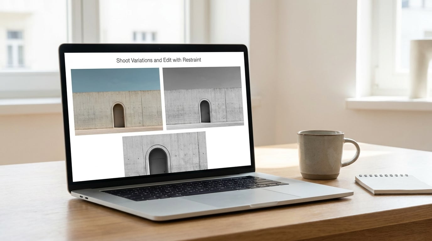
Never stop at the first frame. Shoot the same idea five or six times: subject left, subject right, subject low, subject small, then one with the light moved. Minimalism is a search, and the version that works is rarely the first one you set up.
Then edit to reinforce the idea you started with, not to add one you did not have. Start with the crop, because cropping is composition and committing to the frame is the decision that makes the picture work. Crop dead space away, straighten verticals, and stop. The temptation to add a preset, an effect or a heavy clarity slider is exactly what turns a clean frame into a busy one.
On colour, a muted palette does a lot of the work for you. Pulling saturation down on everything except one warm accent creates a clear visual hierarchy from a scene that had none. A black-and-white conversion is also a legitimate minimalist choice, since removing colour removes one entire dimension of information and forces the frame to work on shape, tone and texture alone. Neither is automatically better, and plenty of strong minimalist images are in full colour.
Removing things afterwards is the last option, not the first. Removing a distracting object or two in post is common practice and not dishonest, particularly in editorial and commercial work where a clean frame is the brief. But a cloned frame tells you something you already knew before you pressed the shutter: you were in the wrong position. Prefer moving your feet, and reach for the healing tool or content-aware fill only when the alternative is not shooting the scene at all.
Two small checks finish the job. Squint at the frame, or blur it on screen, and see if one thing still stands out. Then check every edge once more, because a single bright intrusion on a border undoes an otherwise clean image.
Common Mistakes
Overfilling the frame. The instinct to get close and pack the subject in kills most first attempts. Step back until the space around the subject is doing something, then crop a little from that version if the frame still feels too tight.
Leaving the frame empty instead of elegant. If the viewer cannot say what to look at, more space is not the answer. Add gradient, texture or a shadow line, or make the subject larger.
Relying on an empty background alone. A blank background is a starting condition, not a picture. If the only thing your frame has is absence, the light and the placement have not been doing their job yet.
Using uncontrolled light. Harsh midday sun scatters shadows and flattens form, and mixed indoor lighting makes your tones unreliable. Move the time of day or move the light before you move anything else.
Adding too many subjects. Two subjects compete. Pick one, and if the second is truly necessary, either commit to a pattern with three or more, or frame so one is unmistakably dominant.
Overediting in post. Heavy clarity, HDR and full detail recovery work directly against a minimalist frame, because they add texture and edge contrast everywhere at once. Cut them back and your original frame usually improves.
Chasing gear. The strongest minimalist work in the DPReview thread was made with whatever the photographer was carrying, and a crop from a high-resolution file lets you reframe more than a prime lens does. Skill here is subtraction, not shopping.
Frequently Asked Questions
What is negative space in photography composition?
Negative space is the empty or unoccupied area around your subject, and it is a compositional element in its own right rather than leftover background. In minimalist photography it does the work of isolating the subject and giving the eye somewhere to rest. It has to be a deliberate shape with tone, gradient or texture, not a flat block of nothing.
How much negative space is too much?
When the empty area is large, evenly lit and featureless, it stops reading as intentional and starts reading as unused space. A top comment on an r/AskPhotography thread on minimalism puts it simply: when the viewer’s eye lands there, there is nothing to look at. Fix it by adding a gradient, a texture or a shadow edge, or by making the subject larger, rather than by adding clutter back.
Do I need a telephoto lens for minimalist photography?
No, but a short telephoto between 70mm and 200mm is the most useful lens for the style, because it compresses layers and shrinks a busy background into a clean one. A 35mm or 50mm prime works well indoors and for still life, and a wide lens suits architecture and open space. The lens matters far less than where you put the subject and where you put the light.
Should minimalist photos be black and white?
Not necessarily, and neither choice is automatically simpler. A black-and-white conversion removes colour as a dimension, which forces the frame to work on shape, tone and texture, and it suits graphic or textural subjects. Colour is stronger when one hue carries the frame and everything else is muted. Decide by looking at your subject, not by assuming monochrome is the serious choice.
Is it okay to remove distracting objects in Photoshop?
It is common practice and not dishonest, especially in editorial and commercial work where a clean frame is the brief. The limitation is that a cloned object tells you the frame was in the wrong position. Move your feet, change lenses or use long exposure to solve the problem in camera first, and treat selective removal as a last resort rather than the plan.
What are the 60/30/10 and 20/60/20 rules in photography?
They are colour balance guidelines rather than composition rules. The 60/30/10 rule says roughly 60 percent of a frame should be the dominant colour, 30 percent a supporting colour and 10 percent an accent. The 20/60/20 rule is a looser variant that allows two dominant colours. For minimalist work the useful idea is the one behind both: a limited palette gives you the visual hierarchy that a cluttered frame lacks.
Conclusion
Pick one subject, take everything else out of the frame, and make three exposures with the same light from three positions. That is the whole practice, and it takes less time than reading about it does. Once those three frames exist, the questions worth asking are the ones this guide keeps returning to: what is the visual idea, where is the subject, and what is the light doing.