
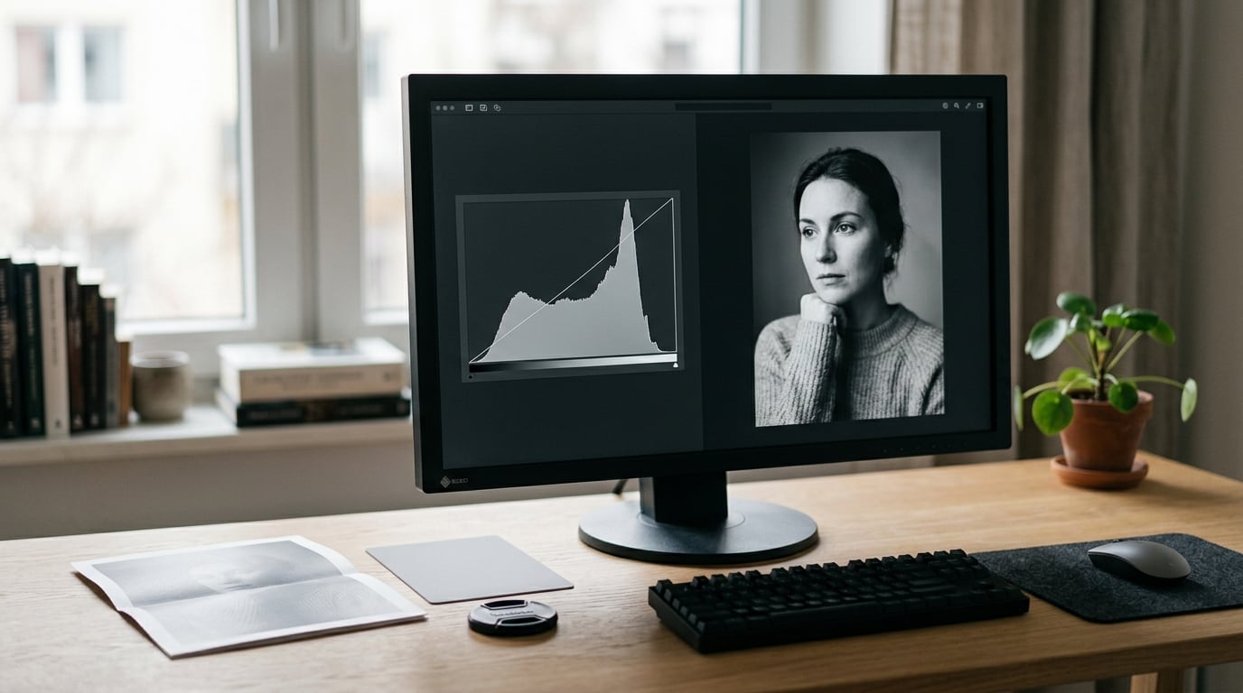
A histogram is a graph of how many pixels in your image sit at each brightness value, running from 0 (pure black) on the left to 255 (pure white) on the right. To read one for black and white photography, you look at the shape: where the data piles up tells you whether you have real shadow and highlight detail to convert, or whether detail is already gone. It takes about ten minutes per frame once you know what to look for.
Monochrome makes this more important, not less. Remove the colour cues and the back-of-camera screen becomes much harder to judge, especially if you shoot RAW and convert later. The histogram is the one objective reading you still have.
In this guide I walk through the reading routine I use on my own black and white edits, including the part most guides skip: checking the histogram again after the conversion, because that is where the real decisions happen.
Table of Contents
- What You Need
- Step-by-Step: How to Read a Histogram for Black and White Photos
- Common Mistakes
- Frequently Asked Questions
- Does a black and white histogram need to look smooth or evenly spread?
- What does a histogram bunched in the middle mean?
- Is clipping bad for black and white photography?
- Why does my histogram change when I move the Bu0026amp;W mix sliders?
- Should I expose to the right in RAW and recover the highlights later?
- Which histogram should I trust: the camera, the RAW converter, or the exported JPEG?
- What to Do First
What You Need

You need three things, and none of them are expensive.
- A photo editor with a histogram panel. Lightroom Classic, Capture One, darktable, Affinity Photo, GIMP and Photoshop all have one. In Lightroom it lives in the Develop module’s right-hand panels, or you can enable it from the panel menu on the bottom right.
- A display you trust. Not a laptop panel in a bright room, and not a phone. If your screen is uncalibrated, your eyes and the histogram will disagree and you’ll fight yourself all afternoon.
- A decision about how you convert. Either you use the black and white mix in the develop module, or you convert at the end with a channel mixer or a plug-in. Knowing which one changes which histogram you watch at each stage.
One optional extra is a grey card or an 18 percent grey card. Shoot one frame with it filling the frame and you have a reference point: that frame’s midtone should land in the middle of the range, and if it doesn’t, your display or your expectation is off.
Step-by-Step: How to Read a Histogram for Black and White Photos
Step 1: Open the Histogram in Your Photo Editor
Open the histogram panel, then switch it to the luminance or all-channels view rather than the individual red, green and blue channels. In Lightroom the histogram panel has a dropdown at the top right where you can cycle between RGB, Red, Green, Blue, Luminance and All Channels. For a monochrome workflow, Luminance is the one that matches what you’ll see after conversion.
Photoshop keeps its histogram in the Info panel or the Histogram panel under Window, and its histogram is a luminance histogram by default. Capture One shows RGB, Luminance and RGB Parade. Darktable calls the equivalent a “scope”, and it is in the bottom panel by default.
On the camera side, the histogram is usually one of the display modes behind the DISP or INFO button. Canon bodies list Histogram Display in the shooting menu, Nikon has it in the custom shooting menu under Display, and Sony and Fujifilm both have a Histogram setting in their display menus. Fujifilm also offers a combined RGB histogram option, which is the more useful one before you convert.
Step 2: Identify the Three Main Tonal Zones
Split the graph into three areas and name what each one is holding. The left third is shadows, the middle third is midtones, and the right third is highlights. Most pictures live mostly in the middle, which is why a good histogram usually has a big lump in the centre with thinner tails reaching outwards.
You can map that to the Zone System, which is a more useful mental model than thirds for monochrome work. Zone 0 is pure black with no detail at all, zone 10 is pure white, and the middle zones carry the texture you actually see. The rough correspondence looks like this.
| Zone | Tonal value | Approximate pixel value |
|---|---|---|
| 0 | Pure black, no detail | 0 |
| 1-2 | Deep shadow, minimal detail | 10-50 |
| 3-4 | Open shadow, texture visible | 50-105 |
| 5 | Middle grey | About 118 |
| 6-7 | Light midtone, skin, sky | 130-190 |
| 8-9 | Near-white, fine highlight detail | 190-240 |
| 10 | Pure white, no detail | 255 |
For most black and white frames you want the bulk of the data between roughly 20 and 240, with the midtone mass around 110 to 130. If your face is sitting in zone 4, you will spend the whole conversion fighting to bring it back.
Step 3: Look for Clipping at the Edges
Clipping is data pressed flat against the very edge of the graph. A spike at 0 means pixels at absolute black with no detail left in them. A spike at 255 means pixels at absolute white, and those are gone too.
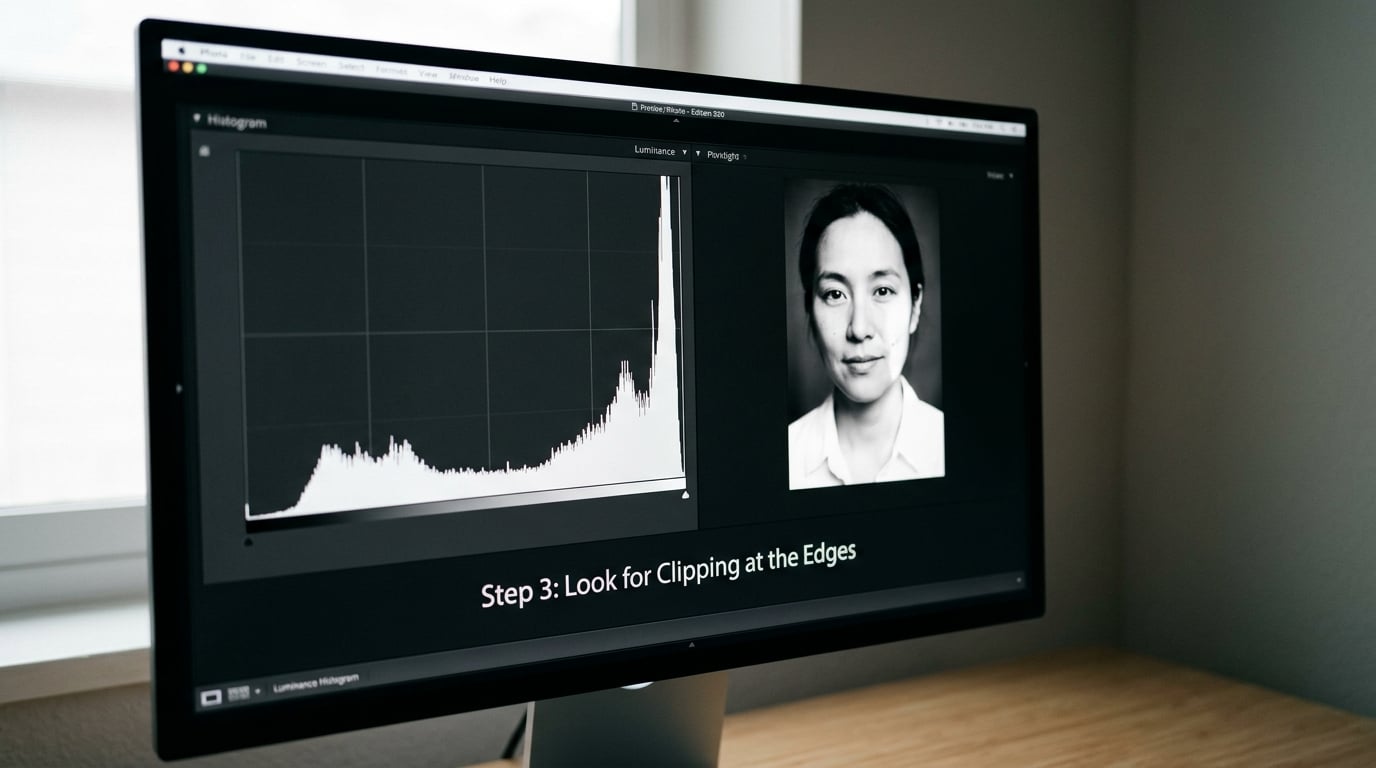
The important word in that last sentence is absolute. A histogram that reaches 250 but not 255 still has recoverable highlight information in a RAW file, and the same is true on the shadow side. What you cannot recover is a pixel that has hit the wall.
Monochrome is more forgiving than colour here, and this is where the usual colour advice breaks down. A blown patch of sky in colour might be a patch of clipped blue channel that reads as pale cyan; once you convert, that same patch may be perfectly usable because luminance rarely sits at the ceiling. That is why photographers will happily block their shadows to zero for a moody frame, and why a histogram with a hard left edge is not automatically a mistake.
So the question is not “is there clipping” but “is the clipping doing something I want”. A silhouette against a bright sky is supposed to have solid black in the subject. A portrait with clipped skin across the cheek is a problem. Check where the spike is and what it is attached to before you decide.
Step 4: Check the Distribution for Tonal Balance
Now look at the overall shape and ask what story it tells. This is the step that turns reading into a decision.
| Shape you see | What it means | What to do |
|---|---|---|
| Wide spread, data at both ends | Full tonal range, good separation | Nothing. This is the target for most work |
| Piled hard on the left | Blocked shadows, image reads heavy | Raise exposure, or lighten black point in the edit |
| Piled hard on the right | Blown highlights, image reads washed | Lower exposure by compensation, recover in RAW if possible |
| Narrow bunch in the middle | Flat, low contrast, no depth | Widen black and white points until the tails appear |
| Two humps with a gap between | High contrast, strong subject separation | Usually intentional. Check the gap is not accidental loss |
| Tall narrow spike | Large flat area at one value, sky or snow or a wall | Fine for a deliberate backdrop, bad for skin or a face |
| Data touching both ends | Scene exceeds sensor range | Bracket or use a graduated filter, or accept a low-key conversion |
Different black and white styles want different distributions, and there is no single correct graph. A high key portrait, the kind with pale skin and an airy background, should sit mostly in the right two thirds with a soft left tail. A low key portrait wants the reverse. A dramatic landscape wants the bimodal shape, dark ground and bright sky with a valley in the middle.
If you want a low contrast, misty monochrome, then a narrow spread is the goal, not the symptom of a mistake. Decide the look first, then check whether the histogram is serving it.
Step 5: Adjust Black and White Tones and Recheck
This is where the histogram does its real work in monochrome. Work in this order, and re-read the graph after every single move, because each control changes the others.
Set the black point first. Drag it until the data just touches the left edge, or stops short of it if you want open shadows. A common starting value is around 15, which puts the deepest black just shy of pure black and gives you a little breathing room for print.
Then the white point. Drag it until the brightest part of the subject reaches the right edge. Many people start near 235 rather than 255, which keeps paper white separate from the brightest subject tone.
Next, work in the B&W mix. Each of the six sliders changes how much each colour contributes to the final luminance, and moving them reshapes the whole histogram. This is where the “why does my histogram look completely different after I move the mix” question comes from, and the answer is that you have changed which colours are bright and which are dark, so every pixel has been re-mapped.
Finish with the shadows, highlights and midtone sliders, watching the edges specifically. If pushing highlights has created a spike at 255 that was not there before, back it off.
One habit worth keeping: check the histogram on the grayscale preview, not on the colour one. A colour frame can look well exposed and convert to a flat, lifeless monochrome. The graph is the only place that disagreement shows up.
Step 6: Export with Intended Tonal Treatment
Before you export, view the image at the size it will actually be seen. At 100 percent on a large monitor you will see texture and grain that disappear completely in a feed, and the histogram will tell you nothing about that.
Keep a 16-bit master file if you can. Black and white edits stack up: a levels pass, a curve, some local work, then grain. Eight-bit JPEGs start banding in the shadows long before the contrast looks wrong on screen.
For screen delivery, a standard sRGB JPEG at quality 90 or better is fine. For printing, export at the printer’s requested profile and check the deepest blacks on a calibrated display first, because a monochrome with blocked shadows that looks fine on a laptop can look like mud on paper.
Common Mistakes
Treating a bell-shaped curve as mandatory. There is no ideal histogram shape. The picture decides, not a diagram. If you keep adjusting toward a tidy mountain shape you’ll flatten a picture that was working.
Trying to fit every pixel between the endpoints. Some pixels belong at 0 and some at 255. Zones 0 and 10 are legitimate parts of the range, and a conversion with a little genuine black and white in it usually reads as more solid than one that’s artificially capped.
Judging monochrome on the colour histogram. A single composite RGB graph tells you almost nothing about the final tones. Switch to Luminance, and check the individual channels before conversion to catch a clipped red or blue that the composite is hiding.
Clipping highlights to make the frame brighter. Adding exposure to a flat histogram is the right instinct, but pushing it until data slams into 255 destroys detail you will wish you had back. Watch the right edge, not the general brightness.
Editing on an uncalibrated display. A cheap panel in a bright room will convince you a contrasty edit is fine. If you have never calibrated, at least view in a dim room at normal brightness and keep your expectations modest.
Checking once and never again. The B&W mix, the tone curve and the local adjustments all move the histogram. A frame that was fine before the mix can be clipping badly after it, and nobody notices because they stopped looking.
Frequently Asked Questions
Does a black and white histogram need to look smooth or evenly spread?
No. There is no correct shape for a black and white histogram, and chasing a smooth even curve is the most common mistake beginners make. A wide spread with data reaching both ends gives you the most tonal range to work with, but a narrow bunch in the middle is right for a soft low contrast image, and a two-humped shape is right for a dramatic one. Decide the look you want, then check that the distribution is serving it and that nothing important has clipped.
What does a histogram bunched in the middle mean?
It means most of your pixels sit within a narrow band of midtones, with few reaching either end. The result is a flat, low contrast picture with grey-looking blacks and dull whites. In a black and white conversion the fix is usually to widen the black and white points until the tails reappear, then add contrast in the curve. Check first that the bunching is not caused by a flat scene or a haze, which no amount of editing will fully rescue.
Is clipping bad for black and white photography?
Sometimes, and often it is exactly what you want. Clipping means pixels have hit 0 or 255 and hold no detail, which is a problem when it lands on a face or a texture. It is a deliberate tool when you want solid black in a silhouette, a low key portrait or a graphic shape. The key distinction is absolute: values pressed against 0 and 255 are unrecoverable, while data sitting at 245 still leaves headroom to work with in a RAW file.
Why does my histogram change when I move the Bu0026amp;W mix sliders?
Because the mix sliders change how much each colour contributes to the final brightness, which re-maps where every pixel lands. Dropping the red slider makes red objects darker in the monochrome, so the data that was sitting in the highlights shifts left into the midtones. This is why the mix should be adjusted with the histogram visible, watching for new clipping at either edge rather than judging the effect by eye alone.
Should I expose to the right in RAW and recover the highlights later?
Exposing to the right means raising exposure until the histogram nearly reaches 255, which maximises shadow detail and usually gives a cleaner file. It is safe with RAW because highlight recovery is possible, but it is not a licence to clip. In black and white you gain extra latitude because luminance rarely reaches the ceiling even when a colour channel does, so watch the luminance histogram and the individual channels, and stop just short of the edge.
Which histogram should I trust: the camera, the RAW converter, or the exported JPEG?
Trust the RAW converter when you shoot RAW, because that is the file you will edit and the camera display is a simplified preview of it. The camera histogram is still useful for catching gross exposure errors on location, since it is right there. Check the exported JPEG last, as a quality gate, because compression and profile conversion can shift things slightly. Never make a final tonal judgement on a screen you have not calibrated.
What to Do First
Open the histogram panel, switch it to Luminance, and look at your last ten black and white frames in that view. Almost everyone finds at least one they had been happy with and had a clipped edge they never noticed. That single pass teaches the reading faster than any article, including this one.
From there, the routine is short: set the black point, set the white point, adjust the B&W mix while watching the edges, and check the graph again at the end. The histogram is a decision aid, not a grade. Treat it that way and it will tell you exactly what you need to know about your monochrome frames in 2026.