
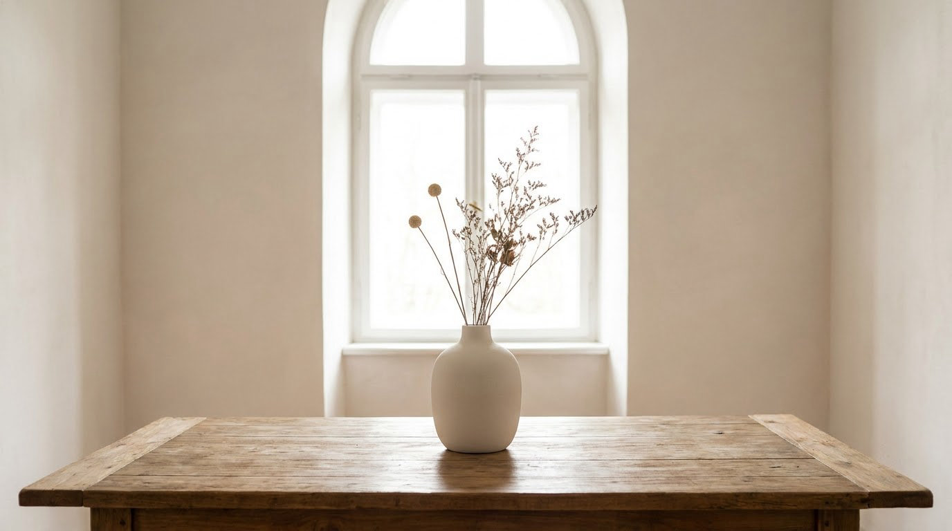
Break the rule of thirds when the subject itself is symmetrical, when the picture needs a central axis to read at all, or when off-centre placement would fight the story instead of supporting it. The rule is a strong default, not a law. Treating it as a guideline is what separates a considered frame from a formulaic one.
Table of Contents
- When to break the rule of thirds in photography
- What Is the Rule of Thirds?
- 7 Situations When Breaking It Can Improve the Photograph
- When You Should Still Use the Rule of Thirds
- How to Break the Rule of Thirds Without Losing Balance
- Common Composition Mistakes When Breaking the Rule
- Frequently Asked Questions
- Is the rule of thirds still relevant?
- Should the subject be in the center of a photo?
- How much negative space should I give a subject looking off-frame?
- How do I break the rule of thirds without it looking like a mistake?
- What is the rule of symmetry in photography?
- When should you follow the rule of thirds?
- Conclusion
When to break the rule of thirds in photography
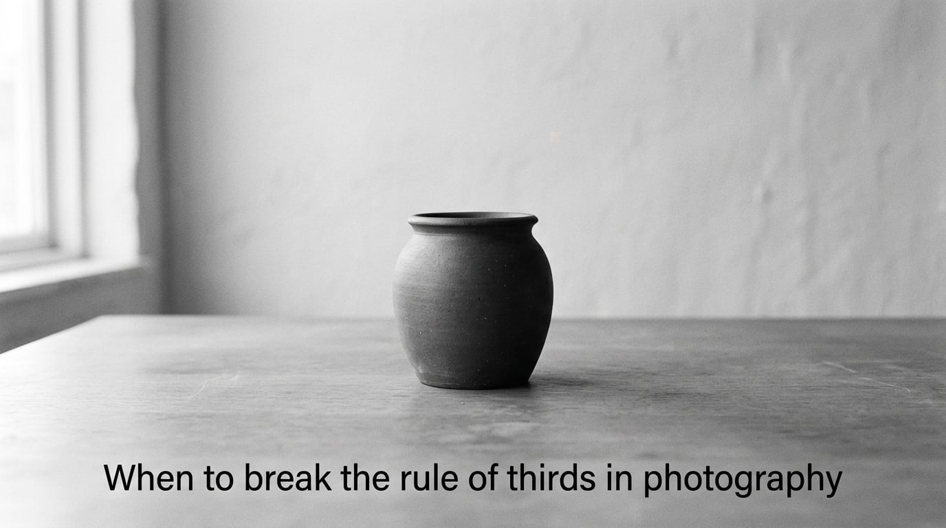
Knowing when to break the rule of thirds in photography comes down to one question: does the grid support the subject, or does it compete with it? Push your subject off centre when a sense of direction or a landscape-scale space matters. Keep it centred when the subject has its own symmetry, when the frame depends on a mirror axis, or when you want the viewer to feel pinned in place.
The short version, in a list you can work from in the field:
- Symmetrical subjects — a centred frame honours the geometry instead of fighting it.
- Reflections and still water — a mirrored image needs a central axis or the pairing falls apart.
- Portraits with direct eye contact — centring matches the subject’s gaze to the viewer’s.
- Minimal frames with lots of empty space — a quiet picture wants one anchor and even emptiness.
- Architecture shot straight on — the facade’s own symmetry is the subject.
- Product, still life and flat-lay work — dead-centre placement survives cropping and keeps catalogue layouts clean.
- Deliberate tension — a tilted frame or a subject pushed hard off-axis creates unease that a balanced frame cannot.
None of these are secret techniques. They are simply the cases where the default is wrong, and where you have a reason you could explain out loud.
What Is the Rule of Thirds?
The rule of thirds divides a frame into nine equal rectangles using two vertical and two horizontal lines. That gives you four intersection points, and the standard advice is to place your subject on one of them rather than in the middle. Cameras, phone screens and most editing apps can draw those thirds lines over the viewfinder so you can see them while shooting.
The origin story gets repeated so often it has its own gravity: a 16th-century book on painting, then a 19th-century guide for photographers, and eventually a general belief that a wide list of sensible-looking places has something to do with natural proportion. Whatever the derivation, it has survived because it produces reliably readable frames. Useful is not the same as mandatory.
What Makes the Rule of Thirds Work?
It works because it exploits visual weight. A subject in the exact middle has no direction to move, so the eye rests there and stops. A subject set on a thirds line, with room left in front of the direction it faces, has somewhere to go, and the viewer’s attention travels with it. That travel is what people mean when they say a composition feels alive.
Three things are happening at once in a well-placed frame: the subject has emphasis because it is isolated against simpler space, the empty area is doing work as directional space, and the frame as a whole stays balanced rather than lopsided. Remove the emphasis and the emptiness just looks like an accident.
That is also why the grid can become a problem. Turning the overlay on out of habit, then putting everything on an intersection every single frame, produces the same composition over and over without you noticing. The grid was a training aid. Treating it as permanent scenery is how a set of photographs starts to look like one photograph repeated.
7 Situations When Breaking It Can Improve the Photograph
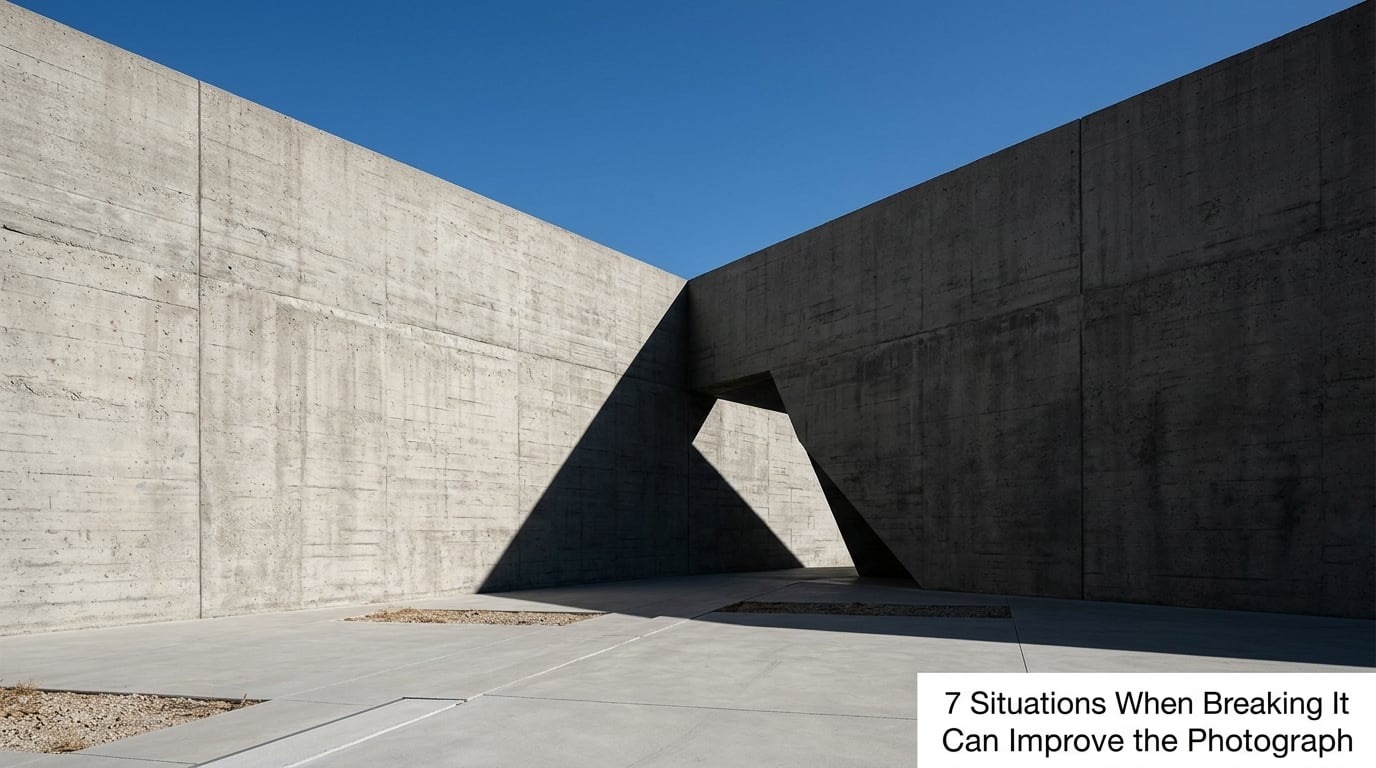
1. Symmetrical subjects reward a centred frame
A cedar tree photographed straight up its trunk, a bridge seen head-on, a cathedral doorway: when the subject has bilateral symmetry about its own middle line, an off-centre placement cuts the frame in a way that damages the thing you came to photograph.
Symmetry reads as order and control. Centring lets the shape complete itself, and the eye can travel down the axis without being interrupted. This is the clearest case for ignoring the grid, and the one most photographers already trust without being told.
2. Break it for Reflections and water
A still puddle holding a building, a boot in wet sand, a person standing ankle-deep in a lake at dawn — a reflection is a mirror, and a mirror needs a central axis to read as a mirror. Centre the axis of the reflection and the real subject together, with the waterline running across the middle of the frame.
Some photographers go one step further and accept an uneven split, putting the waterline on a third instead. That works when the reflection is graphic rather than literal: ripples, mud, a strong colour block. Decide whether your reflection needs a perfect pairing or just a strong shape, because the two answers want different frames.
3. Portraits where the subject looks straight down the lens
When a face is turned directly at the camera, the frame becomes a bullseye. Centring the eyes puts the viewer’s attention exactly where the subject’s attention is, and the two match up. A portrait that fills the frame, cropped tight with the eyes near the middle, often feels more direct than the same face pushed to a third.
Once you centre for a direct gaze, the empty space matters more. Give the frame even space on both sides, or a small amount more above the head than below the chin, and the picture settles. Uneven space around a centred head is what makes centring look like a mistake rather than a choice.
For an off-centre gaze, the usual rule still applies: more space in the direction the person is looking. Photographers on r/fujifilm describe it plainly as giving the subject negative space in the direction of the gaze, and that framing is what keeps a person at a third from feeling hemmed in.
4. Minimal frames built on negative space
A single tree in a wide empty field, one chair in an empty room, a boat far out on flat water. Minimalist pictures need one anchor and a great deal of even emptiness around it. A centred subject in an uncluttered frame gives the eye one place to land and plenty of quiet to rest.
Split the frame into two busy halves and the calm disappears. That is the difference between a contemplative frame and a cluttered one, and the negative space is doing all of the work rather than being left over. Keep the emptiness even unless you have a reason not to.
5. Architecture shot straight on
Facade photography is the one genre where frontal symmetry is a professional convention rather than an artistic choice. A building centred in the frame, verticals held parallel, the entrance on the middle line: this is how architects and developers expect the building to be shown, and it is how catalogues and listing pages crop.
Off-centre architecture is not wrong, it is a different photograph. It suits a scene with a strong single corner, a diagonal shadow or a leading line running off to one side. Just be sure you are switching modes on purpose and not by moving two steps to the left for no stated reason.
6. Product, still life and flat-lay work
Commercial work has the strongest convention of any genre: the object sits centred, square to the lens, with even margins, because the image has to survive being cropped into a catalogue grid, a banner and a thumbnail. A bottle nudged to a thirds intersection gets cut awkwardly in half in those crops.
Flat lays follow the same logic with a horizontal or vertical axis instead. Once you know the image will be used commercially, centre the subject and check it against the tightest crop you can imagine, not the biggest one on your screen.
7. Deliberate tension, tilt and imbalance
Sometimes the point of a photograph is that something feels slightly wrong. A horizon tilted a few degrees, a lone figure jammed against one edge with a large empty mass on the other side, a person half-cut by the frame border: these create the unease that a balanced thirds composition cannot.
It has to stay deliberate. A tilt only reads as energy if it is small and consistent, and an off-centre subject only reads as tension if something is holding the other side of the frame together. On photography forums, the line that keeps coming back to is that breaking a rule adds tension, and the best frames mix rule-following and rule-breaking on purpose. Tension plus structure, not tension alone.
When You Should Still Use the Rule of Thirds
There is a long list of frames where the grid genuinely is the better tool, and knowing it is what keeps the exceptions meaningful. Broad open scenery with a single distant subject wants the horizon on a third, either low for a tall, spacious frame or high for a close, intimate one. Wide scenes do not survive being centred, because a centred horizon splits the frame into two dead halves.
Street scenes, group photographs, sports and anything with movement also belong on the grid. Once a frame has two or three competing subjects, or a person who is walking, running or heading somewhere, an off-centre placement with room in the direction of travel gives the eye a path. Centred action reads as static.
Landscapes with a strong foreground element, reflections that are graphic rather than literal, and wildlife where the animal sits in a busy field all benefit from an intersection. So does anything where you have a subject and a secondary element, because the standard advice puts the smaller, weaker element on the opposite intersection as a counterpoint, and that gives the frame its balance.
The honest test is not whether you are following a rule. It is whether the frame has a clear visual hierarchy and whether the eye has somewhere to travel. If both are true, you are composing, whatever the grid says.
How to Break the Rule of Thirds Without Losing Balance
This is the part most people actually want, because the fear behind the question is real: break the rule on purpose and the frame holds together. Break it by accident and it just looks like a bad shot. Here is the process I use.
- Turn the grid off before you decide anything. Compose one frame with no overlay. Most of the time the subject will tell you where it wants to sit within a second or two.
- Take the same shot on a thirds line. Now you have two frames from the same standing point, which is the only fair way to compare.
- Try dead centre. Shoot it, even if it feels wrong. The centred version is usually worse than you expected, and that is genuinely useful to discover.
- Check the space, not the subject. Judge the empty area around the subject. Even, quiet, and deliberately shaped beats lopsided and unexplained.
- Look for a second element. A reflection, a shadow, a doorway, a line in the pavement. One small counterweight in the opposite half of the frame is usually what stops an off-centre frame from tipping.
- Crop last, not first. Decide the frame in the viewfinder. If you intend to crop in post, leave extra room around the subject and treat the crop as a second decision rather than a rescue.
Three questions to ask before you break it
Before you commit to an off-grid frame, three quick questions sort out most cases. First: can you name the reason in one sentence? If you cannot, you probably just misjudged the distance and should step back onto a thirds line. Second: where does the viewer’s eye go after the subject? A break with no destination behind it is just an empty corner. Third: does anything in the frame cut awkwardly — a limb, a horizon, a roofline grazing the subject’s head? Tangencies read as errors even when nothing is technically wrong.
Common Composition Mistakes When Breaking the Rule
Accidental tangencies. Centring a subject so that a background edge sits exactly beside the face or shoulder makes the frame look broken rather than composed. Fix: move a step left or right, or wait for the person to shift. Almost no great frame has a line landing exactly on a cheek.
Awkward empty space. Off-centre placements create a large empty region, and if that region is an undifferentiated grey wall or bare sky, the frame reads as unfinished. Fix: put something in it — a shadow, a texture, a small distant figure, colour contrast — or fill it by moving back in.
Unclear visual hierarchy. Centring everything gives the viewer no order of importance. Two subjects both at the middle, or a bright background element pulling attention away from the face, and the picture becomes confusing. Fix: decide what matters most, isolate it with contrast, and let the rest stay quiet.
Changing a working frame to look unconventional. A perfectly good thirds composition that you moved purely to avoid looking conventional is not a rule break, it is a worse version of the original. Fix: keep the original, shoot the off-grid version too, and let the two argue it out afterwards. That is also what a square-crop critique amounts to: crop tight, let the subject fall into the middle third, and see whether it still reads.
Frequently Asked Questions
Is the rule of thirds still relevant?
Yes, as a default rather than a law. It reliably produces readable frames, and for scenic vistas, street scenes, group photos and anything with movement it remains the fastest way to get a balanced image. Its weakness is habit: putting every subject on an intersection produces the same composition again and again. Use it until you can place a subject without it, then decide from the subject rather than the grid.
Should the subject be in the center of a photo?
When the subject is symmetrical, when the picture needs a central axis, when the subject is looking straight at the lens, or when the image is going into a catalogue grid or a thumbnail crop. Centring a symmetrical subject honours its geometry, and centring for direct eye contact makes a bullseye frame that matches the subject’s gaze to the viewer’s. Keep the space around a centred subject even, or the frame tips.
How much negative space should I give a subject looking off-frame?
More space in the direction of the gaze than behind it, in a ratio that looks deliberate rather than accidental. A common starting point is roughly a head or two of space in front of the face and much less behind, then adjust until the frame feels open but not abandoned. The negative space is a signal of where the story continues, so it should point the same way the subject does.
How do I break the rule of thirds without it looking like a mistake?
Break it on purpose and with a second element to hold the other side of the frame. Compose once with the grid off, then shoot the same frame on a thirds line so you can compare them honestly. Check the empty area around the subject, watch for background lines landing beside a face or shoulder, and crop only after the composition already works. If you cannot name the reason in one sentence, stay on the grid.
What is the rule of symmetry in photography?
Symmetry is when a subject or scene balances around a central axis, either bilateral, like a doorway or a bridge seen head-on, or radial, like a spiral staircase or a circular window. Because the two halves match, the axis is the strongest line in the frame. Centring on that axis lets the shape complete itself, which is why symmetrical subjects are the clearest case for ignoring the rule of thirds.
When should you follow the rule of thirds?
Follow it for wide scenery with a single distant subject, for street scenes and group photographs with competing elements, for anything involving motion, and for any frame with two subjects where you want a counterpoint on the opposite intersection. Put the horizon on a third, low for a spacious frame or high for an intimate one, and leave room in the direction of travel. A centred horizon usually splits the frame into two dead halves.
Conclusion
Composition serves the photograph, not the other way round. The rule of thirds is a good way to start, and a poor place to stop. Knowing when to break the rule of thirds means recognising the frames where the grid fights the subject — symmetry, reflections, direct gazes, quiet minimalism, frontal architecture, commercial crops, deliberate tension — and having a reason for each one.
Do this next time you are out: shoot the scene twice from the same spot, once on a thirds intersection and once with the subject deliberately off it or dead centre. Look at both at full size, ask which one you keep looking at, and notice what your eye is doing. That comparison teaches the decision faster than any list of rules, and after a few rounds of it the grid goes back to being a tool you reach for rather than one you obey.