
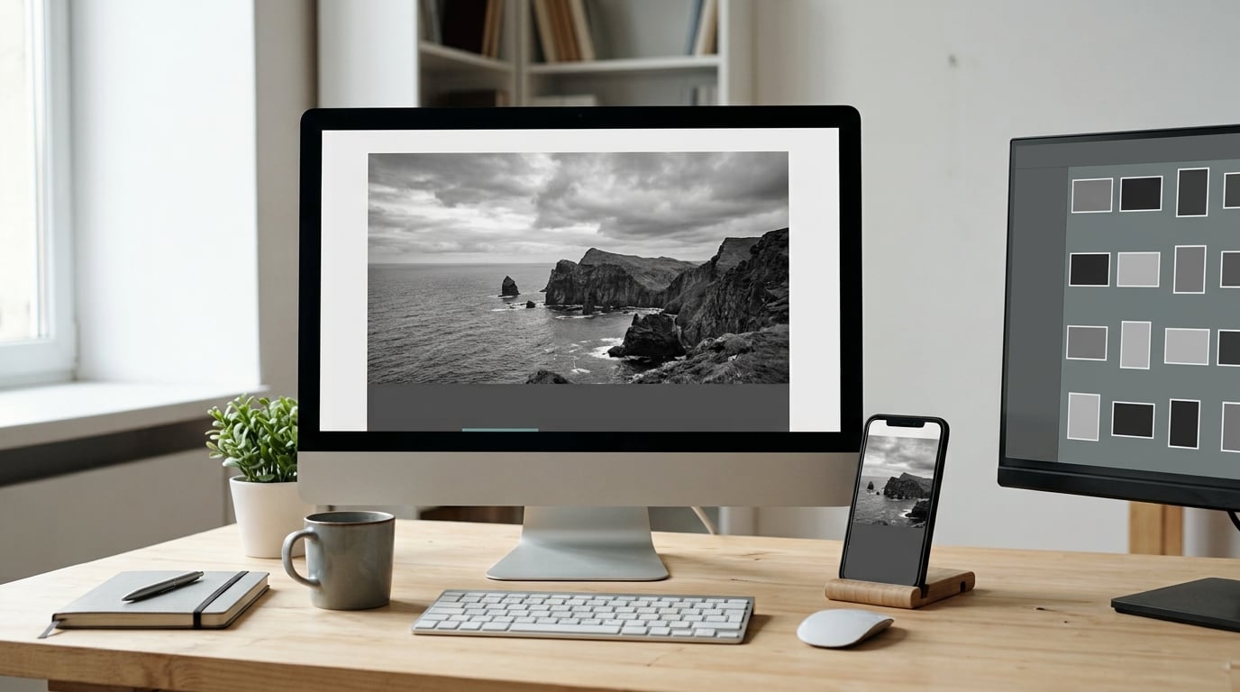
To build a photography portfolio website you need three things: a platform that handles big image galleries gracefully, a custom domain in your own name, and a small set of edited photographs you can defend. Most photographers get the third one right, then stall on the first — because the choice feels bigger than it is.
There are three practical routes. Use a dedicated portfolio builder if you want galleries, proofing and print sales without touching code. Use a general site builder like Squarespace or Wix if you also sell other services. Go self-hosted on WordPress when you need full control and are willing to maintain it. Pick one and the rest of the build takes a weekend.
Table of Contents
- What You Need
- Step-by-Step: How to Build a Photography Portfolio Website
- Define Your Positioning and Ideal Visitor
- Choose a Platform and Custom Domain
- Design a Cohesive Visual Identity
- Curate and Organize Your Best Photographs
- Build the Core Portfolio Pages
- Optimize Images for Speed and Search Visibility
- Add Contact, Proofing, and Sales Features
- Test, Publish, and Maintain the Portfolio
- Mistakes to Avoid During the Build
- Common Mistakes and How to Fix Them
- Frequently Asked Questions
- Do I need coding skills to build a photography portfolio website?
- What is the best platform for a photography portfolio?
- How many photographs should I include in my online portfolio?
- What file format and resolution should I use for portfolio images?
- Should a photography portfolio include pricing?
- How often should I update my photography portfolio website?
- Conclusion
What You Need
Before you open a browser, line up these seven items. Missing any one of them shows up later as a half-finished site.
- A defined niche. One or two genres you want more of — wedding, corporate headshots, landscape, editorial. “Photography” is not a niche. “Documentary-style wedding coverage in the Pacific Northwest” is.
- An edited body of work. Fifteen to twenty-five finished images per gallery is plenty. More than that and nobody looks at any of them.
- A custom domain. Something like
www.yourname.com. A subdomain on someone else’s builder looks like a portfolio you haven’t outgrown yet. - A platform decision. Dedicated portfolio builder, general site builder, or self-hosted WordPress.
- An image export workflow. In Lightroom: sRGB color space, quality around 80, long edge 2000–2500 px for full-width images and 1200–1600 px for grid thumbnails.
- Consistent file naming.
clientsmith-wedding-ceremony-014.jpgbeatsDSC4821.jpg. You will thank yourself during the next re-sort. - A contact method. A real email address you check, plus somewhere for visitors to send details without leaving your site.
Descriptive alt text is worth writing now too, not later. It is thirty seconds per image and it does work for search visibility and for visitors using a screen reader.
Step-by-Step: How to Build a Photography Portfolio Website
Define Your Positioning and Ideal Visitor
Write one sentence describing who photographs you make, in what style, for whom — and use it to filter every later decision. If your statement is “black-and-white fine-art landscape photography printed in small editions,” then the site is quiet, typographic, generous with white space, and built around a shop. If it is “surreal photomontage for album covers and editorial features,” the site can be stranger, darker, and full-bleed.
Then name the one action you want a visitor to take: book a session, request print pricing, email for a commission, or download a licensing PDF. One site, one primary action. If you cannot decide, you will build a page that does none of them well.
How to verify this step: read your statement aloud, then look at your five strongest frames. If the words do not describe those photographs, the statement is wrong, not the photographs.
Choose a Platform and Custom Domain
Choose on three axes: how much layout control you need, how much upkeep you can tolerate, and whether galleries or a store are the point.
- Dedicated portfolio builders (Adobe Portfolio, Format, Pixieset, Cargo) understand photographs natively. Masonry grids, lightbox viewing, client proofing, print fulfillment and instant retina exports come built in. You give up deep customization.
- General site builders (Squarespace, Wix) are more flexible and let you add services, blog and booking around the images. You maintain the image behavior yourself.
- Self-hosted WordPress with a photography theme gives total control and the best long-term flexibility, and it is the one option that costs you time on every update, backup and security patch.
- Hand-coded sites stay relevant. Photographers report exporting galleries straight out of Lightroom as static HTML, which is a genuinely free path if you are comfortable with files and folders.
Wix versus Squarespace comes down to design ambition. Squarespace produces cleaner, more typographic results with far less fiddling, and its image handling is more predictable. Wix offers a larger template library and stronger service integrations, at the cost of layouts that can drift toward generic if you rush them.
Register your domain, then connect it inside the platform’s domain settings rather than letting the builder publish on a free subdomain. SSL is automatic on all of these, so check that the padlock appears before you announce the site.
Verify: type your domain into a private window, watch where it lands, and confirm the navigation works on the first click. If it redirects twice, fix it now.
Design a Cohesive Visual Identity
Your photographs are the design. Everything else — type, color, spacing — exists to get out of their way.
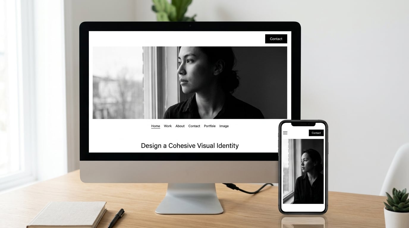
Pick two typefaces maximum: one for headings, one for body, and a clear size gap between them. Choose one neutral color for text and surfaces, plus a single accent used only for links and the contact button. Photos in a grid will fight a loud background every time.
Sketch the homepage on paper first. One large hero image, a short positioning line, six to twelve thumbnails, a contact button that is visible without scrolling on a phone. Photographers who wireframe before building report far fewer redesigns later, because the structure is settled before the pixels are.
Keep navigation to five or six items, always at the top, always the same order on every page. A photography portfolio site lives or dies on whether someone can reach the work in one click.
Verify: shrink the browser to phone width and look at it. If the hero image is cropped into something unrecognizable, the crop settings need adjusting before you add more pages.
Curate and Organize Your Best Photographs
Fifteen to twenty-five strong images per gallery beats eighty adequate ones, because visitors judge you on the weakest frame they see.
Edit ruthlessly in your catalog, not in the browser. Flag the keepers, then cut everything that only exists because you shot it. A useful rule of thumb is a 20-60-20 split: roughly 70% of the portfolio should be the work you actively want more of, 20% adjacent work that shows range, and 10% experiments that show ambition.
Then sequence. Open each series with your strongest frame, build a rhythm between wide shots and details, and end on something quieter. A gallery should read left to right like a short story, and a caption of one line per image is often enough context — place, subject, year.
How to tell a gallery is cohesive: squint at it. If it reads as one body of work at a distance, it holds. If you can immediately identify three unrelated assignments, split it into separate series pages.
Build the Core Portfolio Pages
Five pages cover almost every portfolio: home, series, about, services, contact.
The homepage does one job: show your best work and make the next click obvious. One hero image, a positioning line, a grid of recent series, a contact button.
Series pages hold the galleries themselves. One series per page beats dumping everything into a single archive, because it gives each body of work its own URL, title and description for search.
The about page is where clients actually decide. A real photograph of you, a short paragraph about how you work, your location and service area, and a line about what a session with you is like. Clients hire a person, not a lens.
Services or prints states what you offer, what is included and what happens next. For fine-art and print sellers, this is where edition, paper, sizing and licensing live.
The contact page repeats your email in plain text and gives a form for people who would rather not open a mail app.
Optimize Images for Speed and Search Visibility
Export for the web, upload those files, and never let a raw camera file touch your server — file size is the number one cause of a slow photography site.
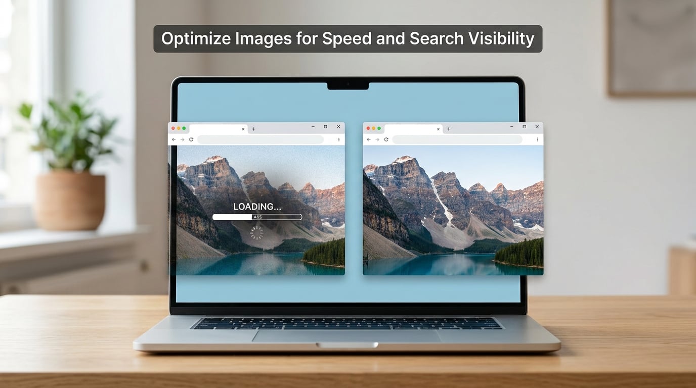
Export in sRGB, quality around 80, long edge 2000–2500 px for full-width images. Grid thumbnails can go much smaller, around 1200–1600 px. A well-compressed full-width portfolio JPEG usually lands well under 400 KB, and if one of yours is over 1 MB, run it through a compression tool before uploading.
Turn on responsive images so phones get small files and large screens get large ones, and enable lazy loading so images below the fold do not load until someone scrolls to them. Name files descriptively and write alt text that describes the picture in plain words — alt text is read aloud by screen readers, so “bride walking down the aisle of a stone church” beats “wedding1”.
Give every series page a distinct page title, meta description and a few sentences of body copy. Search engines cannot read your photographs, and a page with no text is a page with nothing to quote.
Verify: run the homepage through Google’s PageSpeed Insights tool and check the score on mobile, which is the harder test. Then load the page on a real phone on mobile data, not office wifi.
Add Contact, Proofing, and Sales Features
Add the essentials first — a working form, a visible email, social links — then add proofing or print sales only once inquiries are actually arriving.
A good contact form asks for name, email, what they need, a date or deadline if there is one, and how they found you. That last field alone tells you which pages and posts are producing work. State a response time, such as within two business days, so people know when they will hear back.
Optional add-ons, in the order most photographers end up wanting them: a mail newsletter, client proofing with favorites and comments, a print shop integration for fulfillment, licensing information for commercial buyers, and online booking if you are at capacity.
Proofing is worth explaining to clients before they need it, because a gallery they have already approved is a gallery you do not reshoot. Keep it separate from your public portfolio rather than password-hiding your public work.
Verify: send yourself a real submission from a phone, not a desktop. Confirm it lands in the inbox you actually check, and that the auto-reply reaches the sender.
Test, Publish, and Maintain the Portfolio
Test on real devices, submit the URL to search engines, then treat the site as a living document rather than a launch-and-forget project.
Run through this before you announce anything:
- Open the site on an Android phone and an iPhone, not just a desktop preview.
- Click every navigation item and every thumbnail.
- Submit the contact form and confirm the email arrives.
- Zoom in to 200 percent and confirm text stays readable.
- Check every image has alt text and every page has a title.
- Run PageSpeed Insights and fix anything dragging the mobile score down.
- Add analytics so you can see which pages get visited.
- Submit the site to Google Search Console and confirm the sitemap is found.
- Set up automated backups if you self-host, and know where they are stored.
- Announce it, then put a quarterly review in your calendar.
That last item is the one people skip. A site last updated two years ago reads as “not currently working,” which is exactly the impression a portfolio should never give. Even a modest refresh — three new images, one updated series — reverses that reading.
Mistakes to Avoid During the Build
Most portfolio sites fail on process rather than taste: too many images, an unedited first draft, and a launch that was never tested.
- Showing everything. Cut to your strongest work; a thin portfolio reads as confident and a crowded one reads as unfocused.
- Designing before editing. Upload your final selects, not your raw catalog with a filter applied later.
- Hiding the contact button. If the only contact is in a footer below twelve images, assume you will get fewer inquiries than you deserve.
- Writing alt text last, in a hurry. Batch it while you are still naming and exporting files.
- Building print sales before the portfolio works. Nobody buys a print from a site with no body of work on it.
Common Mistakes and How to Fix Them
These are the errors that keep showing up in finished portfolio sites, with the fix and the way to confirm it worked.
Too many images. One fix: cap every gallery at 15–25 frames and give each series its own page. To verify, count the images on your longest page — if you cannot count without scrolling back, it is too long.
Inconsistent presentation. Mixing aspect ratios, crops and color treatments makes good work look careless. Fix it with one export preset applied to every image, and check a grid thumbnail at thumbnail size — that is how visitors will actually see most of your work.
Slow pages. Oversized files are almost always the cause. Fix it by re-exporting at sRGB and a smaller long edge, then confirming the improvement in PageSpeed Insights on mobile. Your own screenshots of the before and after numbers are worth keeping.
Poor navigation. If series are buried under dropdowns, a visitor leaves. Fix it with a flat structure and a homepage grid that links directly to each series, then test by reaching a gallery in one click from the homepage.
Missing context. A grid of unexplained frames gives an art buyer nothing to hold onto. Fix it with one caption line and two or three sentences per series about where the work was made and why. Read them aloud — if you cannot say it naturally, cut it.
No call to action. Fix it with one visible button, one destination, and one sentence about what happens after they click. Verify by checking how many form submissions arrive once it is live.
Weak metadata. Unique page titles, real descriptions, descriptive filenames and honest alt text on every image. Verify by searching Google for your own name plus your location; if the wrong page comes up first, the titles are not doing their job.
Frequently Asked Questions
Do I need coding skills to build a photography portfolio website?
No. Every route described here works without touching code, because portfolio builders and general site builders handle galleries, mobile layout and domains for you. Coding only becomes necessary when you want a layout no template offers, or when you self-host WordPress and need to resolve a plugin or theme conflict. Most photographers who learn even basic HTML and CSS end up changing type sizes and spacing, which is a comfortable middle ground.
What is the best platform for a photography portfolio?
For most working photographers, a general site builder like Squarespace or Wix is the best balance of image handling and flexibility. Adobe Portfolio is the fastest start but constrains layout, and people often outgrow it. Format and Pixieset are stronger for client proofing and print sales. Self-hosted WordPress offers the most control and demands the most maintenance. Choose based on how much upkeep you can sustain, not on features you might need in three years.
How many photographs should I include in my online portfolio?
Fifteen to twenty-five finished images per gallery is a good target, with a homepage grid of six to twelve. The number matters less than the edit: twenty cohesive frames that tell one story outperform eighty varied ones. A useful split is 70 percent the work you want more of, 20 percent adjacent work for range, and 10 percent experiments. If a gallery feels thin, add a stronger image rather than a longer one.
What file format and resolution should I use for portfolio images?
Export JPEGs in sRGB color space at quality 80 or so, with the long edge around 2000 to 2500 pixels for full-width images and 1200 to 1600 pixels for grid thumbnails. A properly compressed full-width image usually stays well under 400 KB. Keep your original RAW files for printing and archiving, and let the platform generate the retina and mobile versions from the files you upload.
Should a photography portfolio include pricing?
It depends on your niche. Weddings, headshots and commercial sessions benefit from published starting prices, because it filters out mismatched inquiries and signals that you take the work seriously. Fine-art and editorial photographers often keep pricing private and move the conversation to email or a printed price list. Whatever you choose, describing the scope and deliverables clearly matters more than the number itself.
How often should I update my photography portfolio website?
Review it quarterly and add something each time: a new series, a refreshed gallery, an updated testimonial. Regular activity signals that you are currently working, and a site that changed two years ago reads as dormant no matter how good the photographs are. A larger refresh, such as a new homepage hero or a redesigned series page, is worth doing once a year. Keep the maintenance effort small enough that you will actually do it.
Conclusion
Here is the whole build in one pass. Choose your niche and name the one action you want visitors to take. Edit down to your strongest series and sequence it. Pick a platform, register your domain, and connect them. Sketch the homepage on paper, then build five pages. Export in sRGB, upload compressed files, write alt text while you upload. Add a contact form that reaches your inbox. Test on two real phones, then publish.
Start with one thing today: pick your strongest photographic series, write the audience you want to see it, and outline the gallery structure. Everything else on this list is a weekend of work that follows from those three decisions.