
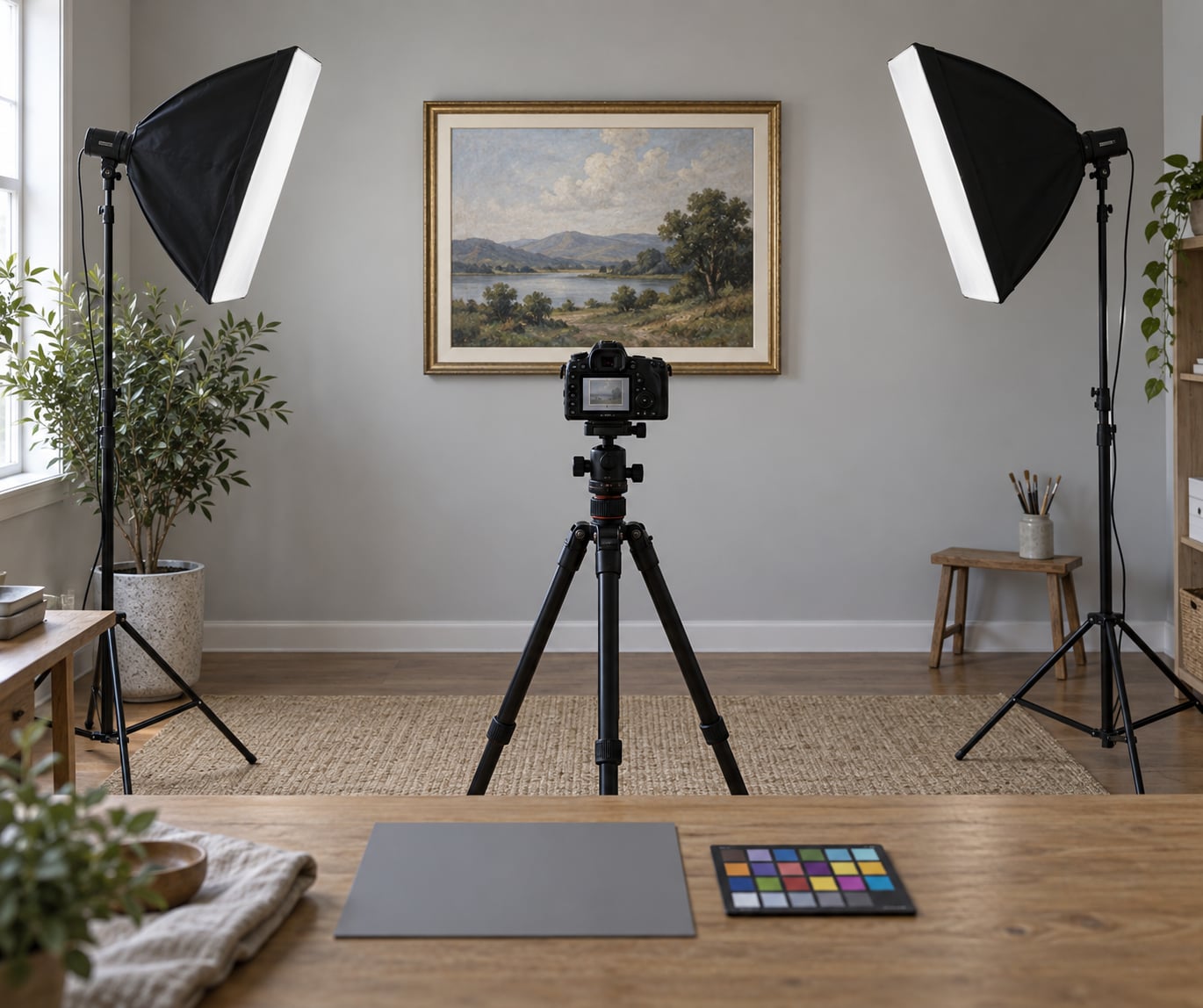
To photograph artwork for prints you need four things working together: the camera held exactly parallel to the surface, two matched sources of soft light at 45 degrees, manual camera settings at ISO 100 and f/8 to f/11 in RAW, and a grey card reference so colour can be corrected before you export at 300 DPI. Set up once and the whole session takes 30 seconds a piece.
The reason this matters is that a print is judged harder than a screen. A yellow cast, a glare hotspot or a slightly tilted frame looks like a rendering problem once it is 24 inches wide in someone’s living room, and buyers read that as carelessness.
None of this needs a studio. A spare room, a tripod and two lamps will get you a file a print lab will accept. The rest of this guide walks through the workflow in the order you should actually do it.
Table of Contents
- What You Need
- Step-by-Step: How to Photograph Artwork for Prints
- 1. Prepare the Artwork and Photographing Area
- 2. Set Up the Camera for Maximum Resolution
- 3. Use Even, Diffuse Lighting
- 4. Correct Perspective and Framing
- 5. Capture Colour and Detail Checks
- 6. Photograph the Artwork from Multiple Exposures
- 7. Compare the Capture with the Original
- 8. Edit the Image for a Print-Ready File
- 9. Export and Verify the Print File
- Common Mistakes
- Frequently Asked Questions
- Is it better to photograph or scan artwork?
- Can I photograph artwork with my phone and still get print quality?
- What camera settings are best for photographing artwork?
- How do I avoid glare when photographing a painting?
- What resolution do I need to print my artwork?
- Should I photograph artwork before or after varnishing?
- Conclusion
What You Need
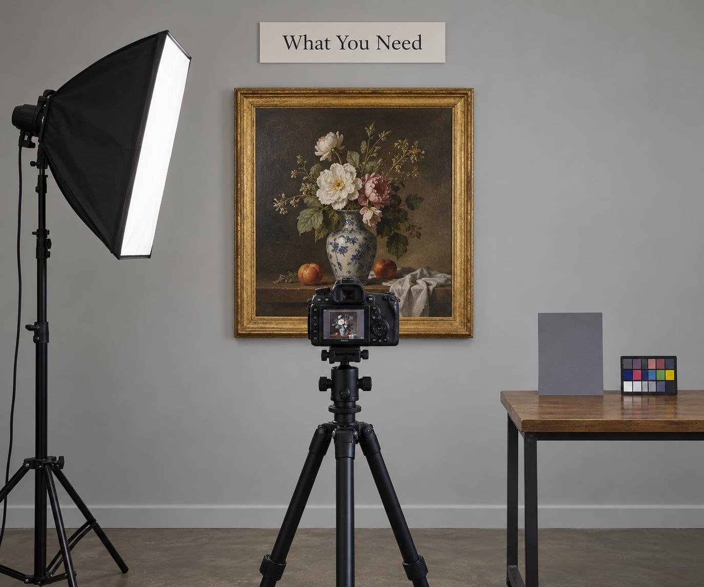
A camera is the obvious item, but it is the least important one. A recent phone with a 12-megapixel main camera and RAW capture produces a better artwork file than a ten-year-old DSLR held in shaky hands.
- Camera or phone. Full-frame or APS-C interchangeable body if you have one; a phone with a 2x optical lens works well too. Resolution matters far more than the sensor.
- Tripod. This is the one piece of gear I will not let anyone skip. Hand-holding introduces enough micro-shake to soften fine texture even at fast shutter speeds.
- Two identical light sources with diffusion. Softboxes, LED panels through a white sheet, or a large window plus a bounce. They must match in colour temperature and output.
- Grey card or colour checker. A cheap grey card fixes white balance. A colour checker also lets you build a correction profile and check your reds and blues.
- Ruler or tape measure. You need the exact artwork dimensions in inches to calculate print resolution later.
- White foam board. Acts as a reflector to lift the shadow side when you are working with window light alone.
- Remote release or 2-second timer. Removes your hand from the shutter. Phone timers do the same job.
Skip the polarising filter unless you are dealing with glass or heavy gloss varnish. It costs edges of contrast and you can often solve the same glare by repositioning the light.
Step-by-Step: How to Photograph Artwork for Prints
The goal of every step below is a technically accurate master file. Editing comes after, and it should be limited to correcting what the lens and the room got wrong, not repainting the work.
1. Prepare the Artwork and Photographing Area
Work with the piece flat, clean and fully dry. Wipe the surface with a dry microfibre cloth, let varnish cure for at least a few weeks, and check the edges for warping that will catch a raking light and throw a shadow across the image.
Hang the piece on a blank wall or rest it flat on a table covered with white foam board. Close curtains and turn off household bulbs, because warm indoor bulbs will fight your daylight and give you a colour cast you will spend an hour chasing later.
2. Set Up the Camera for Maximum Resolution
Mount the camera, shoot RAW, and set ISO 100 for the cleanest file. Choose manual exposure at f/8 to f/11, which keeps the whole surface sharp from the corners in.
Switch off image stabilisation when the camera is on a rigid tripod, since stabilisation can introduce its own slight softness. Use focus peaking or manual focus magnified to 100 percent on a high-contrast edge. A remote release or the 2-second self-timer keeps shake out.
Check the histogram before you shoot. Bright whites should sit just below clipping so you keep headroom for the print.
3. Use Even, Diffuse Lighting
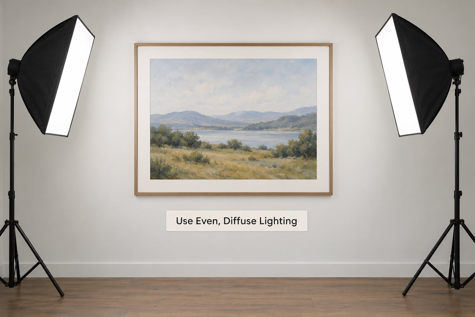
Place two identical lights at roughly 45 degrees to the wall, one on each side, about 4 to 6 feet from the artwork, and as far from it as you can manage. Distance matters because light falls off with distance, and further back means gentler fall-off across the surface.
Diffuse everything. A bare bulb or a small reflector gives you a hotspot in the middle and a shadow in the corners. Bounce light off a white ceiling or sheet if you have to.
On the sunlight question you will find in most guides, both camps are half right. Direct sun has a full visible spectrum and photographers who work in it can meter and correct it well, but it also creates hot patches and forces you to work fast. Overcast daylight is even and forgiving but soft and slightly blue. For most people shooting at home, overcast daylight or diffused window light wins. If you shoot in direct sun, wait for a thin cloud or use a scrim.
Never mix a warm lamp with daylight. One grey card cannot rescue two different colour temperatures in the same frame.
4. Correct Perspective and Framing
Stand the camera at the exact centre of the artwork, at the height of its middle, with the lens perpendicular to the surface. Use a spirit level on the tripod head if you have one, or check that the top and bottom edges of the artwork are the same length in the frame.
When the camera tilts, the far edge shrinks and the piece becomes a trapezoid. This keystoning cannot be fully undone later because it changes the geometry of the picture itself.
Leave a small margin of wall around the frame rather than filling the shot edge to edge. You want enough pixels for the largest print you plan, and margin gives you room to correct minor tilt.
5. Capture Colour and Detail Checks
Put the grey card in the artwork’s plane for one frame, in the same light, then take it out. In Lightroom, use the eyedropper on the grey patch to set a custom white balance, and check the two darkest and lightest patches on a colour checker.
The grey card has to sit in the frame. Photographing it separately on a different surface tells you about that surface, not about the painting.
Then zoom in at 100 percent on a textured area and look for three things: focus, clipping in the highlights, and canvas weave or paper tooth throwing tiny shadows. Those micro-shadows on oil and watercolour are normal, but they should not be so strong that the texture reads as damage.
6. Photograph the Artwork from Multiple Exposures
Shoot a bracketed sequence for anything with a difficult range: glossy varnish, deep blacks, metallic leaf, or mixed media with both chalky matte passages and wet-looking darks.
Keep everything fixed between frames. Camera position, lights, focus and aperture stay identical. If you move the tripod, the three frames will not merge and you will have shot yourself a very tidy mistake.
Two frames either side of your meter reading is usually enough. More than that and you are stacking noise for no gain.
7. Compare the Capture with the Original
Put the piece and the capture side by side under the same neutral light and compare hue, brightness, contrast, texture and shadows. On a colour-managed screen, the file should look like the artwork.
Look for three failure signatures. A green cast usually means mixed daylight and indoor light. A warm cast means tungsten bulbs or a missing white balance step. A soft haze across the lower third usually means a reflection, so change the angle of the light rather than editing it out.
If anything reads wrong, fix the cause and reshoot. Do not build a correction on top of a flawed capture, because the file keeps the flaw forever.
8. Edit the Image for a Print-Ready File
Edit in a fixed order so each step feeds the next. Crop and straighten for geometry first, apply lens and perspective corrections non-destructively, then set white balance from the grey card, then exposure, then dust removal last.
Resist heavy saturation. The most repeated complaint from artists on painting forums is that their edited photos come out over-saturated and wrong, almost always because they pushed vibrance to compensate for dull lighting instead of fixing the lighting.
Work from the original RAW file and never overwrite it. If you photograph before varnishing and the finished surface looks better, you will want the option.
9. Export and Verify the Print File
Export a 16-bit TIFF as the archival master, keep the RAW, and produce a high-quality JPEG for quick review. Send sRGB unless the lab specifically asks for an embedded profile in another space, and never send the RAW straight to a printer.
Check the pixel dimensions against your target size. Multiply the print width in inches by 300 for the pixel width you need, then confirm your file is at least that big with a little extra to spare.
| Artwork size | Longest print at 300 DPI | Longest print at 200 DPI |
|---|---|---|
| 8 x 10 in | 2400 x 3000 px | 1600 x 2000 px |
| 12 x 16 in | 3600 x 4800 px | 2400 x 3200 px |
| 16 x 20 in | 4800 x 6000 px | 3200 x 4000 px |
| 20 x 24 in | 6000 x 7200 px | 4000 x 4800 px |
| 24 x 36 in | 7200 x 10800 px | 4800 x 7200 px |
| 30 x 40 in | 9000 x 12000 px | 6000 x 8000 px |
Before a full edition, order one small test print and hold it next to the original under neutral light. That single print catches more problems than any amount of on-screen checking.
Common Mistakes
Mixed light sources are the most common failure and the easiest to prevent. Unplug every warm bulb in the room, close curtains against tinted glass, and shoot with one matched lighting setup. If a corner is darker than the rest, you were too close to the artwork.
Glare from glass or gloss varnish is a geometry problem, not a post-processing one. Move the lights off the reflection angle, angle the frame very slightly if you own it, or shoot the unglazed work. A polarising filter helps on some surfaces but costs contrast.
Camera tilt produces a trapezoid that no crop can fix. Reset the tripod, centre the camera on the artwork, and verify with the edges in the frame.
Wrong white balance is usually down to skipping the grey card. Photograph it in the frame, sample it with the eyedropper, and set a custom temperature.
Over-editing is the quiet one. Heavy contrast, crushed blacks and boosted saturation all shrink the tonal range the print lab has to work with, and the piece ends up looking harsher than it is in the studio.
Dust shows up hardest on glossy surfaces under raking light. Clean the front element, wear a clean shirt, and use the spot removal tool sparingly in 16-bit so you are not smearing texture.
JPEG-only workflows destroy your options. An 8-bit compressed file cannot recover clipped highlights, and the quality loss compounds every time you resave it.
Unstable focus ends the shoot. A tripod, manual focus at 100 percent magnification, and a 2-second timer cost nothing and fix most softness complaints.
One final quality-control habit: photograph a grey card in the first frame of every session. If it reads neutral on the histogram, the lighting is doing its job. If it does not, you have found the problem before the artwork.
Frequently Asked Questions
Is it better to photograph or scan artwork?
Photograph anything larger than about 8 x 10 inches, and anything textured, dimensional or on canvas. Scanners are unbeatable for flat paper works, giving you an even, perfectly repeatable result with no perspective correction. A camera handles canvas, board, heavy paper and mixed media without forcing you to press the work flat against glass. Photograph it unless your work is small, flat and matte.
Can I photograph artwork with my phone and still get print quality?
Yes, for prints up to roughly 16 x 20 inches, provided you shoot RAW and work carefully. Turn on the camera grid, lock exposure by long-pressing on the artwork, tap to focus on a high-contrast edge, and use the 2x lens rather than the ultra-wide. Support the phone on a tripod or a stack of books and set a timer. A 12-megapixel RAW file gives you 300 DPI at 16 x 20 inches.
What camera settings are best for photographing artwork?
ISO 100, RAW, manual exposure, and f/8 to f/11 for sharpness across the surface. Focus manually at 100 percent magnification or use focus peaking, and trigger with a 2-second timer or remote release. Turn off image stabilisation when the camera sits on a tripod. Set a custom white balance from a grey card in the frame, and leave highlights just short of clipping so the print has headroom.
How do I avoid glare when photographing a painting?
Move the lights instead of editing the reflection out. With glass or gloss varnish, place your two lights at 45 degrees well away from the mirror angle, and move the camera slightly off-centre if the surface is curved. Turning off flash helps too, since a bare flash fires straight back into the glass. If a reflection persists, photograph the unframed work or pull the glazing and shoot the piece itself.
What resolution do I need to print my artwork?
Multiply your print width in inches by 300 for the pixel width you need. A 24 x 36 inch print needs 7200 x 10800 pixels at 300 DPI, while the same size at 200 DPI only needs 4800 x 7200. Most print labs quote 300 DPI as the quality threshold and allow 200 DPI for larger pieces viewed from further away. If your file falls short, photograph in a higher resolution mode.
Should I photograph artwork before or after varnishing?
Shoot before varnishing for your master file, because varnish adds a gloss surface that introduces reflections and slightly shifts colour. Shoot again afterwards for the archive and for mockups, since varnish is what the buyer actually sees. Let varnish cure fully first. If you only have time for one session after varnishing, tilt the lights well off the reflection angle and use a longer exposure at ISO 100.
Conclusion
Start with the three things that cause most failures: secure the artwork so it cannot shift, set up two matched diffused lights at 45 degrees on either side, and photograph a grey card in the frame before you take anything else.
From there the workflow is mechanical. Parallel camera, ISO 100, f/8 to f/11, RAW, timer release, edit in order, export a 16-bit TIFF at 300 DPI, and order a single test print before you produce an edition. Once you can repeat that sequence on a single piece, a batch session of twenty takes about the same effort as one.