
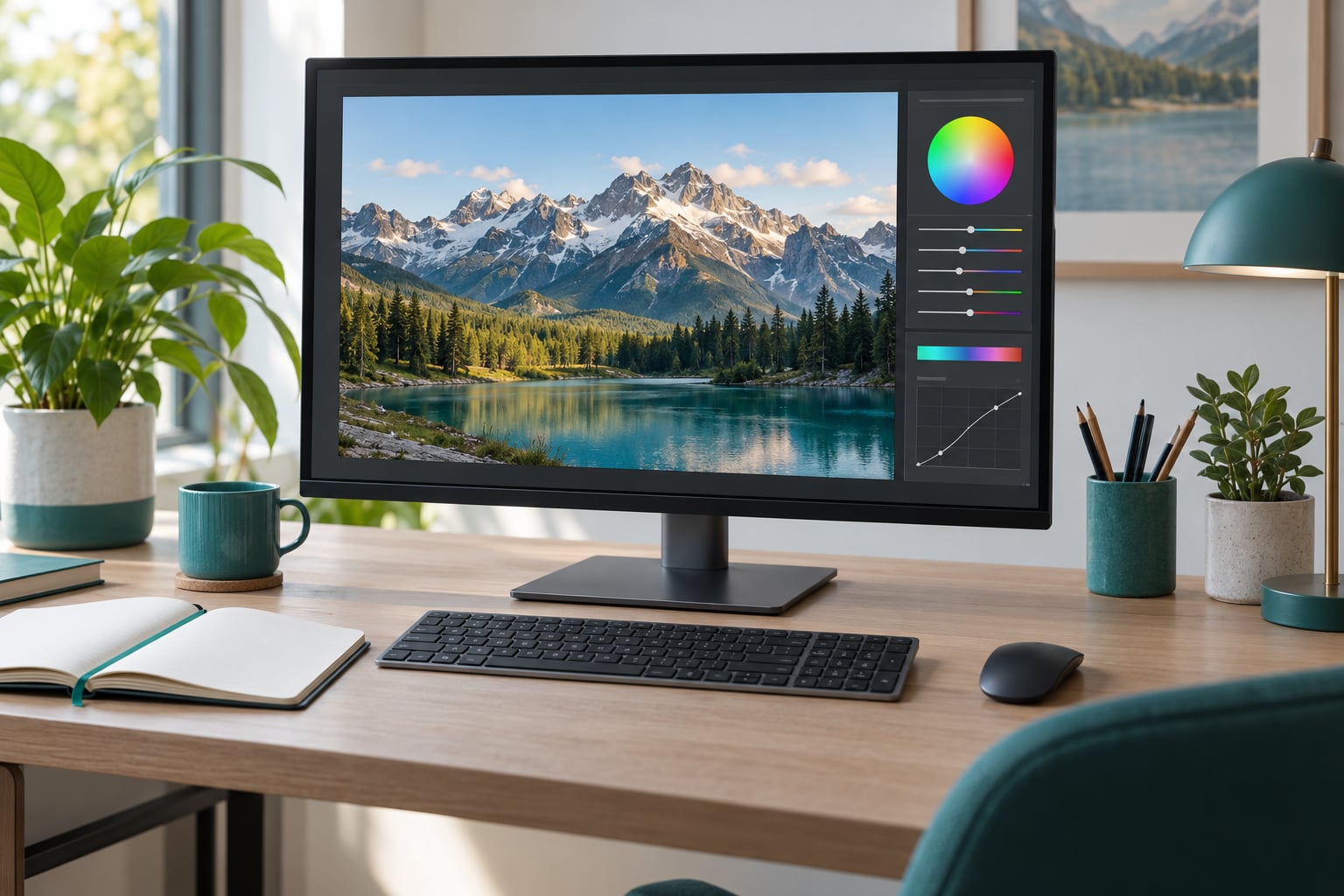
The HSL panel in Lightroom lets you change the color of one part of a photo without touching the rest. Open the panel in the Develop module, click the targeted adjustment tool, click a color in the image, and drag up or down to shift its hue, saturation or luminance. Most good edits stay within about 30 points on any slider.
It sounds technical because the panel is really three controls — hue, saturation and luminance — repeated eight times, once for each color range. Once you know which range holds the color you are looking at, the whole thing takes about a minute per photo. Here is how to use the HSL panel in Lightroom, step by step, with the values I start from every time.
Lightroom has renamed this panel more than once, and that is where most beginners get stuck looking for it. In Lightroom Classic it sits under Basic and Tone Curve labelled HSL / Color. From Classic version 13 it is called Color Mixer, with a Point Color picker beside it. Same sliders, different name.
Table of Contents
- What You Need
- Step-by-Step: How to Use the HSL Panel in Lightroom
- Frequently Asked Questions
- What is the HSL panel in Lightroom?
- How do I use the targeted adjustment tool in the HSL panel?
- What do hue, saturation, and luminance mean in Lightroom?
- Can I use the HSL panel on Lightroom mobile?
- Should I use HSL or white balance to fix a color cast?
- Can I make a black-and-white image with the HSL panel?
- Conclusion
What You Need
Three things, and two of them are already on your computer.
- Lightroom Classic or the cloud-based Lightroom desktop app. The HSL panel lives in the Develop module of both.
- A photo already imported and open in Develop. It works on RAW and JPEG files equally well, and because every change is non-destructive you can always go back.
- Optionally, a calibrated monitor. Without one, the sliders still work fine, but your judgment of “is that too green” is really a judgment about your screen. A cheap colorimeter and a correctly profiled display change how the sliders read.
On mobile you get the same panel under a different roof: in Lightroom Mobile it sits in the Edit panel, below Color and above Detail. The sliders are identical, including the circle icon for the targeted adjustment tool.
If you plan to build a look you reuse, it is worth knowing how to save these settings as a preset once you have them dialed in. How to create Lightroom presets covers that, and the HSL values travel inside the preset.
Step-by-Step: How to Use the HSL Panel in Lightroom
Open the HSL Panel in Lightroom
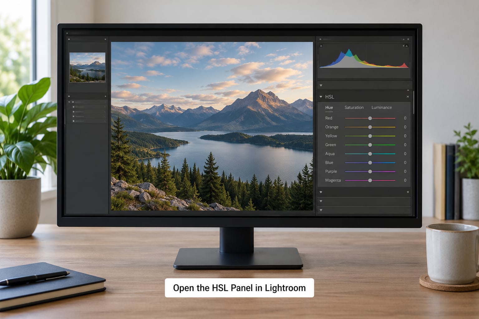
In Lightroom Classic, press Ctrl+Alt+Shift+H on Windows or Cmd+Option+Shift+H on a Mac to jump straight to it. If that does nothing, scroll the right-hand panel group downward: the panel sits below Basic and Tone Curve, above Color Grading and Detail. In versions 13 and later the same block reads Color Mixer.
The panel itself is three tabs across the top — Hue, Saturation, Luminance — with eight color bands stacked underneath: red, orange, yellow, green, aqua, blue, purple and magenta. Every slider runs from -100 through 0 to +100, and clicking a band name rather than a slider selects that color range for the targeted adjustment tool.
If the panel is genuinely not there, three fixes cover almost every case. Check the panel layout menu at the bottom of the right-hand column and switch between Expanded, Collapsed and Hidden layouts. Then check View in the menu bar for Panel Endmarks, which some people switch off by accident. And if you recently updated the app, give it a restart — a stale panel cache is a real thing and it clears itself.
Use the Targeted Adjustment Tool
This is the fastest way to learn where each color actually lives, because it removes the guessing.
- Click the small circle icon at the top of the HSL / Color panel to activate the targeted adjustment tool.
- Click directly on a color in the photo. Lightroom samples that pixel, selects the range that holds it, and shows a red or gray overlay across the rest of the image so you can see the exact area being affected.
- Drag up or down to move the three sliders together. Escape exits the tool and keeps the adjustment.
Holding Shift while you drag moves saturation and luminance without touching hue, which is what I want most of the time. Alt while dragging isolates that single slider.
Two habits make this reliable. Click on a mid-tone area, not a highlight or a shadow, because extremes often fall on the boundary between two ranges and the response feels mushy. And if you overshoot, press Ctrl+Z once rather than dragging the sliders back manually — the whole targeted adjustment moves as a single history state, so one undo removes all of it.
The point of the tool is worth repeating because it is the single most misunderstood thing about this panel: it samples a color, not a place. If a blue jacket and the sky share a hue range, clicking either one adjusts both. That limitation is what masks are for, and I get to that below.
Adjust Hue, Saturation, and Luminance
Hue is the color’s identity. Moving a band shifts it toward its neighbor on the color wheel, and the travel is short: at -100 most colors collapse into the same neighboring hue rather than wrapping around into a new one. Hue cannot turn a blue sky into a red sunset. If you need that, a gradient or a color mix overlay will do it, not a slider.
| Range | Negative moves toward | Positive moves toward | Typically found in |
|---|---|---|---|
| Red | Orange | Magenta | Autumn leaves, warm lights, sunburn |
| Orange | Yellow | Red | Skin tones, sunsets, sandstone |
| Yellow | Green | Orange | Grass and most foliage, sand, hair |
| Green | Aqua | Yellow | Deep leaves, moss, mossy shadows |
| Aqua | Blue | Green | Shallow water, cyan skies, reflections |
| Blue | Purple | Aqua | Sky, water, shadows, denim |
| Purple | Blue | Magenta | Twilight sky, flowers, bokeh |
| Magenta | Red | Purple | Neon signs, deep shadows, violets |
Saturation is how pure a color is. Positive pushes it toward electric and unnatural, negative pulls it toward the neutral gray of the same brightness. Pulling saturation down is the most useful thing in this panel — most flat RAW files look dull because sensors record a wide gamut but a conservative saturation, so putting 10 or 15 back into a blue is usually enough.
Luminance is how bright that color is, and it is the slider people underuse. Darkening a sky by dropping Blue luminance 15 to 30 looks natural; darkening it by dropping Blue saturation tends to just make it gray. Raising luminance on foliage separates it from the background without touching the color at all.
Two facts explain most of the “why does my slider do nothing” complaints. Ranges overlap softly at their boundaries, so a pixel can respond to two bands at once. And the names follow how software measures hue, not how people name colors: grass and most leaves live in Yellow, not Green, which is why nudging Yellow at +10 while dropping Yellow saturation 20 does more for a lawn than the entire Green band.
Use the HSL Color Mixer for Global Corrections
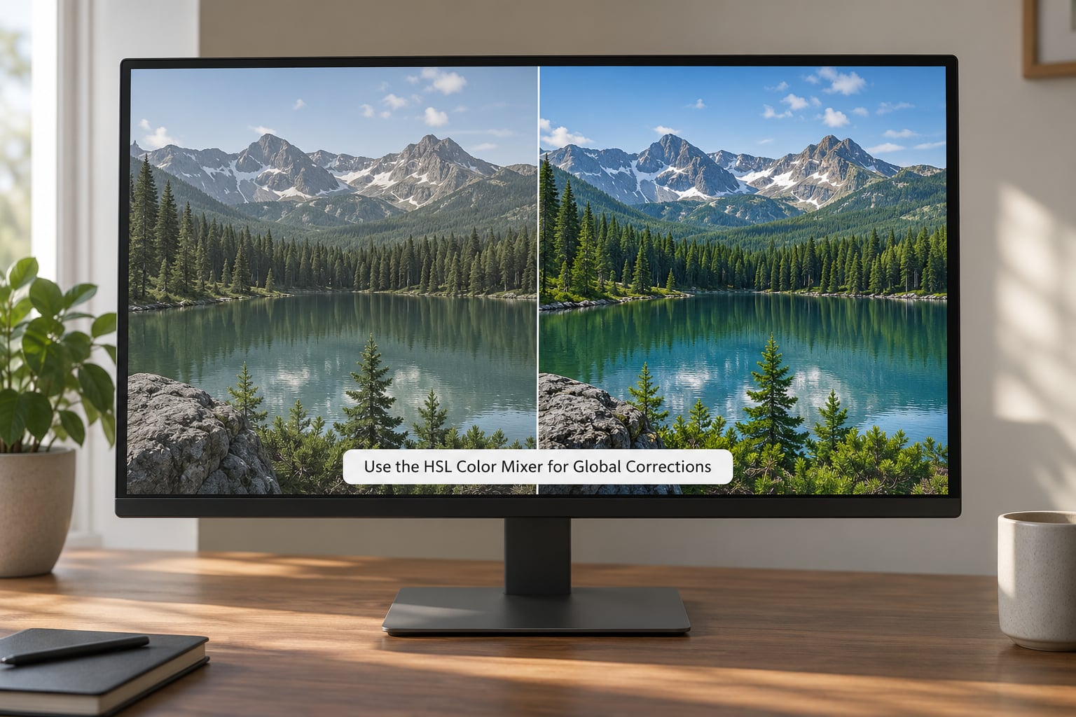
Now work band by band, without the targeted tool. This is the mode for a color cast, a sky that reads flat, or skin that needs evening out across a whole shoot.
A green cast is a good first exercise. Take a photo shot under fluorescent light, set White Balance with the eyedropper on a patch you know should be neutral, then open Color Mixer. Lower Green saturation by 15 to 25 and raise Magenta saturation by about 10. The magenta addition is what most tutorials skip and it matters — removing green alone leaves everything a bit anaemic, and the small magenta push puts the warmth back.
For a sky, three moves usually cover it: Aqua luminance down 10 to 20, Blue luminance down 15 to 30, and Blue saturation up 5 to 15. For foliage, Yellow hue toward green by 5 to 15, Yellow saturation down 10 to 25, and Yellow luminance up 10 if you want the leaves to lift off the background.
For skin, stay conservative: Orange luminance up 5 to 15, Orange saturation down 5 to 15, and Red saturation down 5 to 15 to stop the ruddy patches that plague outdoor portraits. Skin is the one range where going past about 15 looks wrong almost immediately.
Check your work at normal viewing size, not at 100%. Details that look fine zoomed in vanish at fit-to-screen, and the opposite is true too — the face that looked clean at 100% turns orange across the cheek when you zoom out. If you want a bigger color shift than a global band allows, my guide to color grading photos in Lightroom picks up where the sliders stop.
Everything above applies to the whole photo, which is the real limitation of the HSL panel. Blue is blue wherever it appears, so a jacket in the same frame gets the same treatment as the sky. When a correction needs to stay in one place, put the HSL sliders inside a mask. Paint it on with the Adjustment Brush, or drag a radial filter over the subject, and the HSL controls inside the mask’s disclosure triangle only affect the masked area. Skin tones are where this pays off most — an orange luminance lift on a masked face leaves the orange sand behind it exactly as it was.
One more check worth making for portrait work. Open the Scopes panel and switch the bottom right dropdown to the Hue Saturation scope, then hover over a cheek. The skin tone line sits in a narrow band in the lower orange arc. Push an orange slider hard and you can watch that line wander off, which is a faster way to notice a problem than squinting at the face.
Finish and Check the Edit
Before you move on, do four checks.
Toggle the whole adjustment off and on with the eye icon at the top of the panel. If the difference is hard to see, your values are small, which is fine. If it looks like a different photo, you went too far.
Look at the histogram with the clipping indicators in the Develop panel footer. Darkening Blue luminance often drags a sky’s blue channel toward zero and opens shadows around rooftops and tree lines, which is where halos come from. Back the value off by half and the halos go with it.
Zoom to 100% and look at three places: any edge against sky, the brightest part of the brightest color, and the smooth part of a gradient. Sky gradients are where banding shows up first, and the fix is less slider travel, not more.
Reset the panel only when you are genuinely starting over — Alt-click the panel’s three-dot menu and choose Reset, or press Shift+O for a temporary before view. Dragging sliders back to zero by eye wastes time and leaves the history panel full of states you have to step through later.
Once the values are right, copy them with Ctrl+C, select the other photos from the same shoot, and paste with Ctrl+V. HSL settings paste cleanly and this is how you keep a shoot consistent instead of re-tuning the same correction twenty times.
Common Mistakes
Adjusting the wrong color family. Almost always this means picking a color name instead of sampling with the targeted adjustment tool. Point at the thing you want changed and read which band lights up.
Fixing white balance in the HSL panel. Set the white balance first, then make HSL corrections. A cast pushed in HSL gets rebuilt from scratch the moment you touch the Temp slider.
Assuming HSL replaces exposure or contrast. If the sky is blown out, no color slider brings detail back. That is a highlight recovery job, and HSL is the wrong tool for it.
Overdoing saturation. Values past +30 on any band tend to look posterized on skin. If a color needs to sing, luminance is usually the safer lever.
Ruining skin tones. A -40 orange saturation turns a face gray-green and no amount of vibrance brings it back. Keep orange changes inside 15 and check at fit-to-screen.
Expecting one click to target one object. The targeted adjustment tool works on a color range across the whole frame. To restrict it to a single person or a face, put the HSL sliders inside a mask — the Adjustment Brush and radial filter both accept local sliders in current versions of Classic.
Never checking the corners. Darkening a sky is where halos appear, and boosting luminance on one range is where noise shows up in the shadows. Both are invisible at fit-to-screen and obvious at 100%.
Frequently Asked Questions
What is the HSL panel in Lightroom?
The HSL panel is a color adjustment panel in Lightroom’s Develop module. It divides the image into eight color ranges — red, orange, yellow, green, aqua, blue, purple and magenta — and gives you hue, saturation and luminance sliders for each one. You use it to change a single color without shifting the rest of the frame. In Lightroom Classic it is labelled HSL/Color; from version 13 it is called Color Mixer.
How do I use the targeted adjustment tool in the HSL panel?
Click the small circle icon at the top of the HSL/Color panel, then click directly on a color in your photo. Lightroom selects the range that holds it and overlays the rest of the image in red or gray so you can see what is affected. Drag up or down to move hue, saturation and luminance together, and press Escape when you are done. Hold Shift while dragging to skip hue.
What do hue, saturation, and luminance mean in Lightroom?
Hue is which color a range is — moving a slider rotates that color toward its neighbor on the wheel. Saturation is how pure or vivid it is; positive values look electric, negative values pull toward neutral gray. Luminance is how bright that color is, and it changes tone without touching color at all. Every slider runs from -100 to +100, with zero as untouched.
Can I use the HSL panel on Lightroom mobile?
Yes. In Lightroom Mobile the same panel sits in the Edit panel, below Color and above Detail, and it carries the identical eight color ranges and three sliders, including the circle icon for the targeted adjustment tool. It works on imported RAWs and on photos captured in the app. The panel is easier to nudge by touch, so use small values and zoom in to place them.
Should I use HSL or white balance to fix a color cast?
White balance first, always. The Temp and Tint sliders remove the cast at the source by adjusting how each channel is read, and HSL then handles the look. If you set the cast with the HSL panel first, then touch white balance, the cast comes straight back and you redo the work. The exception is a cast confined to one object, like a green reflection in a window, which is a masking job.
Can I make a black-and-white image with the HSL panel?
Not on its own — Lightroom’s Black and White mixer is the tool built for that, and it uses the same eight color ranges with a single weight slider each. The workflow is similar though: you decide which colors go bright and which go dark, then tune it. My walkthrough of editing black and white photos in Lightroom covers the conversion and the mixing that follows.
Conclusion
Start with one photo and one color. Open the HSL panel in the Develop module, click the targeted adjustment tool, click the thing you want to change, and drag up a little. Compare it with the original, keep it only if the photo is better, and stop there.
That is the whole method. Learn where your subjects live in the eight ranges, keep values inside about 30 points, and check your work at 100% before you export. The panel is not the hard part of editing — knowing which color you are actually looking at is, and the targeted adjustment tool teaches you that in about a minute.
Updated for October 2026.